

Design Advice Blog
Hi There! This is my blog, a place you can come to get helpful design and decorating ideas, advice, and instruction. I hope everything you find here is helpful, practical, and easy to understand. These topics come from my Instagram followers that ask for help, so keep asking and I'll keep writing. One thing you should know: Writing is not my forte, so just bear with me because decorating, organizing and shopping for affordable stuff is!
April 8, 2019: DIY Upholstered Headboard
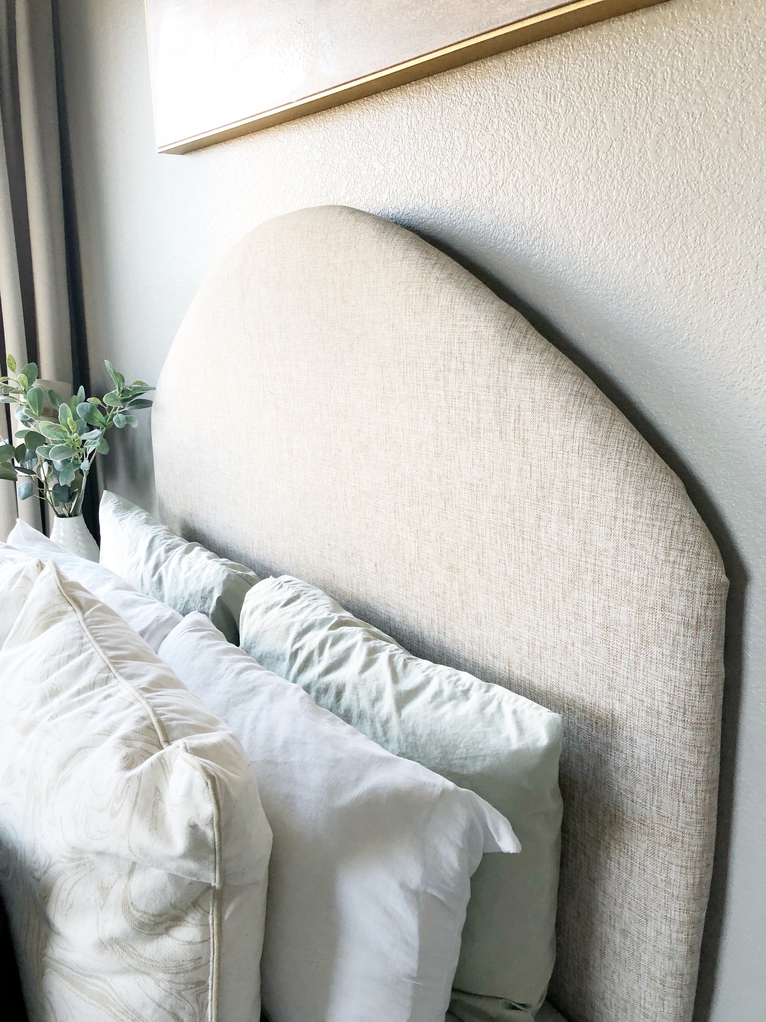
Today is a short little blog post about my DIY headboard. I have had several requests for instructions on making this guy. I paid a total of $40 to make him! It’s a great thing to do if your strapped for $ and need a headboard to finish off a room. This headboard has been in my guest room on this queen bed frame for several years and is so easy. Here is a supply list:
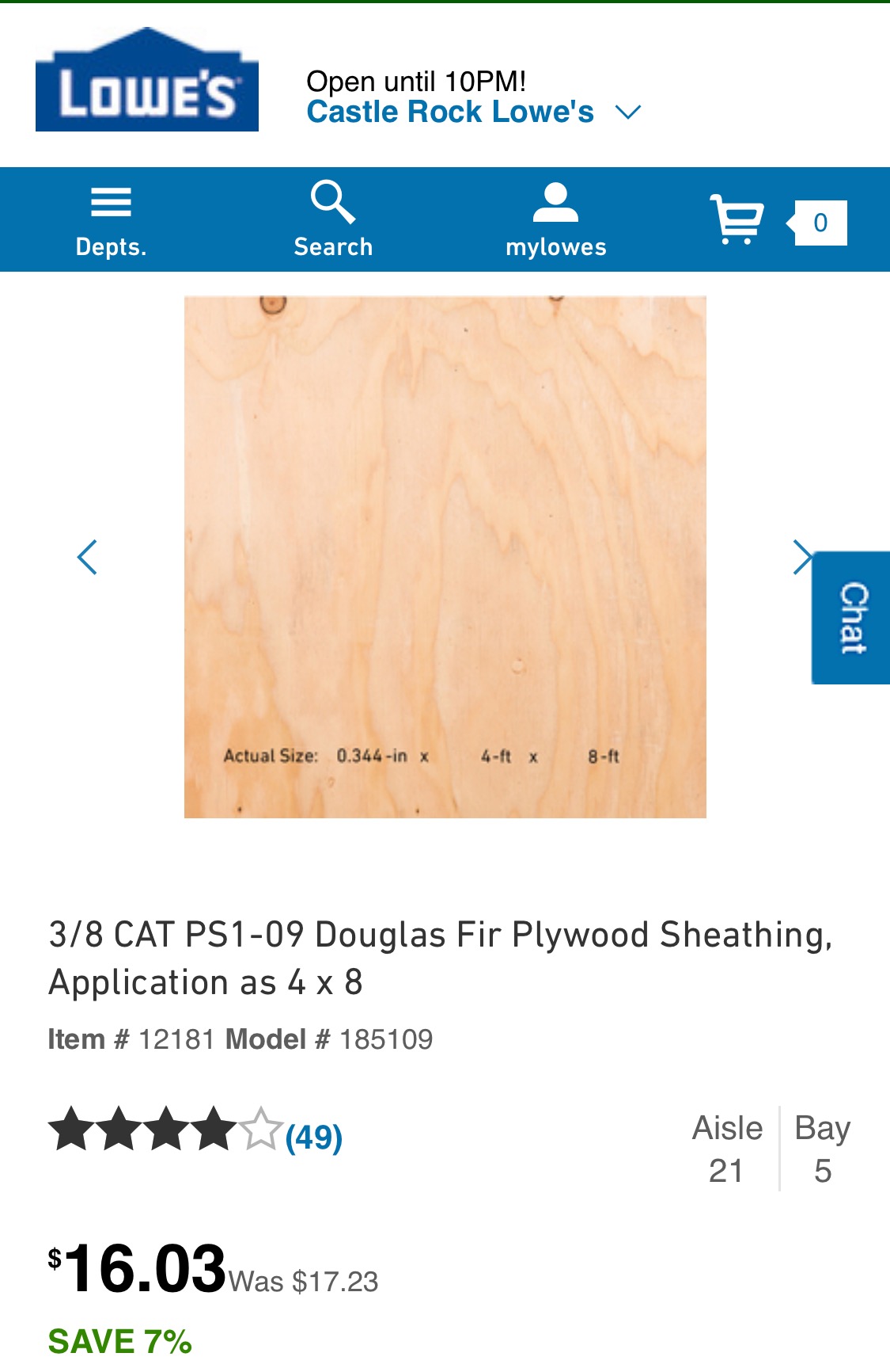
4x8 sheet of ply wood: 5/8’s or 3/4’s inch thickness (the thicker the less it bends)- lowest grade is fine.
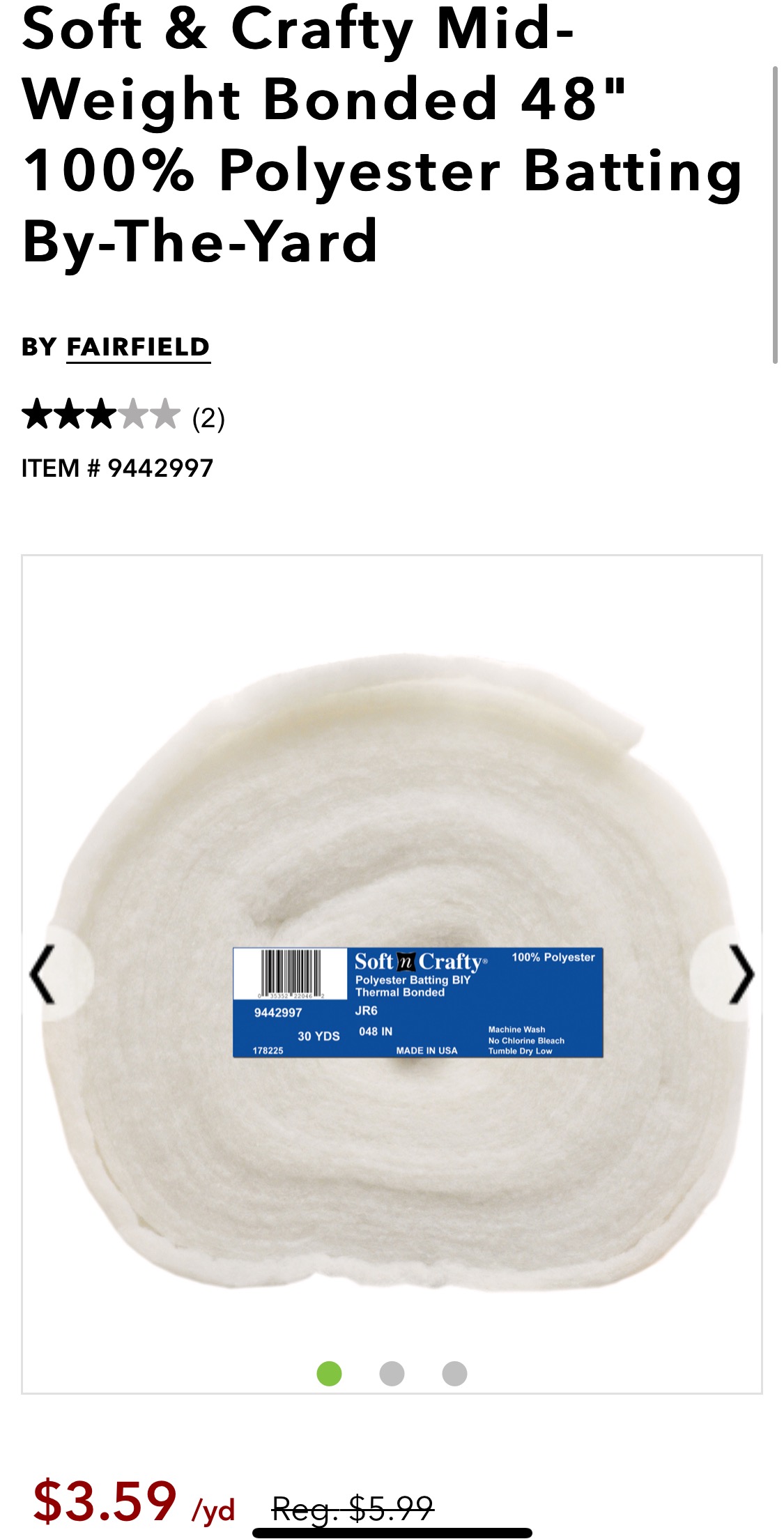
enough batting to cover the front surface and to wrap a little around the back (depends on how high you want it and what size bed)
Enough upholstery fabric to cover the front and go around the back slightly (you will need 58” width and 2-3 yards depending on how tall you want the headboard)
Staple gun and staples
Optional skill saw
First measure how high you want you headboard. Mine is 62’” tall and 58” wide for the queen size. This took us attaching 2 pieces on top of each other. Also decide if you want it arched at the top or square. If you have a skill saw and are comfortable, you can make whatever shape you want at the top. If not, do a square one and have them cut your pieces for you at Home Depot or Lowe’s. The 8’ length needs to be cut to the width of your bed frame. That will leave you with a 48” tall square head board frame which is just fine. It will be much taller than your pillows and looks good at that height so you can stop here.
I got 2 pieces, one 4x8 and a smaller one, and had my husband, Tye, to cut a 58” piece for the base, then cut an arches 58” wide piece and add that to the top. He then took the scrap piece he had and used that to attach the two pieces using some small nails. You will have to buy 2 plywood pieces to add this extra height, but they are cheap. Get the lowest quality.
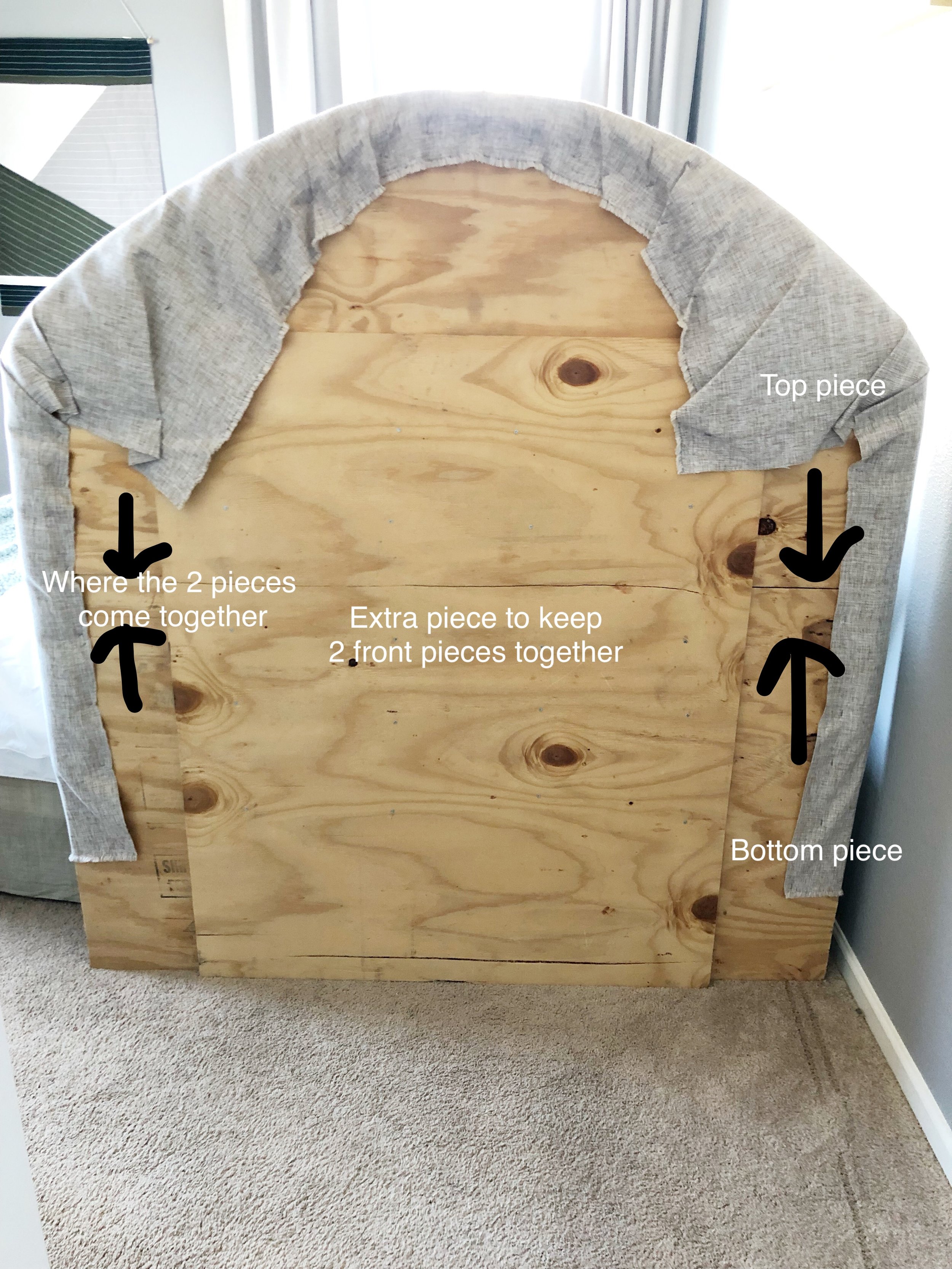
After the piece(s) is/are cut, lay out the batting slightly larger that the size of the plywood piece. 2 layers is best. Wrap the batting around the edges and staple with a staple gun all the way around. The batting doesn’t have to go all the way to the ground, it just needs t go slightly below the mattress all the way up. The batting creates a little cushion over the plywood.
Repeat this same process with your fabric. Choose an upholstery fabric of your choice. Upholstery fabric because its thicker and will pull nice and light without stretching. Hobby Lobby and Joann Fabrics both have great coupons and great choices. I got all i needed for my headboard for $20. Use you stapler to put the fabric really tight and staple it all the way around. Be conscious of how its looking at the corners at the top front. Pulling it different directions to staple will make it look different ways on the front. Just play until it looks smooth.
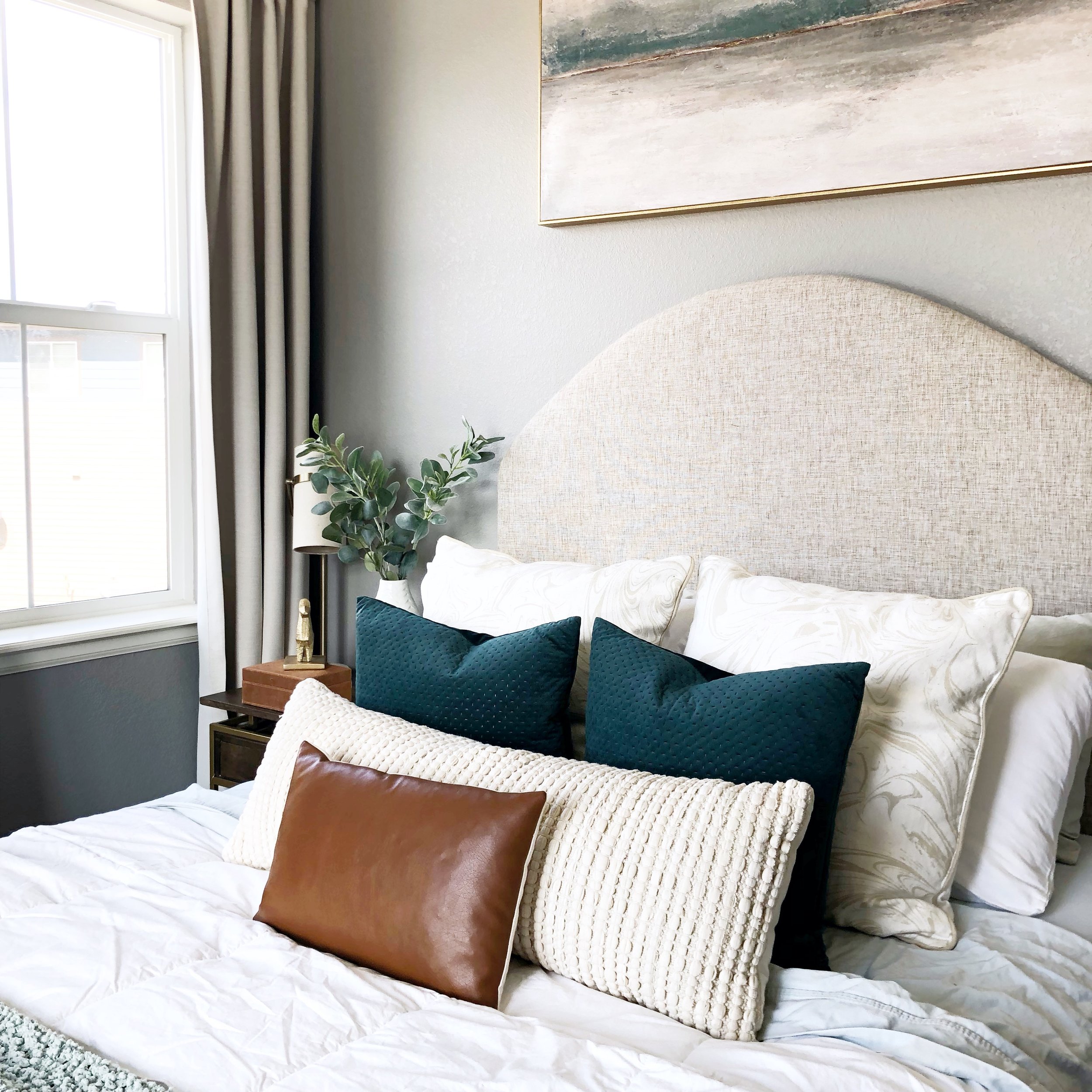
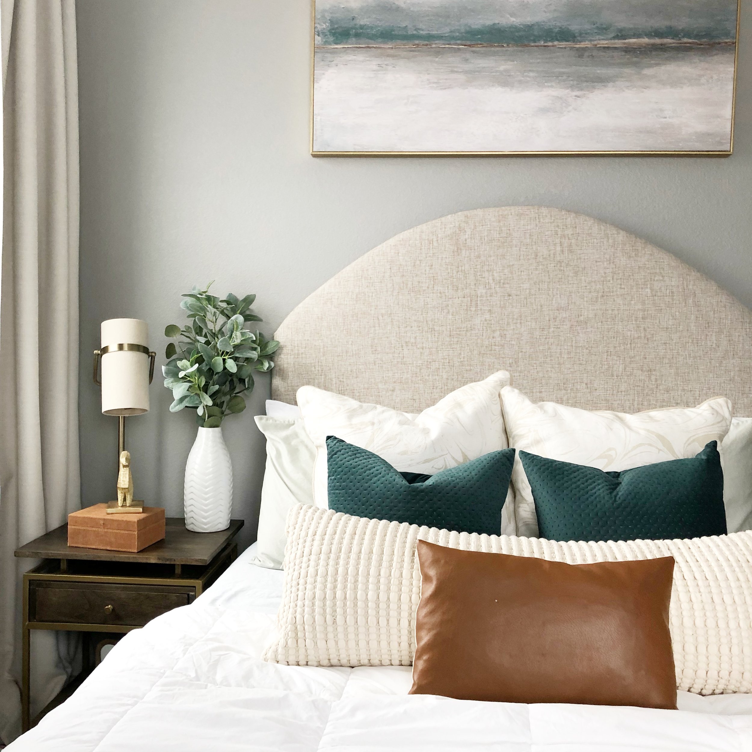
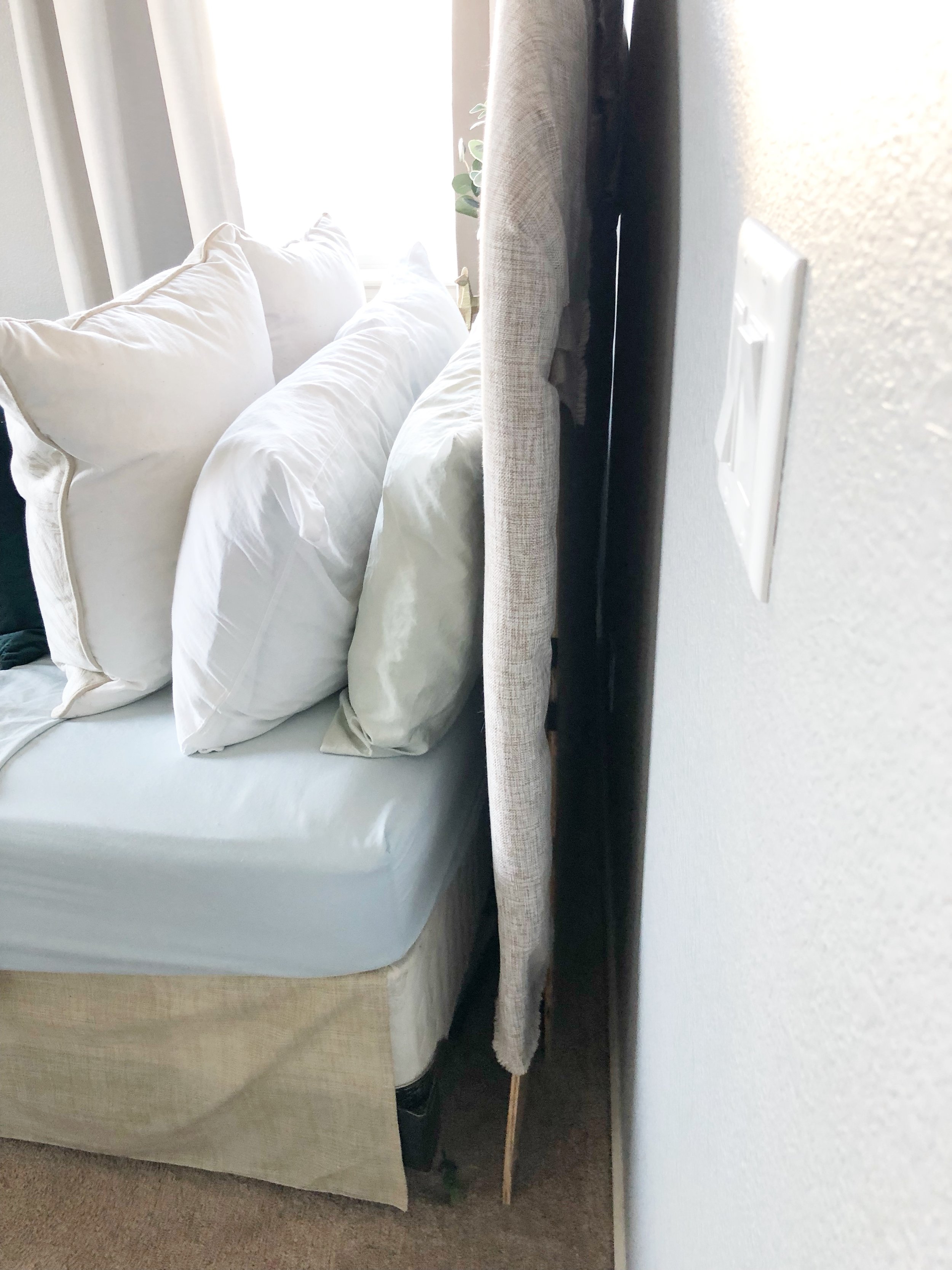
Above are pictures of the back of ours. You can see it just sets on the floor and is pinched between the wall and the mattress. You can attach it to the metal bed frame easily if you want. If you want to, you can also raise it up off the ground and attach it to the bed frame or add some legs with scrap plywood so that its slightly taller too. And that’s it! EASY!
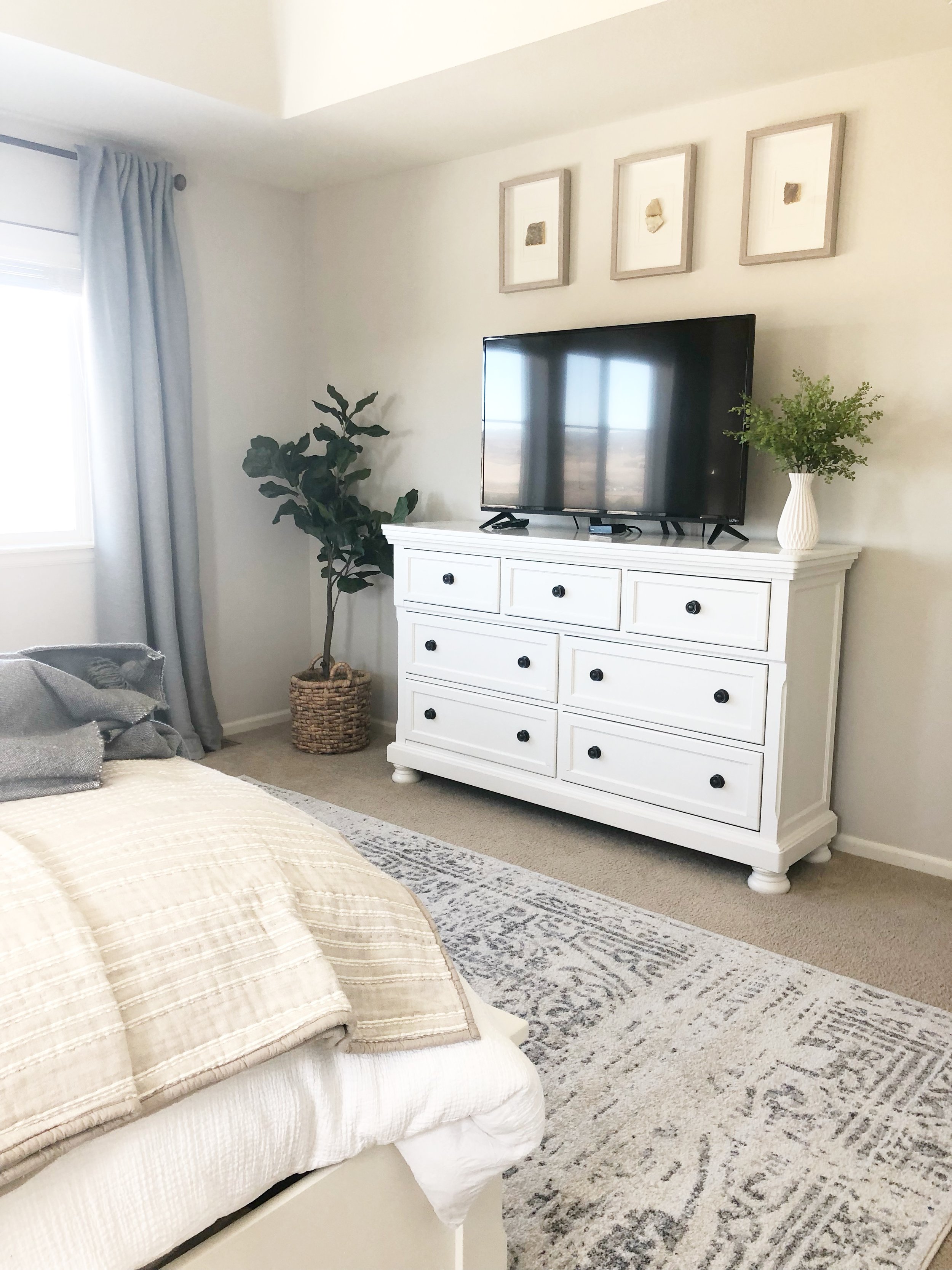
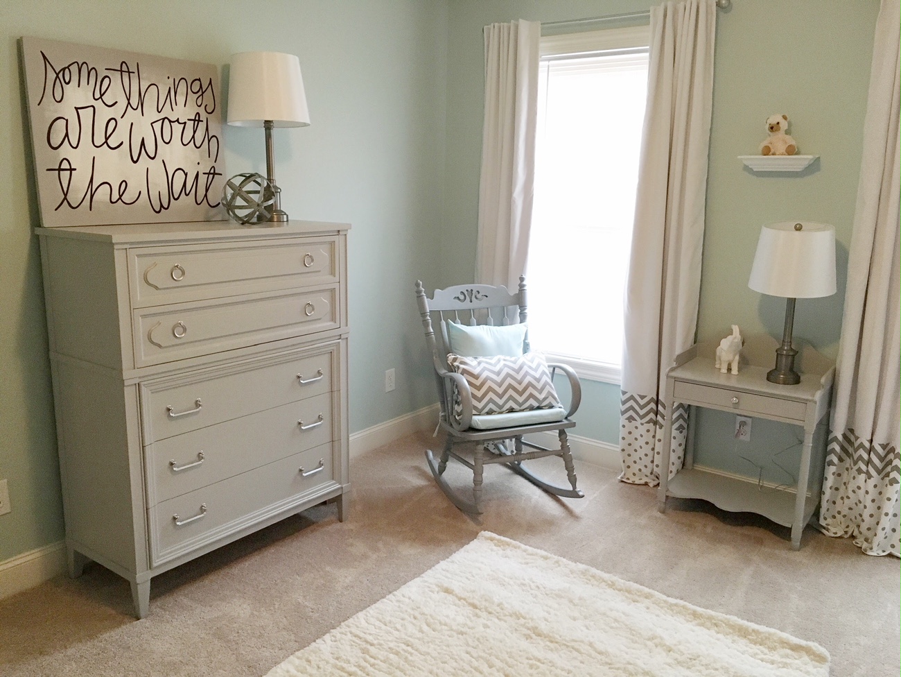
March 18, 2019: The Morrow Master Ambush Makeover
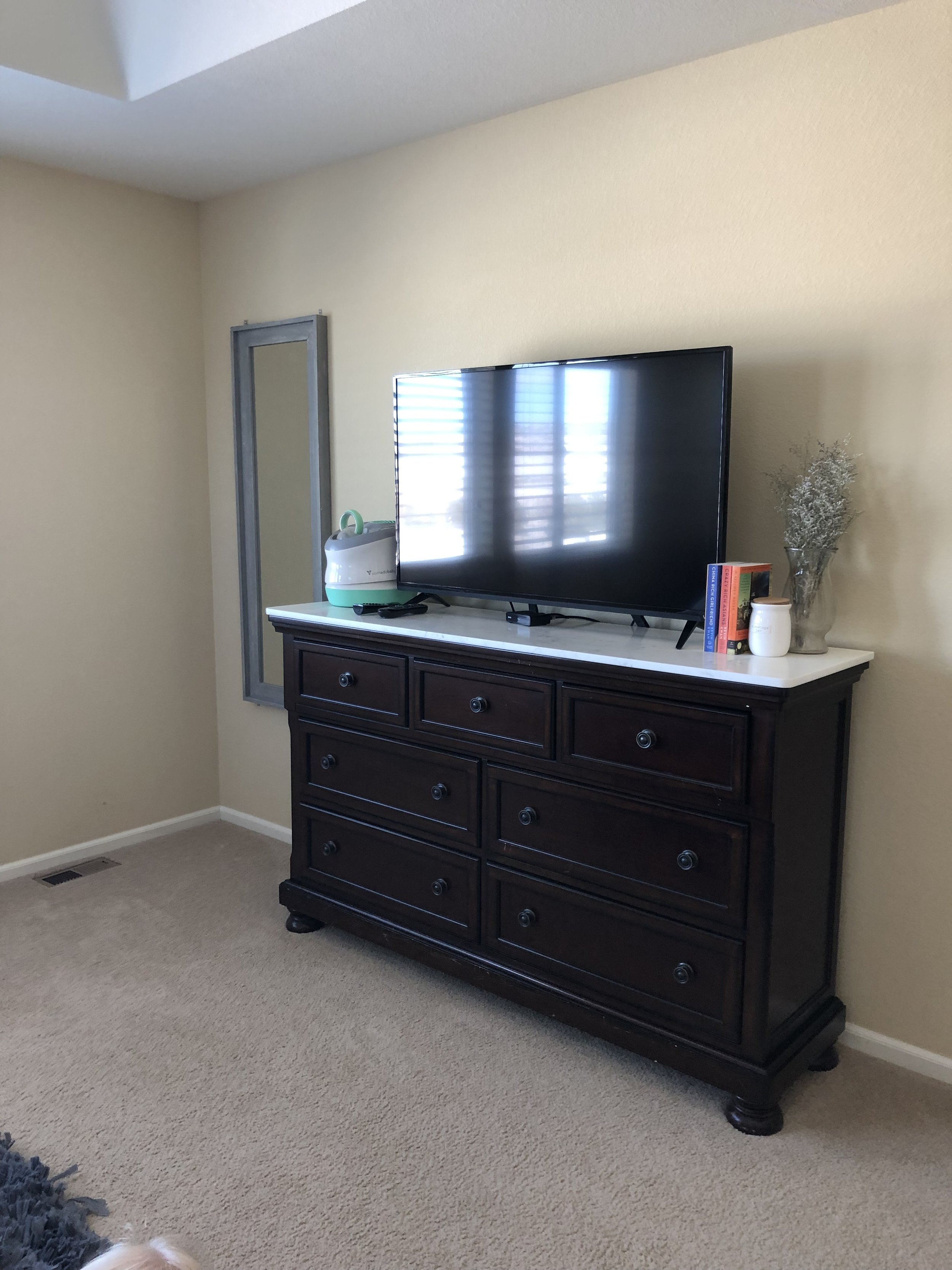
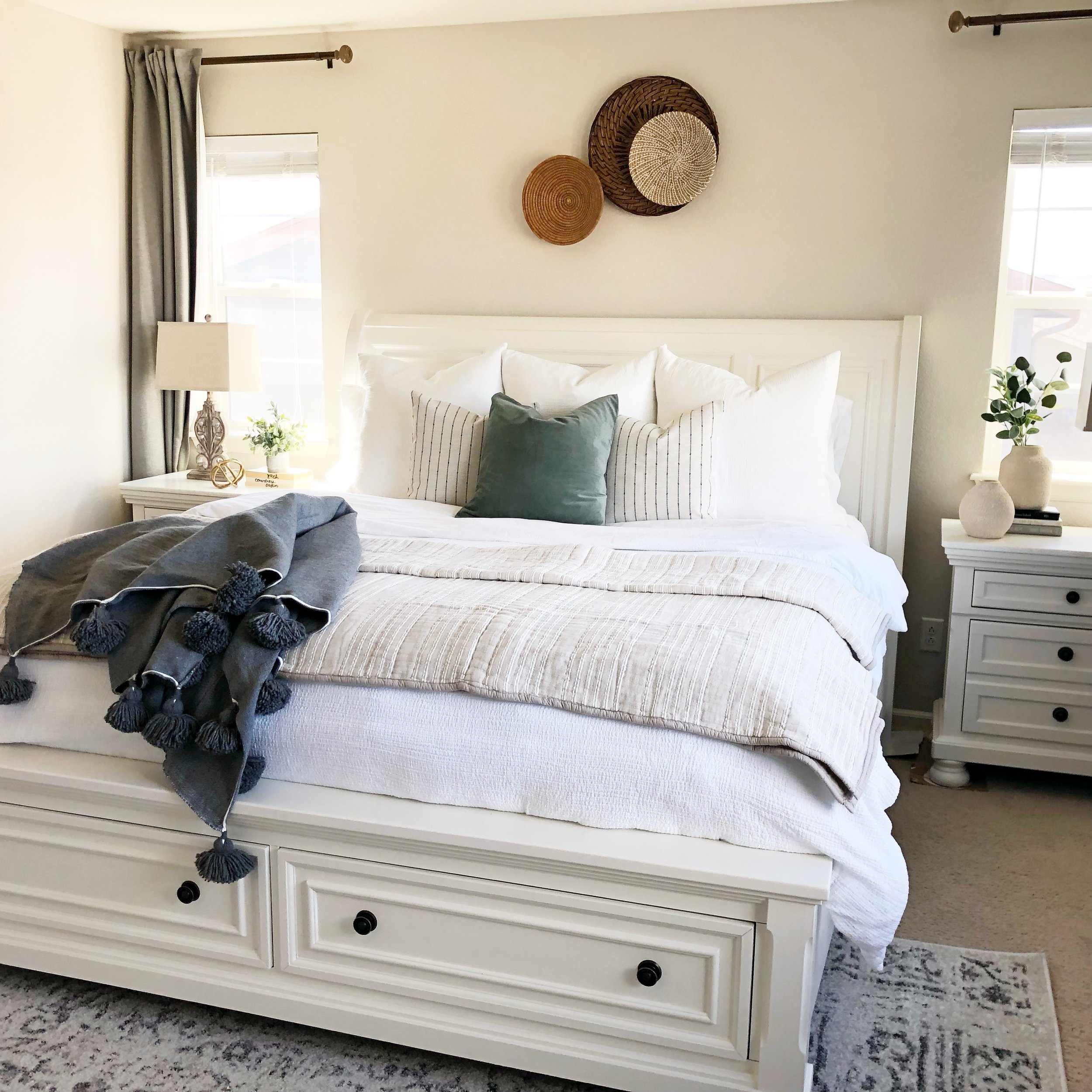
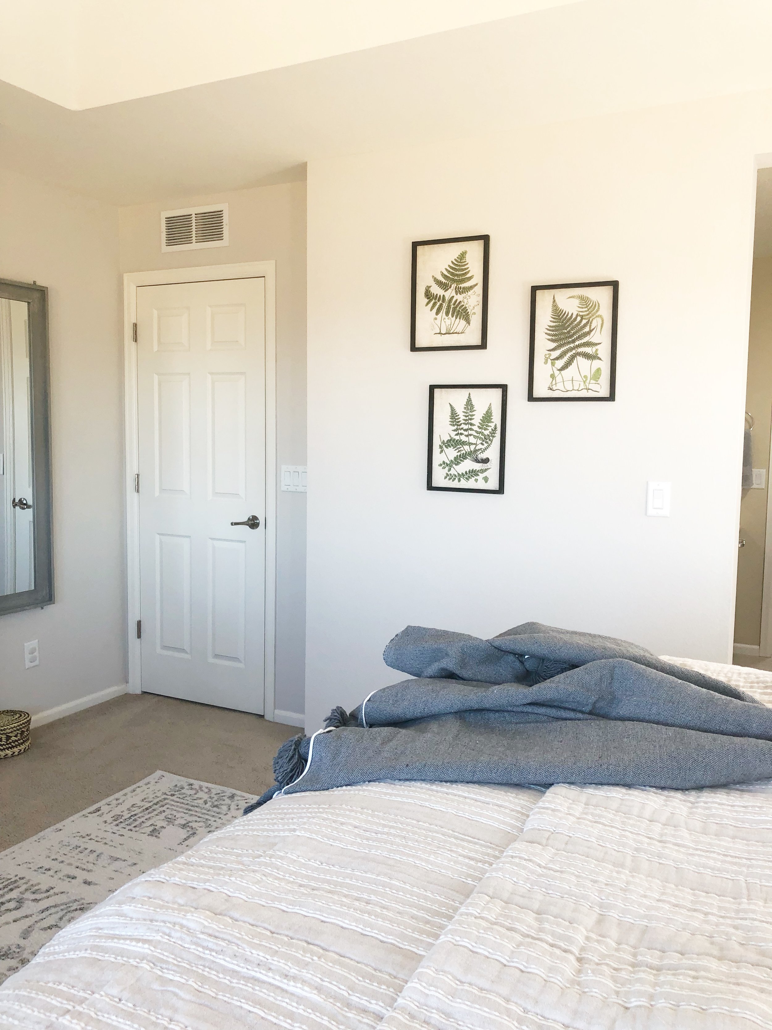
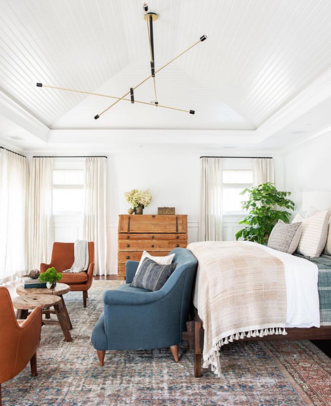
If you haven’t seen already, last week I had the pleasure of completely redecorating my friends, Courtney and Zach Morrow’s master bedroom while they were gone on a week long vacation. Courtney and I live right down the street from one another and they were so trusting in me to redo their room completely while they were out of town with no knowledge of my design plan! We had discussed that she wanted her furniture painted to lighten it up, and that she wanted a very neutral, light, airy room. Other than that, neither her nor Zach had much input into what I decided to do with the design of the room and that was so much fun.
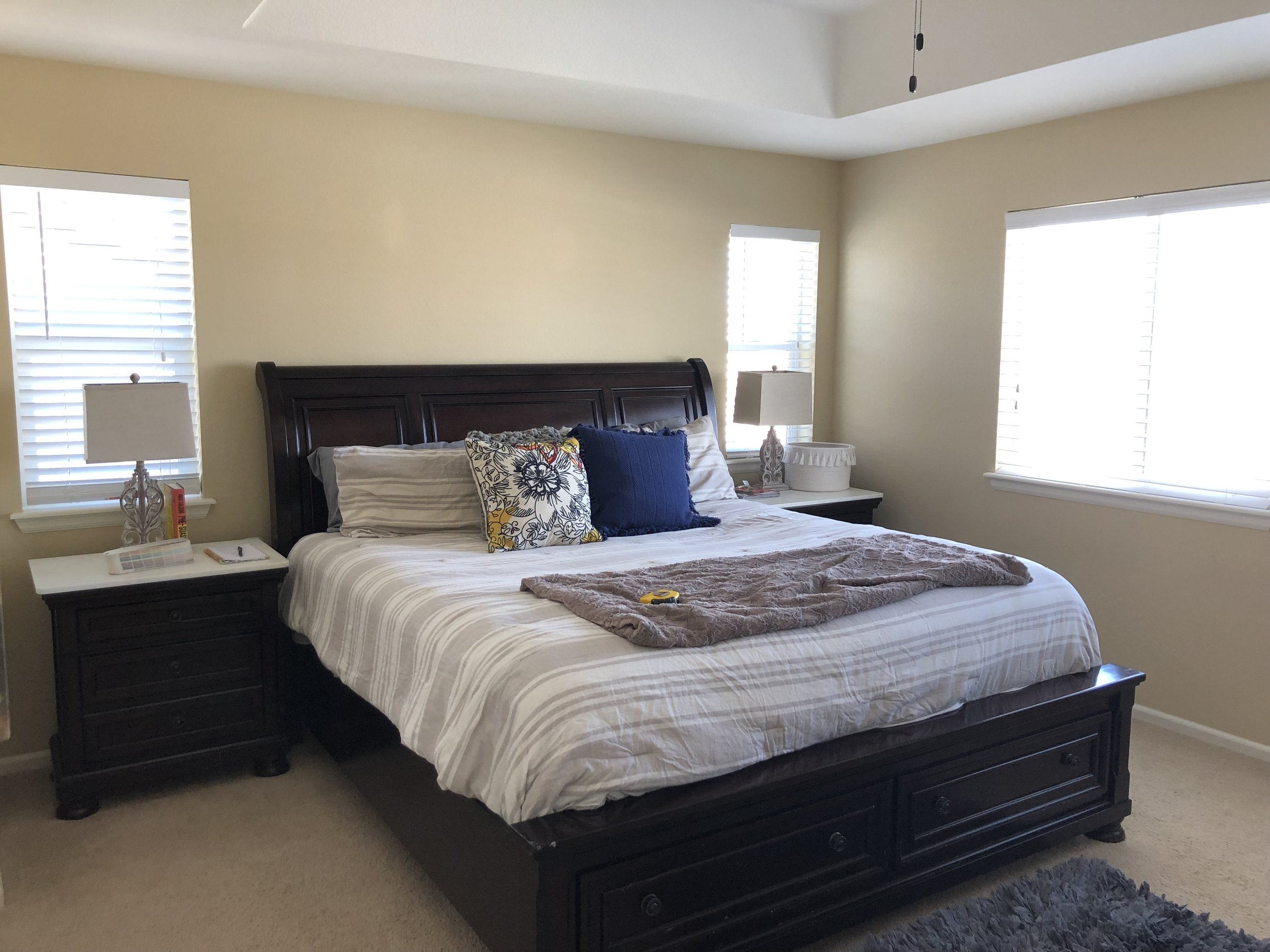
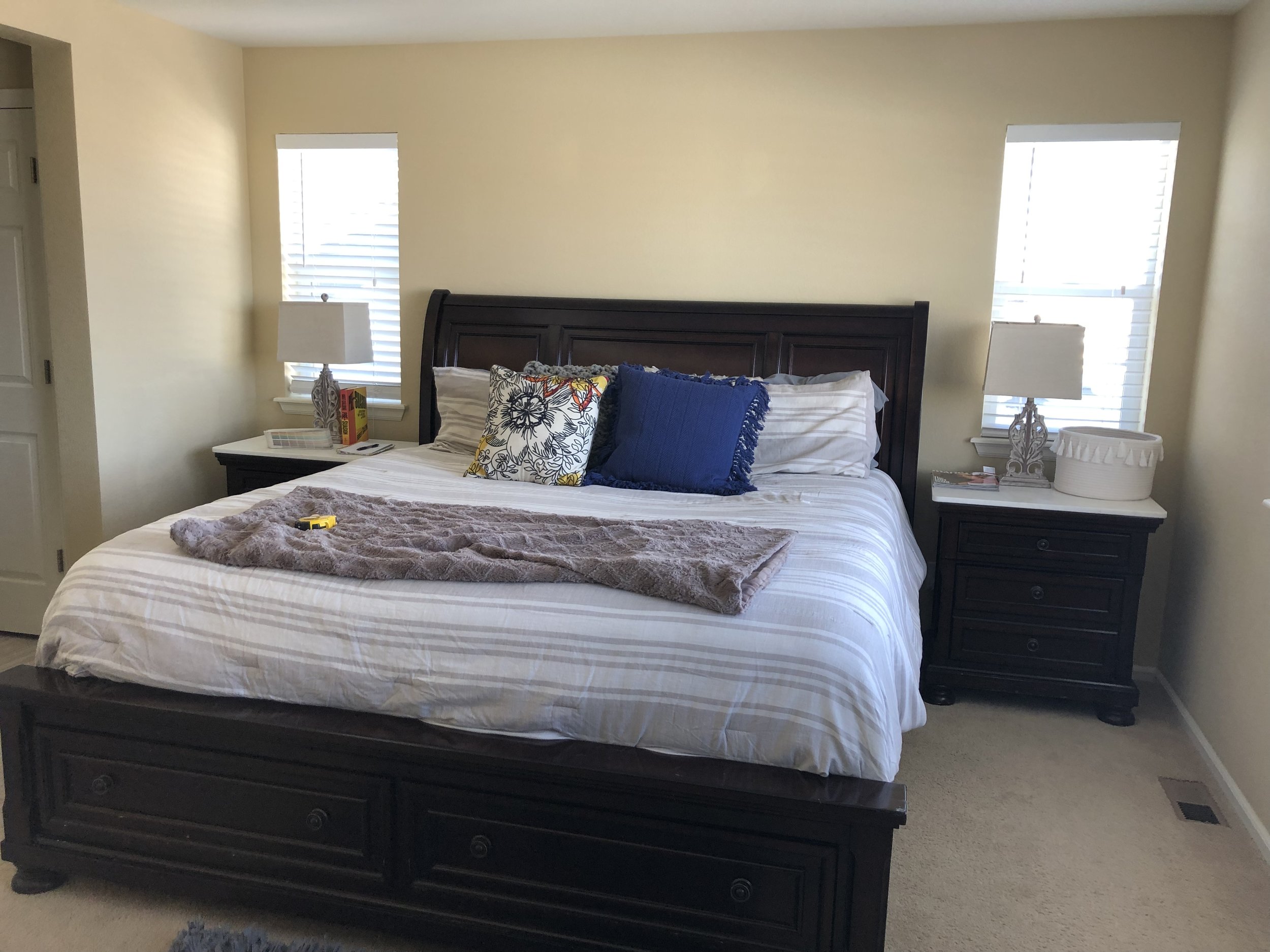
To begin with, the room had a few major things I wanted to change: the walls where a yellow color that was outdated and too warm, especially with all the wood. If you have warm, you have to have cool to balance. Second, the room lacked any interest. It was all kinda “flat” no depth which makes it feel uncomfortable. Of course this is the opposite of what you want to feel in a bedroom. I wanted to create comfort by adding interesting art, textures, and bedding. Included in the textures, was adding curtains to all the windows and a rug. Curtains instantly add an intimate feeling to a room and soften the edges of the dry wall. A rug also creates intimacy by defining the space. They are especially important in large rooms which need to be broken up into 2-3 smaller spaces. In a bedroom they break up all the carpet/wood flooring. Even carpeted bedrooms look tons better with an area rug added.
My design plan started with the wall and furniture colors. I knew I wanted bedding that incorporated creams, stark whites, and light khakis to create that layered look that makes a show stopper and super comfortable looking bed. Because of this I chose one of my favorite colors for walls - Balboa Mist, by Benjamin Moore. Its a soft warm gray perfect for a neutral bedroom in which you want the walls to just kinda fade in the background leaving the comfort of the room front and center. A lighter choice that I almost went with is Classic Gray also by Benjamin Moore. Its a lighter version that I love to use for the same reasons. The reason I went with Balboa mist was the furniture. I wanted the walls and the furniture to contrast more. If I had gone too light with the walls, the furniture would have blended in with the walls.
*Side note- I love Benjamin Moore colors but I don’t usually use BM paint. Its easier for me to run to Lowes and have them use the BM colors to make me a gallon of Valspar paint.
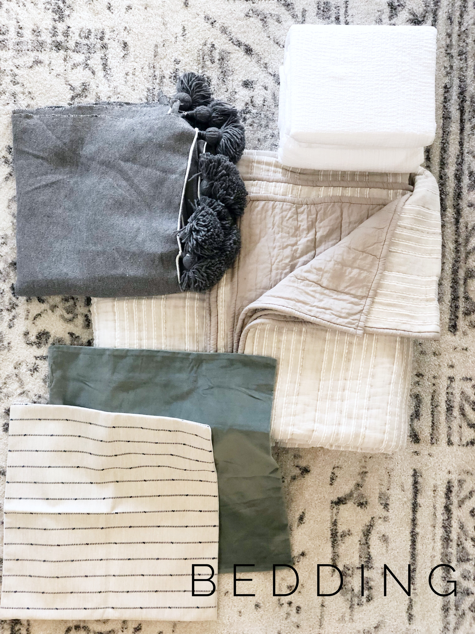
Second was the furniture color. I knew that I wanted a warm white/cool cream color to flow with the marble tops they already had for the furniture. I chose Dune White by BM because I wanted the bed to contrast a little against the stark white of the bedding and create depth. That got me on the track to the next step- the bedding plan. I started with the fact that I knew I wanted 3 white euro pillows across the back to lift the height of the bedding to make it more grand. I also knew I wanted a stark white duvet with some texture. I went by Homegoods and snagged 3 euro pillows which had a great gauzy texture to them that I loved. They were $25 ea. Then I went to Target and found a ton that I loved: the gauzy white duvet cover by Nate Burkus, and the stripped khaki and white textured quilt by Project 62. The quilt was actually on clearance so I grabbed it in a queen size for about $50 and the king duvet for $70. I picked up my curtain rods in a medium wood color for $75 for the 3 (on sale), and I also bought an insert for the duvet there for $50. As far as inserts go just get the fluffiest, cheapest one you can find. I also found those great textures vases there too for $15 ea in the “Joanna Section”.
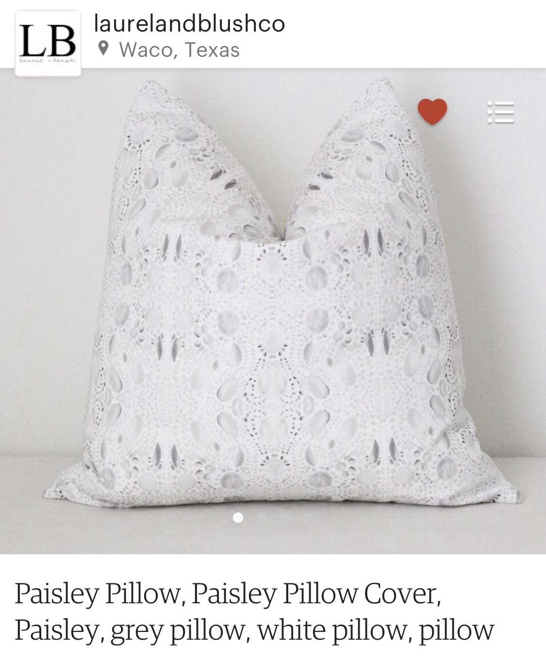
Next I went to my fav place to find great unique pillows and throw blankets- Etsy. There I found that great medium charcoal blanket with the large tassels from Bryant House for $60 and the 18x18 Striped navy and natural throw pillows from Laurel and Blush for $38 ea. I have used her pillows a ton and I actually have those exact ones on my chairs in my living room. I love her pillows! The reason I got that blanket was I wanted the darker color so it would pop and I knew I wanted the large tassels for some uniqueness, and lastly, it was one of the cheapest ones in that size I found.
The key to creating a great neutral space without it becoming boring is variation and texture. That’s why I wanted to bring in all the creams, khaki’s and grays. Along with all the neutrals, I knew I wanted a little pop of color and freshness. Green is the perfect go to for this. I found the toned mossy green 20x20 velvet pillow cover at IKEA for $10 and inserts for all the throw pillows for $6 ea. I also snagged 2 sets of white curtains for the windows.
After the bedding and the colors where pinned down, I needed a rug and accessories. Wayfair is my go to rug place so I narrowed it down to the Olvera Gray Area Rug in an 8x10 for $168! I wanted the rug to have a vintage, farmhouse look with some of that medium gray in it to break up all the light, and pick up the throw blanket color. In bedrooms I usually get a 9x12 with a king bed and a 8x10 for a queen. Because this room was small, an 8x10 did just fine. I like to put the rug width ways under the bed and stick it under about half way.
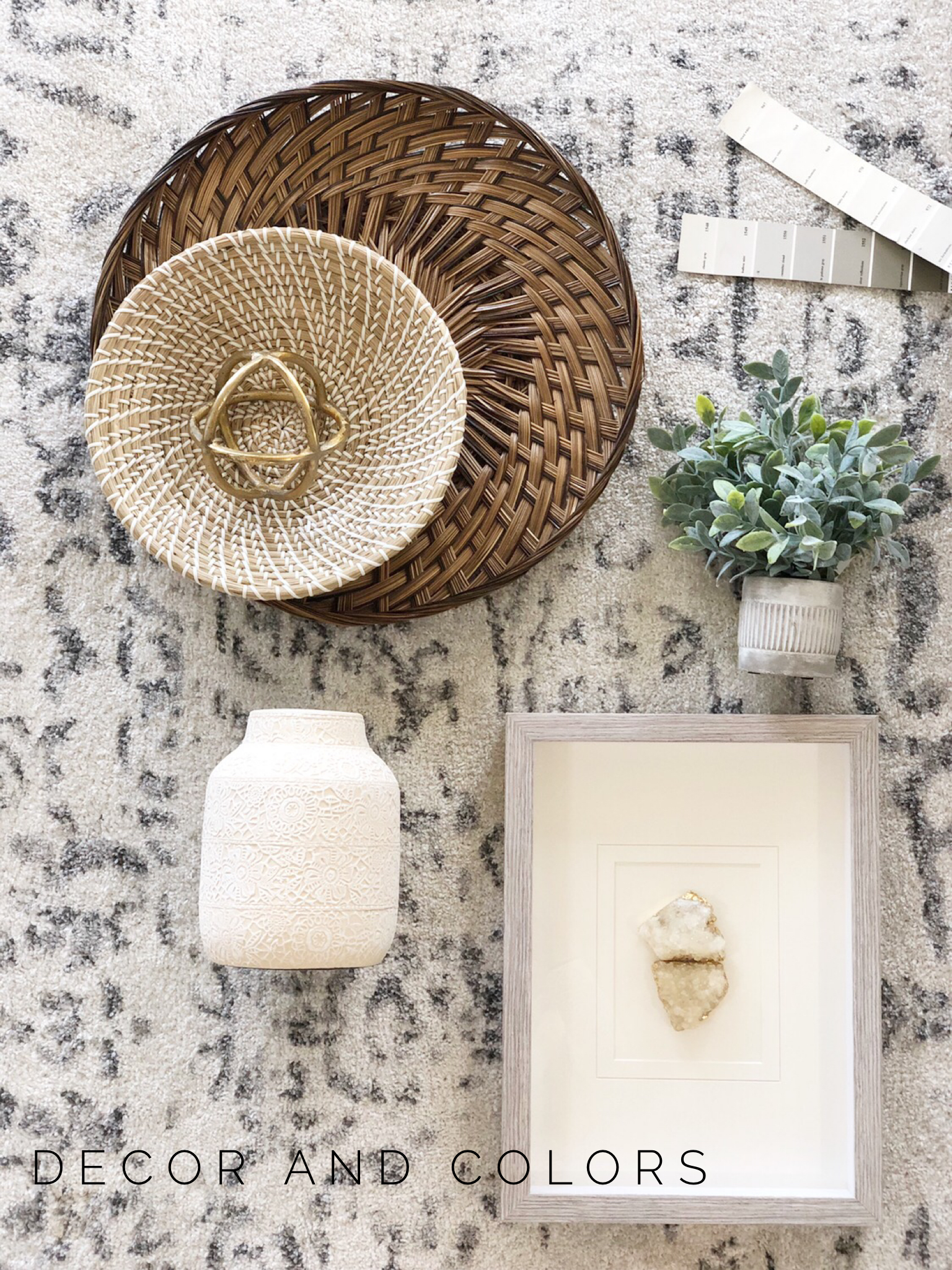
For art and accessories I went to Homegoods. I found those 3 great framed quartz pieces for $30 ea (a little splurge but worth it) and a basket, the small gold ball, a couple faux plants. I wanted to spread the green around the room some too so I found that small fiddle leaf fig there for $59. I kept looking for the perfect round object over the bed to help balance all the squareness of the windows and bed frame, but never could find anything after about 3 trips.
I headed to world market to find something cool and found three green botanical prints that I knew would be perfect to help spread the green for $60 but no round art…I finally was able to snag a couple more baskets and a few neutral hard back books at the local thrift store for about $15 total and decided I would take the basket from target and mix them together as art over the bed. I hot glued them together in a random group and loved it. I took 3 of the books and wrote their named on the side: Courtney, Zach, and Castin - the perfect customized touch. I was done! Now for the plan on how to do all this painting and decorating in 3-4 the days I had with out children while they were gone…
I knew the furniture painting would take the most time, but I found a great paint that’s no prep for the furniture that would cut down time and support the fact that I couldn’t spray it or move it off the carpet. Sherman Williams Infinity paint did amazingly. It cost $40 a gallon, and took about a 1/2 a gallon to paint the whole suite. Follow these steps to get a great finish on wood furniture with a sponge roller and brush:
Sand any deep scratches you need to get rid of until you cant feel them anymore
Sand heavily used areas like corners or around knobs
Wipe it all down with a 1/4 vinegar and water mixture to clean oils and dust off
Use a 4-6” sponge roller and roll as many surfaces and places as you can - don’t put it on really thick or it will drip.
Use you brush to paint everything else - its not going to look great at this point but don’t worry. Let it dry for a few hours then go back and lightly sand any drips or clumps. Repeat with a second coat and maybe a 3rd if the original color and paint are very different. When doing the second coat be aware of the direction you are painting and how the strokes look with the direction of the graining.
Use cardboard squares under the legs to paint close to the bottom of the legs without messing up the finish
Let dry for a few hours before touching. It needs to cure for about 2 weeks for it to be hard to chip or ding.
After all the furniture was painted (it took me 5ish hours on the first day) I painted the walls the second day. I don’t use painters tape but just use a 21/2” edging brush to trim the walls then a heavy napped roller to roll the rest. I used Valspar 2000 - $20 a gallon and most places only need one coat. It took just over 1 gallon to paint the whole room.
The 3rd day was a half a day I had without kids. I hung the curtain rods, curtains, put the mattress back on the bed and the rug under the bed. I originally had white curtains to hang but once I hung them I quickly decided I didn’t like them. I wanted thicker curtains and I needed some that were darker to balance all the white furniture and light walls. I ran to IKEA and got some medium gray lined curtains that I liked way better. They were $40 a pair and were perfect. I hemmed them real quick from 98” to 93” and ironed and hung them - way better.
The 4th day was also a half day and the day I had been waiting for- the day I made the bed, hung the art, and accessorized. It was so fun. My sweet friend came and helped me which made it all the more fun. We decided to put the quartz pieces over the TV, the botanical prints over by the bathroom on a wall that is kinda by its self. It brought the green over to that side of the room. We also hung the 3 baskets above the bed which I feel like was exactly what I was envisioning for that wall from the start. Sometimes that happens and sometimes it doesn’t. Like the curtains- I had envisioned white, but I had to be flexible and change up my original plan. I think its important for everyone to know that it doesn’t always go as planned, but most of the time it comes out better!
The finished room was so exciting to see and I didn’t want to leave haha. I had to wait 3 more days before Courtney and Zach came home to see it but when they did it was all worth it! They loved it and I’m so glad I got to give them the gift of a comfortable, relaxing space. I’ve always felt that your master is the most important room in your house. That’s where you are suppose to be able to relax and enjoy your spouse - where you escape from your day. Make it your retreat. I hope I gave you some steps to make yours a place you love too.
Head to my Instagram @kindandabell to see more pictures, and several videos on my process. Also head to Courtney’s vlog on youtube: Multiplying Morrows - Master Bedroom Makeover to see the video of them seeing it for the first time!
March 10, 2019: A Breath of Fresh Air Spring Tour of my Home

I hope you guys enjoyed my friend, Jordan’s spring tour over at A Blue Nest !I love the way she styled her home for the season and I’m excited to show you my home too! Today I will be sharing the updates to my guest room, living room, and master bedroom. I don’t change a ton of things out for each season, but I am always improving my home to make it more comfortable for my family and my guests. You will be able to tell from my pictures that I love simplicity, and comfort. I have 2 small kiddos and I want my family and friends to be able to really live and visit in our home. I want my kids to be able to jump and climb and still feel that they are in a space that brings them joy like it does me!
Doing simple things like changing out pillows, accessories, and greenery can instantly bring the sunny, fresh, feel of spring into your home with out spending a ton. Also doing a good spring cleaning like organizing and purging items always makes the clean feel come to life.
You can shop my home below as I discuss the different spaces by clicking on the linked words for each room. Make sure to check out the rest of the A Breath of Fresh Air Spring Home Tour bloggers and their homes at the bottom of the page!
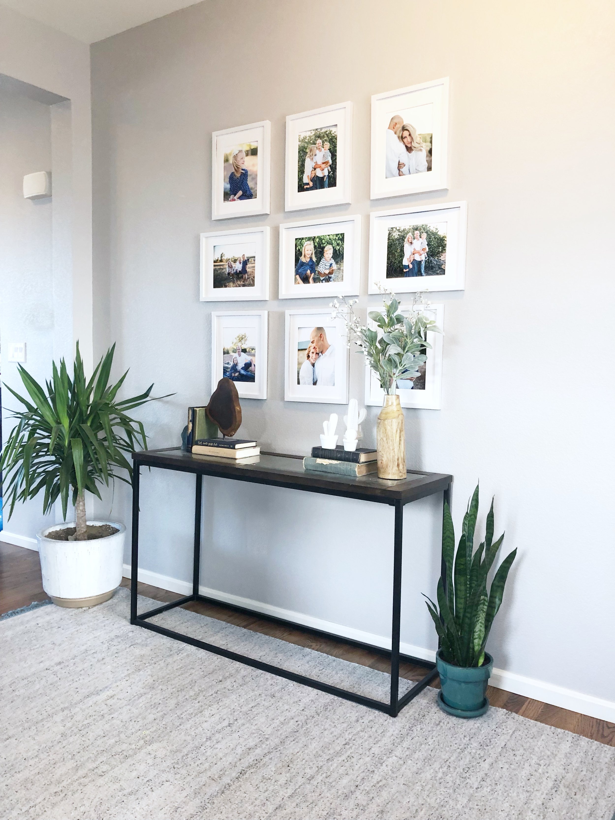
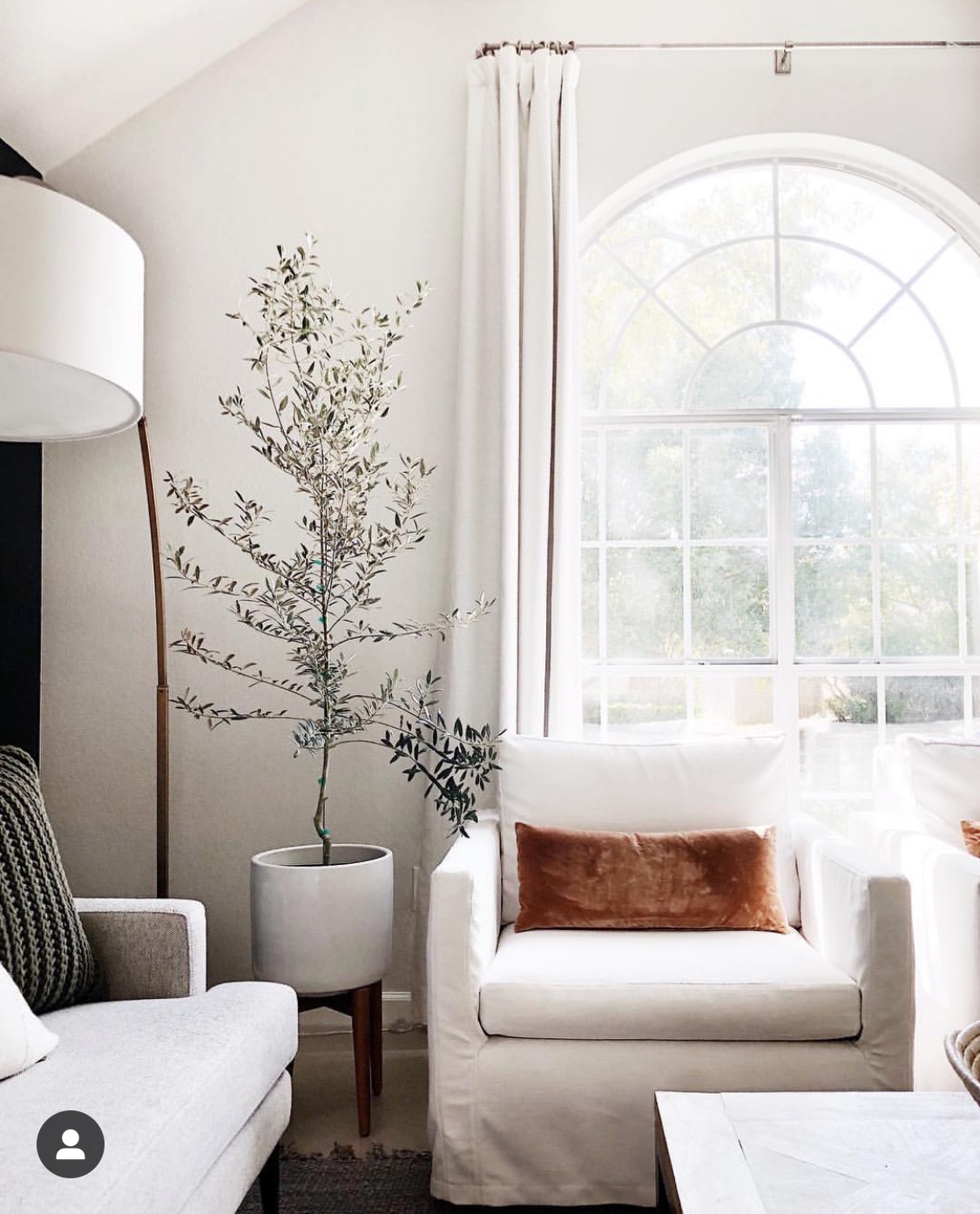
As you can see my small home has tons of windows, which has its challenges in photographing, but allows me to enjoy the beautiful views of Colorado, tons of plants, and natural light!
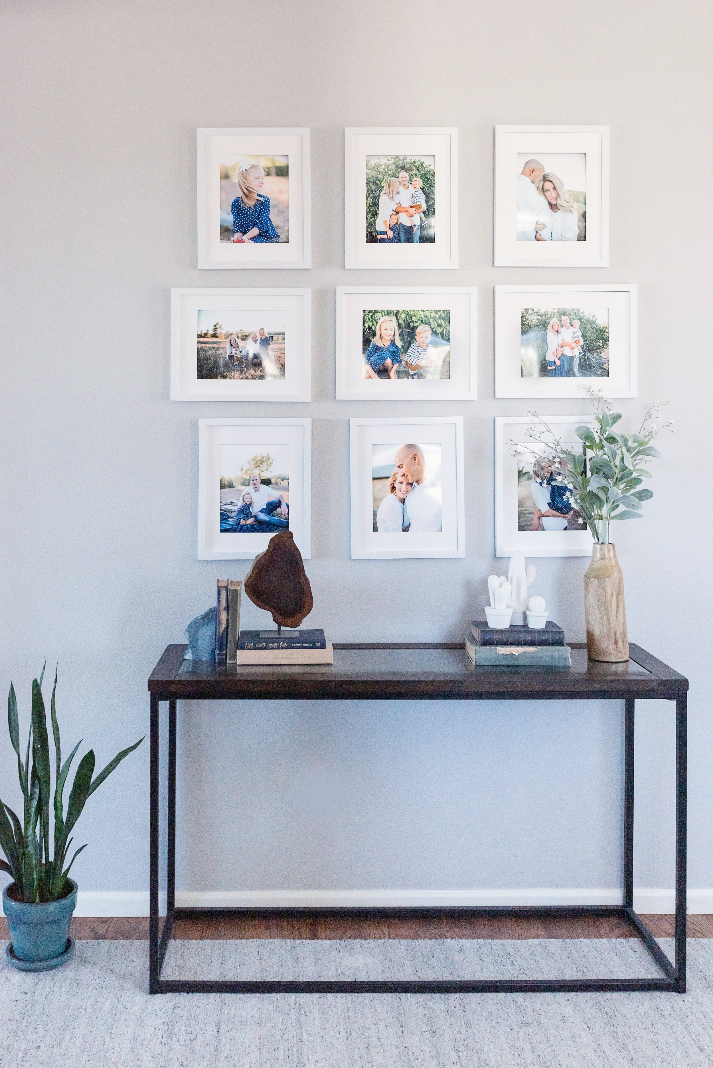
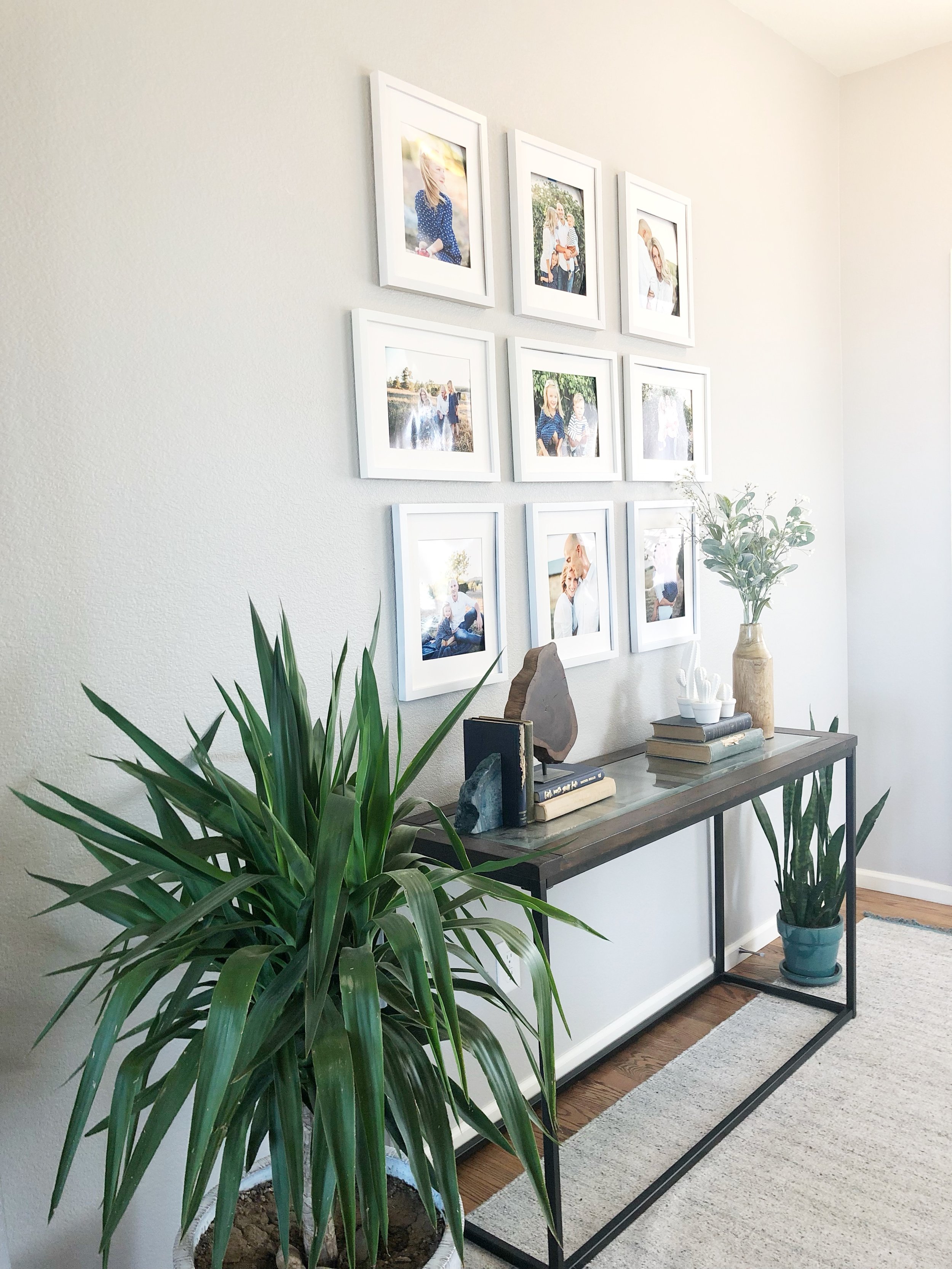
My entry way is a place that introduces my visitors to my family with a grouping of family photos by Courtney Taylor Photography. IKEA has these frames along with the large mattes to easy create a clean, simple gallery wall of your own. This table from Wayfair, has a mixture of wood and metal, is not bulky, and is just enough to make this entry a great first impression of my home.
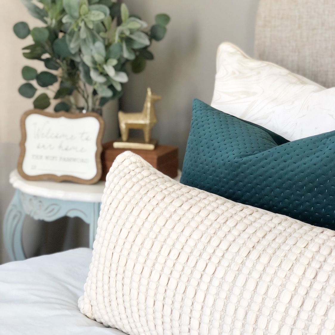
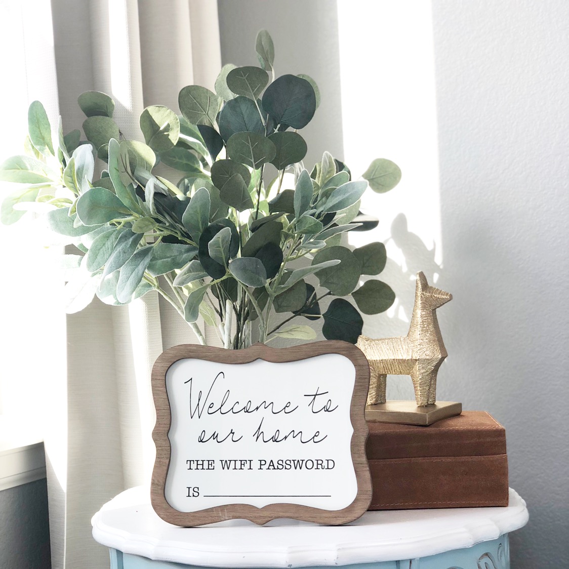
My guest bedroom is comfortable and cozy with all the amenities guests appreciate. We have a ton of over night family and friends as we just moved to Colorado from the Nashville area abut a year ago. It was very important for me to create a space guests enjoyed. With pillows from Homegoods and Linen and Ivory, I wanted a simple yet complete bed with plenty of pillows for comfy lounging. I also have a nightstand, from Homegoods as well, with info on our WiFi and places for personal items so they don’t get lost.
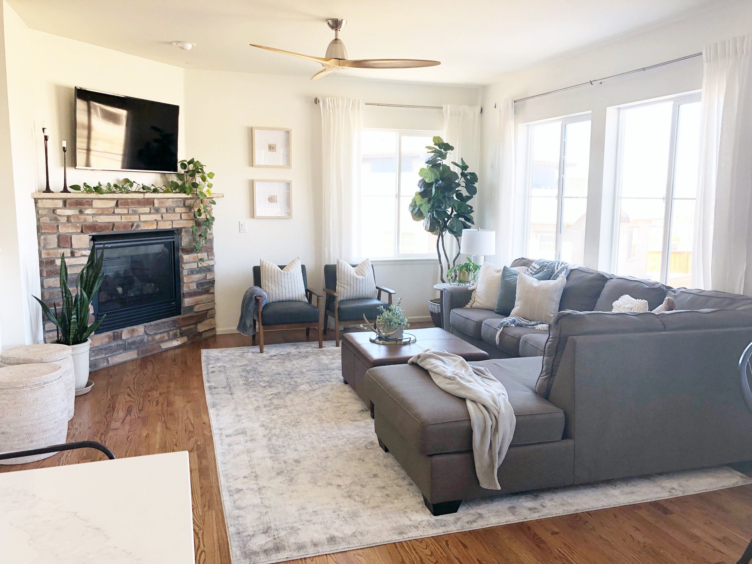
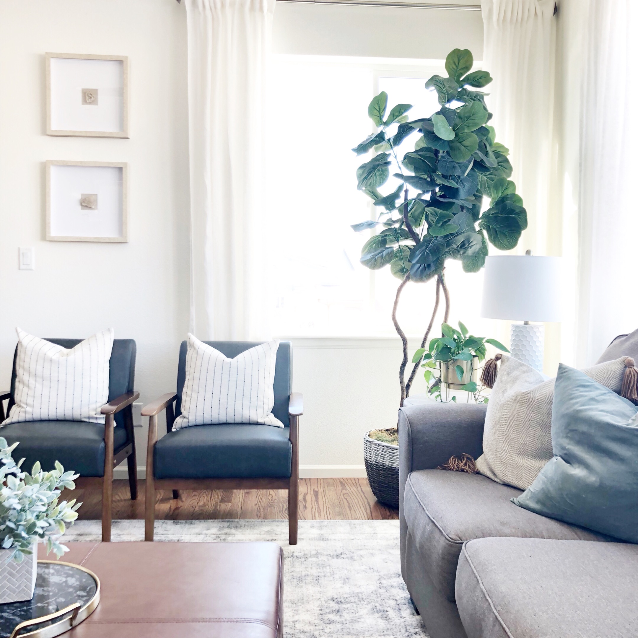
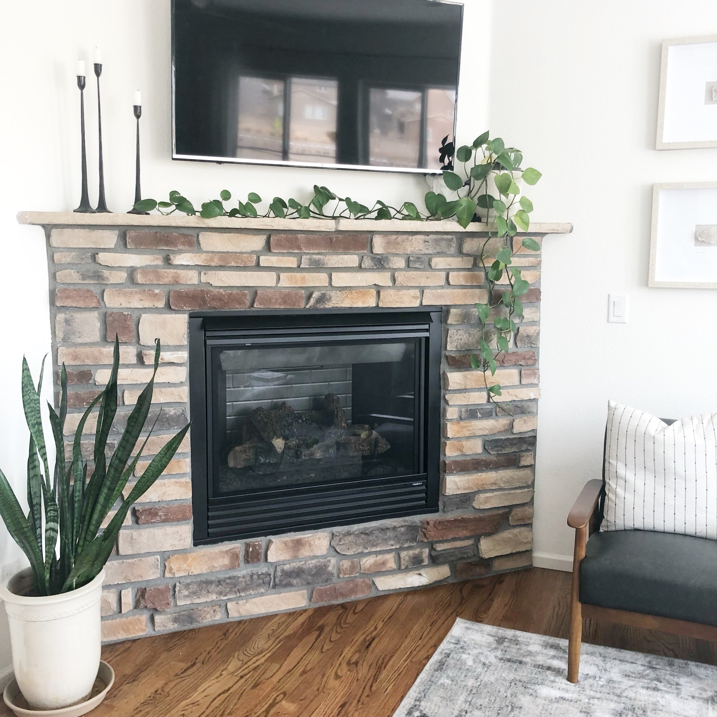
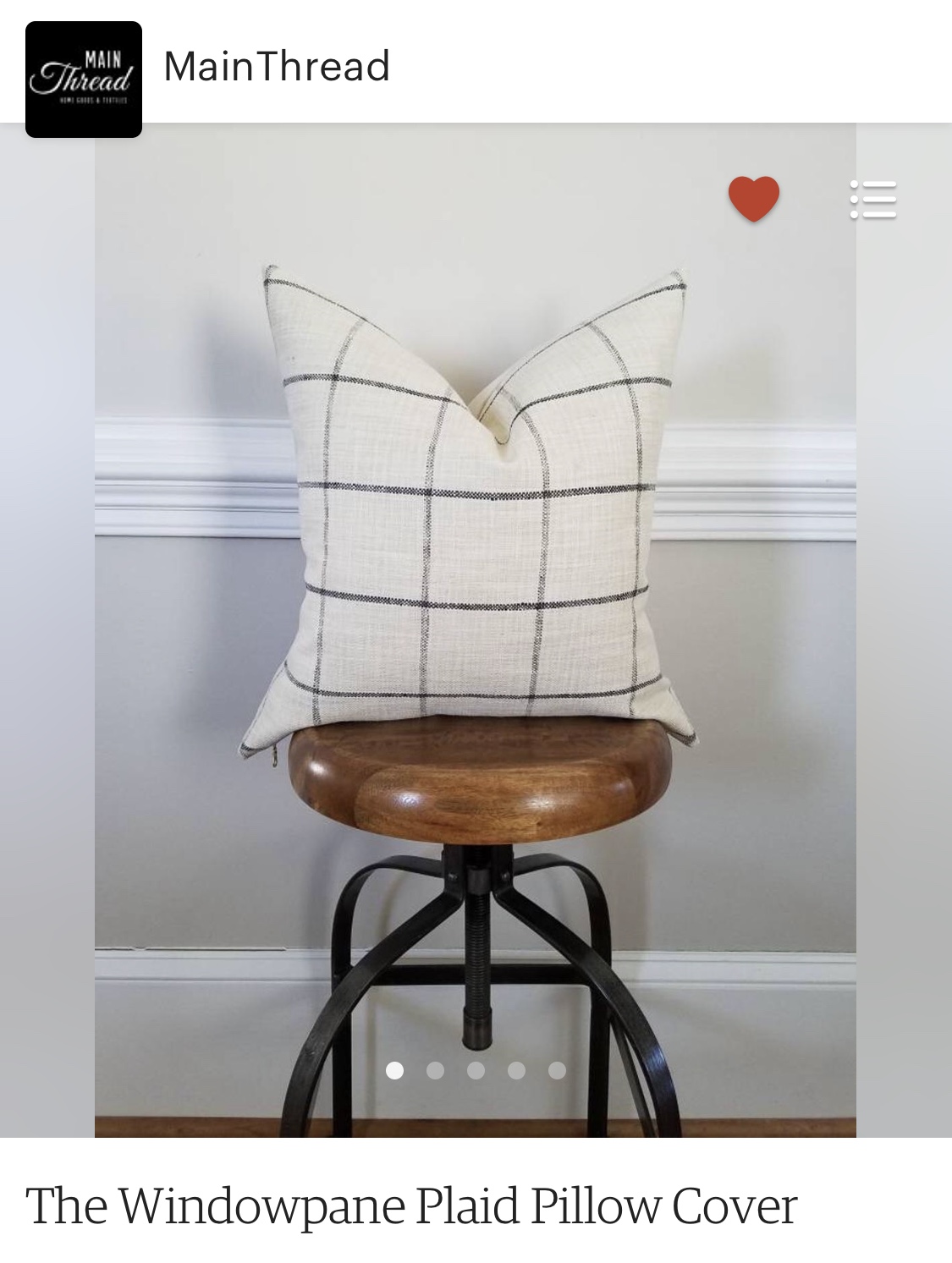
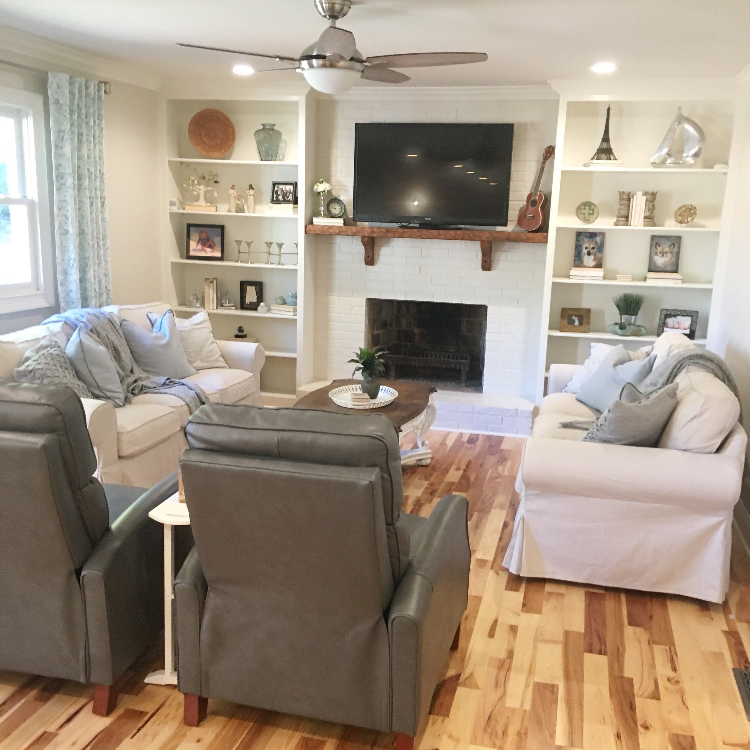
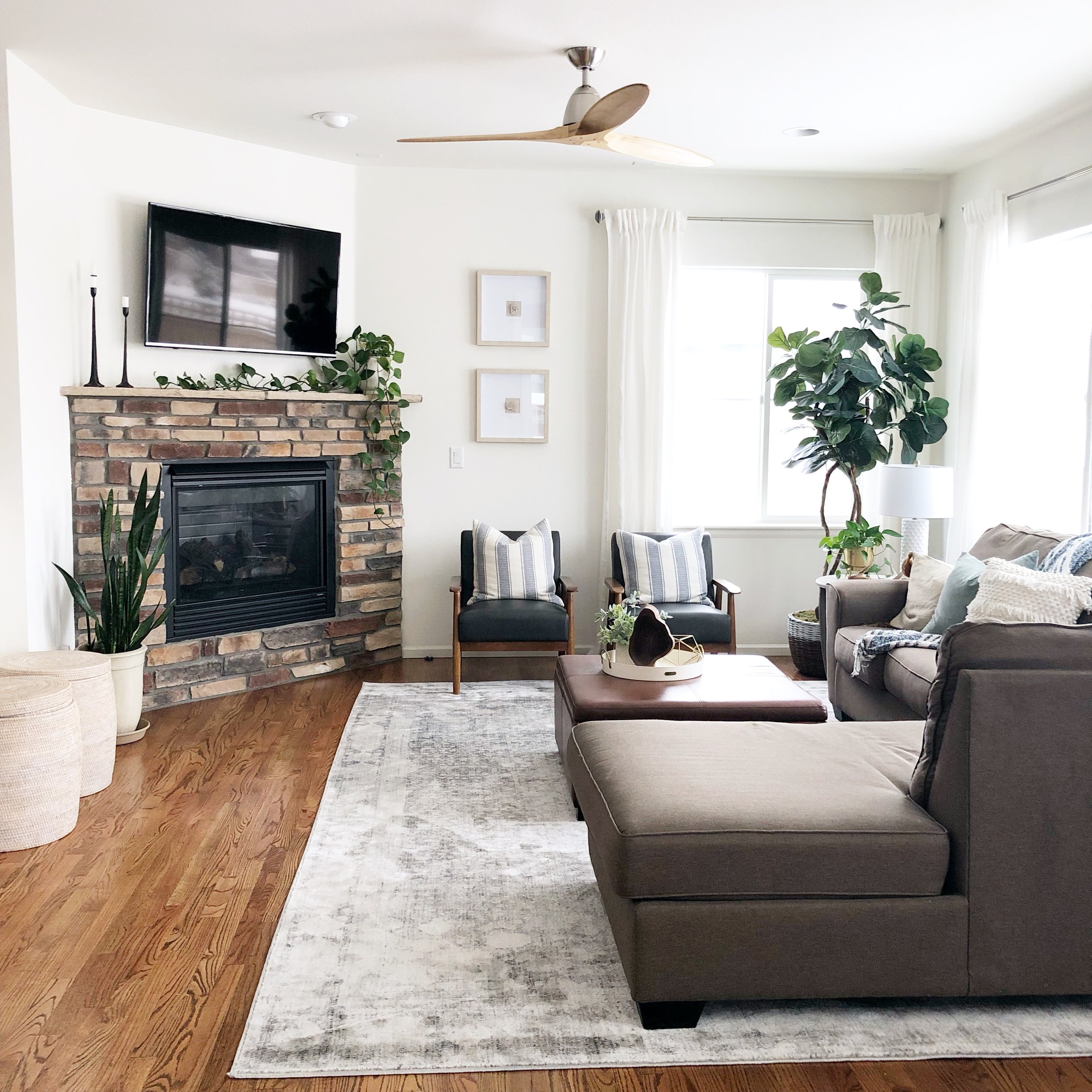
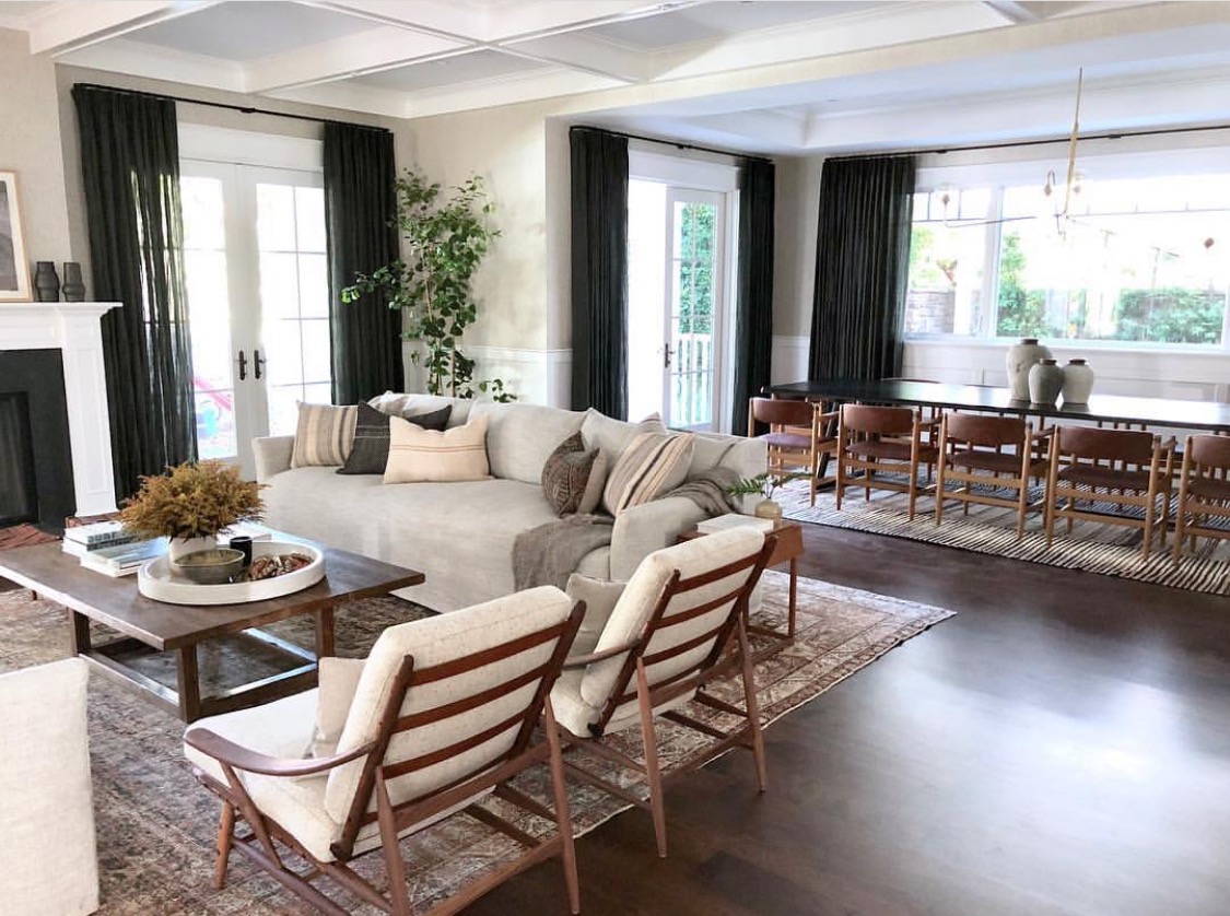
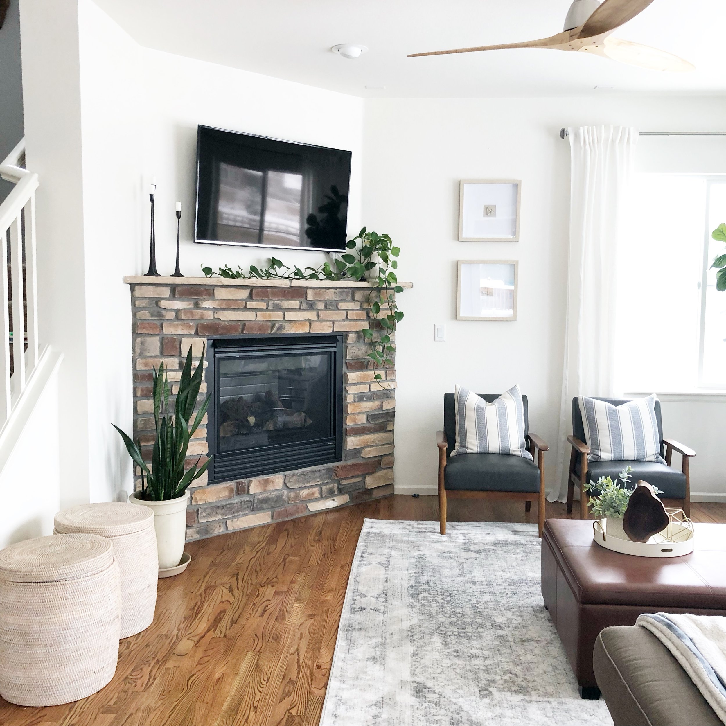
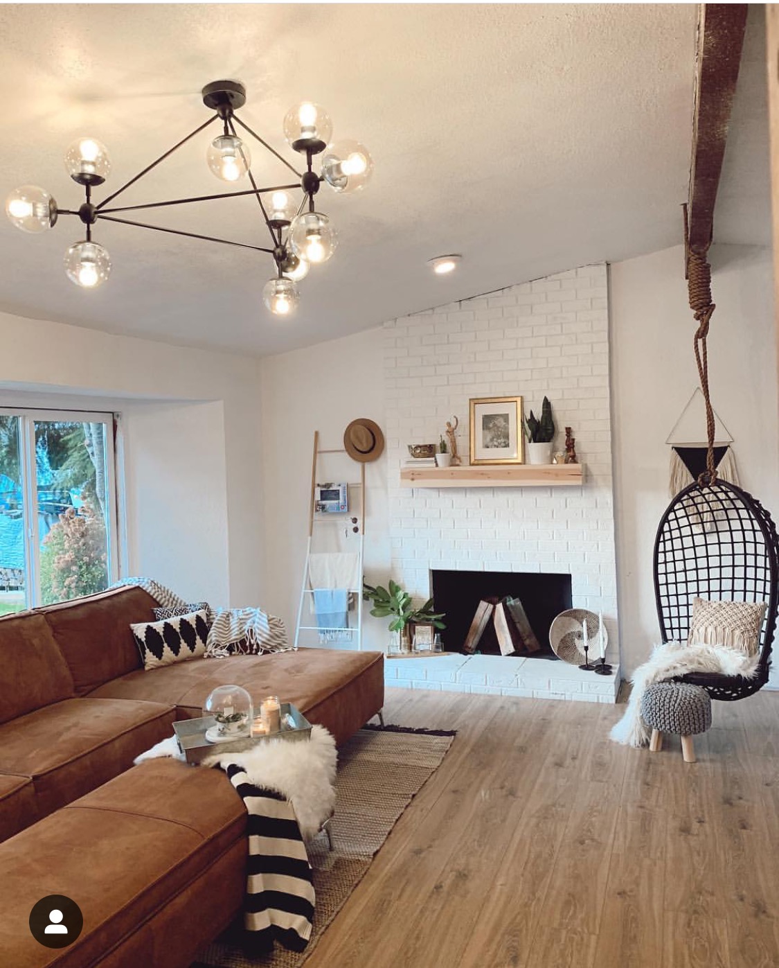
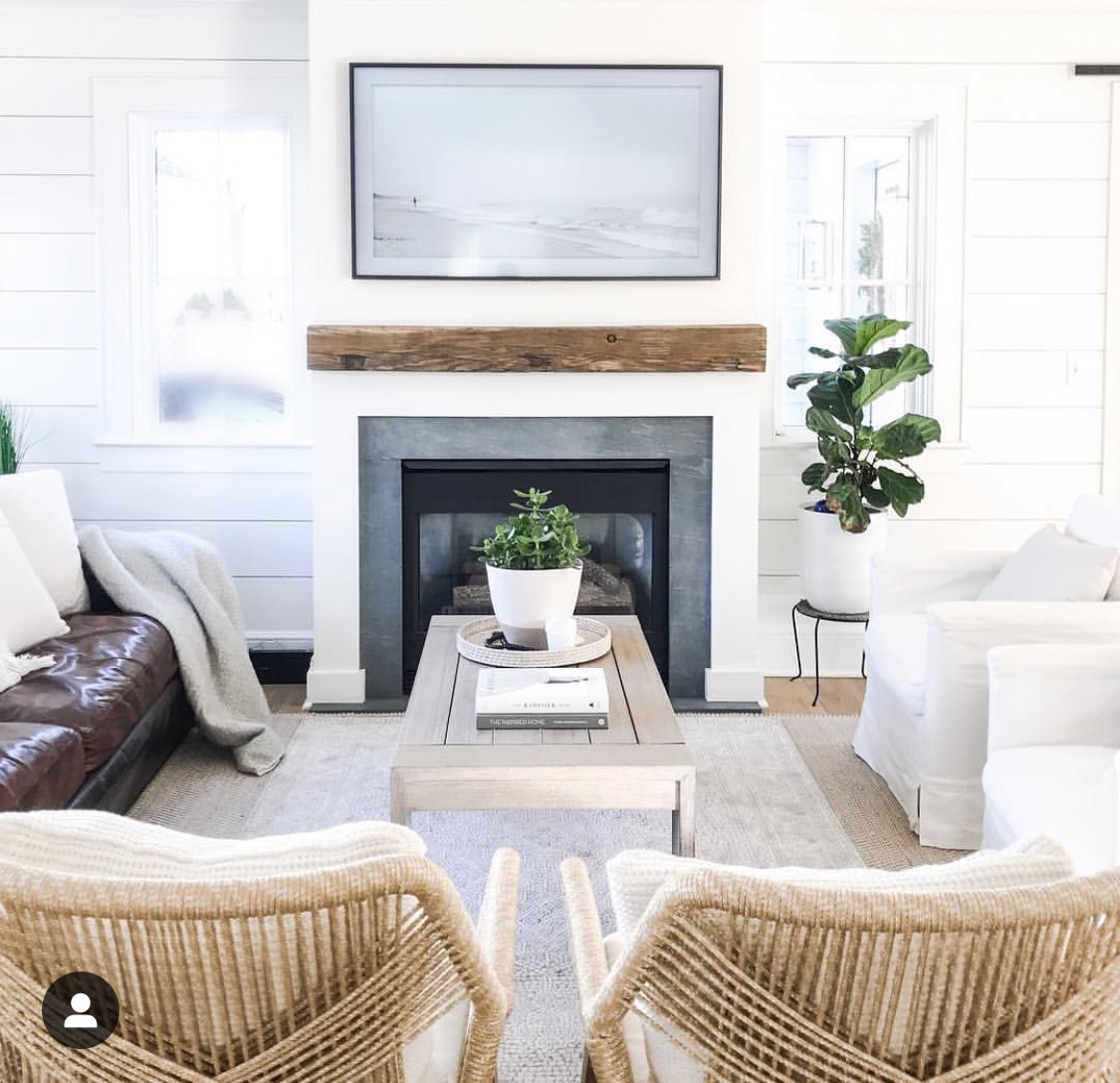
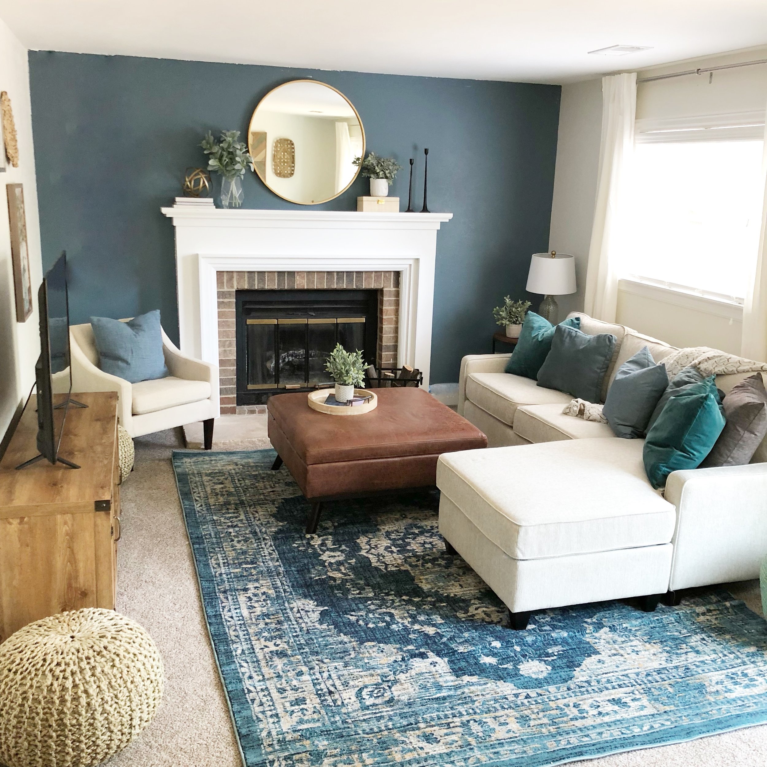
Our Living room is where we spend most of our time. We have a very open floor plan which is amazing for cooking dinner while my young children play in this comfy and functional space. I have tons of storage for toys in my faux leather ottoman and stool baskets from Wayfair. Here is a link to an amazing storage ottoman very similar to mine that I have used in several clients’ homes! With a super comfy sectional , arm chairs , and over sized rug - all from Wayfair, we have plenty of seating for guests and our family really enjoys lounging and playing in this room. My pillows from Etsy shops like Laurel and Blush, and Main Thread, create lots of texture and interest. I love our simple mantle and cozy fireplace for the snowy nights here in CO.
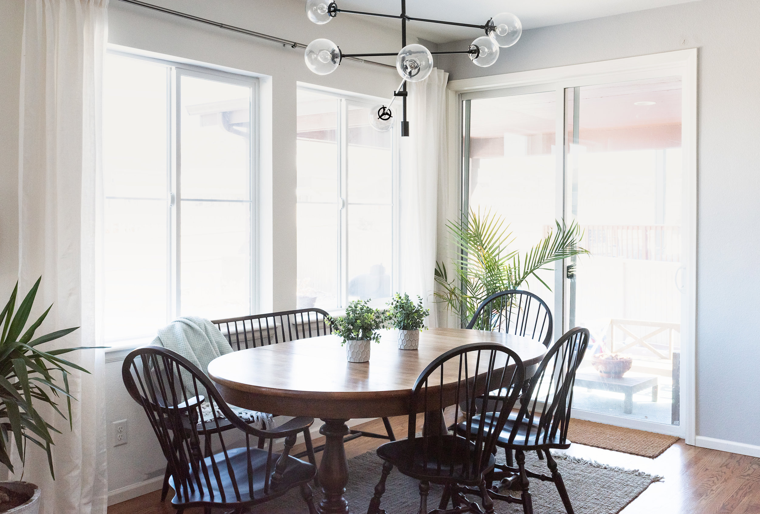
Our eat-in/dining area is our only table in the house so we make sure it has plenty of seating without taking up a lot of space. The best way to do this is with a bench. I’m very appreciative that my husband’s parents gave us this antique table, chairs, and bench that my husband actually grew up eating on as well! With my modern chandelier hanging above, and jute rug below this space is both functional and cozy for every dinner we sit down together to eat.
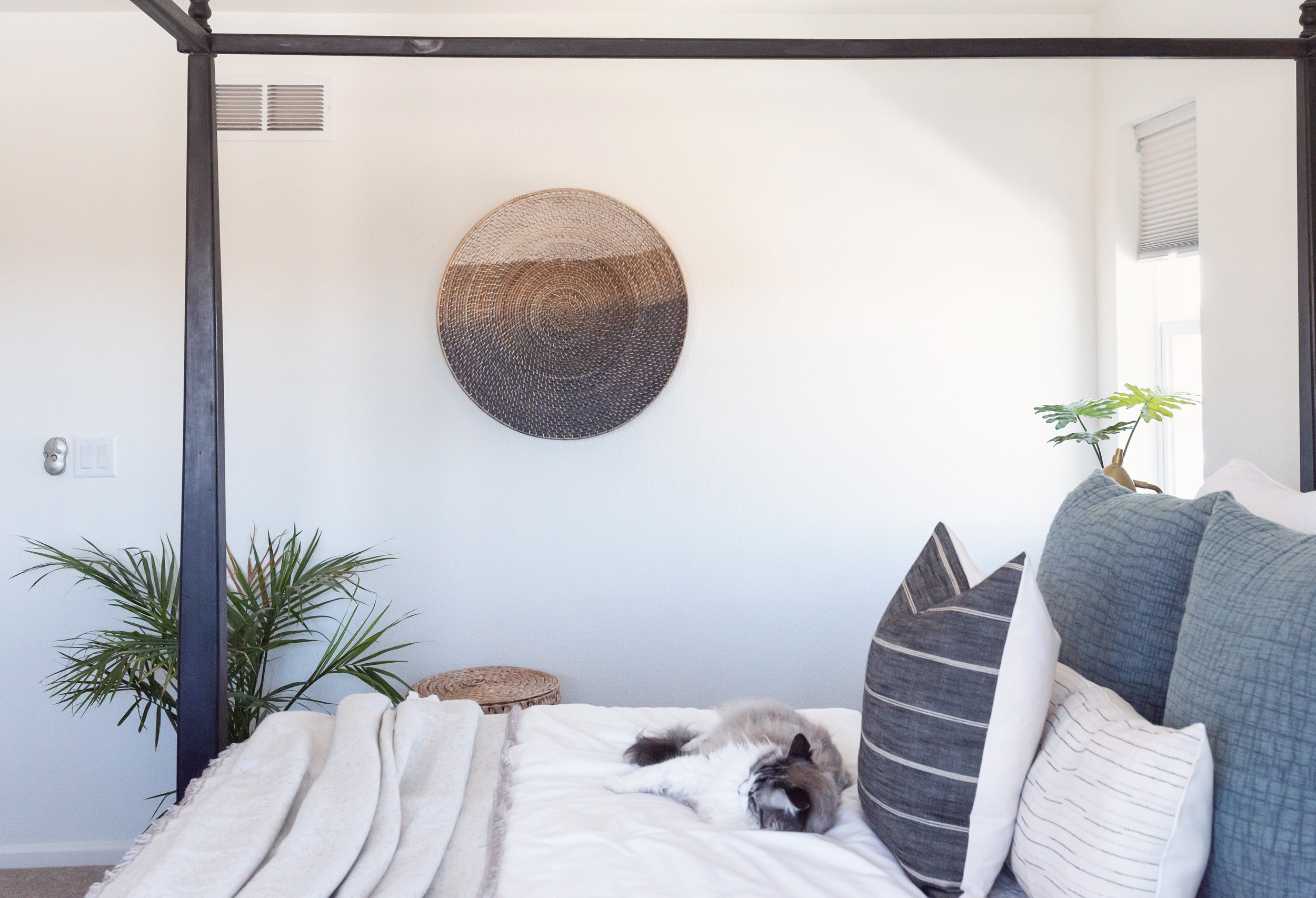
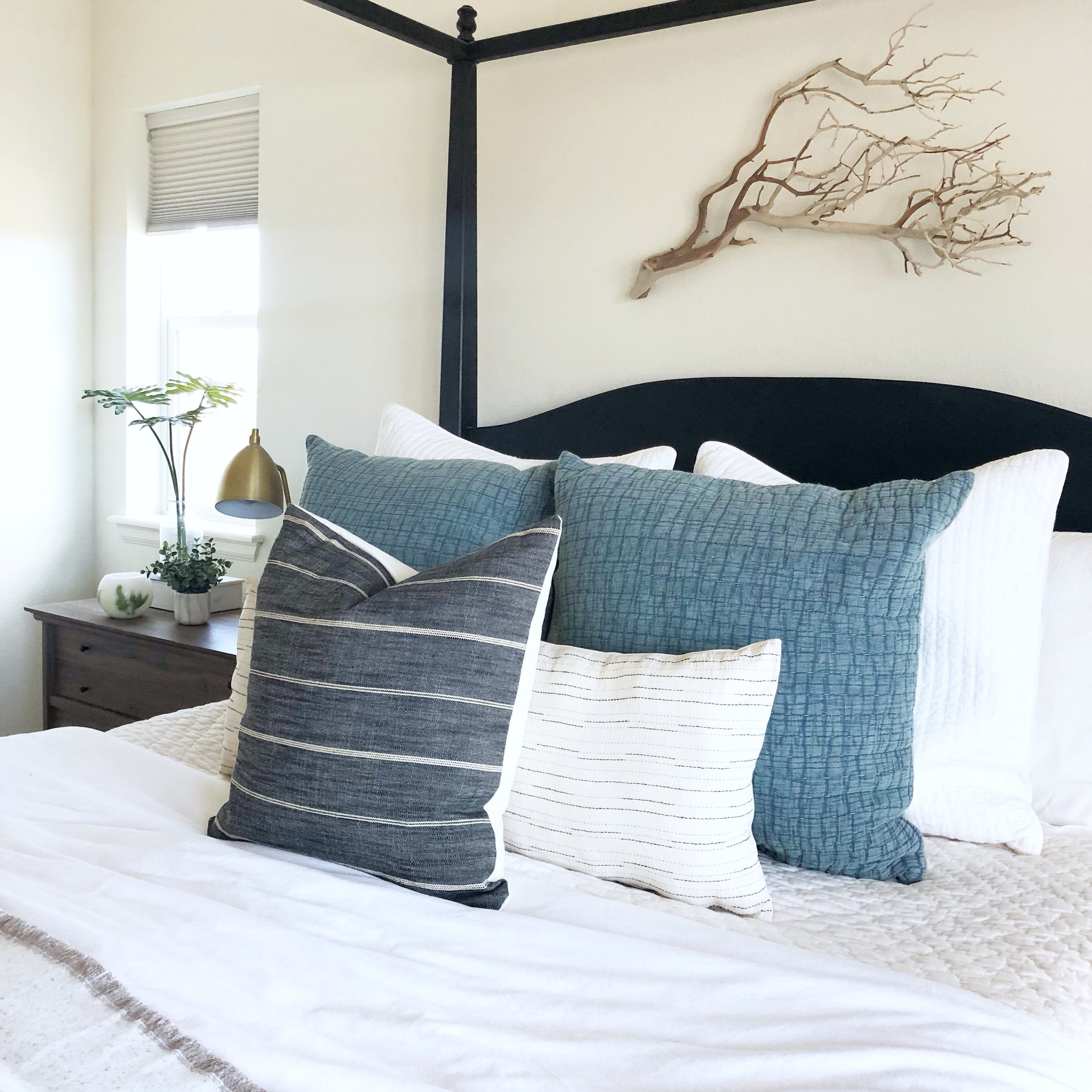
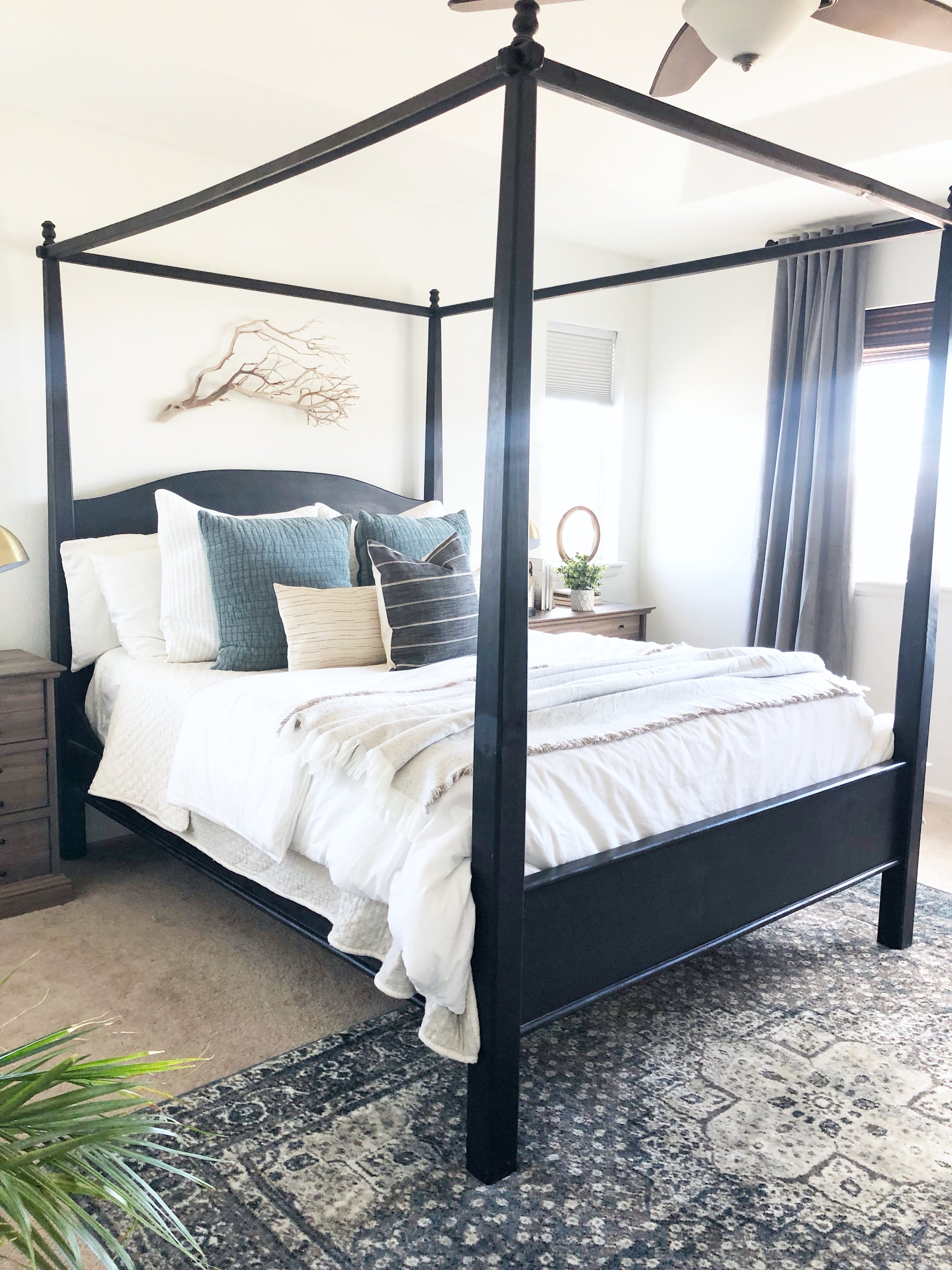
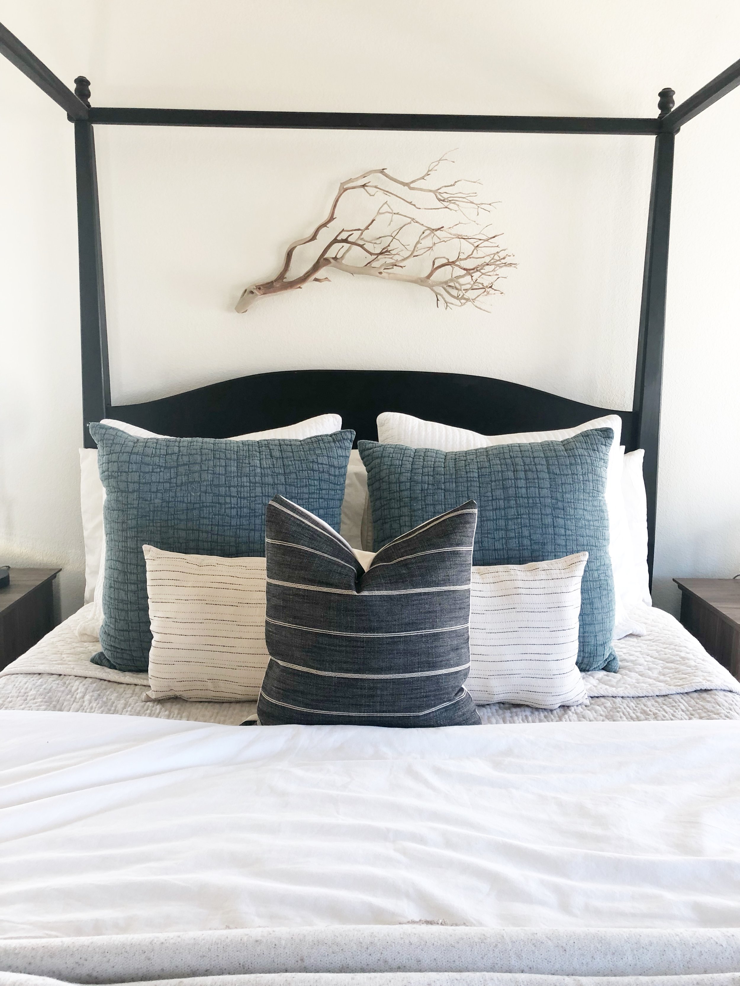
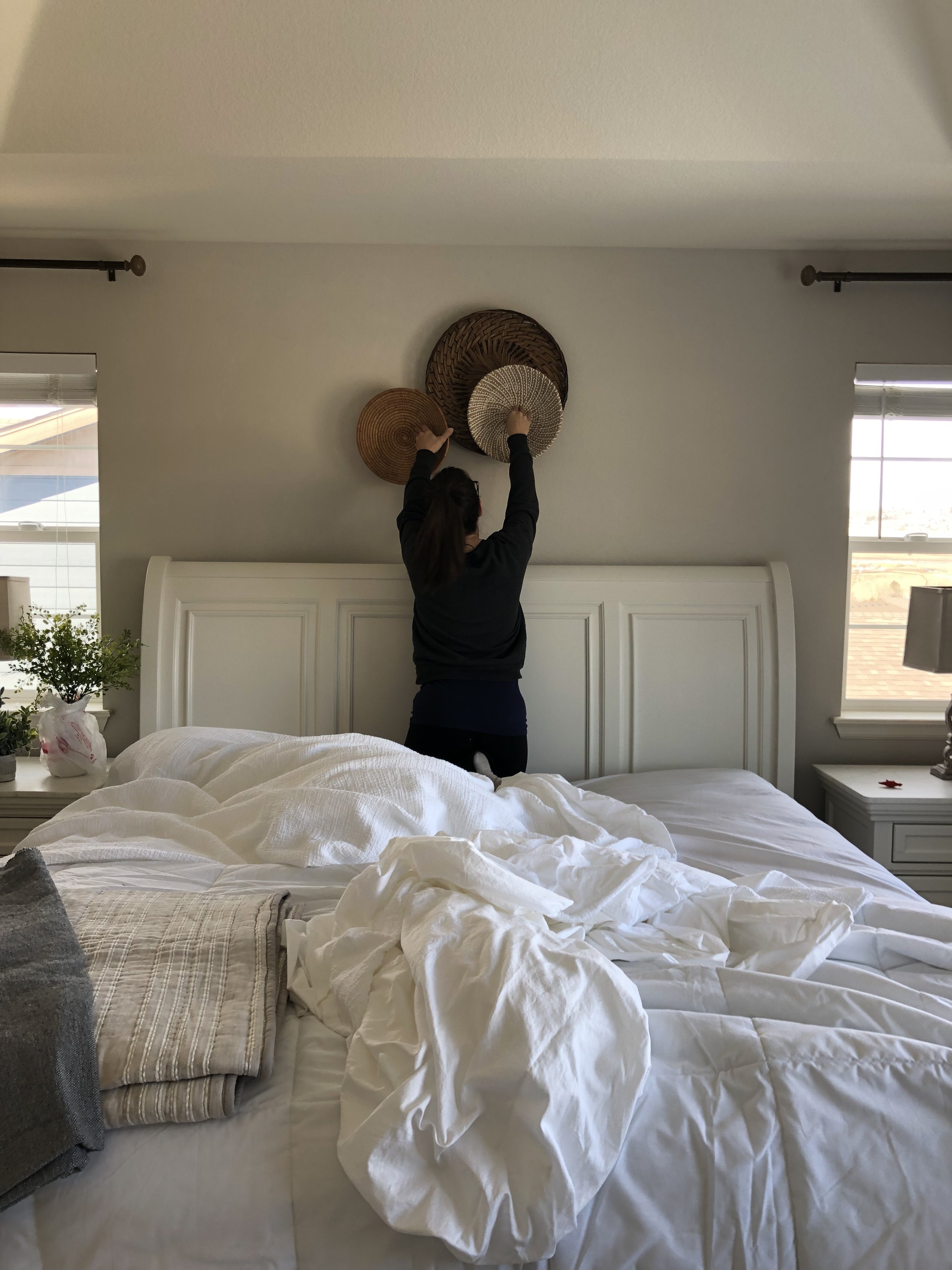
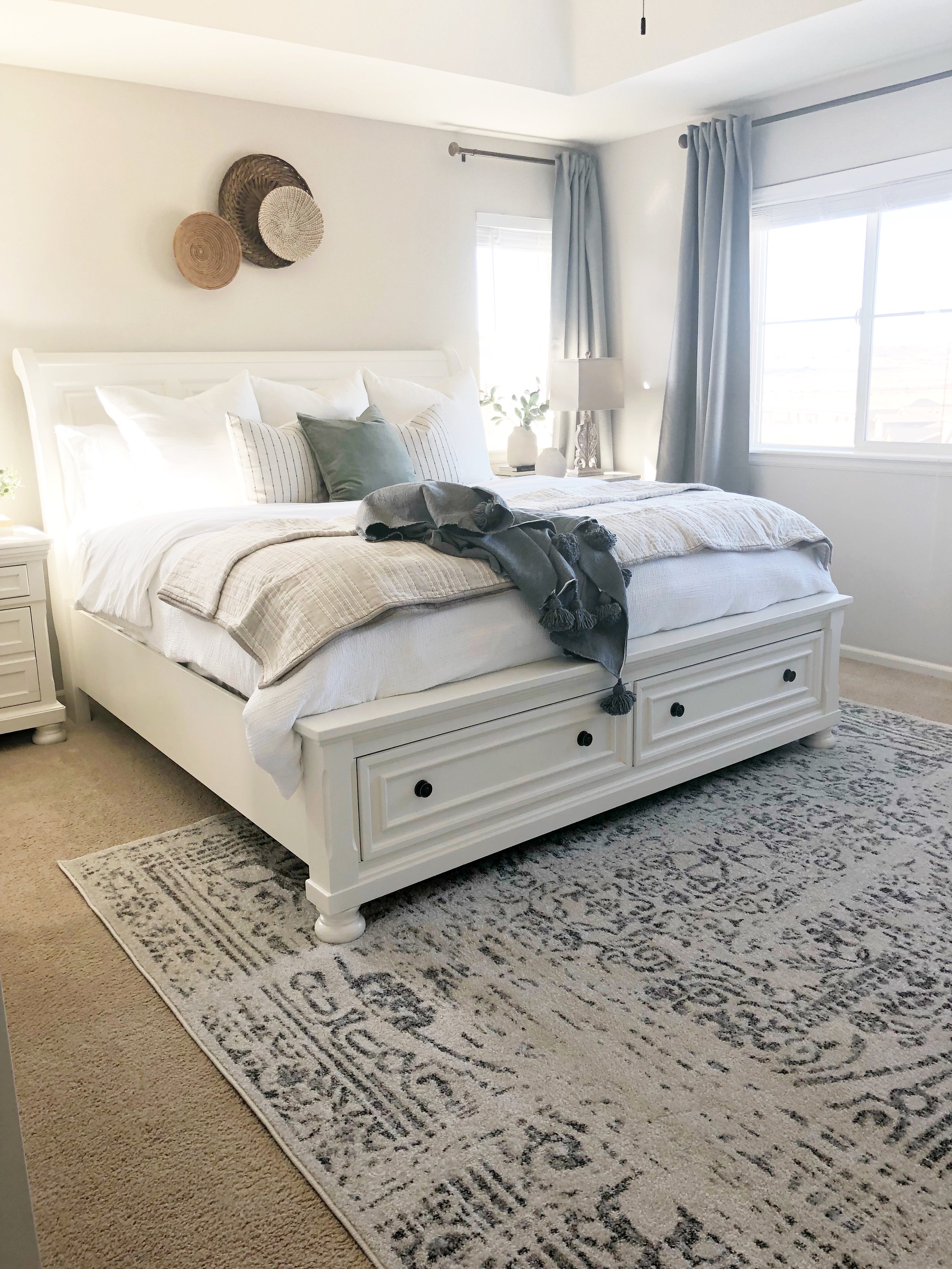
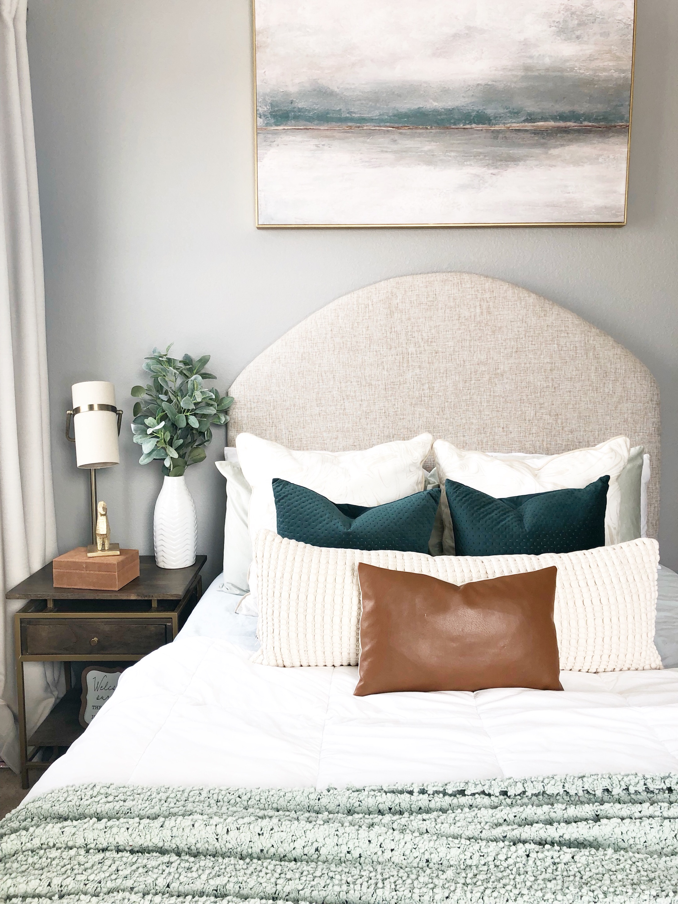
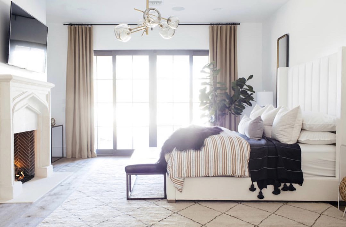
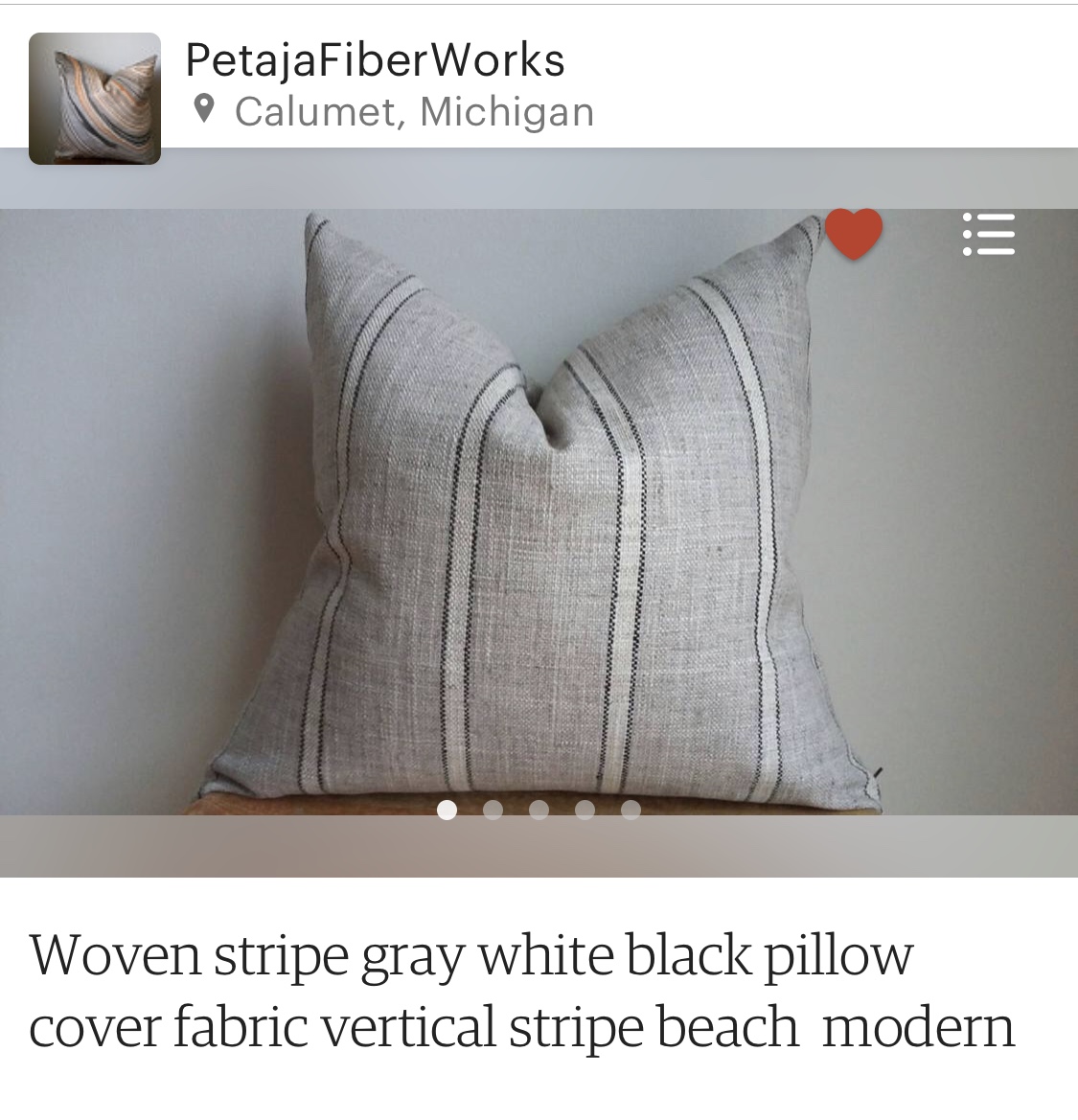
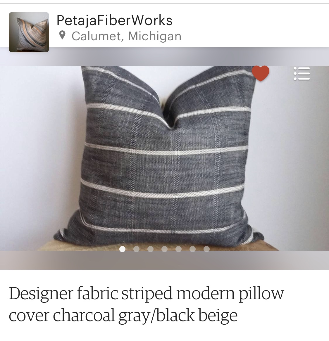
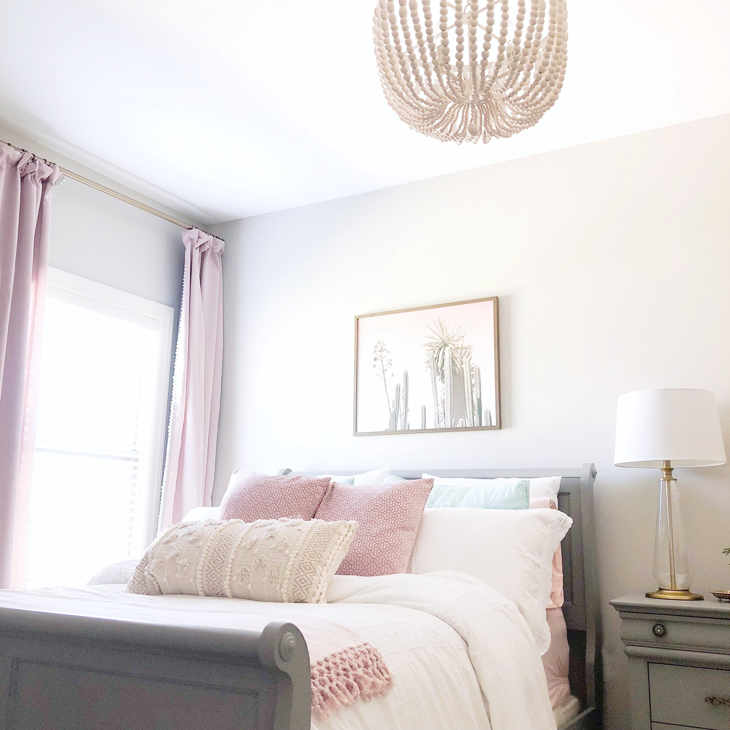
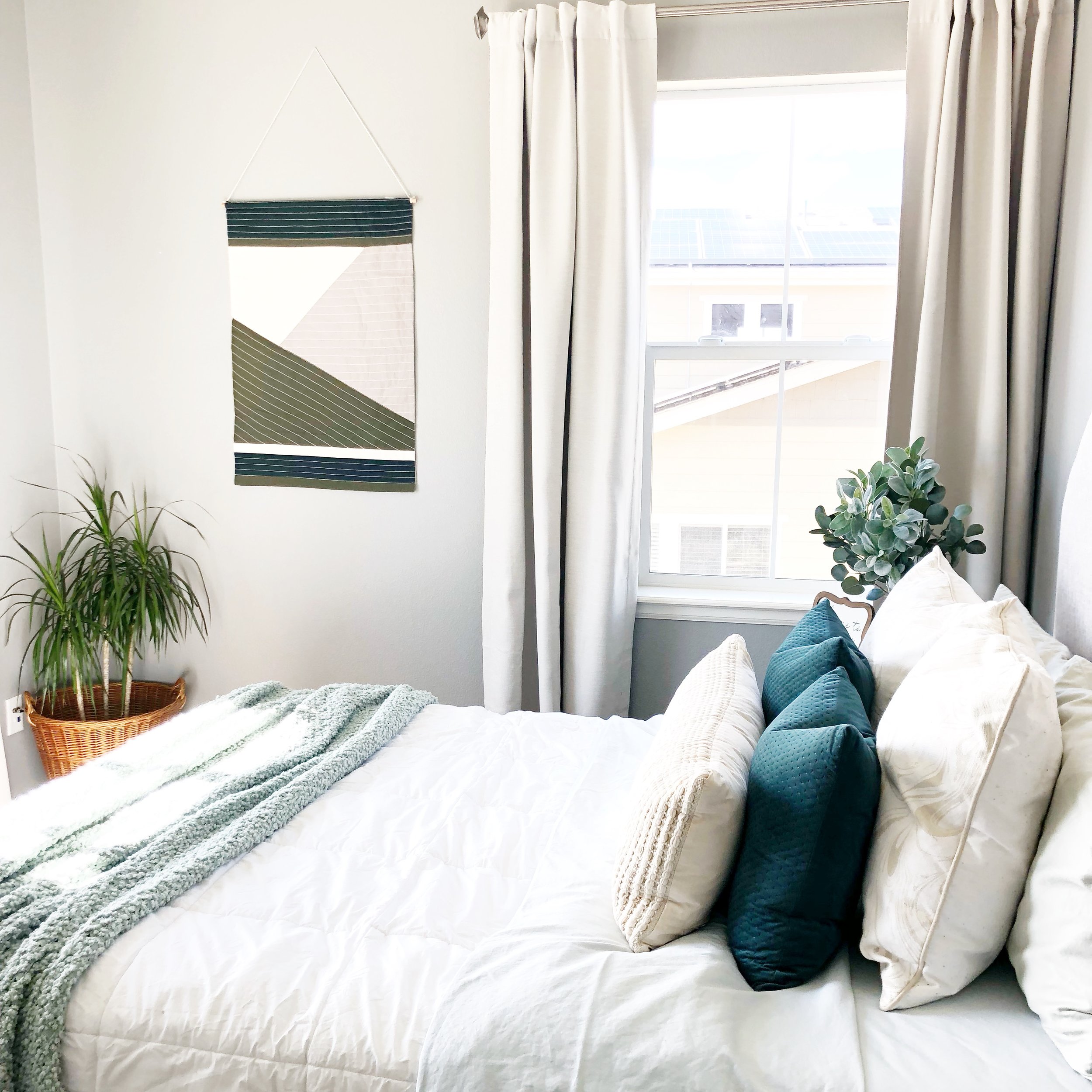
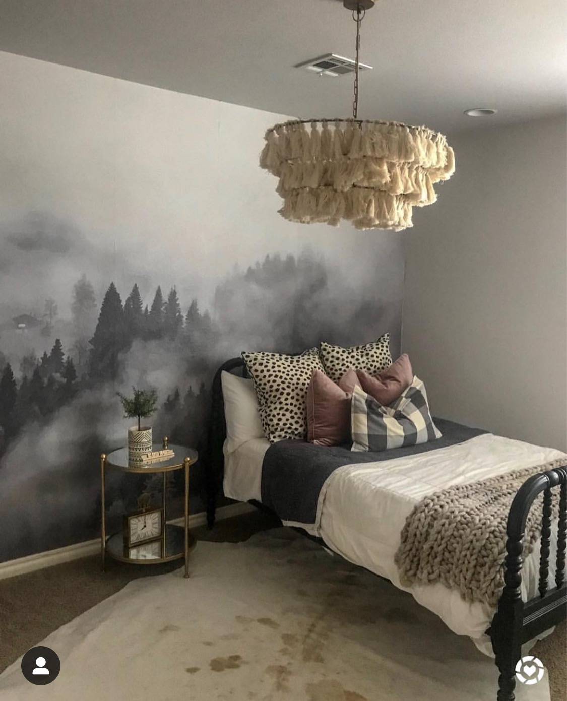
My favorite spring update so far has been my master bedroom. This has always been a very fresh, tropical looking space but I wanted to add some dimension and warmth with updated bedding and art. I found this amazing branch at Homegoods that I felt was the perfect art piece for over my bed. I love how interesting and different it is. I added new throw pillows from PetajaFiberWorks and Main Thread Etsy shops to add warmth to the stark white bedding I already had. I also added a cream textured quilt and new fringed throw blanket, both from Target. This allows us more options fort the changing temperatures at night here as spring approaches.
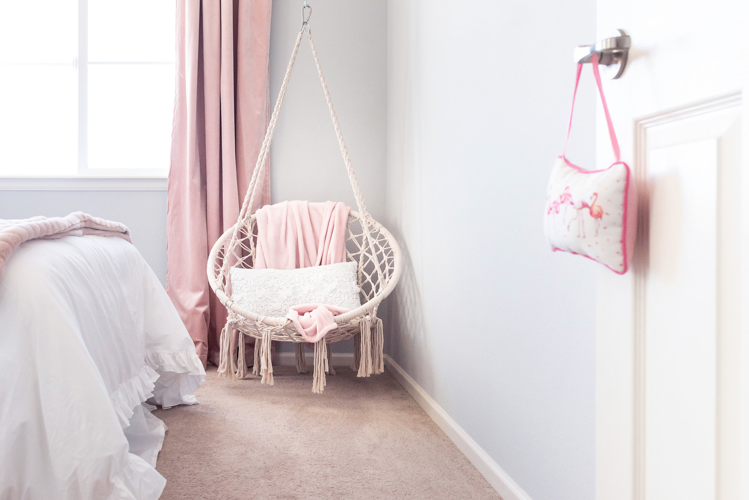
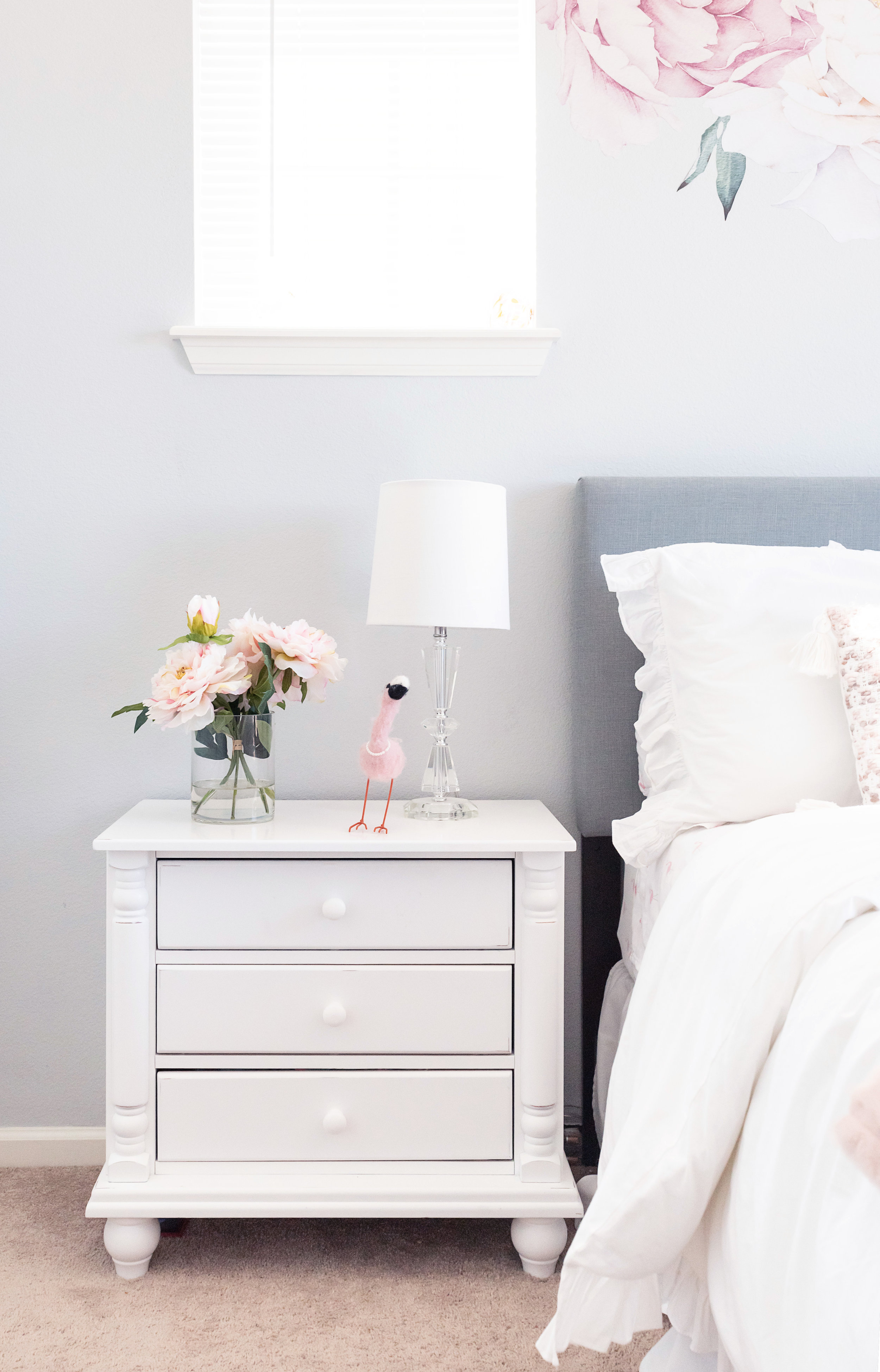
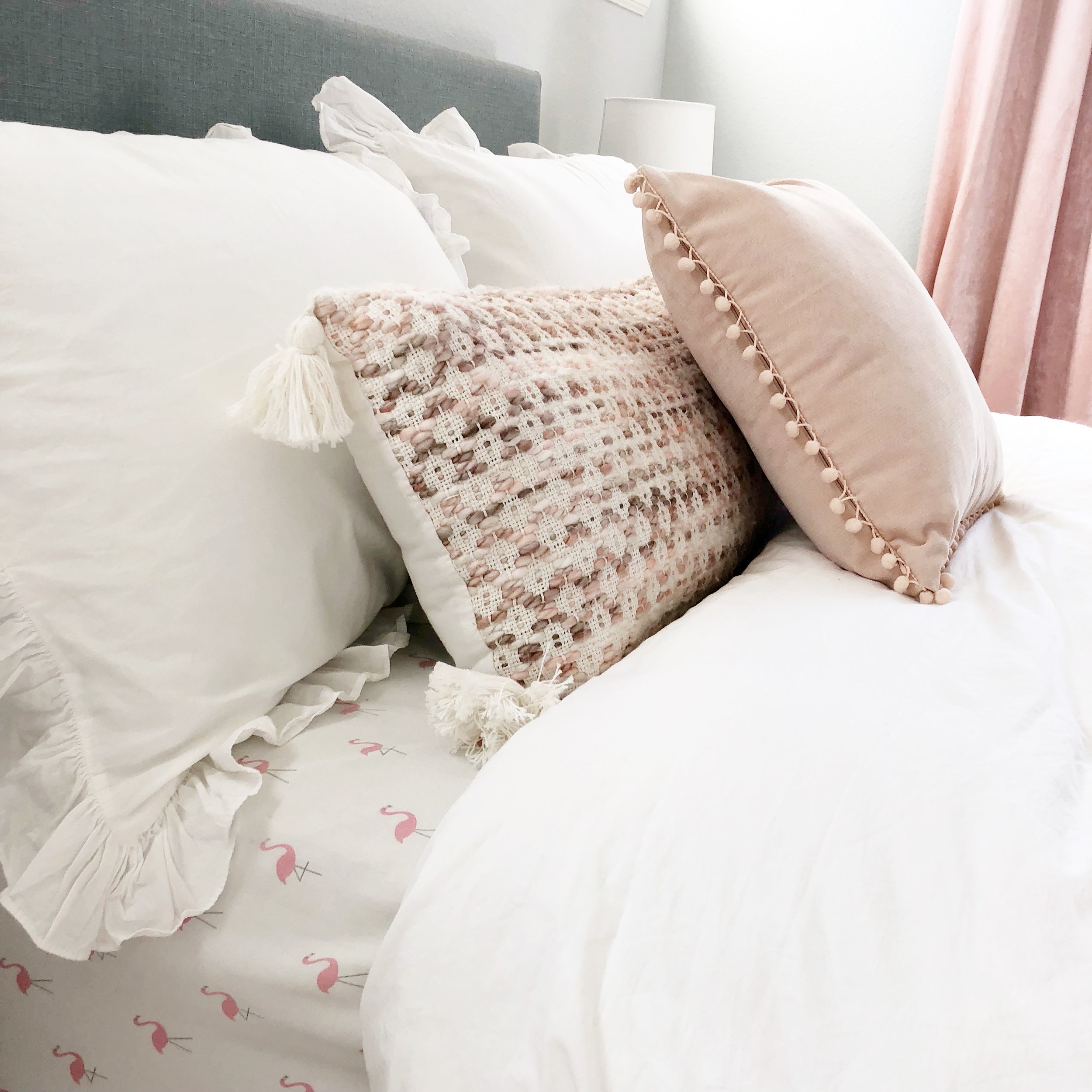
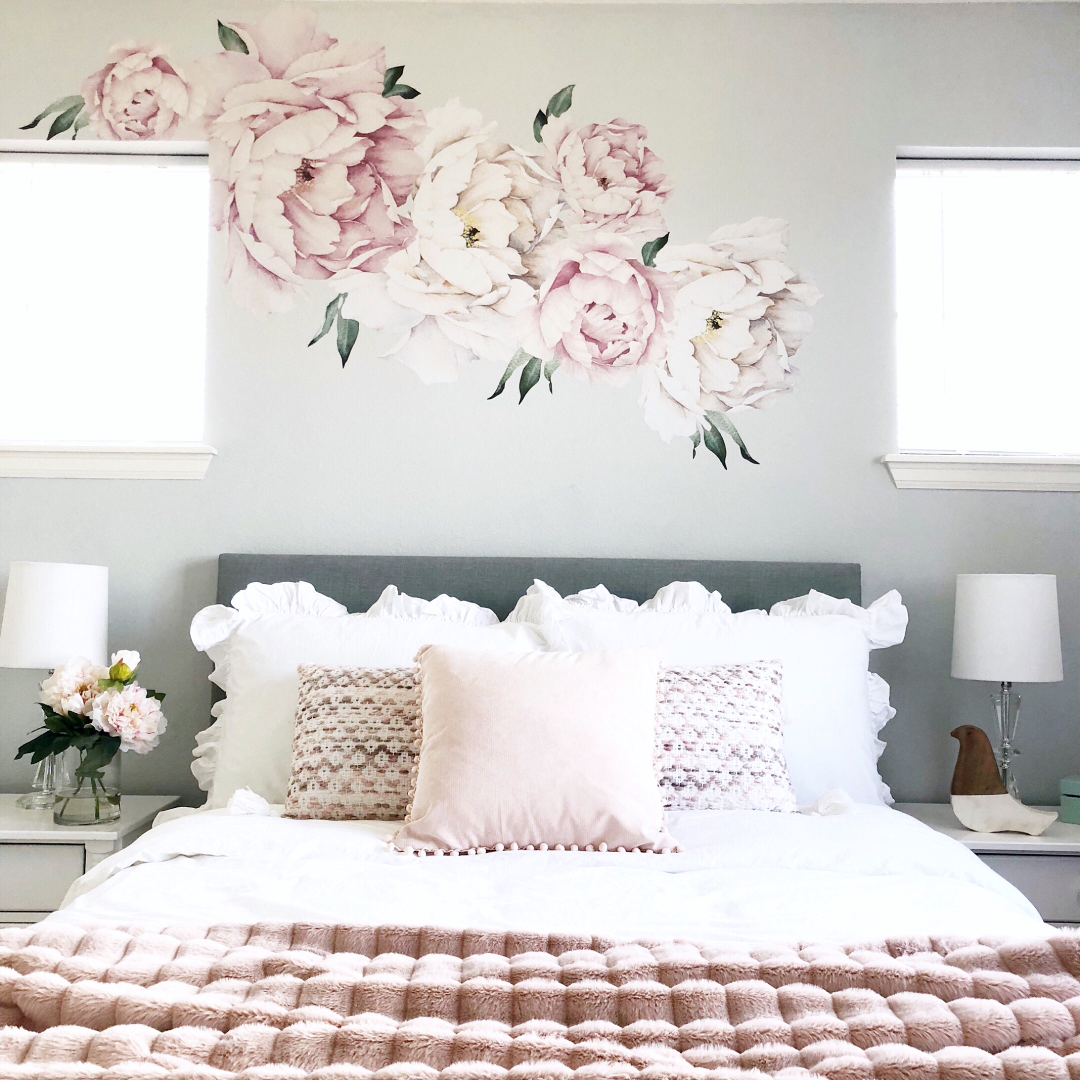
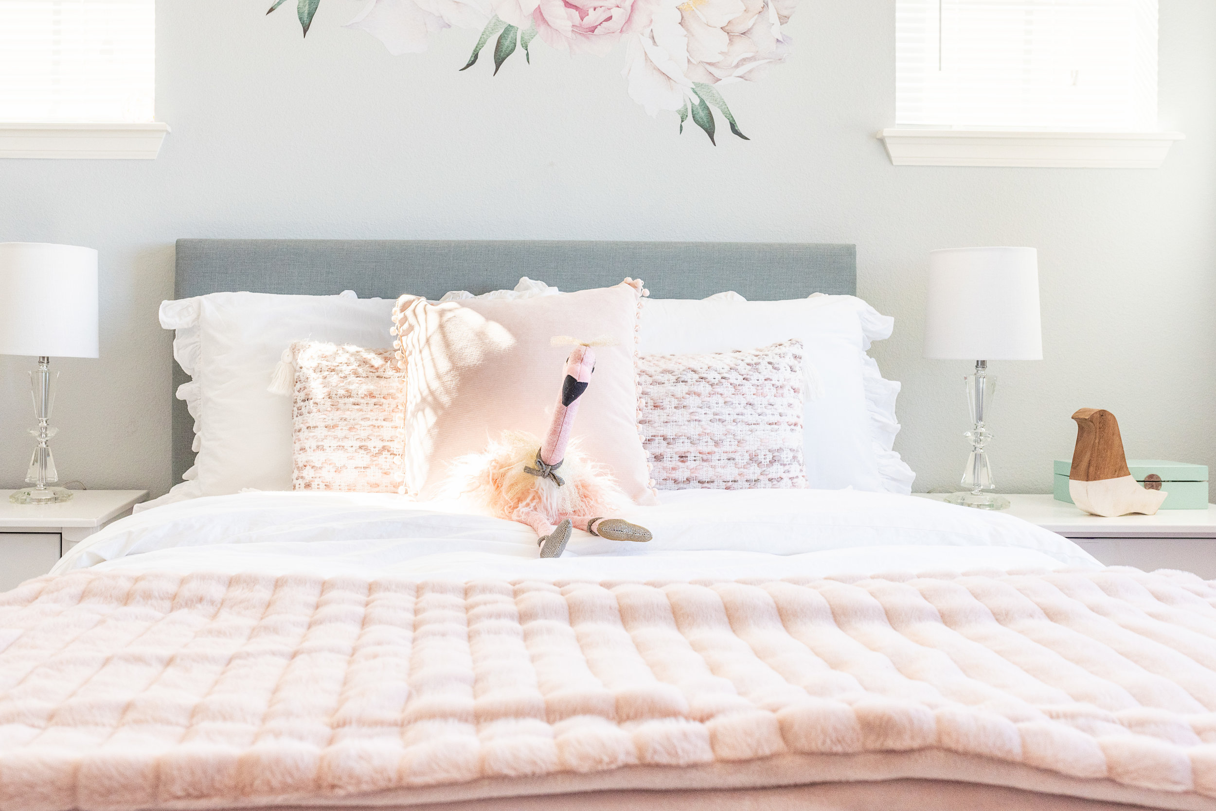
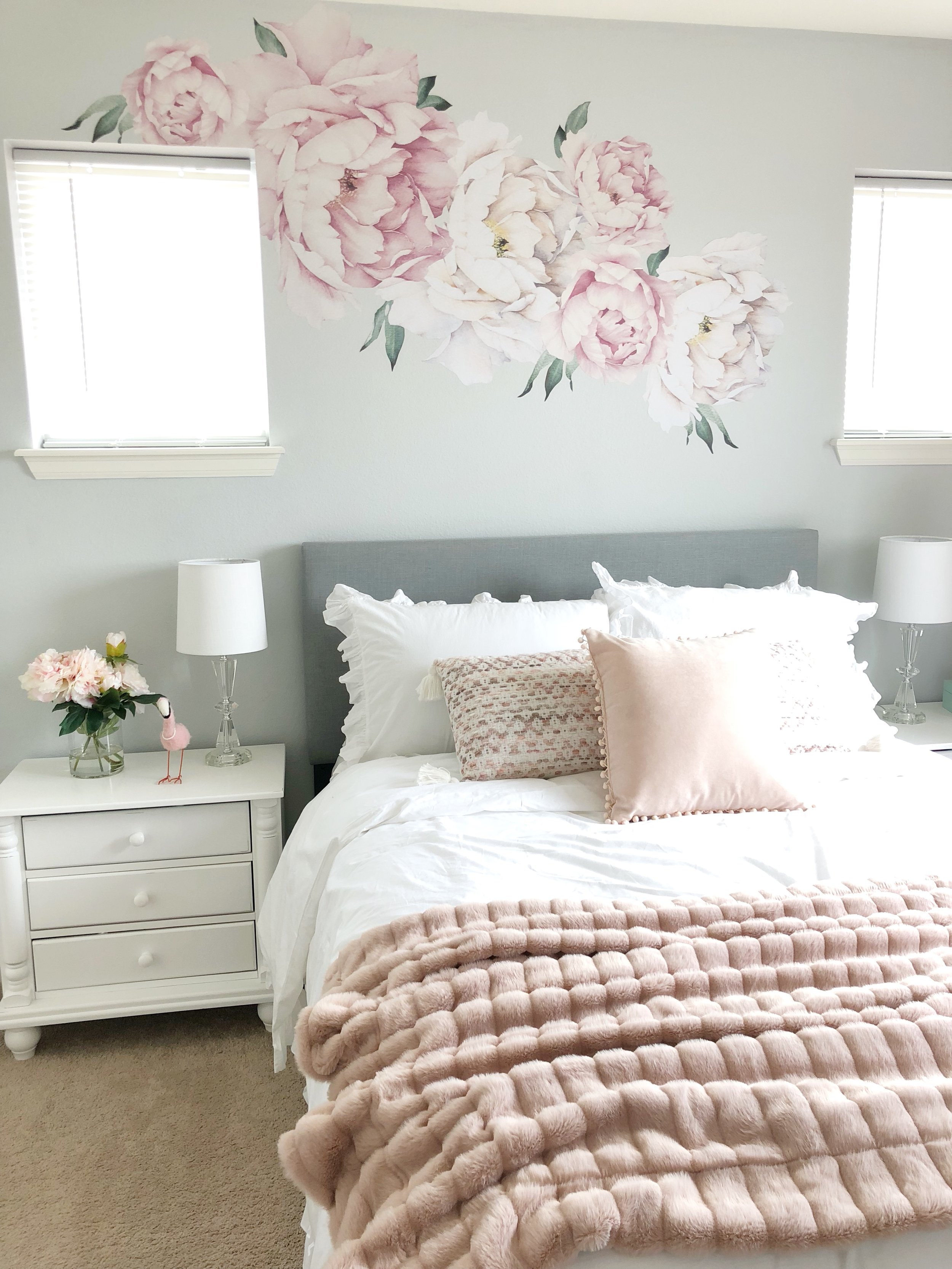
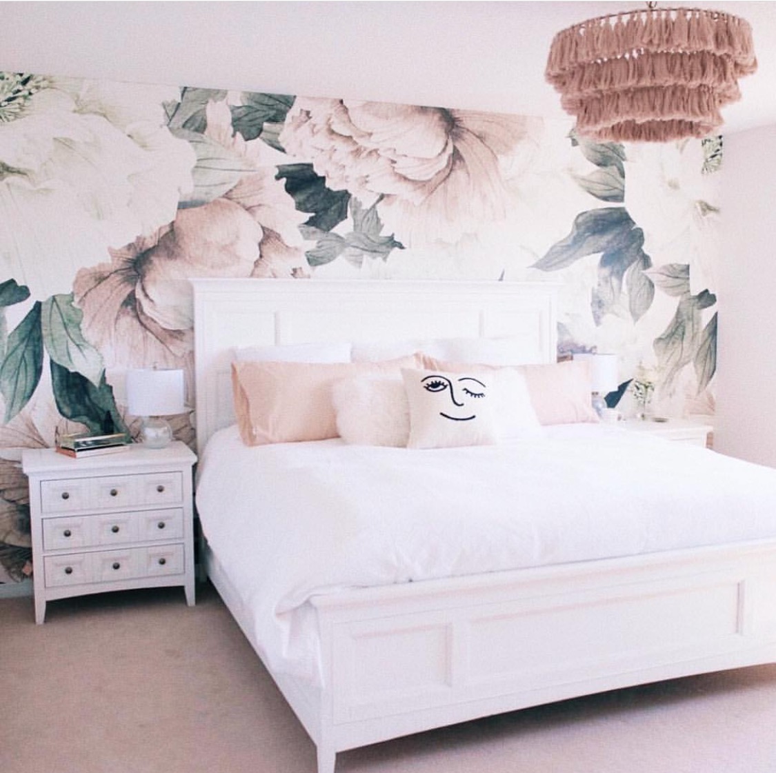
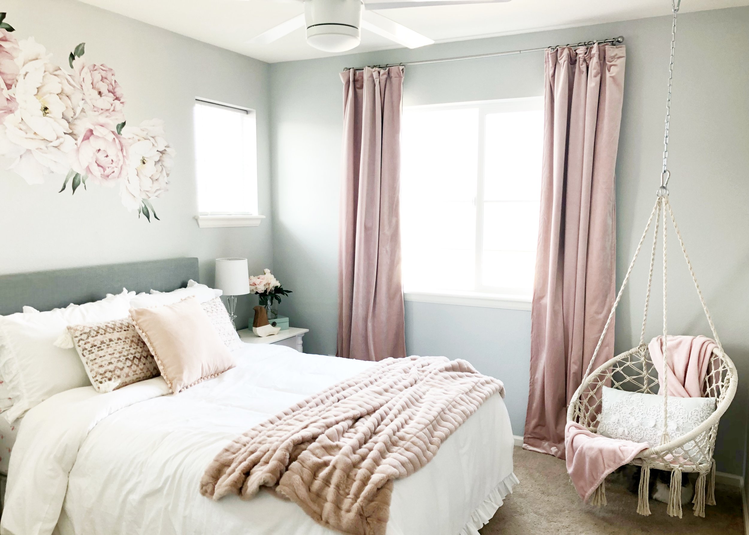
My daughter’s room always feels like spring! With a peony wall decals, blush bedding from Homegoods, and a woven swing chair from Target, this flamingo loving girl loves her pink room.
We still have a couple other spring projects in the works like completely repainting the exterior of our house and finishing up the downstairs bath. Check back to my IG feed soon to see those finished projects @kindandabell !
I hope you have enjoyed seeing the new spring changes to my home! Now head over to Enchanted Hill Life to check out Carla’s beautiful tour, and don’t forget to check out all the lovely ladies and their spring homes with the full tour list below:

Photgraphy by Kristin Camfferman
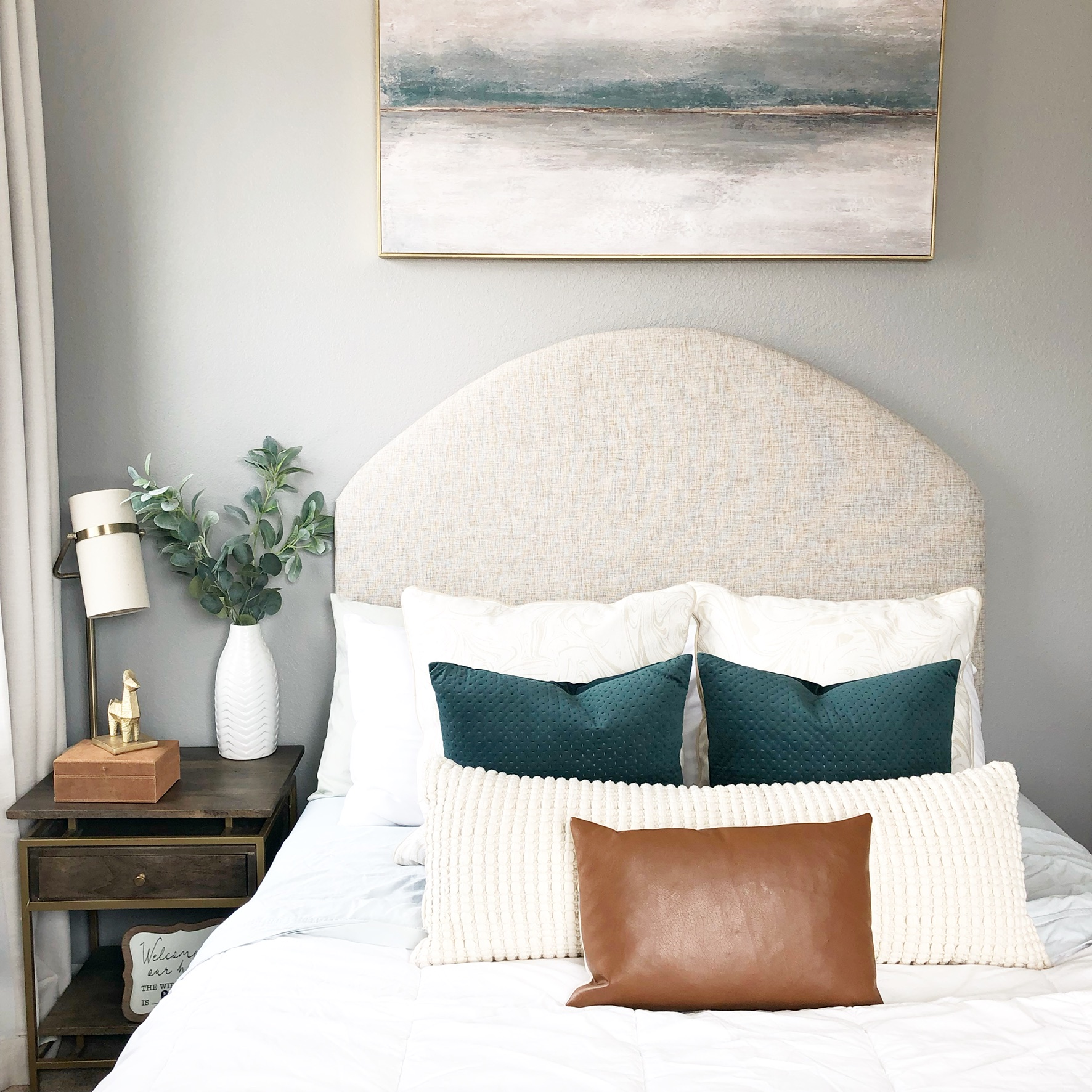
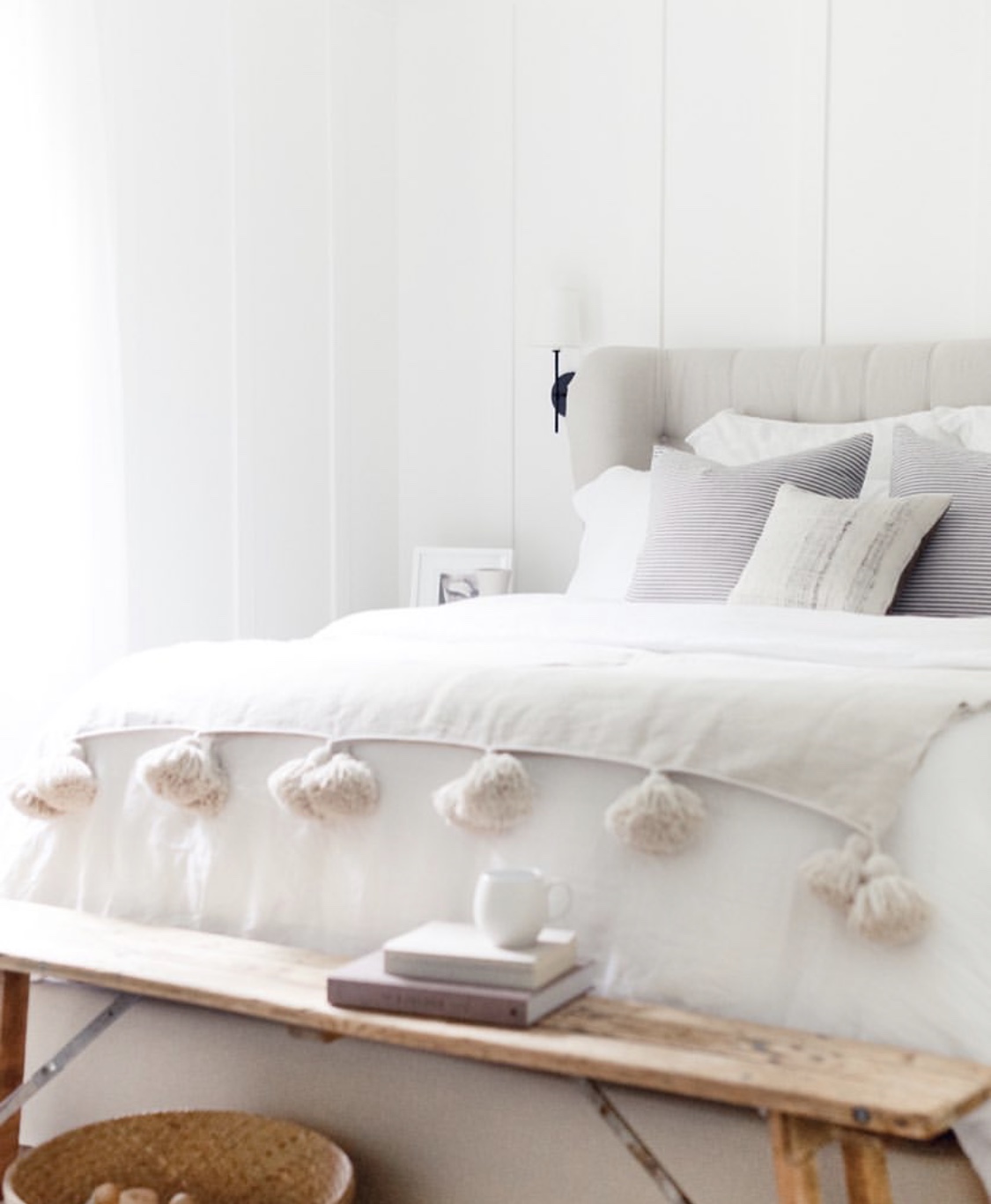
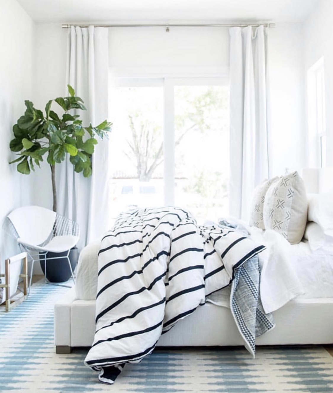
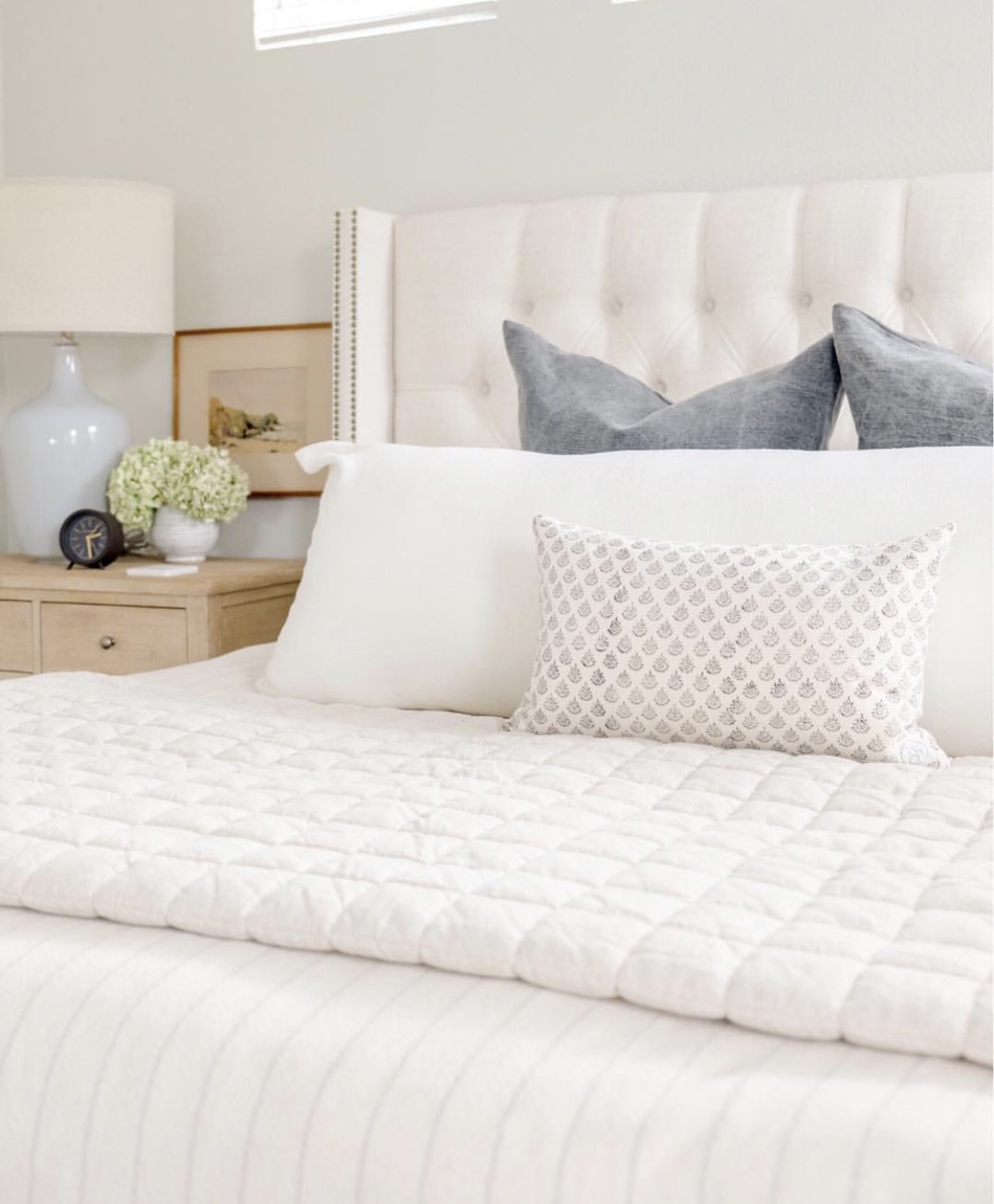
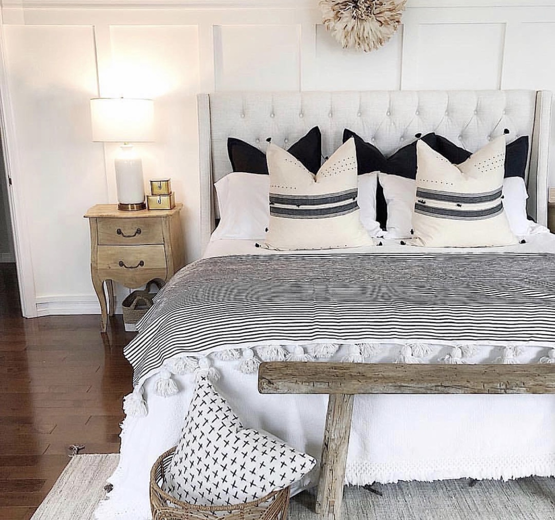
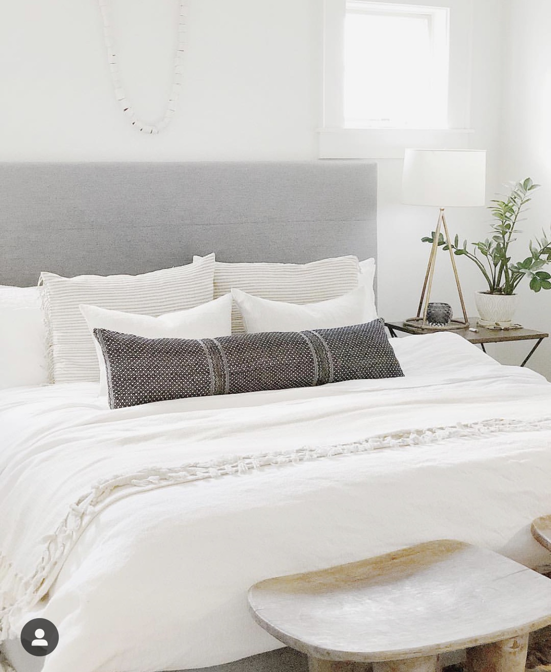
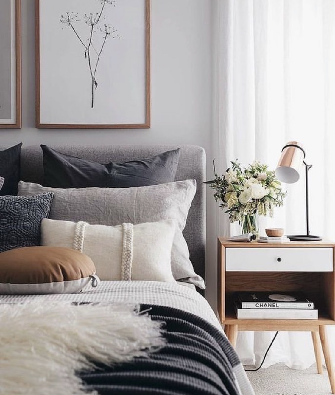
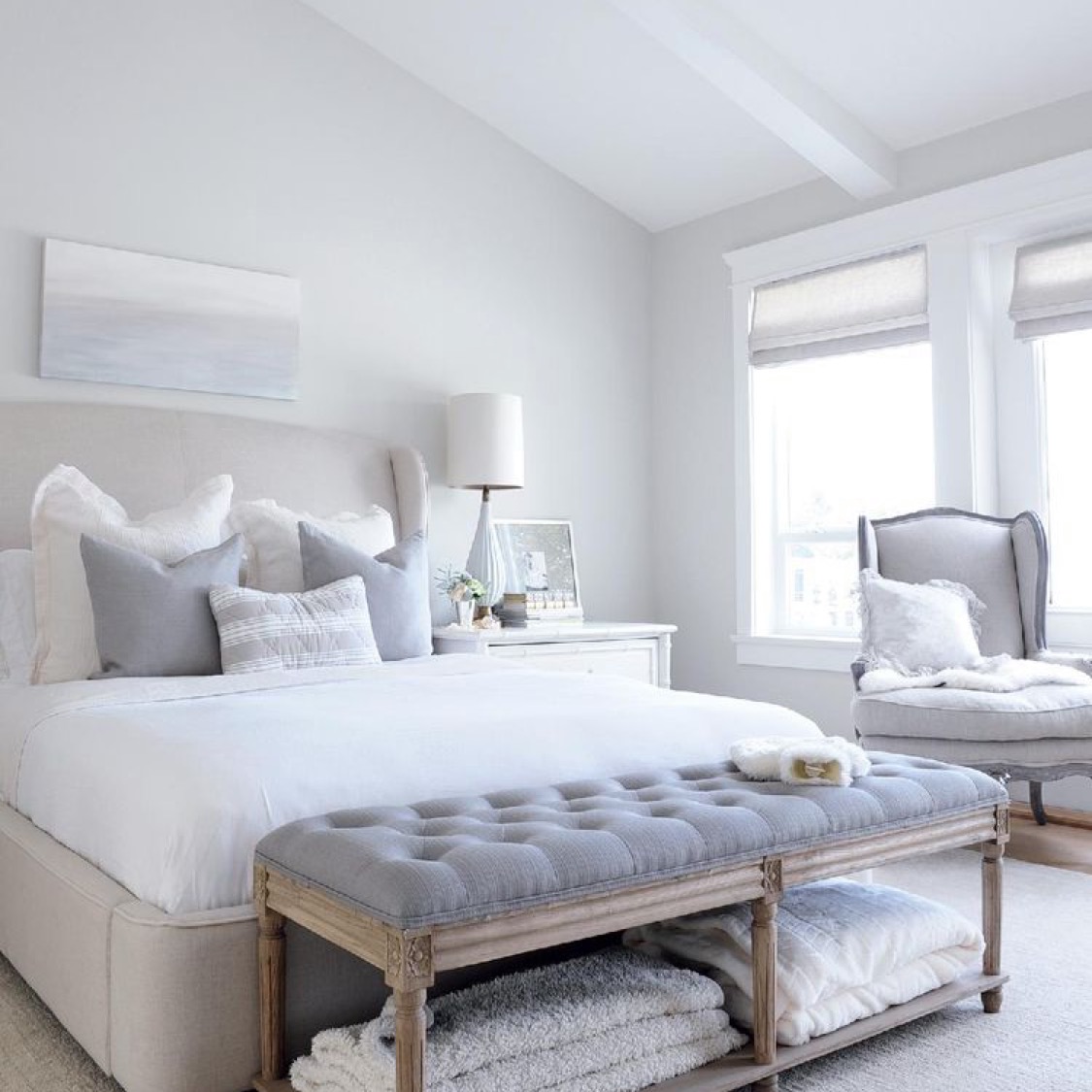
March 4, 2019: How to create a beautifully made bed
Happy Monday Friends! I have been struggling to write a blog every week these days, but its because I’ve been so busy and that’s a good thing, but I’m going to try to do better!You guys know how I feel about master bedrooms: they are the most important space to your mental health in your house. You need a master that creates a “get away” space and the heart of that space is of course your bed. Today I want to break down how to create a magazine-worthy bed. I’ll go over what makes a bed look so cozy and exactly where you can get the items you need to make that happen without spending a ton.


First and fourth pictures are mine, others from Instagram
The Equation: from back to front
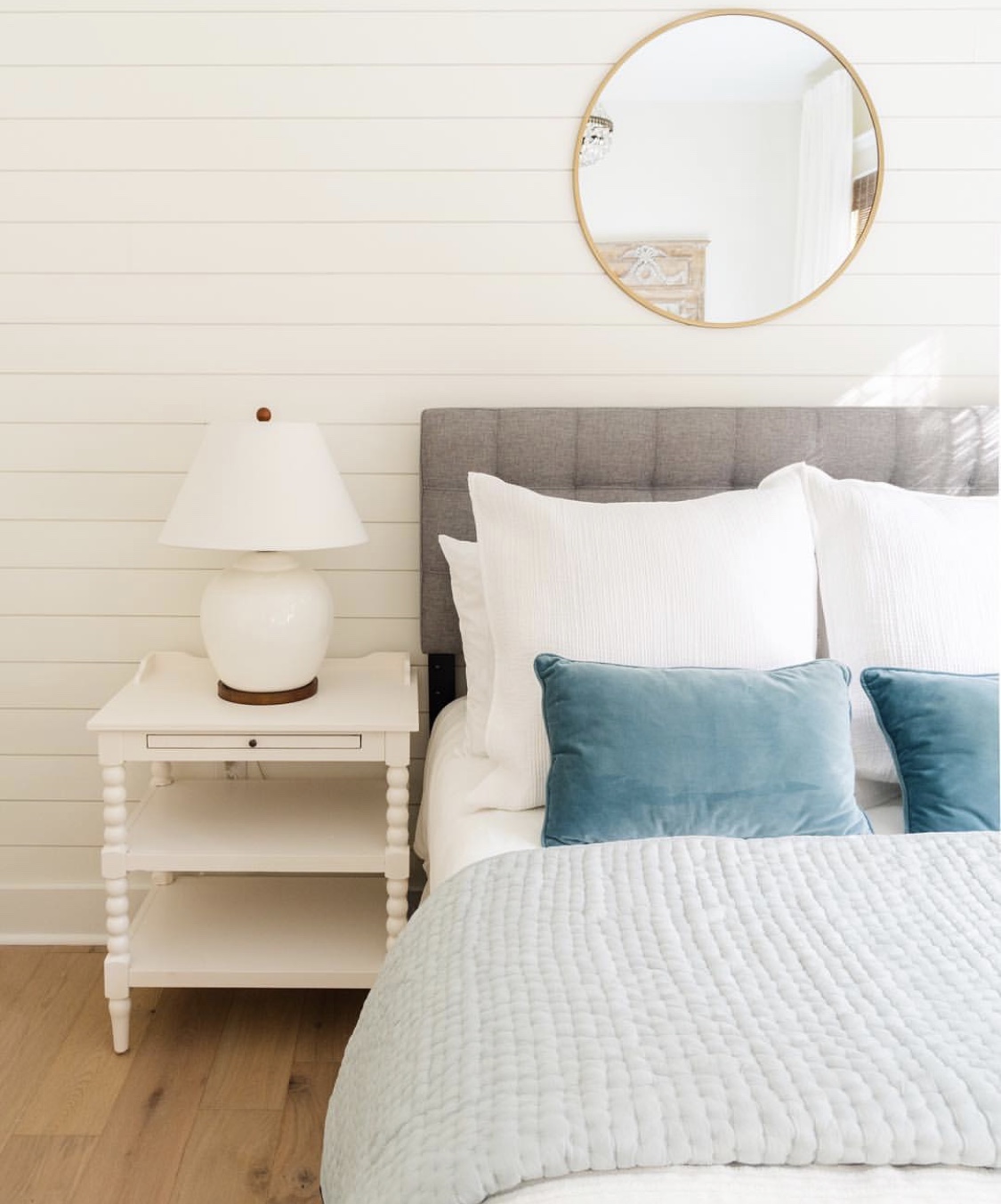
Sleeping Pillows + Euro pillows + 2 Throw pillows + 1 Lumbar or Single throw pillow + Quilt + Duvet + Throw Blanket
The pillows you sleep on- by this I mean either 2 or 4 pillows that have the sheet pillow cases on them. If you have a king, you may want to king pillows and 2 standard. Both Tye and I like 2 pillows each at night so we have 4. You can lay these down and stack them in the back for a cleaner more modern look like pictures 2 and 5 above, or you can set them up in front of one another. As far as sheets go, I don’t spend a ton, but I get plain white, cotton sheets that feel good. You can get a color or pattern but it may compete with the other things you get for the bed so keep it simple. Also white is great bc you can bleach them!
Euro Pillows and Shams - A Euro pillow is a square that’s about 26’x26” and the best place to get these is home goods. Its hard to find 3 that are the same though. If you have a king, you need 3, if you have a queen, 2 is good. I try to find simple, yet textured ones. The only time I would suggest you don’t need euro pillows is when you have a low profile headboard and you don’t want it hidden by pillows. Some pictures above don’t have them for this reason.
A set of throw pillows - these need to be about 18”x18” or 20”x20” and identical to create good symmetry. I love getting these from great Etsy shops like Laurel and Blush or Cloth and Main, or target, ikea and Homegoods. Some are expensive, but not all. Look for pillows that have some color or good pattern/texture that you love. I will create a list of shops and some examples of some great pillows from each below. If you get them from Esty, they are just the covers, but you can get inserts really cheap from AtHome or IKEA.
A Single long lumbar or throw pillow - these are also great to get at the shops listed below.
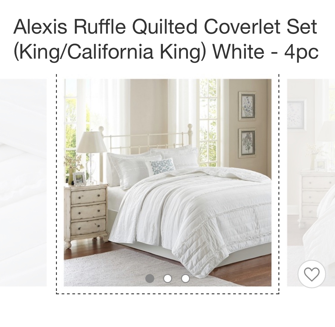
Duvet and insert- Don’t spend a lot of money here. Wayfair has a great duvet that’s $25, I listed it below. It comes in like 30 colors and its a cotton duvet that will work well for anyone. Target also has great solid duvets with some texture. The solid duvet will help separate the pattern of your throw pillows from the pattern of your quilt and throw blanket. Get a cheap insert from Homegoods or target. It can be down alternative or cotton, just pick the fluffiest one. Again don’t spend more than like $50 here. I love duvets over comforters bc you can easily clean them in the washer with your sheets.
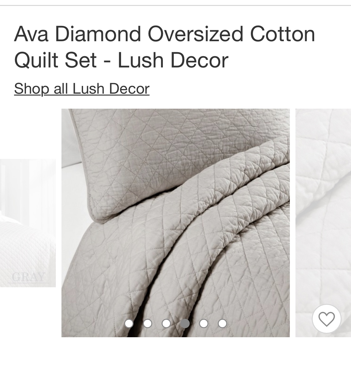
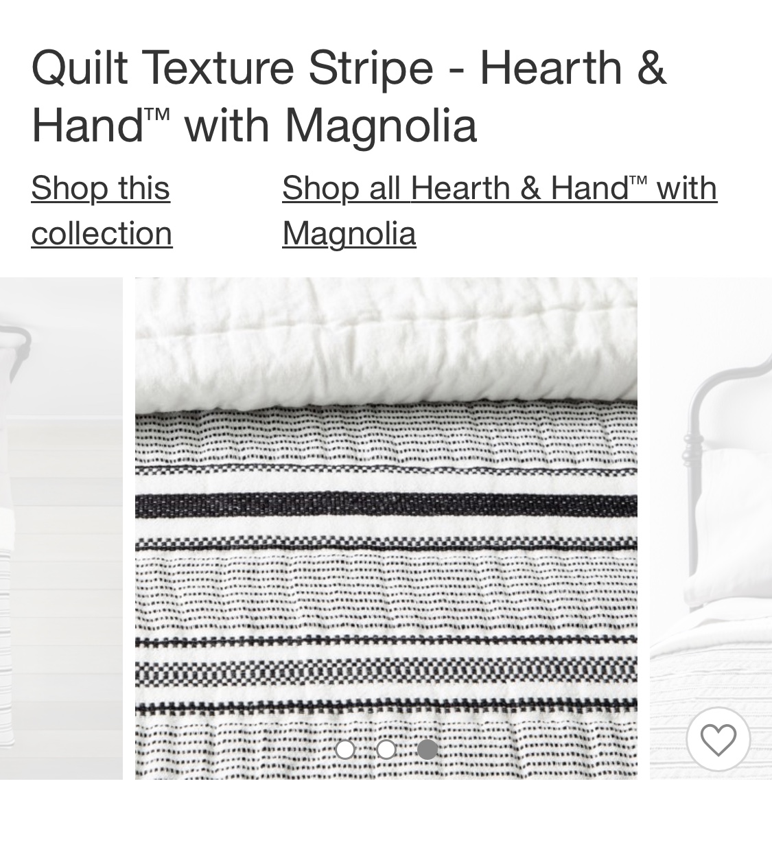
Quilt- This is optional, but remember, the more layers, the more cozy and complete the bed will look. Pick a quilt that has some light pattern to it like a stripe. A little color is OK too. Target has the best selection under $100. See Below
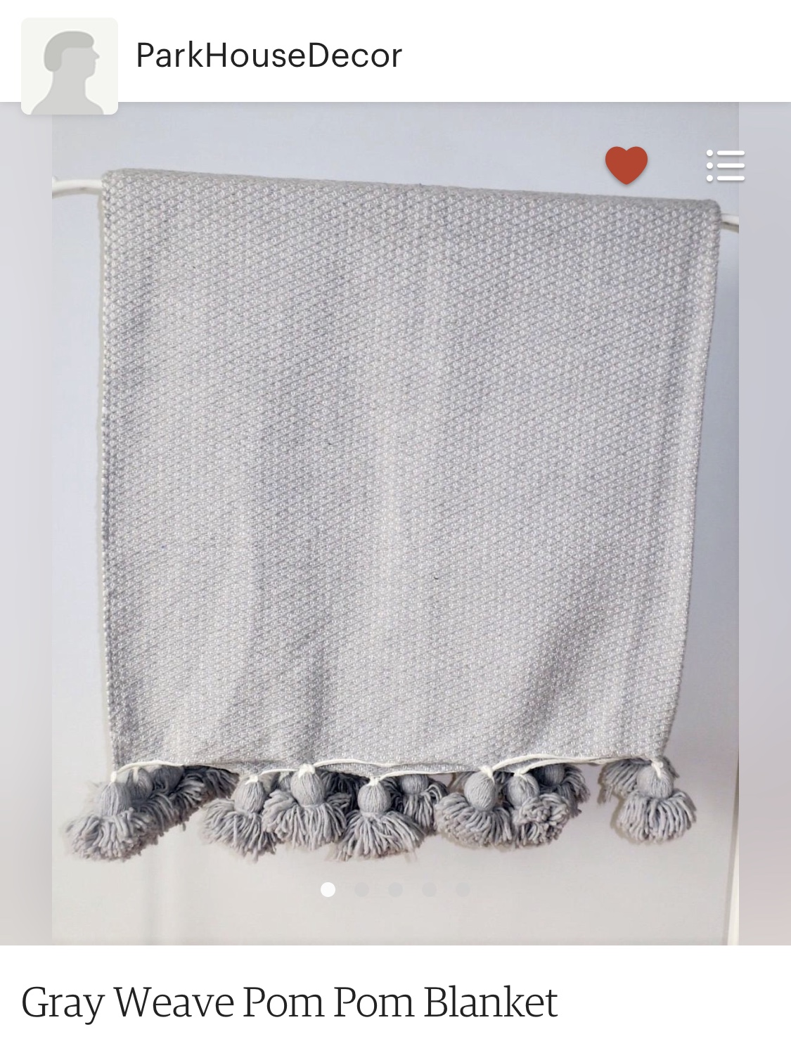
A throw blanket - this needs to have a ton of personality: fringe, tassels, stripes, texture, etc. I gave some great examples below. Etsy and Target are great places to look. Spend about $50 on this.
Fourth picture is mine, all others from Instagram
Below are some of my favorite pillows from a few Etsy shops I love. Most of these throw pillows are $30-$40 and the lumbar pillows are about $60. There are tons of great ones at all of these shops, so just go and look around and get what speaks to you!Save your money on the duvet/comforter and splurge on your pillows- trust me.


Below are some duvets,quilts and throw blankets I love. Remember, spread out your pattern, so if you don’t do a quilt, do a solid duvet and a patterned throw blanket. If you get a patterned duvet then do a solid quilt/throw blanket. FYI, a quilt will not replace a duvet- its too flat.

February 11, 2019: Equations for the Perfect Spaces
So many of my friends and clients get overwhelmed with where to start on a space. A common mistake I see is people feeling they have to fill every wall and every corner. Today I want to give you a simple strategy for most spaces people struggle to begin decorating and designing. Start with each “equation” and then only add a handful of small accessories and wall art to complete the space. I’ll even help you with that part at the end of each room section!
Living rooms
Small Living room = Sectional/2 small couches + 1 pair of chairs + 1 8x10/9x12 rug + coffee table + TV area
Large Living room = Sectional + 1 pair of substantial chairs + optional 1 pair of low profile chairs/ottomans + 9x12/12x15 rug + coffee table + TV area
or
Large Living room = 2 couches + 1 pair of substantial chairs + optional 1 pair of low profile chairs/ottomans + coffee table + 9x12/12x15 rug + TV area

You are ultimately creating a U shape facing a focal point aka fireplace/TV. Obviously every space is different, so contact me if you want help with that, but the above equations are a great place to start. Remember less is more. Keep small pieces to a minimum and fill the space with less, larger items.
If you have a fireplace area that is separate from the TV area, only one can be the focal point and the other is just an added feature and that’s OK. Your furniture doesn’t have to face the fireplace if the TV is in a different area. Furniture can even go on front of the fireplace. Ottoman stools or low profile chairs are great options for this. Console tables are great for TV spaces without fireplaces. The console should be at least 6” wider on each side than the TV. Hanging the TV over the console is also a great idea. Make the TV part of the wall decor over the console by adding a few things on the wall around the TV.
Accessories to add:
Side table(s) - on the ends of couches or between pairs of chairs. Don’t use too many, 1-3 tops
Throw pillows and blankets - Very important in adding a layer or comfort, 4-5 per couch. 1 per chair, match them if its a pair.
Lamp(s) - floor or table lamps
Plants - use to fill corners or awkward places that furniture doesn’t work. They can add height behind furniture also
Mantle/coffee table/ built in accessories - this can easily over clutter the space. Only add 1-3 things for each shelf or space.
Wall Decor - You do not need decor on every wall. Keep it simple, decorate large walls, if you do a gallery wall, use larger pieces and less of them to keep the cluttered look from happening. Large mattes and simple frames help with this.
2. Bedrooms
Large bedroom = Bed + 2 nightstands + 8x10 or 9x12 rug + dresser + chest of drawers + optional seating area (chair or 2 and small table with lamp)
Small bedroom = Bed + 2 nightstands (use as dressers if needed) + 5x7 or 8x10 rug + dresser

Begin with the fact that the bed always needs to go on the furthest wall from the entrance. You should walk into the room with the bed facing you. Try your very best to have 2 night stands instead of 1. It creates symmetry that gives a restful feeling to the room. I have 2 - 3 drawers night stands in my daughters room instead of a dresser. Her room is very small. If the layout doesn’t allow for it, at least have 1. Carpet or not, a rug always adds an extra cozy factor.
Accessories to add:
Pillows- all beds should have 2-3 large decorative pillows, 2-4 pillows that you sleep with, and a small throw pillow in the front.
Layered bedding- spend your money on throws, pillows, and a fluffy comforter. Save money by getting a simple duvet cover. Let the pillows and blankets make the statement.
Curtains - floor to ceiling, not sheer, hung high, dusting the floor. Add roman shades under if needed.
Wall art - Something large and simple over the bed, or a row of 3-4 unless the wall is wallpapered or trimmed, nothing is needed. Instead of a mirror over the dresser, do art. Add a full length mirror elsewhere.
Plants- again, a great way to fill a corner or add height to an awkward space
Light fixture/fan - a light fixture can be a wow factor for the space. And a ceiling fan can really keep you comfy. Now a days a fan can be both a comfy and statement piece. Check out “prop ceiling fans” on wayfair for some ideas.
Bench at the end of the bed- if you have space
3. Nurseries
crib + dresser + rocking chair + small end table + rug + optional toy/book storage
I have a lot of examples for this one haha


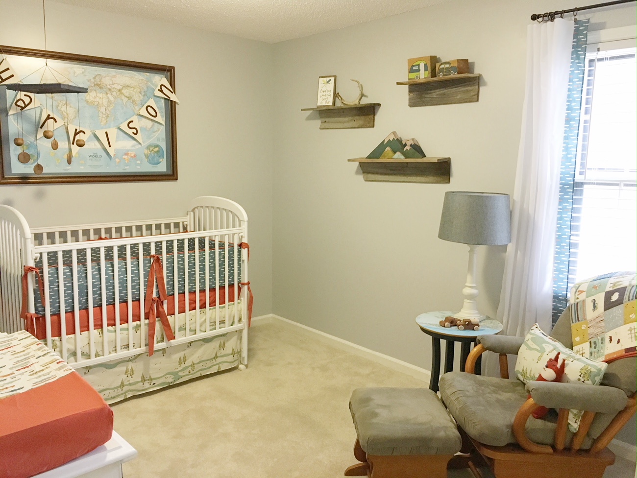
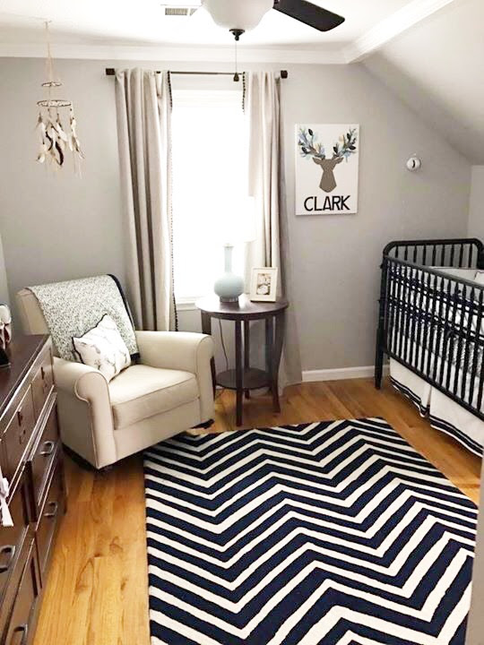
This one is a little more straight forward. If you want the most balance, ease and simplicity in a nursery, this is all you need! Once again, crib goes on the furthest wall from the door. Rocking chair and small table go close to the crib for ease of transfer. A rug is important in a nursery because the floor is so open in the middle. Get a low dresser to double as a changing table so that you aren’t wasting space and money on a separate one. A dresser with several small drawers instead of a few large will help you stay more organized.

Accessories to add:
Lamp on the table and optional on the dresser. (These can transfer to the 2 nightstands later)
Pillow and comfy blanket on the chair - for those all-nighters
Baskets or cubed storage for toys and books
Ottoman for rocking chair - make sure it is round on the bottom or rocks with you
Wall art- something light weight over the crib unless its wallpapered or trimmed out, something over the dresser (hung high so they can’t grab it during diaper changes)
Curtains - floor to ceiling, black out, roman shade underneath if needed
Light fixture/fan
Entryway
Entry with storage needed = bench + baskets under + rug + hooks
Entry no storage needed = entry table + rug
Accessories to add:
wall art- this is a great place for family photos, just a piece of abstract art or a round mirror
Plants - help to anchor the table or bench if you have a large wall you want to fill better
January 12, 2019: Whats Coming in Design for 2019
A majority of my job in helping people refinish spaces, is helping them make decisions that will stay in style a long time. I want to steer clients away from picking finishes that in just a few years will feel out dated, especially if its expensive. Because this is a new year, I wanted to discuss the design trends that I predict are becoming popular and what is going out. If you are planning a big gut remodel or just wanting to freshen up your space with new hardware, lighting, or even a new wall color, here are some design trends that you will be seeing more and more. In general, modern clean lines in furniture, architecture, and textiles will be the most popular. I’ll go ahead and tell you that most of these pics aren’t min- I searched IG for the best examples of what I wanted to show you:

New Color Palettes
The light and bright look of the last 10 years is going away and cream, beige, rich camel, and warm grays are becoming staples. These warm colors are being balanced by olive, dark teal, and charcoal gray. Above are pictures by Amber Interiors, Studio McGee and Cortney Bishop Design. You can see the rich colors against the white walls - which brings me to the fact that cool gray walls are going away and crisp white walls and dark moody accent walls are coming in!
2. Trimmed walls
A huge trend you will see a ton of this year is trimmed out accent walls and simple craftsmen style 3/4 wall trim in bright white and dark jeweled tones. This is beginning to replace the ship lap trend, and while I don’t think ship lap is going away in farm style houses, I think the farmhouse style is going away as a trend. In no way am I saying if you like farmhouse you shouldn’t do it, but its leaving the stage as “the thing everyone is doing”. Above are pictures from House of Hanes Interiors, @Kristan.diane, and West Elm. This is a quick way to add major interest and upscale design to a plain room.


3. Black and white exteriors and black windows
If you are building or painting your house, classic black and white are the way to go. Long farmhouse style black windows with thin panes create a crisp clean exterior that more and more people will be seeking as they build new. The high contrast modern style and mix of warm and cool materials are what you will be seeing! Another huge trend in exteriors is vertical siding. Above are pictures from @asdesignhouse, @mowerymarsharchitects, @mhousemovement, @frazierhomedesign @lapetitefarmhouse
4. Indoor trees
Indoor trees are becoming a HUGE trend, but specifically fiddle leaf figs, olive and ficus trees. The first picture by @rosabeltrandesign is a large ficus tree. Notice it makes that room against the crisp white walls and warm wood furniture. The second picture by @designlovesdetail has a to-scale olive tree by fastgrowingtrees.com. It makes the large ceilings feel more intimate. The third picture is of my fake fiddle leaf fig from homegoods. I love how it fills my corner and brings your eye up in my living room where the ceiling aren’t that tall. The last picture by @kimmyintx is also an olive tree but this one is small. It will grow up to 9 ft depending on the pot size but it creates a nice backdrop next to her low profile furniture. (notice all 4 of these pictures have white walls- just sayin)

5. Asymmetry
Asymmetry is going to be seen a ton in lighting and architecture. Examples will be seen a lot in roof lines, windows, light fixtures and in ceiling pitches. The first picture by Amber Interiors and the second picture by @ll.design.co have a really cool asymmetrical light fixture. The third picture by Studio McGee has amazing asymmetrical windows and the last picture from @sionnach_dalur_house has a really pretty asymmetrical floor to ceiling fireplace and ceiling line. Its unexpected - which is what designers are going for these days.


6. Camel
Camel leather is everywhere! And its only getting more popular. Its great for ottomans like this picture of mine from a clients house and my livingroom, those modern chairs from @designlovesdetail, or these ottoman stools from @kimmyintx. Its also going to be a very popular color for stone and textiles (its another “earthy tone”) It looks amazing paired with cool colors like navy and olive.
7. Dark cabinetry, countertops and marble back splashes
Just as moody earth tones are coming in for other spaces, kitchens are going in the same direction. White kitchen cabinets are not going out, but high contrast against the white like adding dark islands, hoods, hardware and counter tops is. Using solid marble or marble look quartz are also a big up and coming trend. Pictures from @christopherpeacock, @heidicallierdesign, @ll.design.co, @amberinteriors

8. Sputnik and bubble style lighting
Lighting is taking on a whole new look in 2019 with this mid century modern chandelier look. Finishes that are in, not only for lighting, but also in hardware and faucets is brush brass and matte black. Brushed nickle is still in as the “less edgy” choice. Pics by @joshkilbytn, Atro Design, @seekingalexi, @westessexlighting, @edytaandco, @marieflaniganinteriors

9. Wallpaper and accent wall murals
Its no secret that wallpaper and wall decals make a statement but in the past, the statement wasn’t a positive one. Now we have all of these amazing wallpaper and mural companies, like Anewall, to create beautiful wow factors. Not only are they super pretty, but they even create them to be removable like a window sticker so they are so much easier to put up and take down! Pics by @anewall, @thespoiledhome, @kindandabell, @reneemblanc, and @krosserstrat
10. Light white Oak
We all know wood colors go in and out, but one good thing about design right now is that there are so many wood tones that are in style so you don’t have just a few to choose from. White oak is great no matter how dark, because it has no red or orange undertones - its very neutral. Light white oak is being used a ton in cabinetry- like the bathroom vainity above by @briahammelinteriors, floors - like the ones above my @kismethouse, @arrowsandbow, @fox.design and @housesevendesign, and furniture like the light rattan chairs above by @designsixtyfive.
**Hear me that this does not mean you have to change the design that you have in your house now because it doesn’t have these elements. (enough husbands hate my blog already haha) There are no rules. You don’t have to have the style of home that’s “the most in style 2019” or that is “whats coming in style”. What’s important is that you love where you live. Some people have been decorating farmhouse style for 30 years. They love it and that’s what matters. Yes more modern is coming in so if you know thats what you will enjoy for your new house then great! If not, do what you love. ALL styles can be done beautifully every decade!
December 17, 2018: Designing a perfectly restful Master Bedroom
Full disclosure: This may feel like a therapy session, but if that’s what you need then…..well here ya go:
I have so many clients that leave their own bedroom last on the list to be decorated, or organized… or even cleaned for that matter. This is because the mom brain naturally wants to put everyone else’s space before theirs. Also you may think “no one sees my room so I want the places everyone sees to be done first”. But when the day is over, and you have cooked dinner, cleaned the kitchen, put the kids to bed, and washed your face, what is starring at you as you try take the only peaceful time you have all day to relax?
When I lay down for the night, I want to rest in a restful space! If there is laundry or even worse, random stacks of papers setting around that need filed, I can’t rest for anything. This is why I always tell my clients their master space needs to be on the top of the list to be finished. When the rest of the house is a wreck, I want to be able to go into my room at bedtime, when I NEED to rest, and lay down and feel like at least my comfy hideaway is a retreat.


If you feel like this is so far away, here are some easy steps to create a comfy, peaceful master bedroom.
DO NOT allow your bedroom to become a filing cabinet. With that being said, you can keep your files in your bedroom, just make sure you have a bedside table or dresser that allows for you to easily store them. If you have a specified area for papers to go, you can easily add them to that drawer instead of letting them just pile up. Every few months open the drawer and file all the loose papers. The bed side tables we have double as our filing cabinets. The bottom drawer on both sides has files for each aspect of our life. One is organized with each file, the other is loose papers I go through and file whenever I can, but they are never setting out in a pile, starring at me.
DO NOT let your bedroom furniture be the hand-me-downs in the house. I have so many clients whose dressers or bed is about to fall apart or is so worn looking they don’t know what to do with it. You bedroom furniture doesn’t have to be an expensive matching set, but do your self a favor and at least get it refinished or buy something that looks decent. Its hard to be proud of your home when the place you wind down in is falling apart. Below I’m going to list some nice, inexpensive furniture choices for you to get you started if you are in this boat.
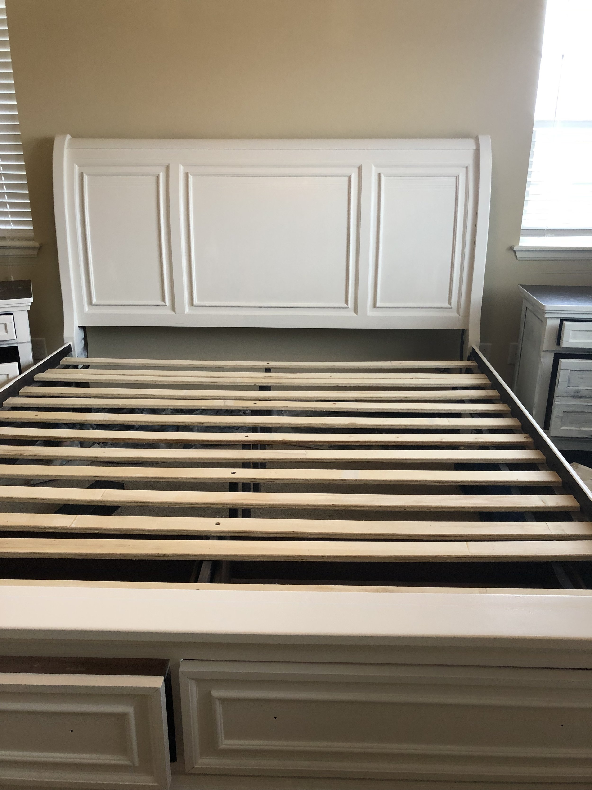
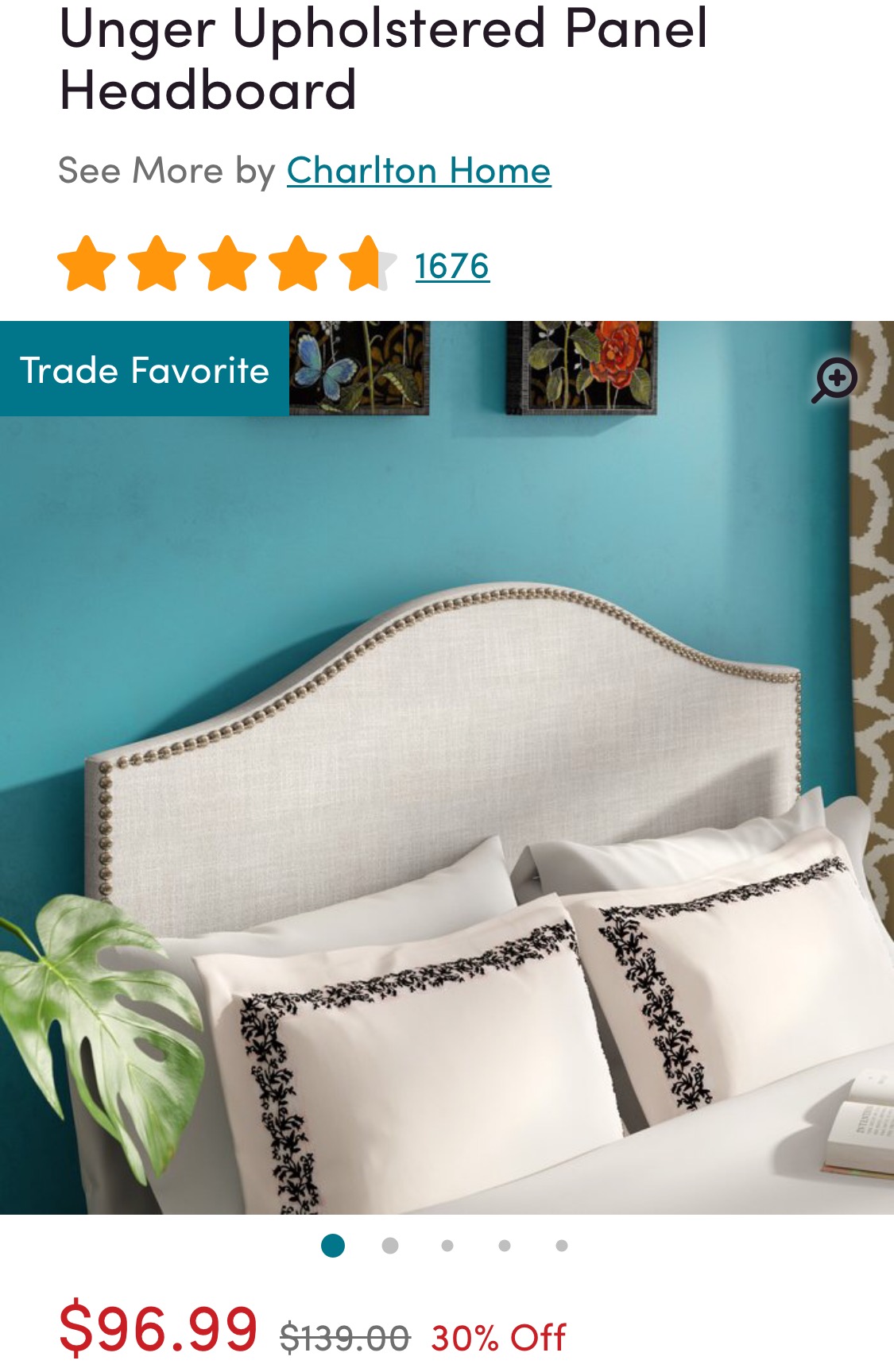
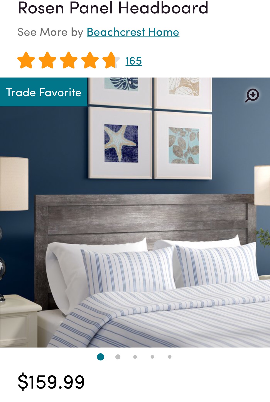
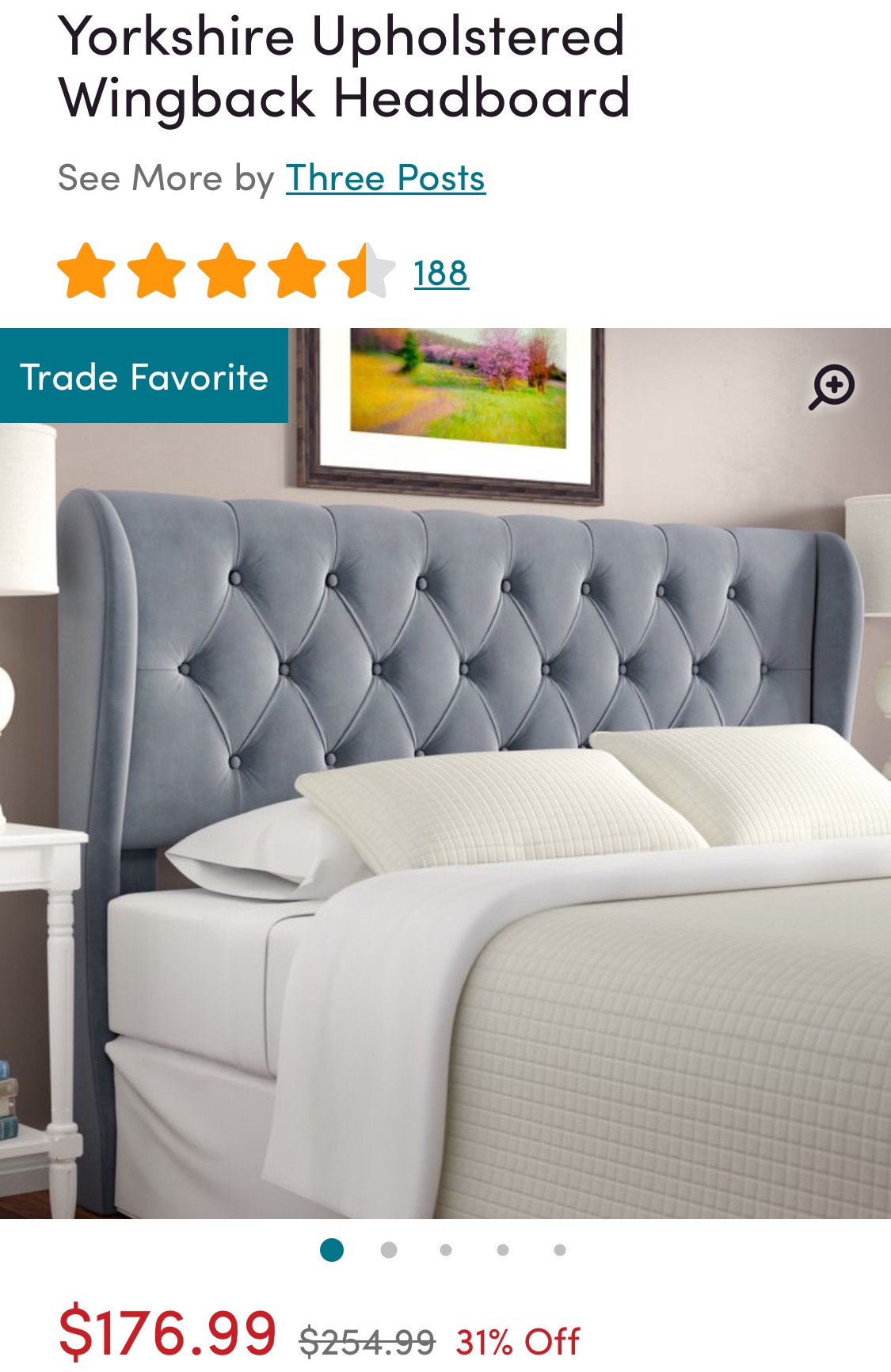
Please get a headboard- this is an extension of the last point. You can not feel like you have a finished room when you only have a mattress on a frame. This is not an expensive purchase. You don’t need a foot board or matching frame. You just need a pretty headboard. You can get one for $100. Ill list some good choices below.
Keep the pattern down - on bedding and curtains specifically. Don’t throw a bunch of pattern into your bedroom if you are going for a peaceful space. It stimulates the brain and does the opposite of relaxes you. Keep it simple. I always recommend solid bedding, even just white, with a stripped or heavily textured throw blanket at the bottom with a few throw pillows. The throw pillows are a great place to add pattern, or texture and to mix and match. Curtains are also a place to keep low key. A pattern is fine as long as its not stimulating, like a small stripe or muted pattern, but it looks just as comfy and pretty with simple solid curtains. What you want to make sure of is that they are nice and thick, and long.
Keep the space symmetrical- next to keeping the room organized, I feel like this is very important. There is something about our brains that appreciates symmetry and our bedroom is no exclusion. The symmetry give us a peaceful mindset. A few key things- nightstands and lamps. Make sure you have 2 bedside tables that, if not the same, are at least the same height and about the same color and size. Get matching lamps, make sure they’re size is good for the space. Sometimes tall skinny lamps are good for small spaces and tables, and other times you need nice big chunky lamps. I listed some great bedside tables below. Notice they all have 3 drawers. This is because most people need the storage- like for random papers. Make sure when picking out night stands to get a height that is as tall as your mattress. The whole point is to be able to reach the table easily.
Get blackout curtains- this is an extension of my point above. Keep it simple, use texture instead of pattern to make it easy like velvet, or a small stripe or linen texture. The key is to make sure they are black out and they are long and thick. Make sure they at least dust the ground and are hung at least 3-4” over the top of the window. I’ll list some great examples below. Black out curtains helps so much with sleep. They are great for blocking out light that will stimulate your brain while trying to get to sleep and in the morning when the sun comes up. They also help with drafty windows. And if your like me and you try to bring the kids into your room in the morning so they will sleep in more, its nice if your room is still dark.
Paint the room a peaceful color- studies show that cool colors like blues, grays, whites, and greens are calming colors. Its best to choose to paint your room a light grayish blue, warm gray, or stark white. A dark moody accent wall is nice too :)
Keep the space Simple- don’t hang a ton of small pictures on the walls or set all kinds of family photos all over your dresser. Of course family pictures are great, you love looking at your kids all night when you have fought with them all day! But keep the amount of stuff setting around to a minimum, keep the art somewhat large and in small amounts. A gallery wall is fine but make sure the photos are a good size, and in a master, I recommend hanging them in straight grids to keep that organized look. Something I see often is jewelry every where. Find a way to organize your jewelry where its not displayed in your room. A cabinet where you can put it away is great, or some organizer hanging in your closet. Leaving jewelry out where you can see it creates a cluttered feel and therefor creates stress.
Efficient closet organizing- you need to put a lot of things in your closet to keep them from cluttering your room. Make sure you have cubbies, lots of shelving, etc. If you have good shelving and have run out of room in your closet that tells me one thing- you have too much. Get rid. Also if you have a dresser, and a chest of drawers and you have run out of room, you have too much- get rid. I’m not playing with you. This “having too many clothes” or “I have enough socks to where for 4 weeks” creates stress on its own. Too many choices are not good for you. Studies show you do not need to have more than 33 items hanging in your closet for each person. I’ll just leave it at that.
Great Curtain choices: All of these are fully blackout, all come in a handful of colors and lengths
Some Night Stand Examples: All have 3 drawers for optimizing storage
Headboards: Some of these are queen prices, some are king- but all are great headboard choices for a master
December 10, 2018: Furniture Arrangement
I feel inspired to write on this topic this week because I have had so many clients lately who are struggling with furniture arrangement. Some, at no fault of their own, have rooms that are challenging to arrange. I work to achieve a couple of things at the end of arranging a room:
Living Room
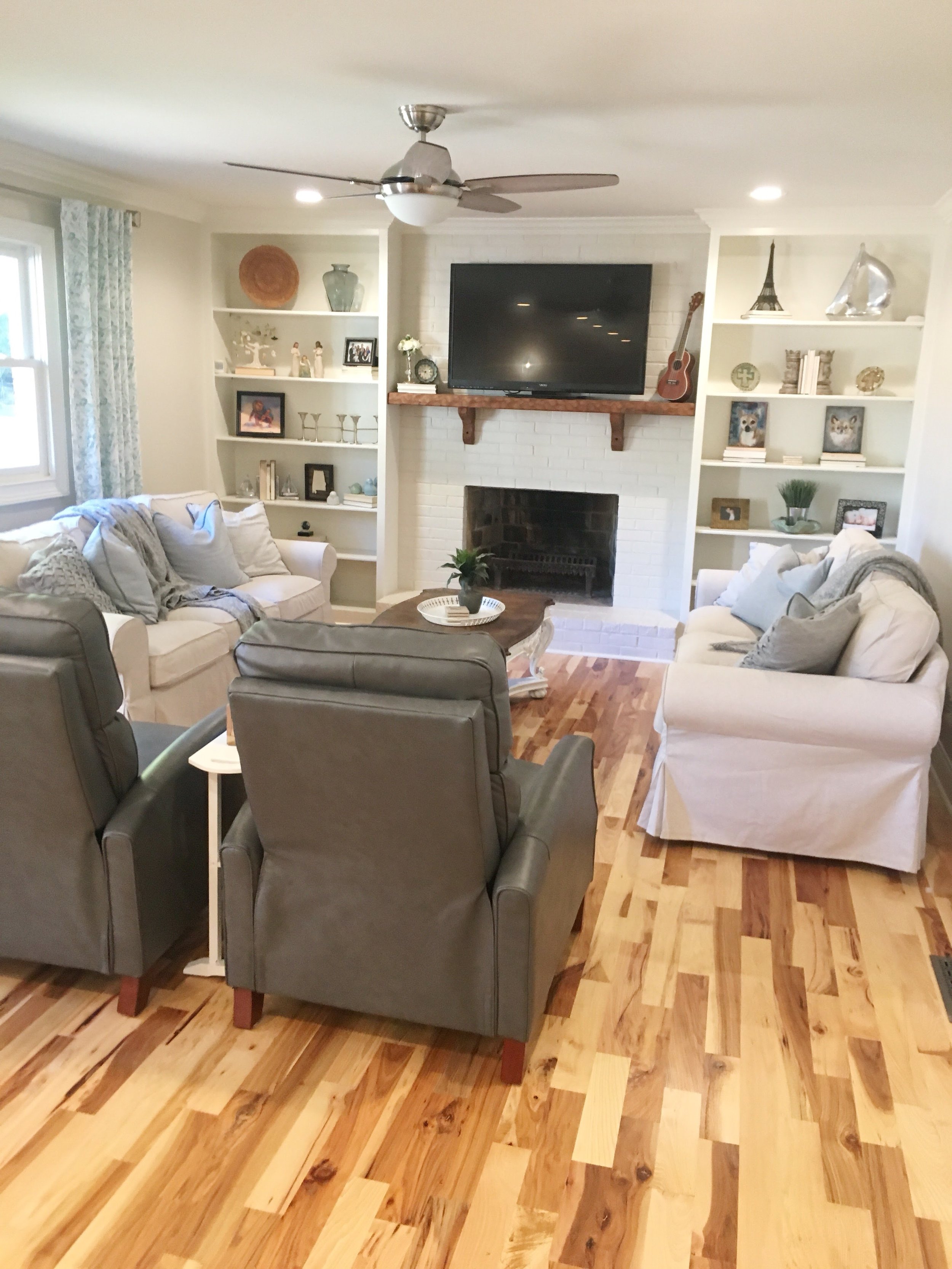

1. Good flow- I want families to be able to move in and out of the room easily. I don’t want any furniture blocking doorways nor do I want it to be difficult for something wide, like a wheel chair or a baby carrier to have trouble entering the space. Usually this is solved by floating the furniture to bring it away from the perimeter. If you have that living room that has 5 entrances - float the furniture.
2. Intimacy- When I say this I mean, I want a good discussion space. The furniture needs to be close enough that people feel like they can talk easily to the person sitting across from them. This brings me again to: FLOAT YOUR FURNITURE. When I say “float” that means, bring it into the center of the room more so it’s not against the wall. Do not assume couch backs need to go against the wall. As a matter of fact, assume that most of the time floating furniture is best in the majority of cases.
In smaller rooms like the first row of pictures above, at least some of the furniture is more often better against the wall. The seating area is large enough to enter, but small enough to be intimate. Also notice that all of the small spaces are arranged a round the focal point of the room (either the TV or the fireplace or both). Also, don’t be afraid to put small furniture like chairs or ottomans in front of the fireplace.
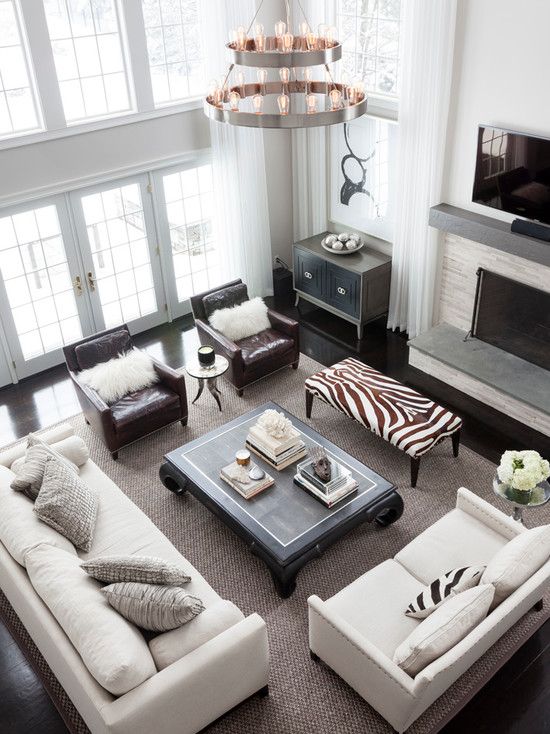
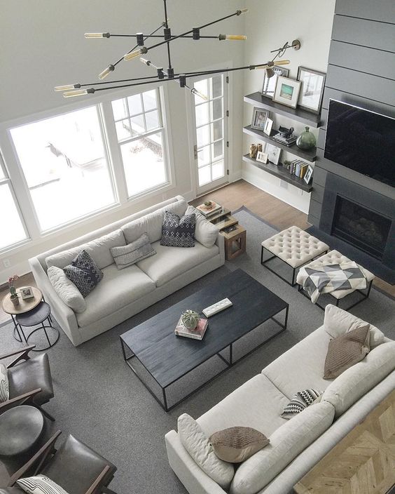
In the second row of pictures from Pinterest right above, all of these rooms are large, requiring all of the furniture to float so that the seating area isn’t too large to have intimacy. Notice the same thing is happening in each picture: all the furniture is arranged in a square around the focal point, and that square is made of a mixture of couches, chairs, and ottomans. Also notice the seating is built around a coffee table of some kind. Bringing the furniture in keeps the flow going around the outside when there are several entry points into the room.
If you room is long and thin and it’s making it hard to create a defined space- create two spaces. Separate the room into a main living space and a secondary seating area creating two more square areas. Area rugs can help define these spaces also if you are having trouble.
Bedrooms
For bedrooms I have a separate set of goals. First thing: you should walk into the room facing the foot of the bed; meaning the head of the bed needs to go on the wall opposite of the door if possible. Second: try to avoid walking into the side of a piece of furniture. If you have to use a wall directly to your left or right, try to make the piece thin or move it down the wall away from the door. In nurseries I try to do the rocking chair if there is a case where we need to use a wall but I don’t want the side of a dresser in your way when you walk in. Same thing with cribs as with beds, try to put it on the furthest wall from the door. Lastly, in bedrooms, don’t be afraid to put furniture in front of windows. I’ve seen some gorgeous rooms with the bed in front of the window and beautiful drapes on each side.
Seating areas in bedrooms are also great if you have room. This is great if the room is long and thin and you can create two different spaces: an intimate seating area with 2 chairs, or a chair and a table, and then the bedroom area.


I hope this was helpful to those of your struggling. It may also allow you to look at your space differently and maybe come up with a better situation than you already have. Comfort in your space should come first so make that a priority!
November 25, 2018: Tips and How-To’s for Christmas Decor


I hope you had a great Thanksgiving! An now that Thanksgiving is over, let the Christmas decorating commence! I have had my tree up for a while now, mainly to be able to create tutorials and take pictures to help give people ideas for decorating. A couple weeks ago I created several videos on Instagram on how to make bows, streamers, and decorate the tree. If you have Instagram, you should head over to @kindandabell and check them out in my highlights. If you don’t have IG or are more of a read instructions and look at pictures type of person then, her ya go:
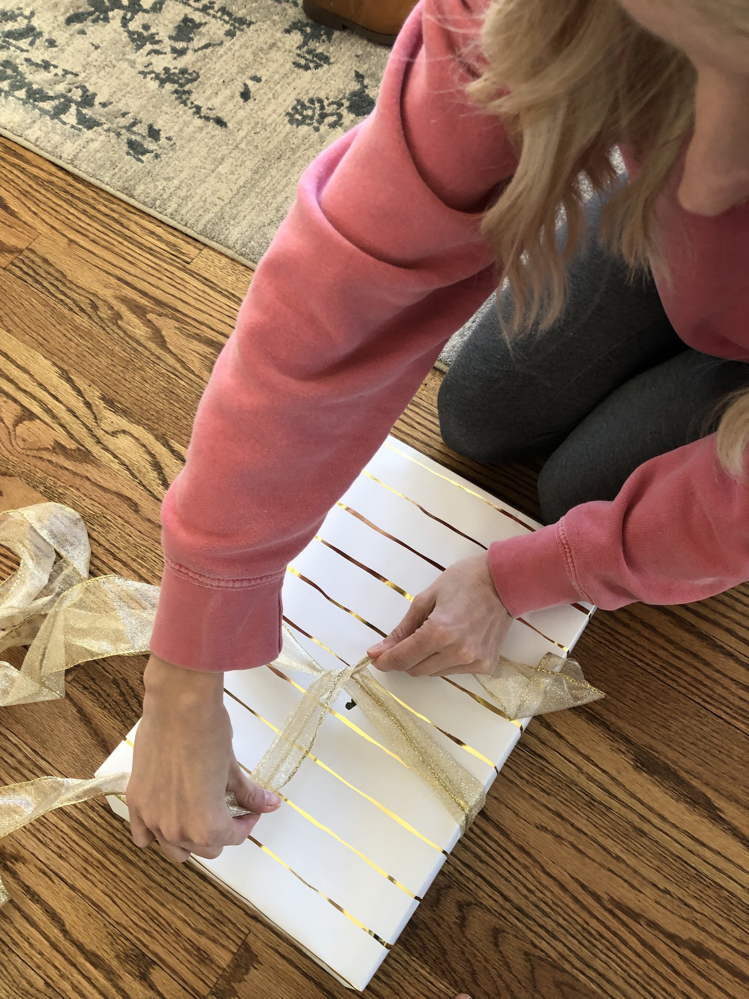
How to make a bow for a tree topper or present:
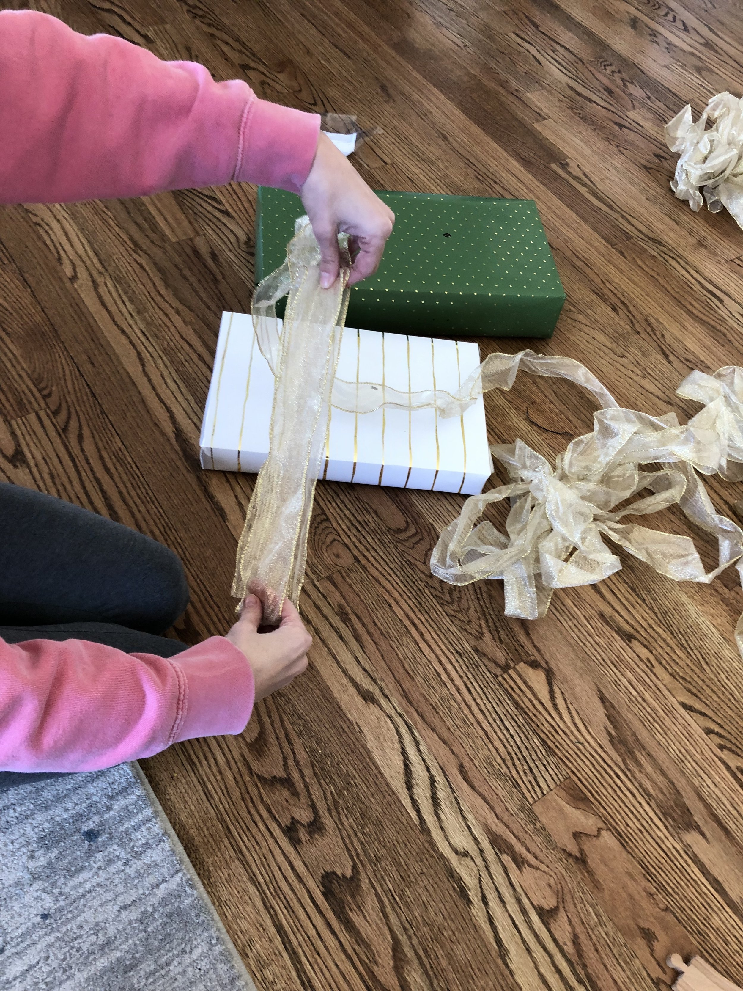
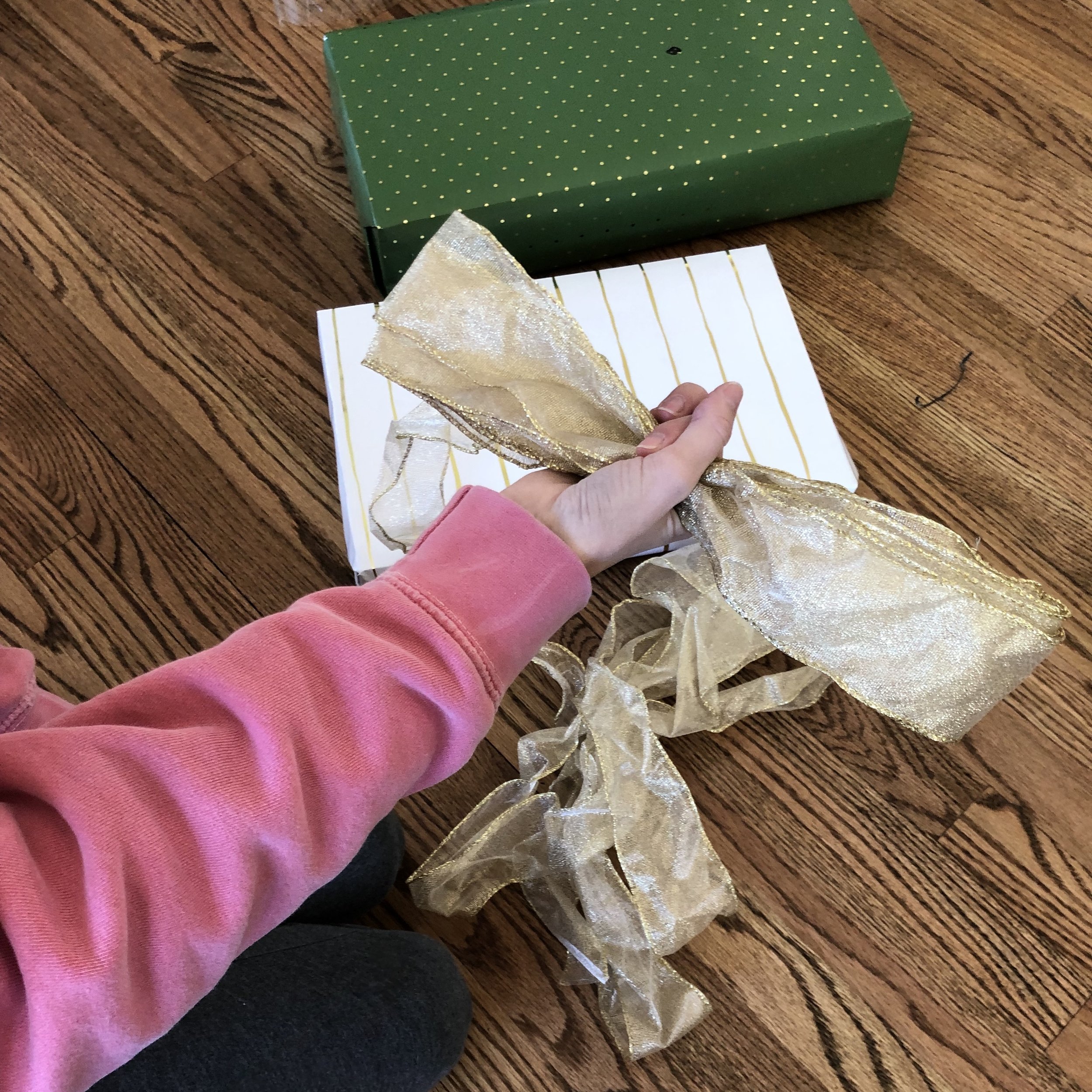
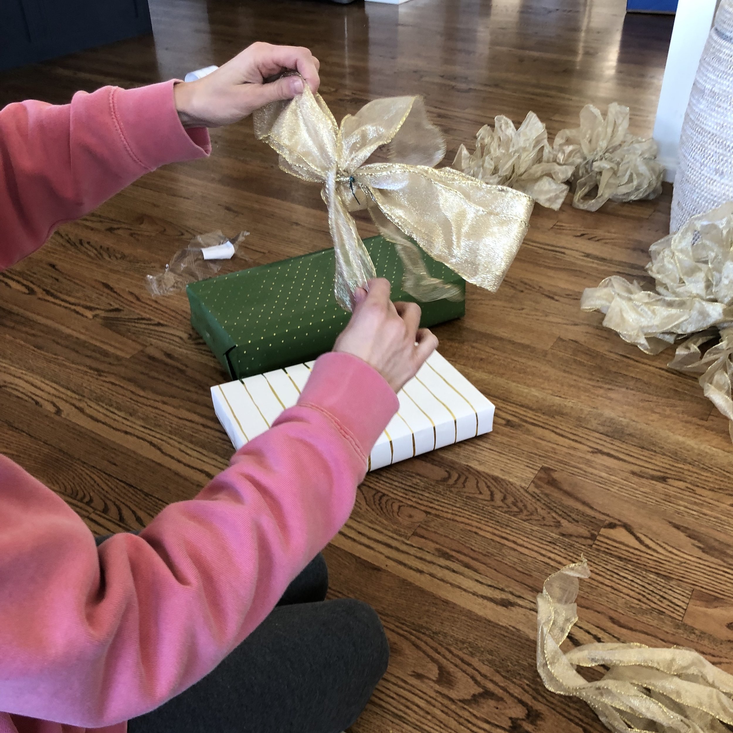
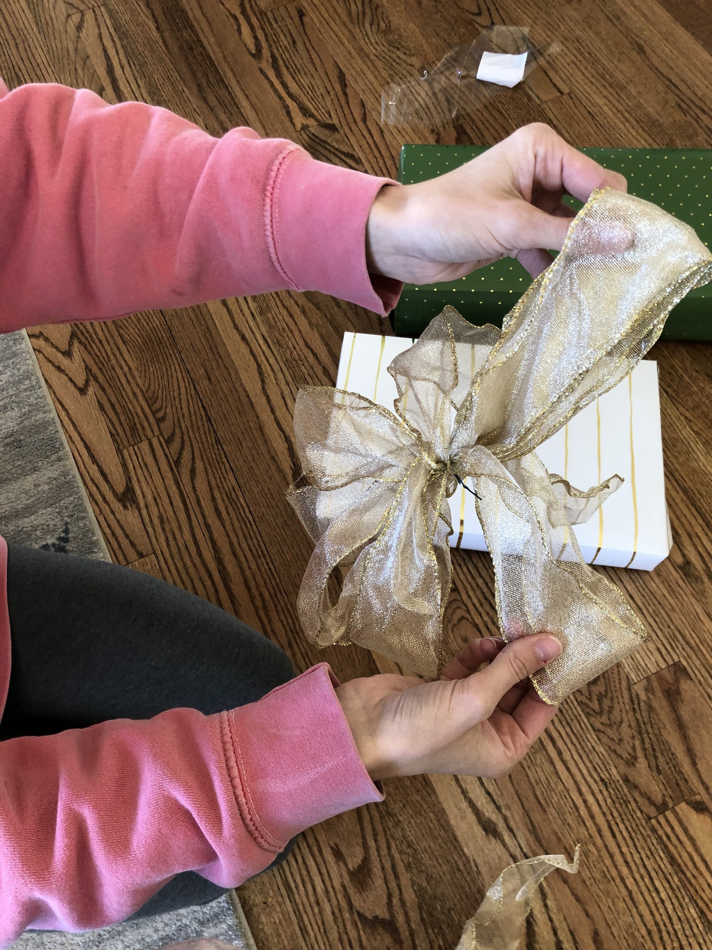
I’m using wired 3” wide ribbon, but for gift wrapping you could use thinner. For tree toppers you need the 3” and you need at least 30’. I used 60’ total by combining 2 different ribbons for my bow.
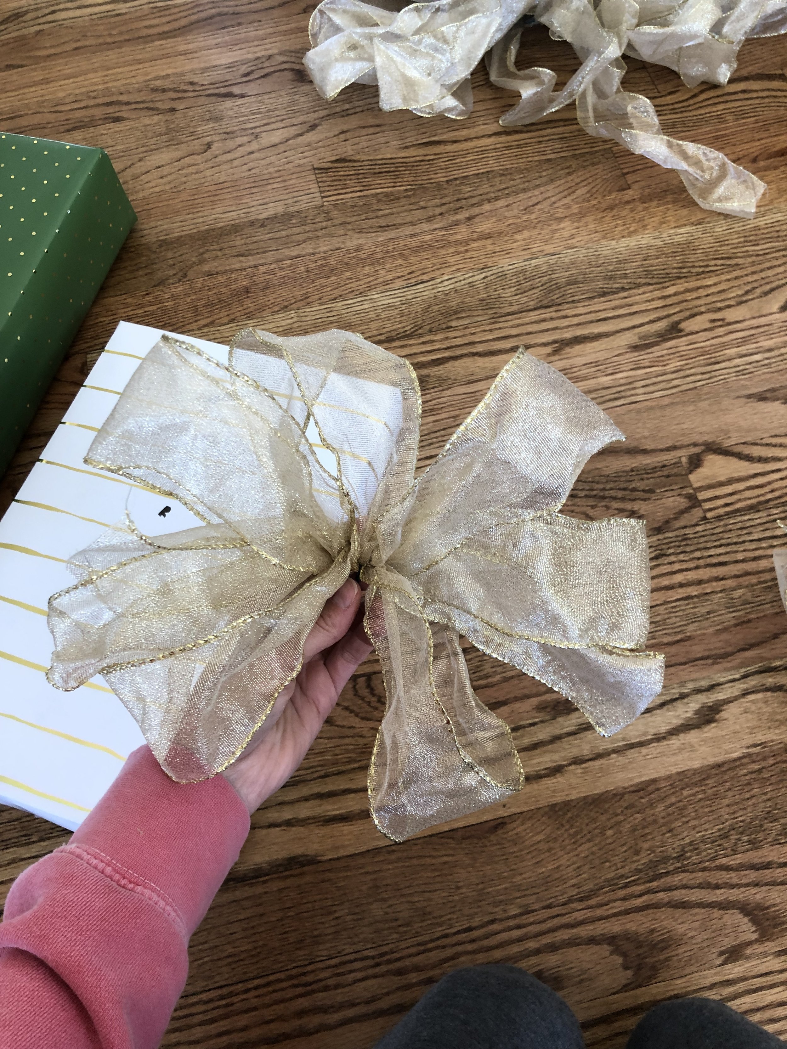
Fold the ribbon on itself in a loop over and over like you are putting up an extension cord. You want the width of the loop to be about the same width you want your bow. I wanted a 7” bow which for a gift is big. For a normal size bow about 5” is good. For my bow, I went around about 5 times.
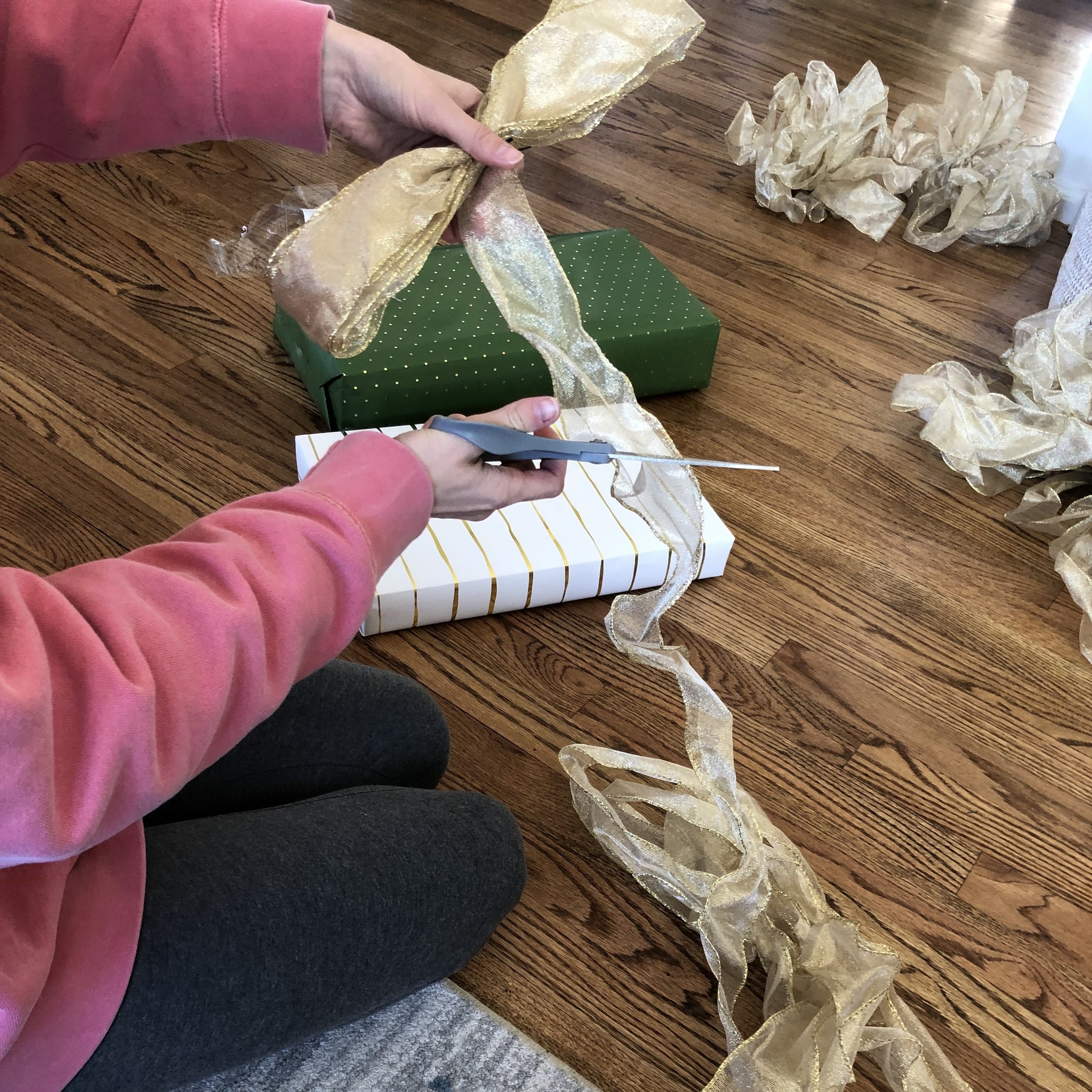
Scrunch the ribbon together in the middle and use a wire or twist tie to tightly tie the loop together. You want it to be very tight and strong. It should make the ribbon very small in the middle. Then cut the excess. (pics 2 and 3)
Pull the loops apart different directions. You want to pull pretty hard. This is why the wire needs to be strong and tight. Pull at them until they create a fluffy bow.
If you want to continue seeing how I attached the bow to finish the gift:
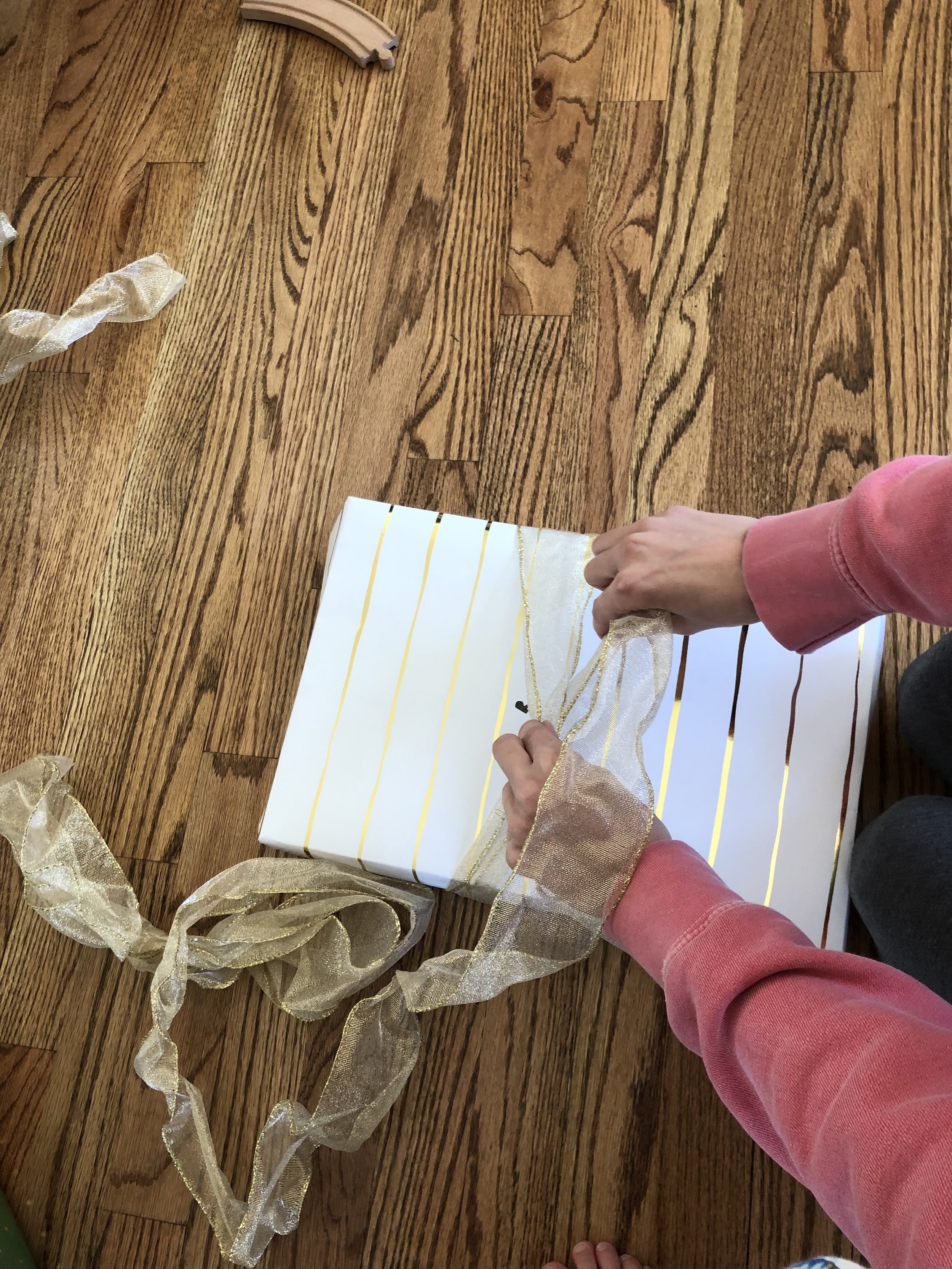
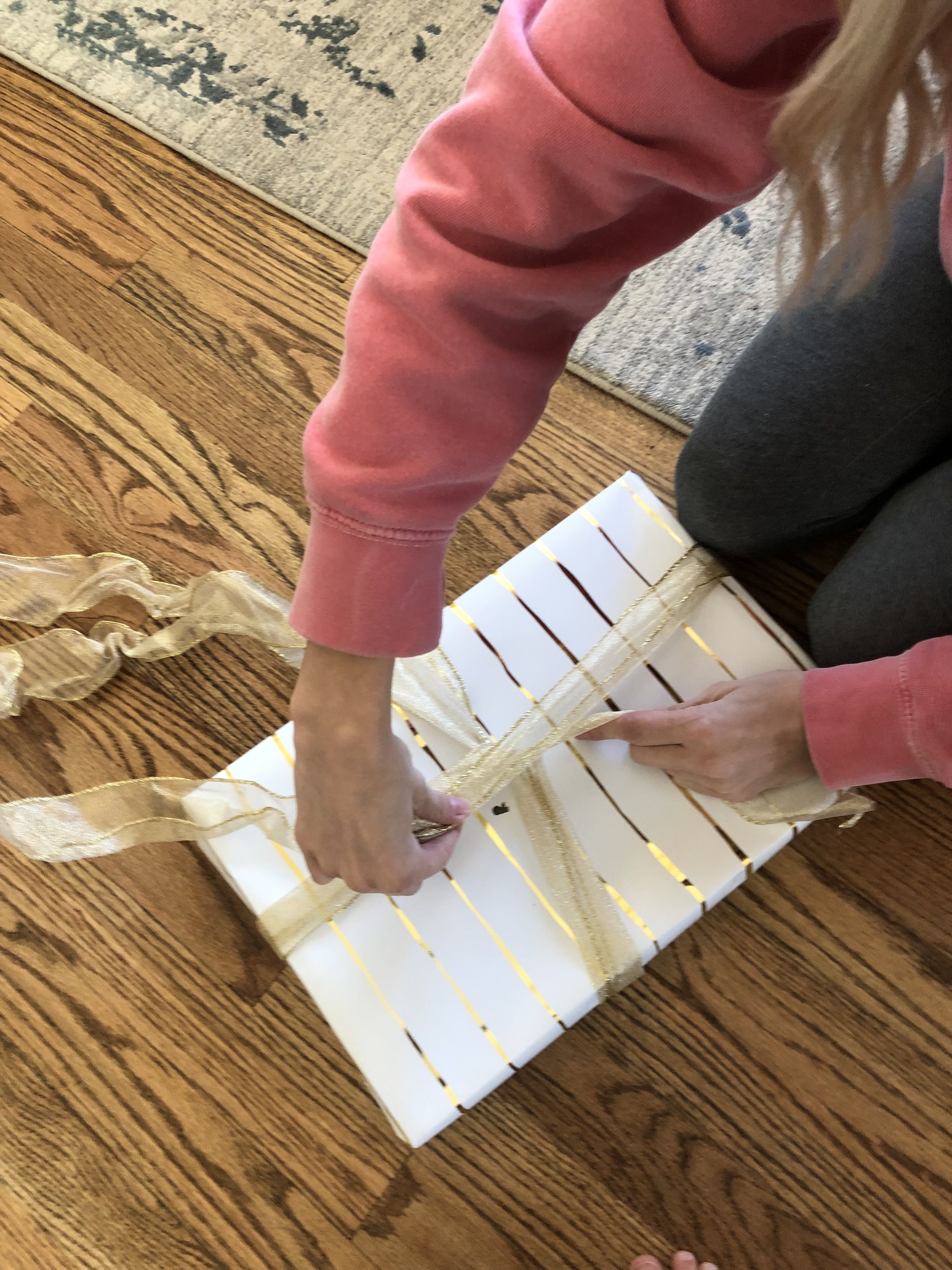


Wrap the ribbon around the gift width wise overlapping the end with some extra length. Take the long end and wrap it around itself turning upward and going under the top of the gift.
Bring the end that’s behind the gift back up from the bottom meeting it in the middle.
Wrap it around the existing knot you created at the front and tie it off.
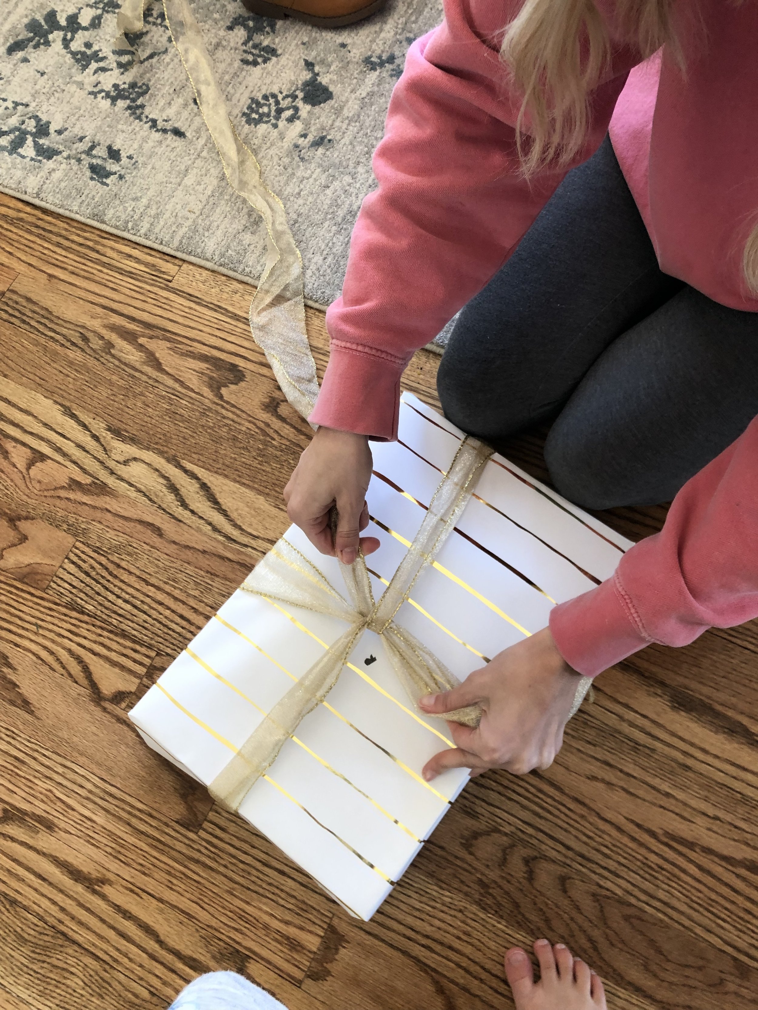
Attach the bow with the extra length. and Done!
Another little tip, after wrapping a gift, use the tips of your fingers to crease the corners. It makes the package look much cleaner!
Christmas Tree Tips:
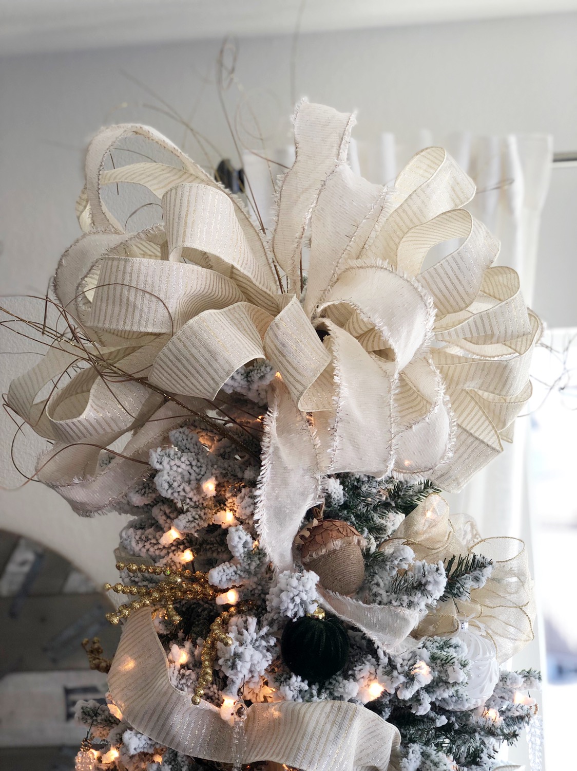


Make the bow first- I use the same process to make tree topper bows as I do for the gifts, just on a bigger scale. I make them a little over a foot, so my loop is about 14” long. I go around and around until I use up the whole 30’ role. Like I said above, my bow is 2- 30"‘ roles.
Use more of your ribbon to make streamers (I bought 4-30’ roles for everything). You can go straight down or spiral like my picture above. Start by tucking the ribbon in at the top below the bow. Stuff the ribbon in to the tree in the natural gaps every 3-5”. You want an “imperfect” look. If you want more details on this or the bow- visit my Instagram.
Add large floral in the natural holes between branches. This fills up the tree quickly with little effort. Tuck them in real good.
Use balls of different sizes, and other ornaments to fill in the rest. THE MOST IMPORTANT THING: tuck larger ornaments down into the tree near the trunk and smaller ones more towards the end of the branches. This gives the tree depth and its the difference between an amateur and professional looking tree.
Use small ornaments like icicles to put on the tips. This way you have ornaments at different depths.
If you are lighting your own tree, the same thing stands. YOU DON’T WRAP LIGHTS around the tree. You start at the bottom branches of the tree at the trunk and come straight out to the tip of the branch and back to the trunk, then move to the next branch and repeat.
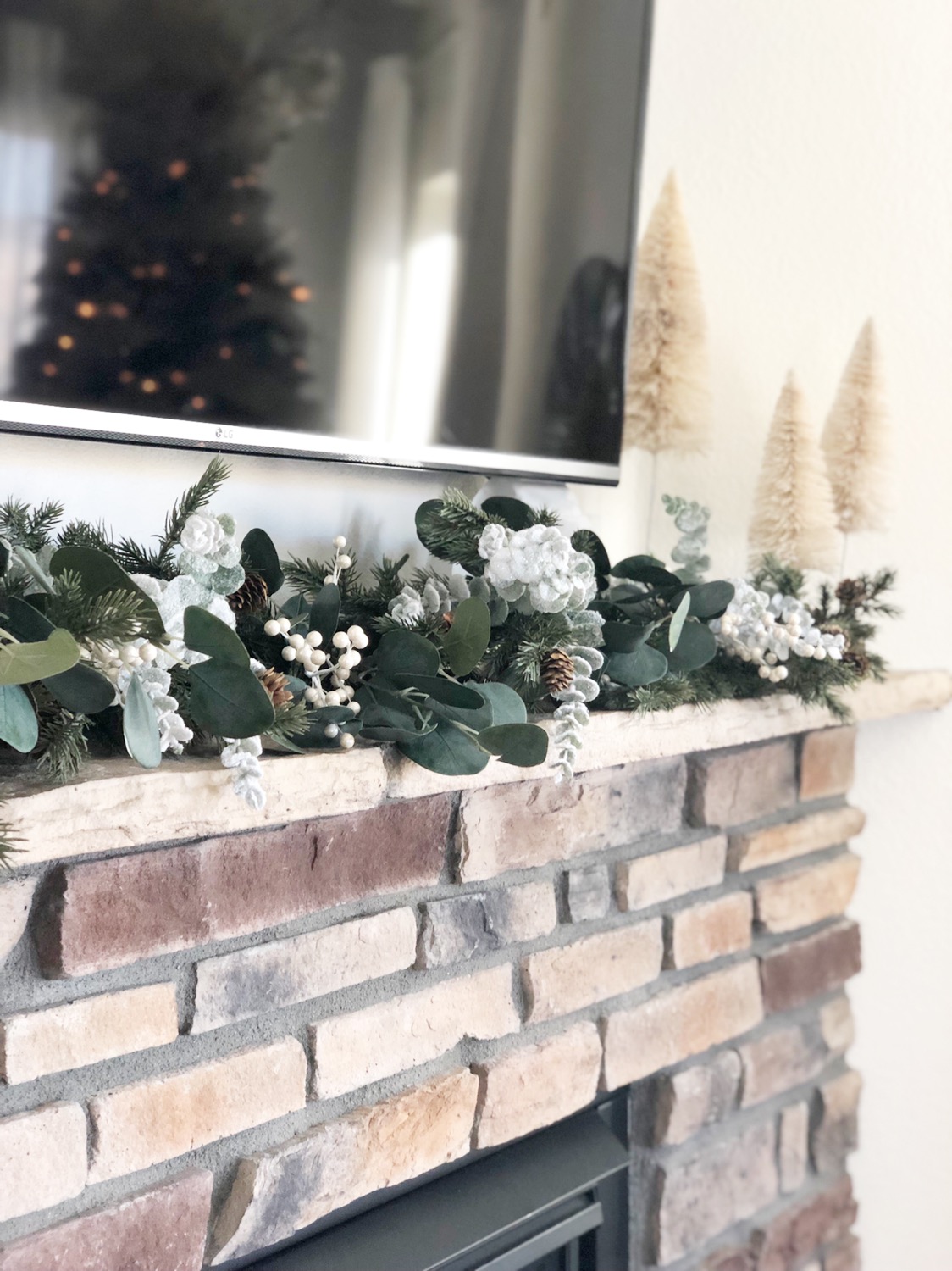
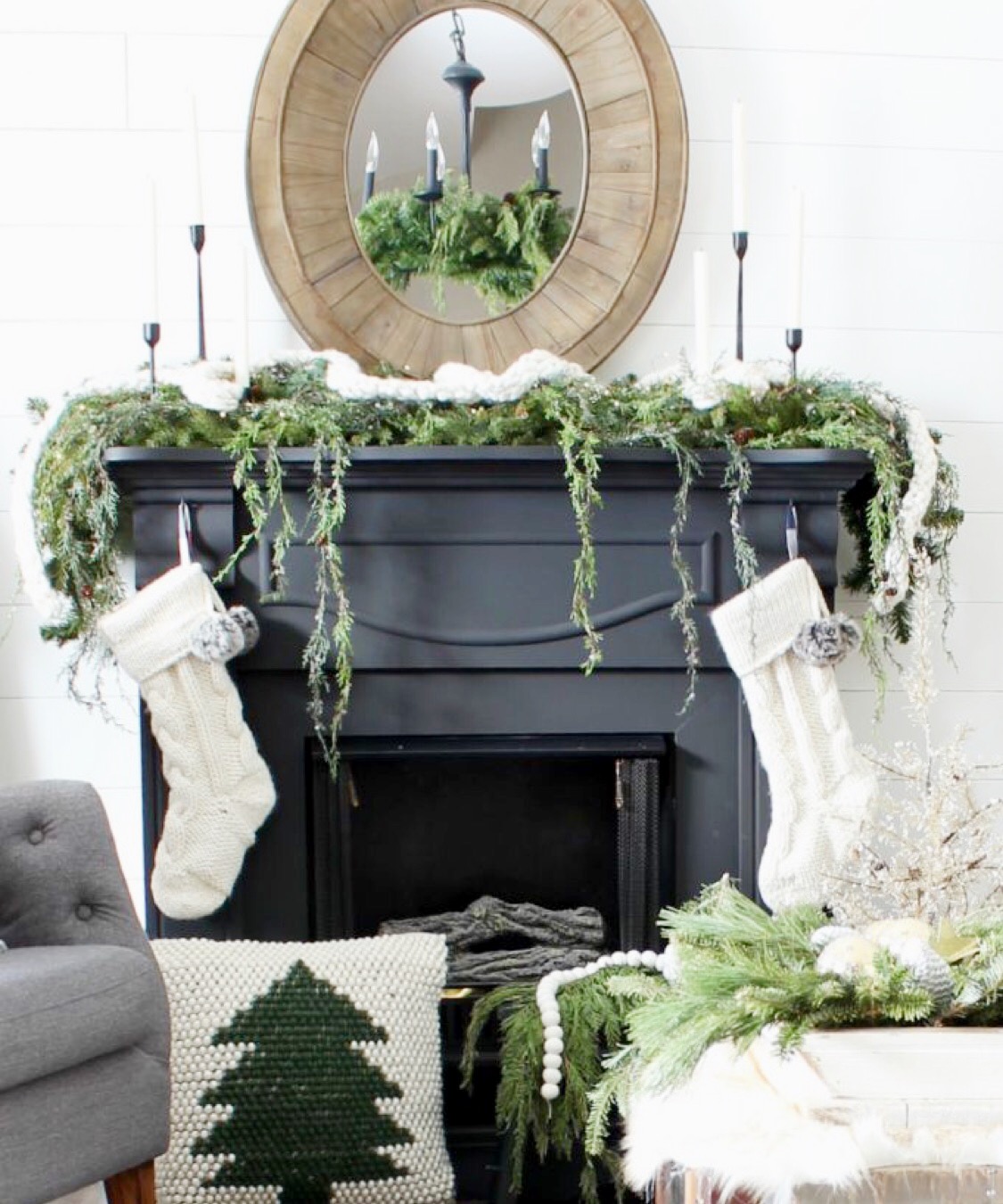
Mantel Decor:
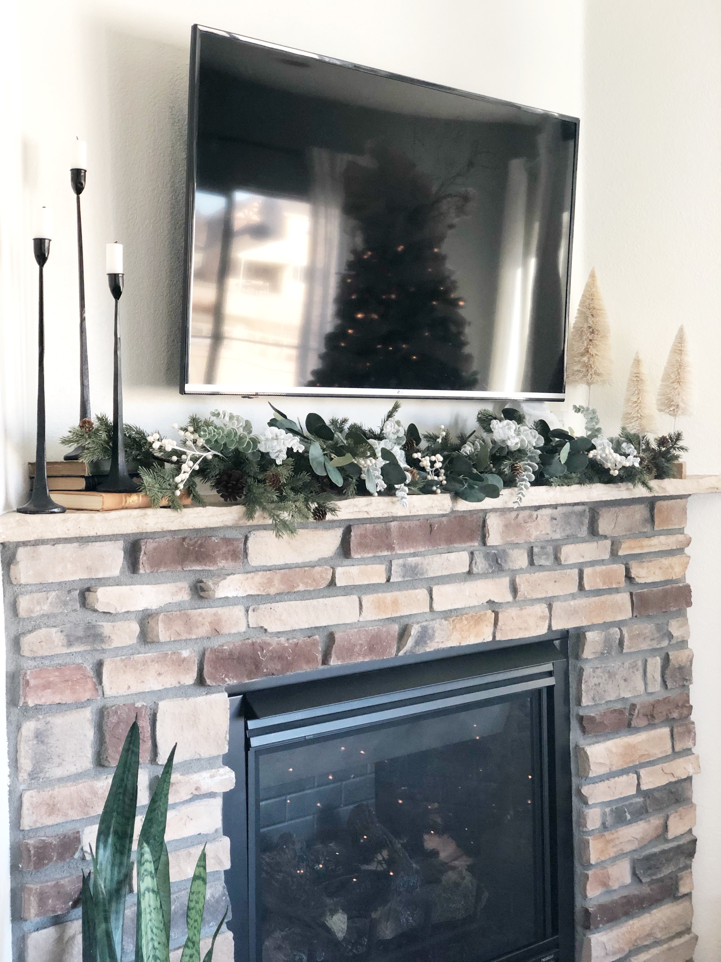
I kind of went over this a few blog posts ago so I’ll keep this short, but add height with art or candle sticks and use different heights and shapes for interest.
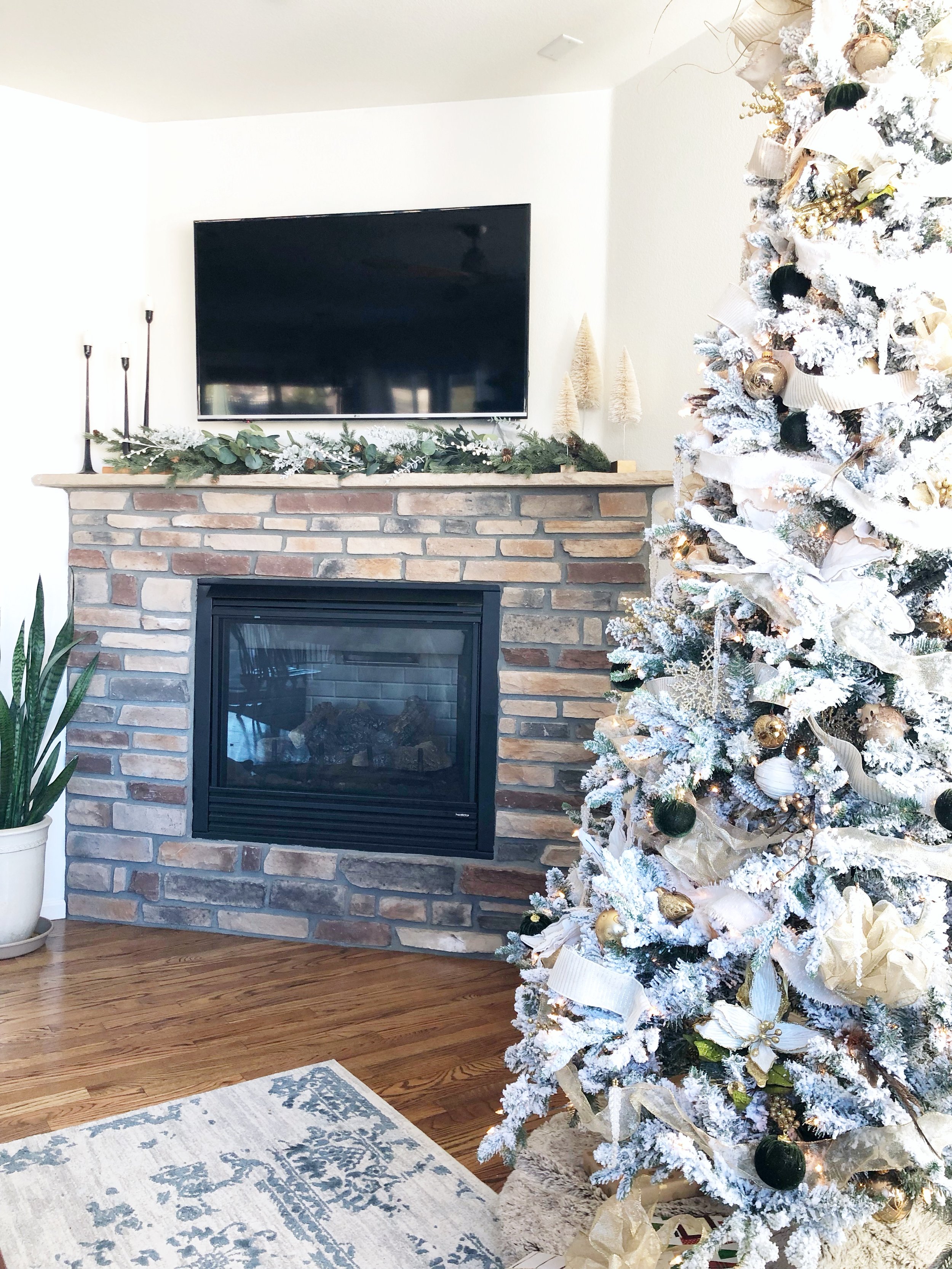
I used a simple garland that reflected the look of my tree and a few of these simple but cute brush trees. I kept my usual candle sticks. I also used different leaves in my garland like eucalyptus to create interest and freshness to the evergreen.
Don’t feel like you have to change everything out. You can keep it all the same and just add some lying greenery and be done. Still looks super festive.


November 12, 2018: Painting Cabinets


To day I want to write about a process that a TON of people have asked me about: painting your own cabinets. Its a big topic because it can save you thousands of dollars. I know the moment I saw our house on the MLS I wanted to paint both the bathroom cabinets and the kitchen. Once we moved here and I got quotes of $5,000-$8,000, I knew I had to do some research on the best, most durable way to paint them myself. Let me tell you up front- its probably the least fun projects I’ve ever done, but that price tag drove me to make it happen haha.
I’m also going to go ahead and apologize for the lack of pictures during the process. When I was doing this, I had no idea I would have a blog in a few months!
I basically combined a few different processes I found on Pinterest. I attempted my smaller bathroom first just to work out the kinks and practice. I wanted to be good at it before I started my kitchen. Below is the supply list and the step by step directions. I used different paint on the bathroom cabinets vs the kitchen, just because I had hear both were good and I wanted to test them both out. I’ll list them both in the supplies, but so far (more than 6 months later) they are both performing about the same. This may be because my kitchen cabinets are used a lot more and the kids are around them a lot more to bang into them, draw on them and scratch them. Ok here it goes!
Time: You have to let each coat of paint dry 12 hours before sanding it so the time is mostly just letting it cure between each coat. I planned for this and created a schedule to get it done in the least amount of days. I have 22 door and drawer fronts and it took me 3 8-12 hour days. The night before I took all the doors and drawers off. First thing the next morning, I sanded them on both sides, painted one coat of primer on the back, let it dry a few hours, flipped them and painted the front side. Because that was about 7 or 8 in the morning, I sanded and painted a second coat that first night about 7 or 8. The next day I sanded again and painted the first top coat first thing in the morning, and then the second coat that night. That way the third day I could hang them and spot sand and touch up.
Supply List:
Benjamin Moore Advanced Paint and Primer or Valspar Cabinet Paint and Primer
4-6” foam paint roller (pack of 3 or more)
2.5” edging brush (is slanted)
320-400 fine sand paper
220 medium sand paper
degreaser/deglosser
a few old towels or wash clothes
canvas drop cloth
Painters tape (if needed)
Directions:
Label all the doors and drawer fronts and make a diagram to help you remember which fronts go back where. I Labeled mine T1, T2, T3 for top left to right and B1, B2, B3 for bottoms left to right then D1, D2, D3 for drawers left to right.
Remove all of the doors and drawer fronts - this is a process best done with a drill that can take out screws quickly. Make sure as you take the doors and drawer fronts off you keep the hardware organized. I labeled sandwich bags with the same T1, B1, D1 and put each door or drawer’s hardware in individual bags.
Lay out canvas drop clothes and lay your doors and drawer fronts out on the ground. You can also hang them from the ceiling if you want to be able to paint both sides at the same time. If you are using a drop cloth, make sure its a canvas and not plastic drop cloth. Plastic sticks.
Degrease both sides of all the wood. This gets grease from cooking and everyday use off the wood before you grind it all over the place sanding. Just wipe all the surfaces with the degreaser and an old rag. Degreser or deglosser comes in several brands at home improvement stores.
Lightly hand sand all the surfaces front and back with 220, which is a medium grit paper. This is to rough up the surface and take some of the current finish off. I ALSO more moderately sanded the fronts around where they get touched everyday. This is usually where the handles/hardware are. I sanded enough that the clear coat was pretty much sanded off. I had read that most of the cabinet fronts wont get touched hardly, but where the hand ware is may get touched several times a day so I wanted to prep these areas much better.
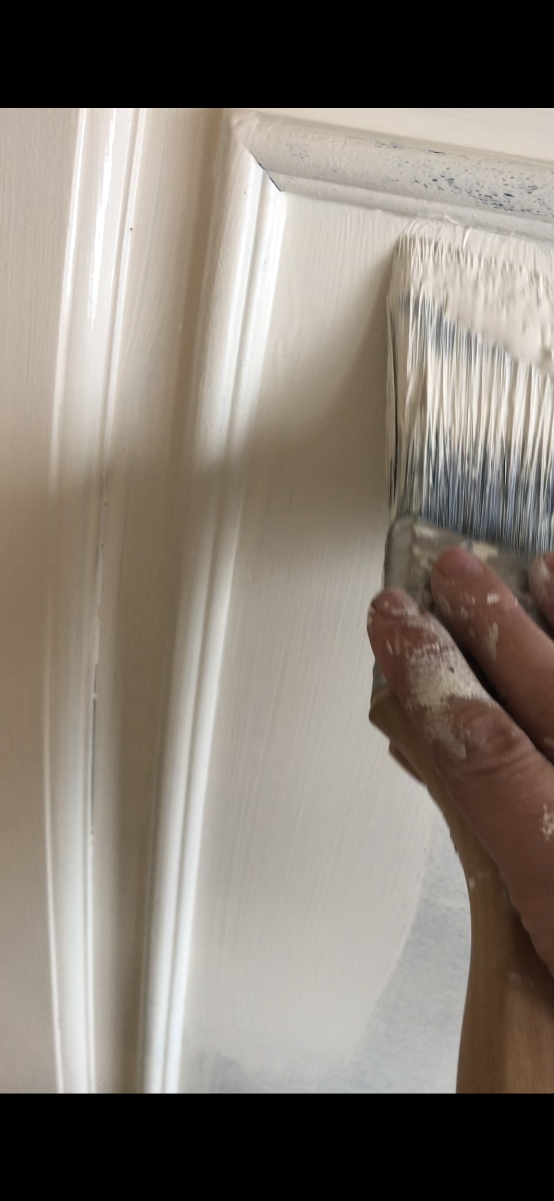
Wipe down the back sanded sides with a clean damp cloth a few times. This just gets the dust off. flip all the cabinets on there fronts and role a thin layer of primer on the backs with the foam roller. The foam makes a cleaner finish that the felt rollers do. Let dry for 3 hours.
Flip all the cabinets over, wipe clean and paint with the foam roller all the fronts. If you have any decorative routing on the fronts, you may need to use the brush to get inside them. I had a little, but I just used the tip of the roller and wiped the paint into the crevices.
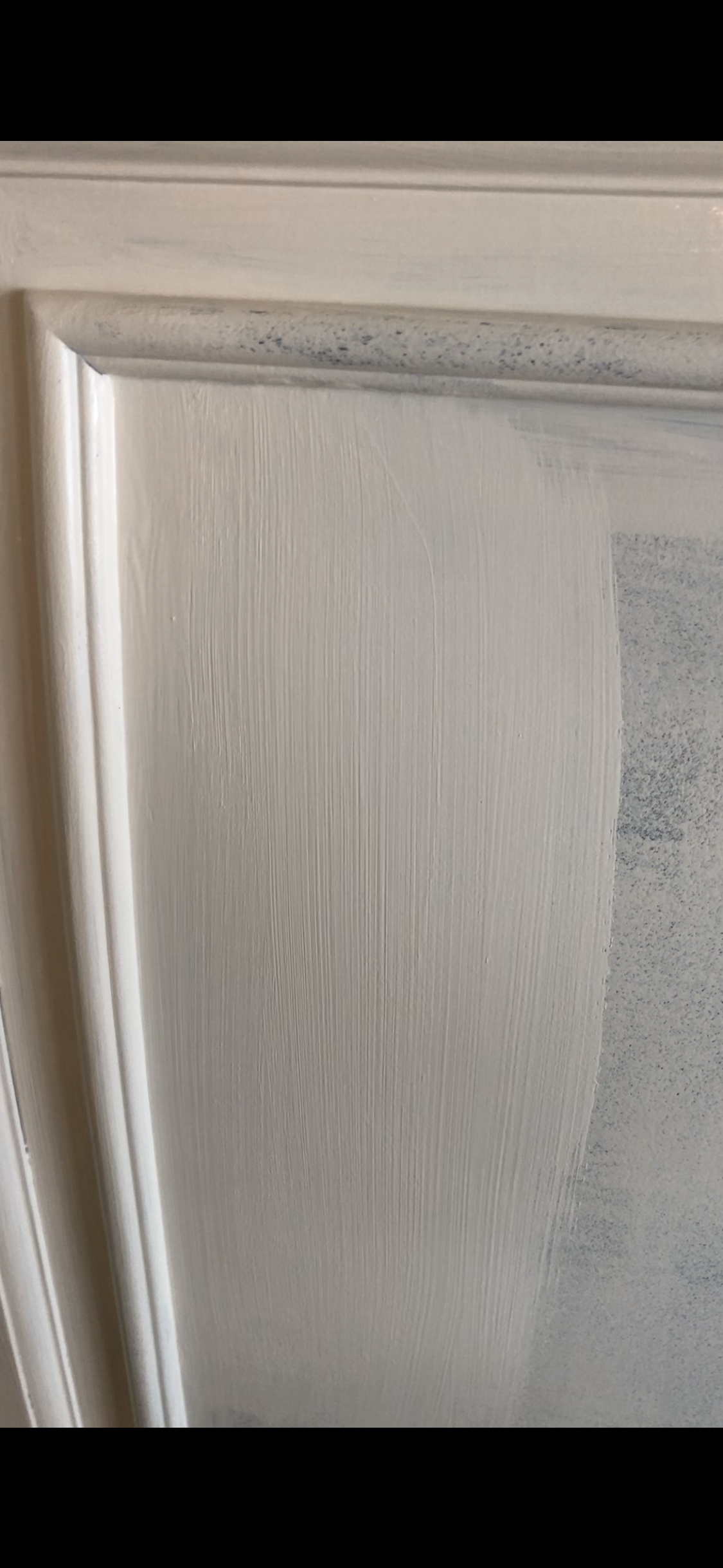
Let everything dry 12 hours and sand with the 320 (fine sand paper) all over. This just creates a really even finish. Focus on any drips or placed that are thicker than others. If you can feel a lip or thick place when you close you eyes, then sand it lightly.
Wipe the backs off with a damp cloth and paint a second primer coat, repeating the steps above. Let dry for at least 3 ours and flip, repeating the steps to paint the fronts.
Let both sides set for another 12 hours, lightly sand with 320, and wipe clean. If the primer looks like it has mostly covered the wood color underneath, move onto the top coat. I used dark top coat colors for some cabinets and light for others. The dark only required one top coat, but the light required two. My cabinets were all very dark wood as you can see int he pictures above of my kitchen before. If you cabinets where lighter, it may require less to paint them light.
Repeat the steps, letting the top coat dry, sanding, and wiping before painting the last coat.
I let the last coat dry for about 3-5 hours and hung them back up. I was just careful not to let them hit each other. This type of paint (no matter which one you choose to use) is an enamel. It cures much harder than regular paint, but it takes about 2-3 weeks to fully harden. So if they get hit hard before then, they may chip. That’s ok, just lightly sand around the chip and touch up the spot with paint and primer.
After hanging the fronts back up, and letting then dry for at least 12 hours, I went around and spot sanded any spots I thought looked uneven or had gotten dinged while putting them up. After 2-3 weeks, I touched up a few dings from the kids and I have had very few places I’ve had to touch up since.
October 30, 2018: Christmas Trends and Ideas
I know its too early to be decorating for Christmas (don’t tell some of my Instagram friends), but its not too early to be planning Christmas decor. I am definitely in the thick of planning mine. I took a few trips to Hobby Lobby and Ikea this last week to take pictures and hopefully give you guys some ideas of what is trending for Christmas 2018. I’m also going to share some inspirational pics for mantel, Christmas tree decor, and more for this upcoming season.
Lets talk colors for this year: Let me go ahead and say all my pictures this blog post are from Pinterest. Mainly because the only pictures of holiday decor I have of my own are my tree from last year, and even though I do think its pretty, its going to change some for this year. However, I plan to post on how to decorate a tree, garland, decorate a wreath, and make a bow soon and I will use all of my Christmas decor for that!
Light/natural decor has been in the last few years, and that’s going to definitely continue this year too, however the light is getting lighter.
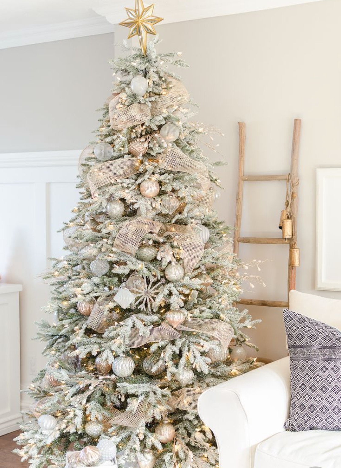
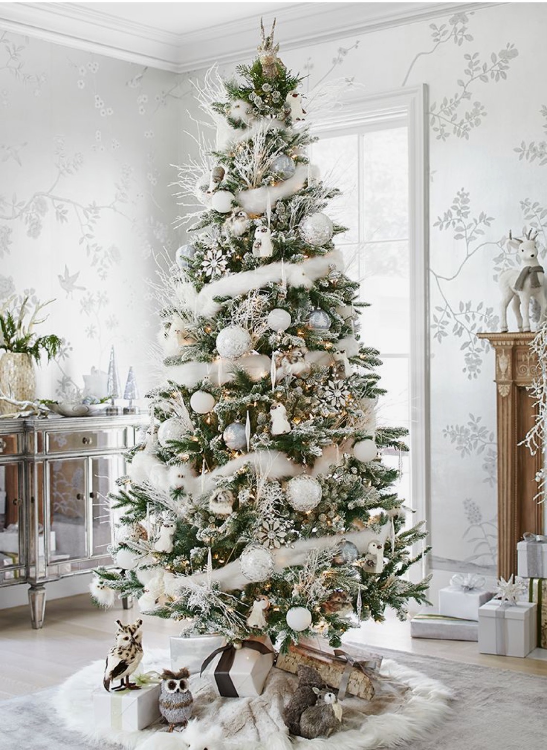

Notice a few things all, or most, of these trees above have in common that are trending this year: White decor is definitely popular this winter. Not only are white ornaments and floral a big thing, but also flocked trees. Flocked means they have faux snow sprayed all over. The first 2 pictures above are flocked trees. If you love that “snow covered tree” look, you would probably love a flocked tree. Some inside info - the tree I’m buying this year is flocked. I’ve never had a flocked tree so I’m super excited!
In addition to white decor which tends to pop, natural decor is also in style for this year. It has been a big trend for farmhouse decor lovers the last few years, but the natural decor is still going to be trending for quit some time, its just taking a more modern turn. Wooden ornaments, pine cones, acorns, and berries are just a few examples. Gold, bronze, and champagne are also colors that are great for natural or light trees.
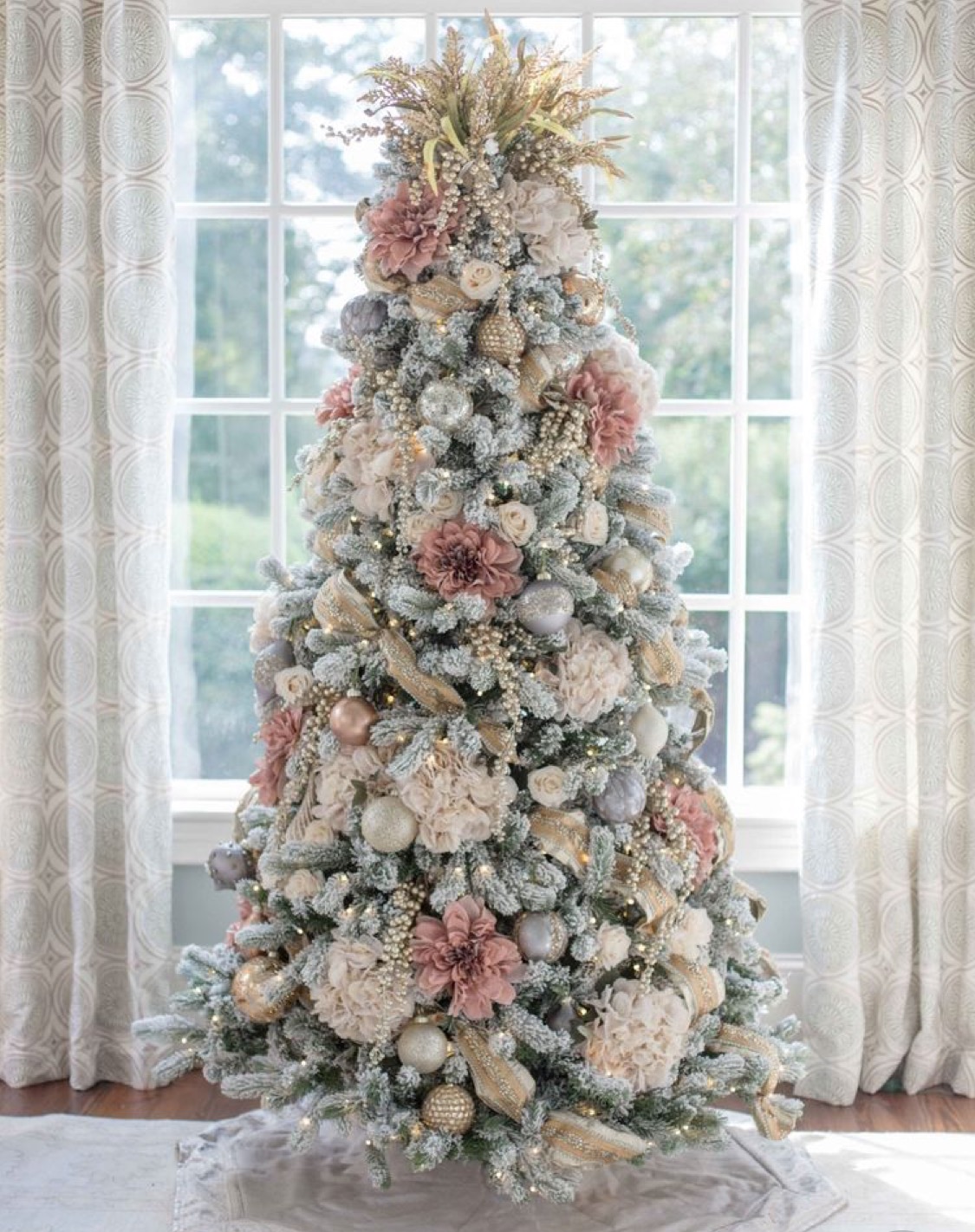
If you want to go super trendy this winter, modern looks include jeweled tones like olive, dark teal, and navy. Pairing these with non-wintery greenery like eucalyptus and love branches gives a very minimalist, modern look.
Lets talk more traditional trees:


All of the trees above are great examples of red and green trees if you want to keep the traditional Christmas colors front and center. Once again, the natural decor like berries and pine cones are still an important part of all of the trees above, and so are metallics like gold and silver. You can still do a flocked tree like the center one with more traditional colors too.
Far all trees, some must haves to creating a beautiful tree like the ones above are:
1. Nice thick, wired ribbon- for all throughout the tree, a bow on top, or both. Look for a blog post from me soon on how to put ribbon on a tree, garland, and how to make a bow for a topper.
2. Floral - the bigger the better! It can be Christmas floral or something more modern like eucalyptus or lambs ear. I’ll show a few examples below. Floral fills a tree quickly and fills in holes in the branches. Its especially helpful in real trees with natural gaps in branches.
3. Different size balls - always put larger balls in closer to the trunk of the tree to create depth and fill holes. Put smaller balls out towards the end of the branches.
4. A tree skirt or basket- there are so many creative ways to cover up the base of the tree. A few ideas are posted below!
Mantel Decor - There are so many ways to decorate a mantle. You can keep it simple, go traditional, or more minimalist and modern. Below are some ideas:
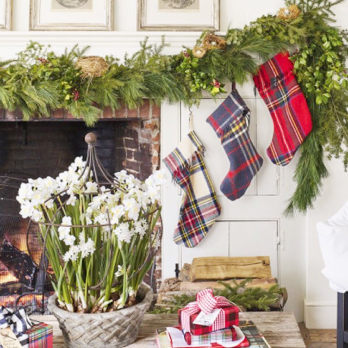
As you can see, all of these garland have one thing in common: they are all very natural and feathery. Trending this year for mantles are very skinny-leaved garland mixed with other types of leaves like eucalyptus, berries, pine cones, and lambs ear as in the first picture above. If you want to be even more trend setting and modern, go with straight eucalyptus or olive branches like the second and last pictures. A modern look is also achieved by simplicity including the greenery and a few candle sticks, along with minimal color.
If you are not a garland person, you can also decorate your mantle with a few miniature trees like the third picture above. Just make sure you create appropriate height! You don’t have to change out everything on your mantle to have great Christmas decor either. You can just add some greenery and/or lights to your normal mantle items.
So now here are some practical ways to get to these ideas! Below is a collection of cute decor stuff I found at Hobby lobby that can each help create all of the looks we have discussed above.
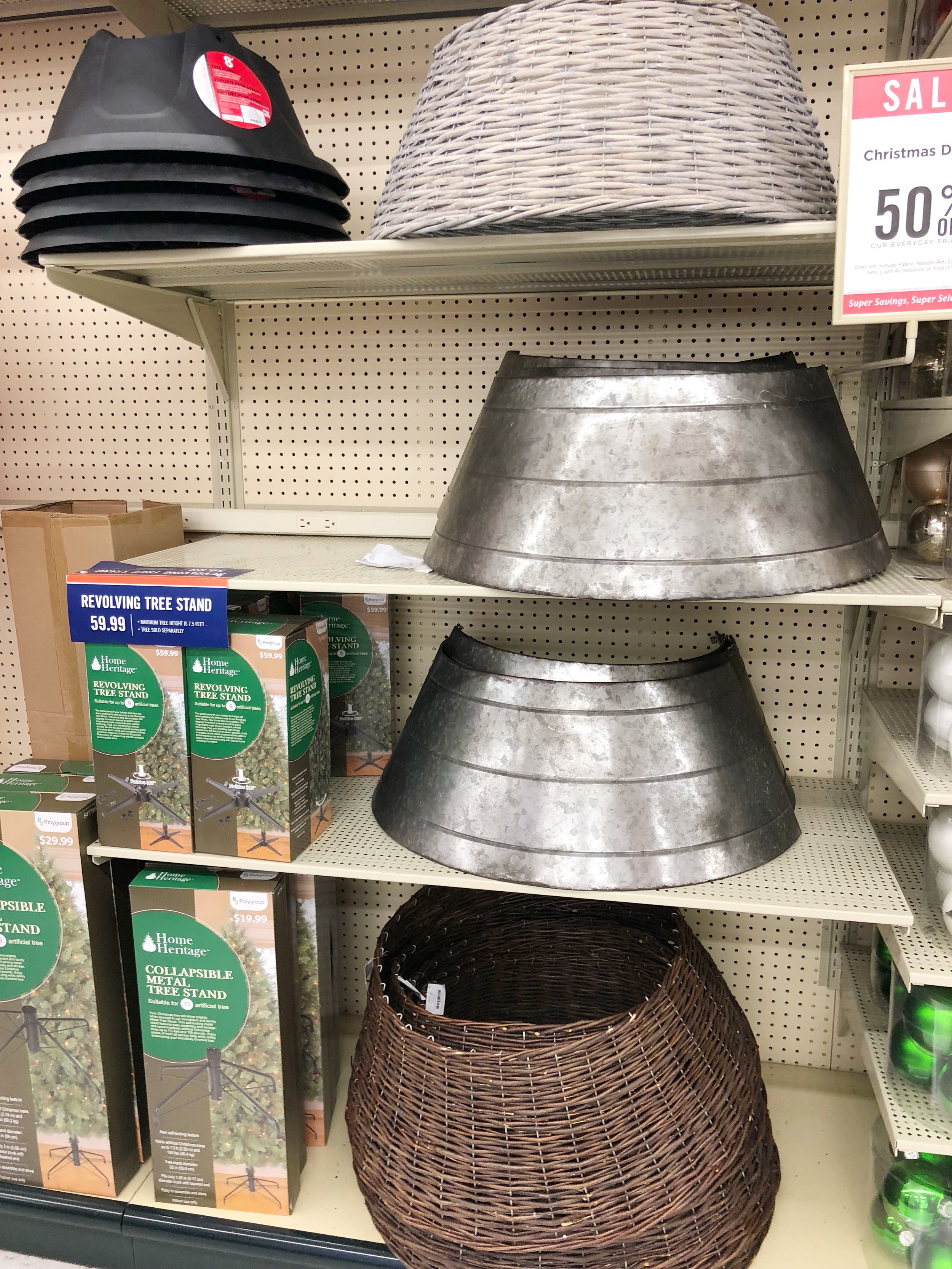
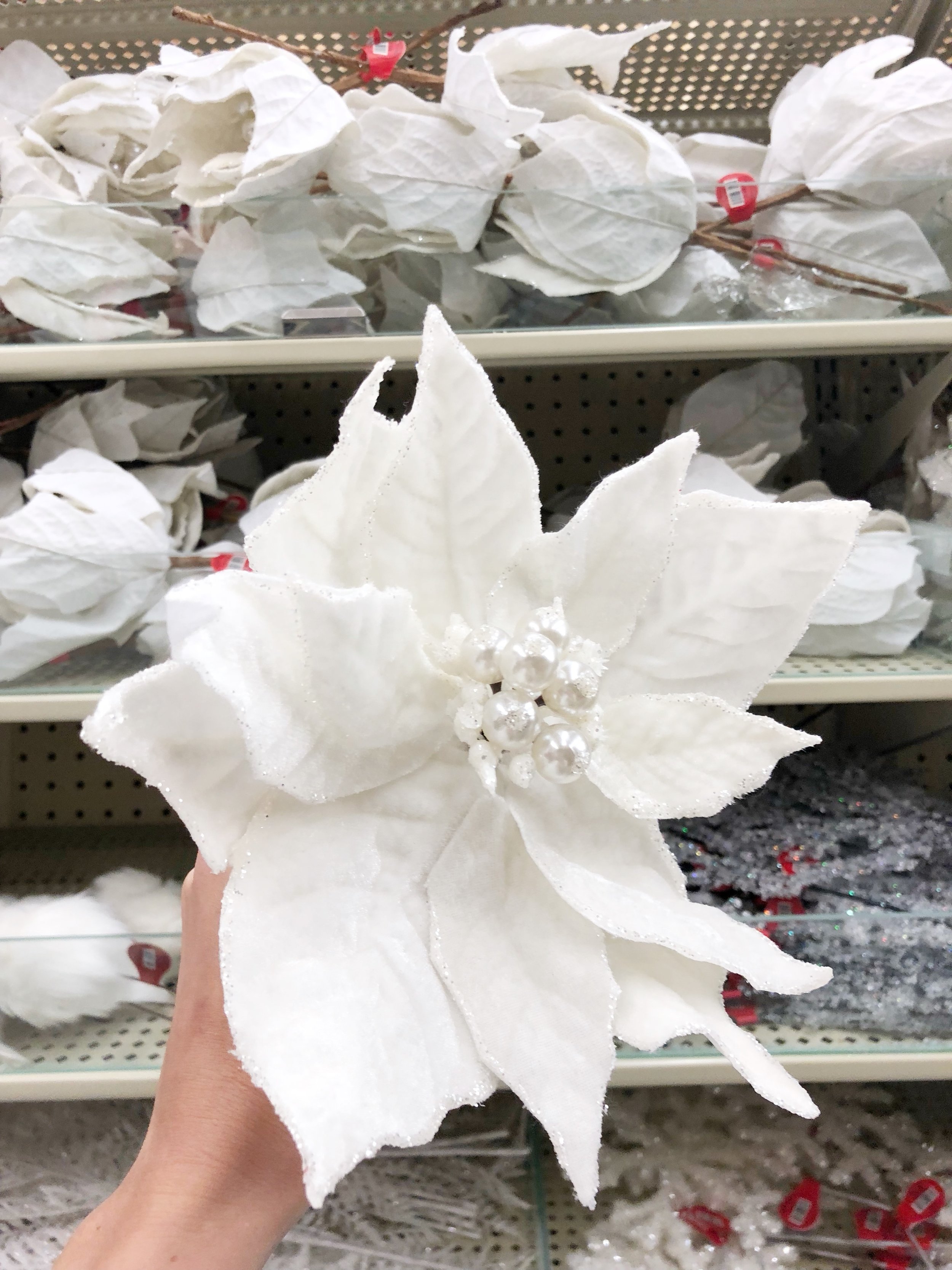

The first picture above are a couple of cute options for covering the base of your tree instead of a classic tree skirt. They had galvanized steel and baskets in a few colors as alternatives. Super cute! The second and fourth pictures are a few examples of great floral to create a neutral tree. Add some of those GORGEOUS olive velvet balls or some red berries to create a more traditional tree. Olive and navy are also very trendy modern colors for this upcoming season.
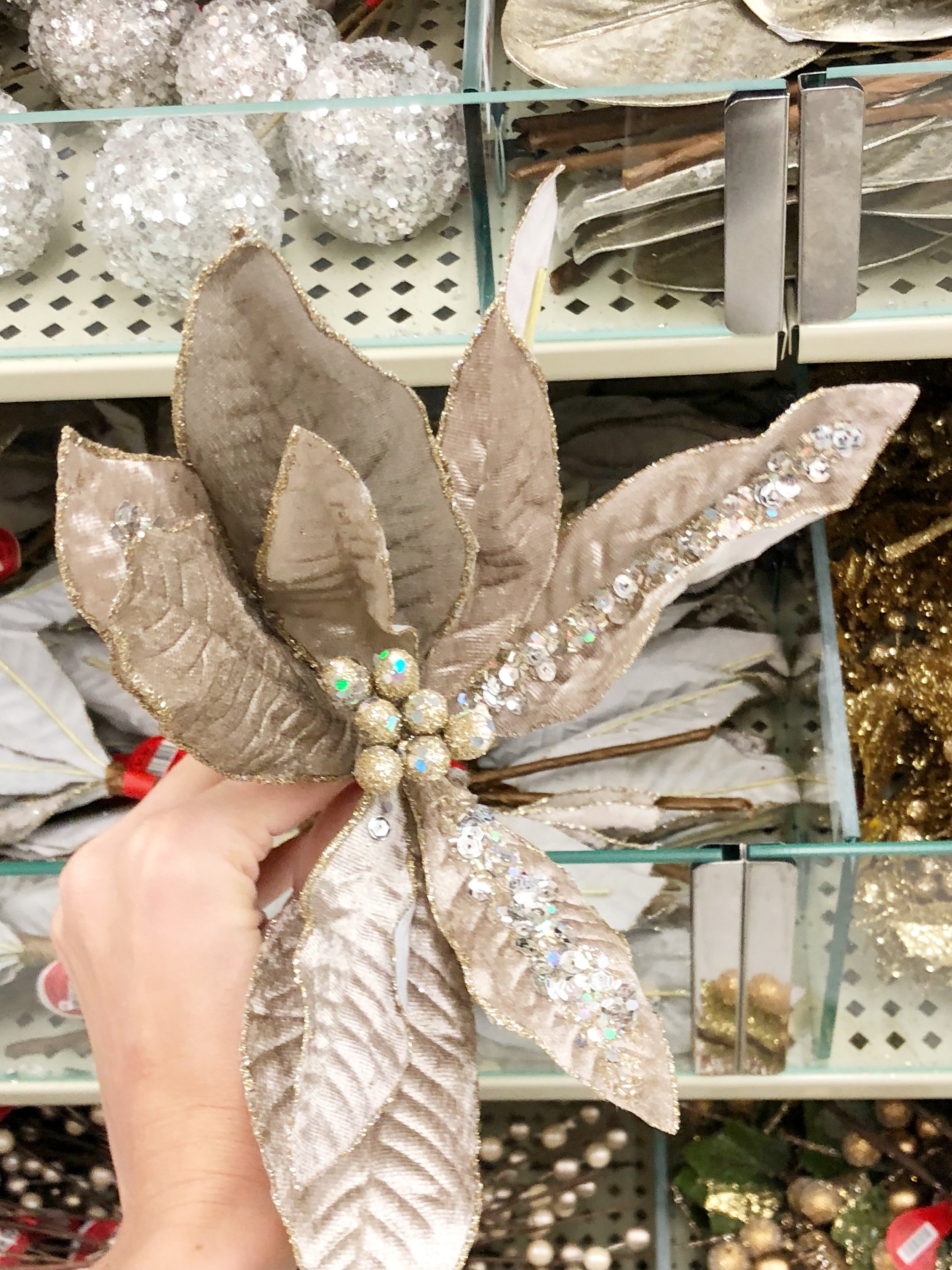
Below from left to right: Some pretty feathers which I thought was really different for tree and garland decor, a great package of gold balls in different sheens - this one container is enough for one normal size tree, and they are plastic so no breaking! The third picture is a close up of a great garland they had- $25! It has that feathery look and includes small pine cones which is one less thing you have to add on your own. The last picture is a HUGE velvet white and gold floral stem that I will definitely be using for my tree this year. It will only take about 5 of those bad boys to make a statement!


Below are some great items to help decorate a mantle. The first are these amazing gold or silver standing branches. These would be perfect at different heights to create some beautiful interest on a mantle- I will be using these guys for mine for sure! The second picture are these simple wooden trees. Again, grouping them in pairs or in three’s at different heights will create a beautiful look. Next is a picture of some balls that caught my eye. They are navy fabric-wrapped. Again, something more modern and non-traditional in color if you want to go different this year. The last picture is a pair of cone trees. These have so much texture. They would be so cute on a mantle on top of a few books to create different heights.
To my surprise, as I was buying some other stuff for a few clients, I stumbled upon a whole Christmas decor area right before the check out at IKEA. I couldn’t believe how cute and cheap it all was so I wanted to share it with you!
The first picture is a super cute boxwood topiary. These would be cute for porch Christmas decor with a small strand of light in them or any time of year on each side of your front door. They are $40! The second picture is a eucalyptus wreath. So fresh, modern, and clean. You could add a few berry springs or a small bow to make them more traditional. The last wreath is a mix of pine branches and 2 different kinds of eucalyptus. It has so much texture and is a mix of modern and traditional. Both of these wreaths are only $15! Ikea also has these really cheap, realistic springs of eucalyptus that can be used all year long in a vase, or mixed into your tree or garland.


OK, I wanted this blog post to get you started with your Christmas decor plan. You’ve got to get out and get most of this stuff soon before it sells out, or gets picked over. You don’t have to put it out until after Thanksgiving, but having a plan can save you some time and money. Stay tuned to more in depth, tutorials for Christmas including bow making, and more tree decorating tips! I will even have some videos on my Instagram on how to decorate for Christmas. Follow me @kindandabell !
October 22, 2018: Creating a Guest Room
This past weekend (they left yesterday) my good friends came to visit me here in Denver. I didn’t use to think about it that much, but now that I have kids, traveling has a whole other goal: resting away from your children haha. Especially if I bring my children with me, there are several things that are nice to have in a guest room. Now that I have my family and friends staying overnight to visit me, I wanted to create a sort of retreat for my visitors, with or without kids.

Here are a few pictures of my guest room I just finished sprucing up before my guests arrive. There are a couple of obvious things:
A nice bed- Guests appreciate a bed that’s comfy and fresh. To accomplish this, make sure its at least a queen, and use light colored (white is the best) sheets. I love having 4 pillows for guests because some like to hug a pillow or put one between their legs when they sleep, in addition to the one for their head.
A side table with room for their phone, water, etc- a lamp is nice too. Some guest like to read before bed and an overhead light is too much to wind down. I have too small of a table for a lamp, but I’ll be working on this haha. Something you may not think about is an extra phone charger by the bed side table. Notice I also included a WiFi password sign, this is something guests love.
A space for their clothes and bag- Guests love to have a place to set their bag so they can go through it easily everyday. I think its important to either have a chair in the corner or even better, a bench under the window or at the end of the bed. This is a great place for guests to keep their bag off the floor.
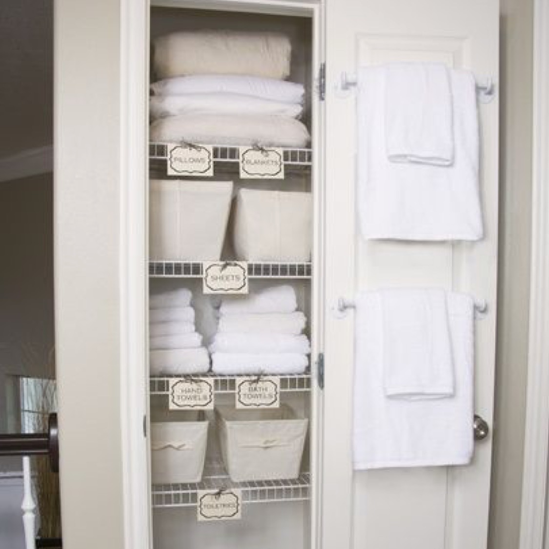
A guest closet in the room or bathroom with a few essentials: extra blankets, towels, empty hangers with space for them to hang some of their clothes, a place on the floor for their shoes, extra tooth brushes, an extra hair dryer, and some mild pain relief for headaches and such. This is important here in the high altitude for sure.
Black out curtains: I wanted to make sure that, especially with the time change, my guests could block out the light to be able to sleep in. Once again, this goal gains a whole new meaning when you are traveling to visit me with out your kids, I want you to be able to sleep in if you want! This guest room has a ton of natural light so I got a couple pairs of curtains I knew would block out light really well.
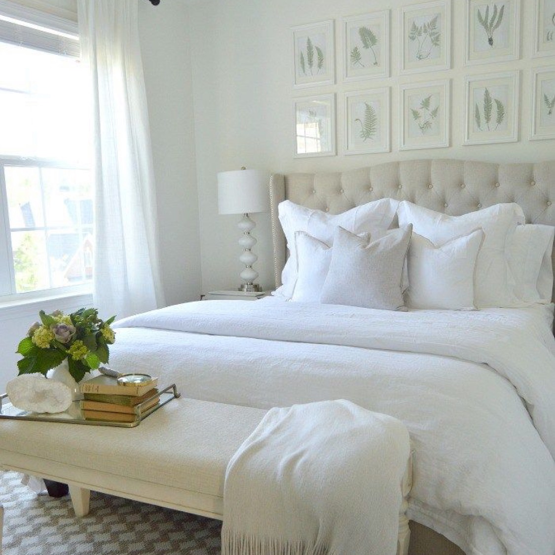
These are a couple pictures of some really pretty, simple, guest rooms off Pinterest and an example of a cute guest closet. The bedrooms have a few things in common I discussed earlier: Simple clean light bedding, complete with a set of euro shams and throw pillows, They both have a nice sitting area and/or bench for guest bags. They also both have a nice bed side table with a lamp and room for guests’ personal items. I love that the last one has extra blankets under the bench as well.
Notice the guest closet is organized and not over whelming. Things are labeled and notice they are all white. Guests love white towels: not only can they be bleached, but they look clean and fresh. These can all be things that are kept in a linen closet for guests or can be organized with in the guest bedroom closet.
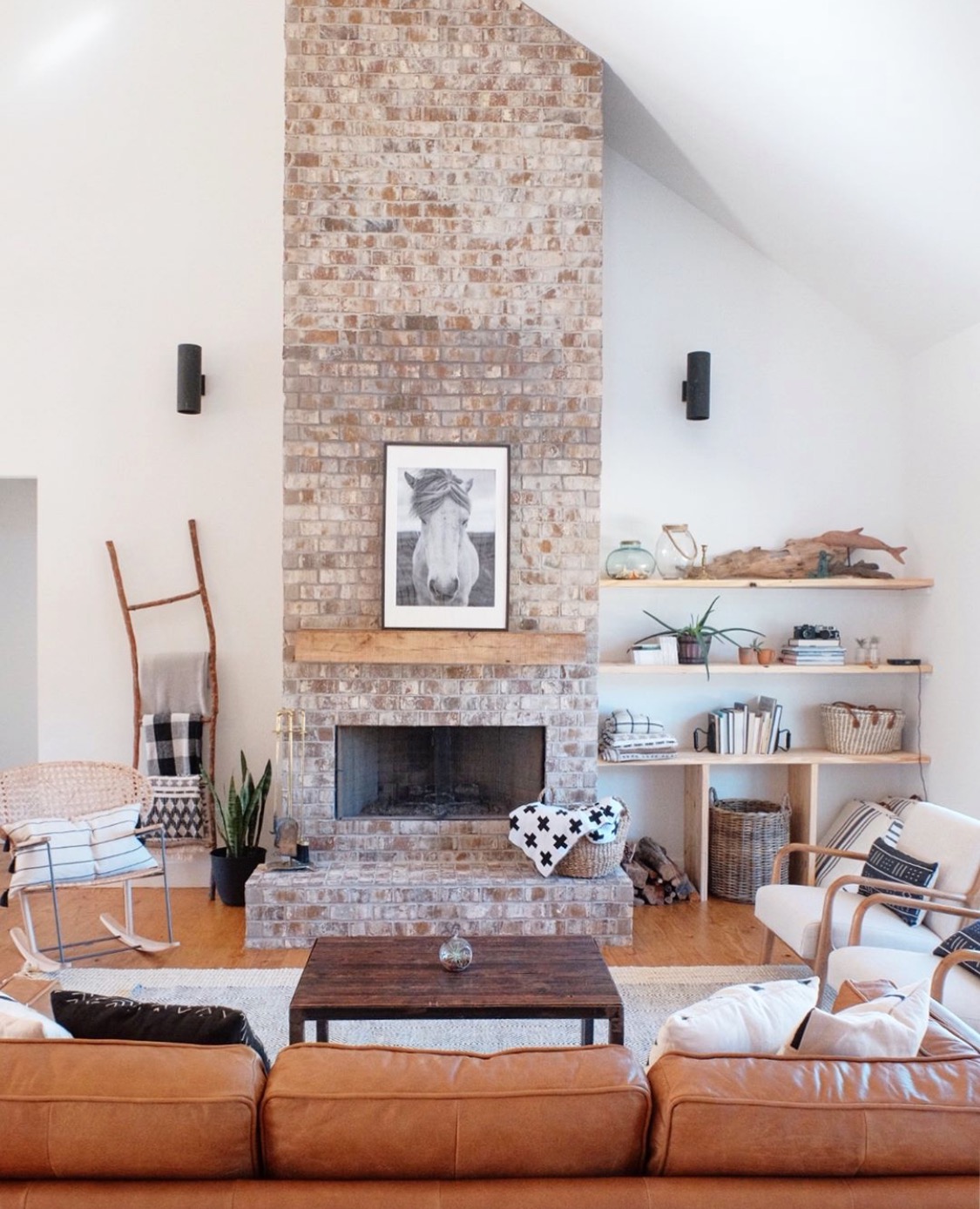
October 15, 2018: Decorating a Mantle
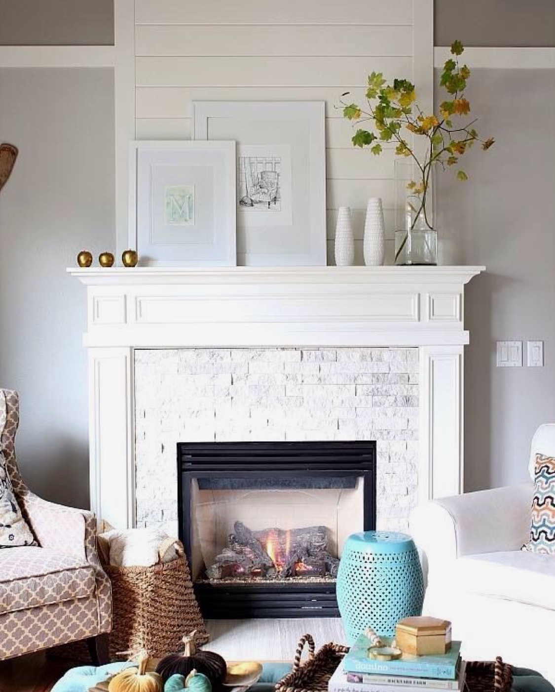

If you’re like me, a good fireplace and mantle is what grabs your eye when you walk into a room. Its usually the focal point of a living room and it can really make or break the warm feeling a room has if its not styled correctly. I have some really easy step,s and some great examples from Pinterest and my own designs, to help you decorate your mantle. Whether you want to keep it simple, do it big, or have a TV above it, I’m here to help!
Designing a mantle has a couple important elements:
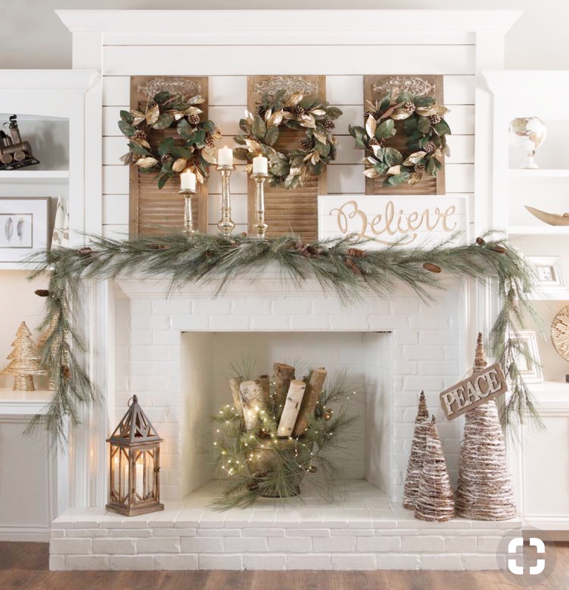
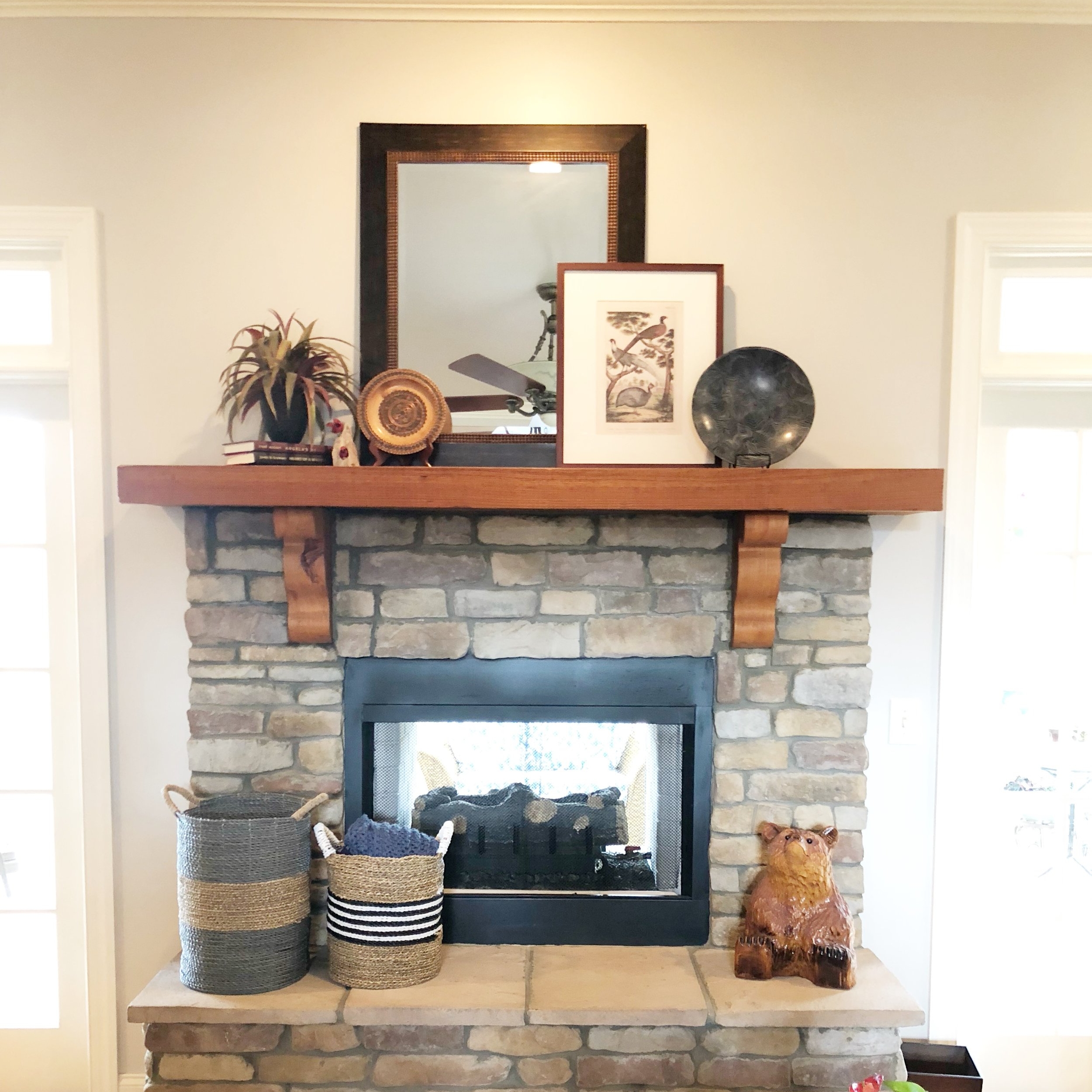
Appropriate height - many people keep their fire place decor too flat. What I mean is, whatever the distance between your mantle and your ceiling is, you should have something tall enough up there that it almost reaches the ceiling. This goes back to that whole “brings your eye up” thing. If you have 8 ft ceilings, hang/set a picture or mirror above your mantle that almost reaches the ceiling (like 1-2’ away). If you have taller ceilings, you still need to fill the space up there, you just don’t need to go as close to the ceiling. For 9-10 ft ceilings go 6-12’ from the ceiling. If its a TV, keep it from being too high to easily watch. Notice in the examples below: The highest object fills up the space between the mantle and the ceiling.
2. Plants: You need at least one plant on your mantle. I know I’m repeating myself, but plants give that fresh, clean feeling in your house that you strive for. Your mantle is no different. Greenery can easily add height with out you spending a lot of money too. Notice the 3rd picture above from Pinterest, that is a simple vase with a couple sprigs of greenery - immediate height and interest.
3. Layering: Layering is a great way to add interest and style to your mantle. It gives that “I didn’t try but it still looks great” look. It also can create a more casual look. Start by setting your largest object in the middle or slightly off set, then set a smaller object in front of the left or right %25 of the bigger object. Use the middle picture above as an example. You can start with 2-3 framed objects then add 3-4 smaller and non square objects on the sides. This brings me to my next trick:
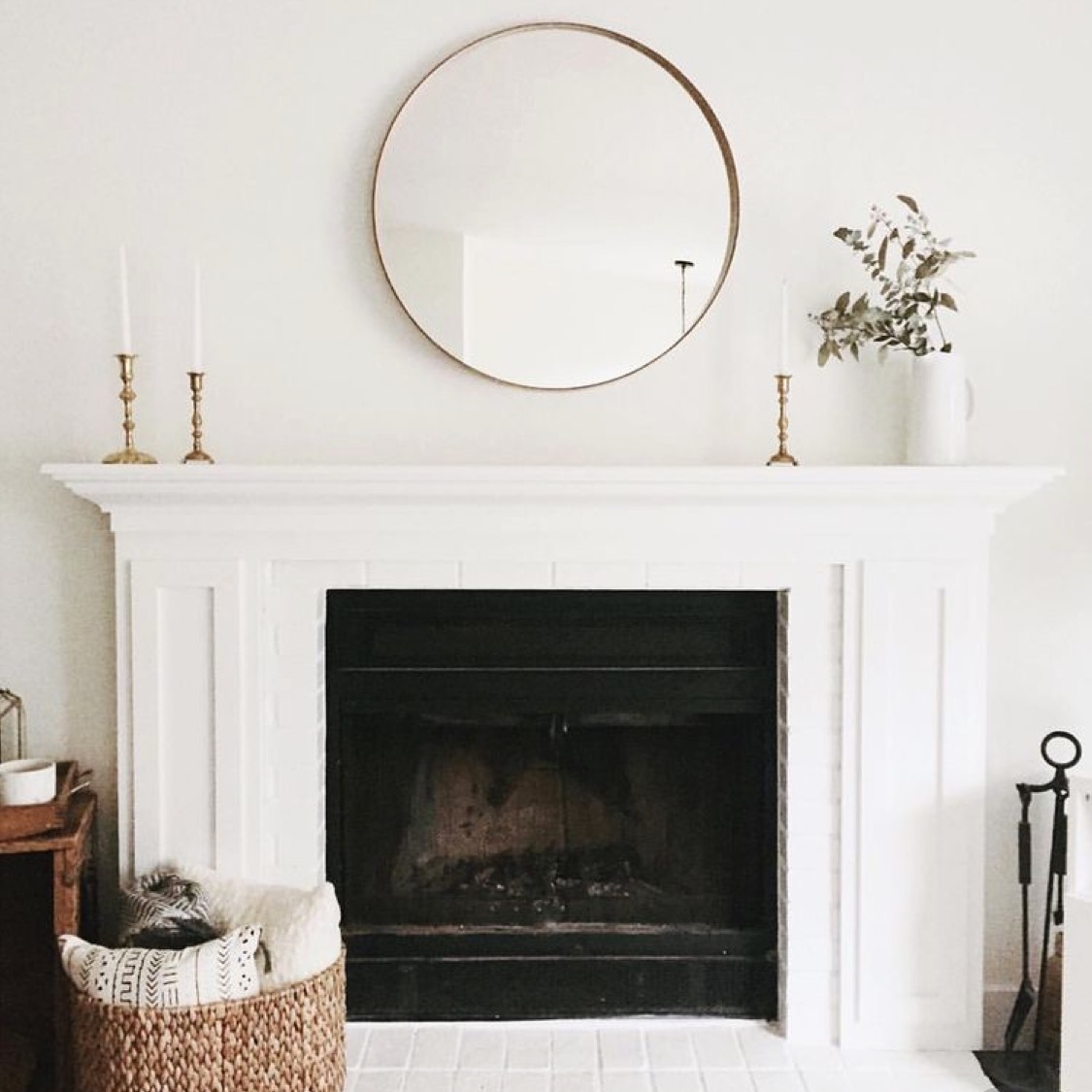
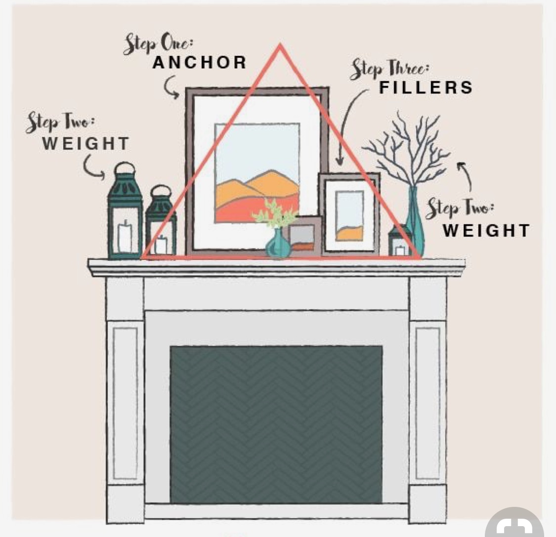
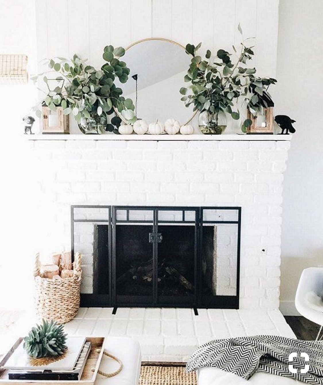
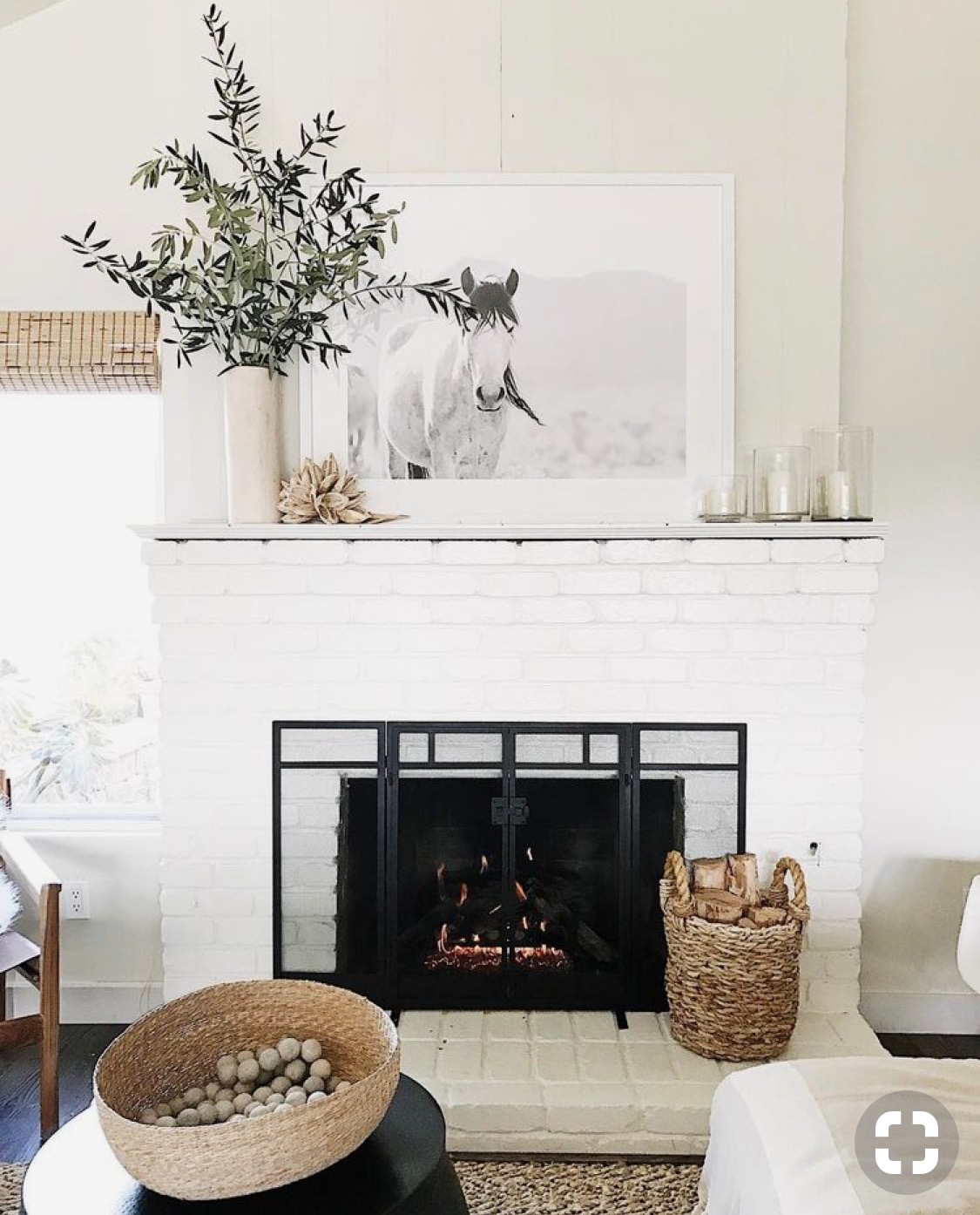
4. Make a triangle: This isn’t something you have to do (The picture up near the top with the horse art is an example) but it can make things easier. Start with your biggest object in the middle and work towards the outsides with smaller objects. Make sure you have some “weight” or more substantial objects on the out sides and your smallest objects in front towards the center. The middle picture above I snagged off Pinterest I thought explained it well. The first and last pictures are a few faves of mine from Pinterest as well. Notice they both have the big round mirror in the middle and shorter objects on the sides.
5. Simplicity: Keeping it simple is totally great as long as there is still interest and the space is filled upward. The first picture above is a great example. That mantle is so simple but it works because the space is still filled, it’s not “dinky” for lack of a better word. There is height, and interest - objects with different shapes and textures.
6. Symmetry: Try not to be too symmetrical. This hurts the interest you are trying to create. The last picture above from Pinterst is a great example of a symmetrical mantle that looks really good. Notice they still have lots of different shapes and textures.
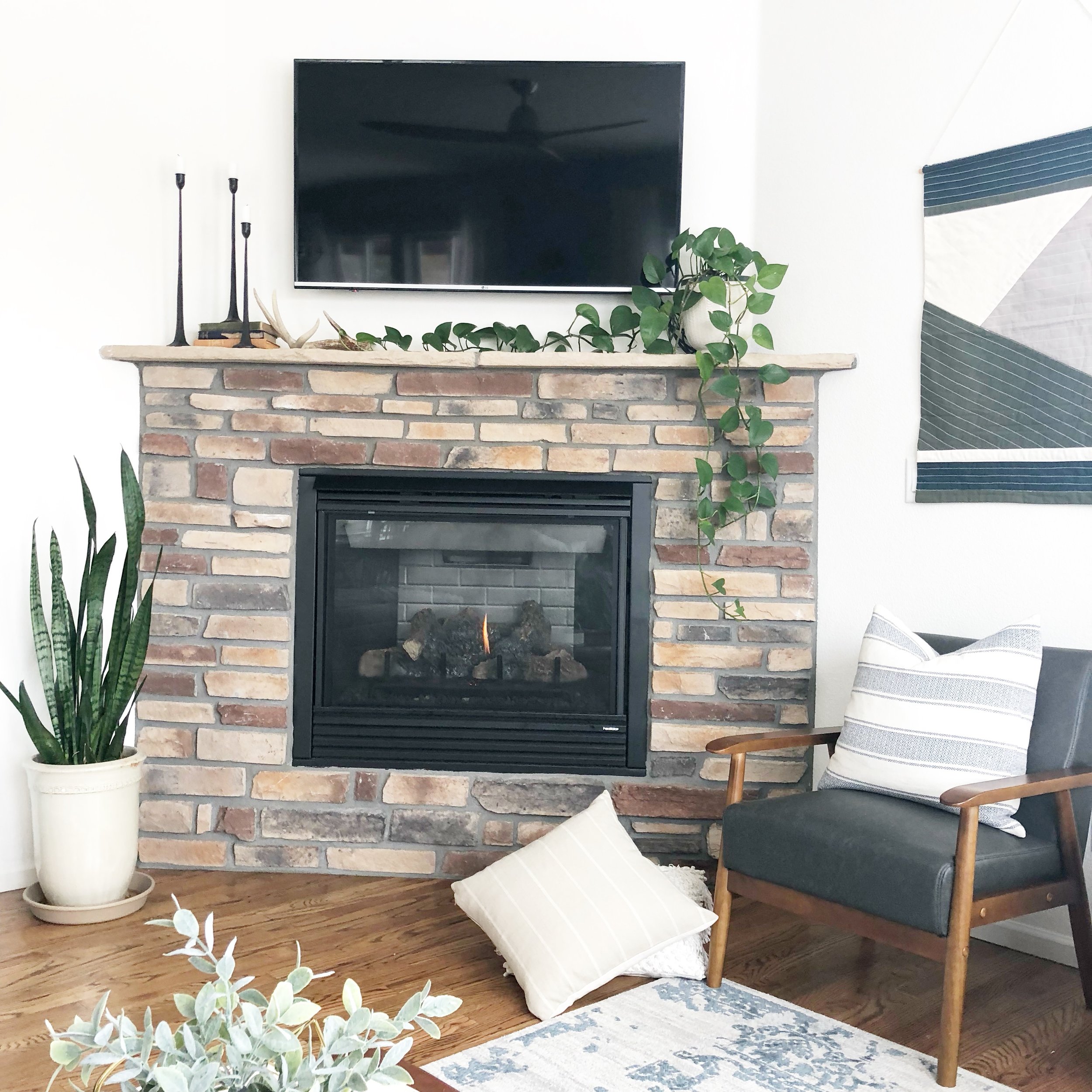
7. TV’s above the mantle: You can still decorate around a TV. Keep it simple, but use the TV as your weight in the middle. You can be symmetrical and just do a topiary or candle stick on each side, or you can create more interest by doing the same things as we talked about above. Get some objects of different shapes and sizes, a plant, etc, as long as you don’t obstruct the view of the TV. If you have built-ins on the sides, you don’t need as much interest on the mantle because the interest is on each side of the mantle like the second picture below. If you don’t have built-in’s try to create the interest as if your TV is part of you mantle decor like the first picture below.

Use the holidays to change up your mantle a little. You don’t need to redo it all, just add a few small pumpkins or lights, or replace some of your smaller items with holiday themed things. Instagram has a TON of great holiday mantle ideas. I hope as the holidays come, you have some great direction now to get your mantle spruced up!
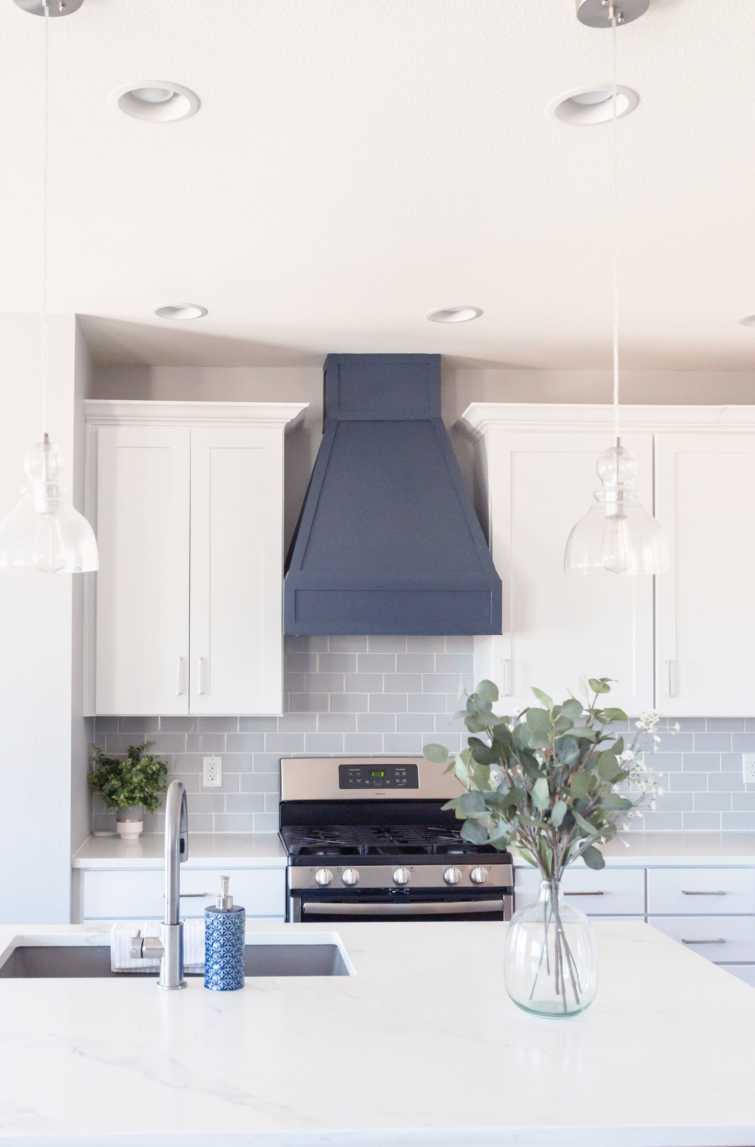
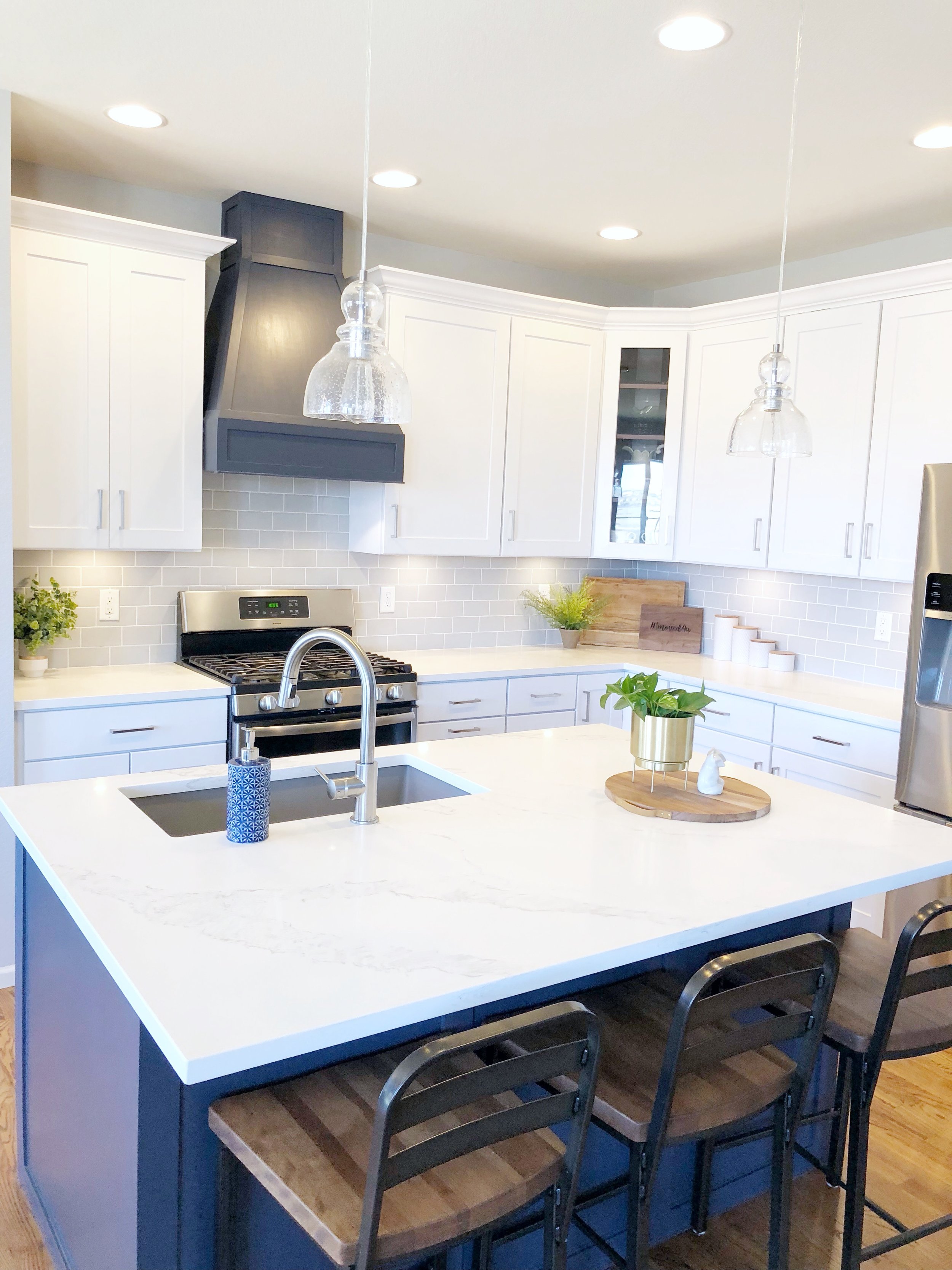
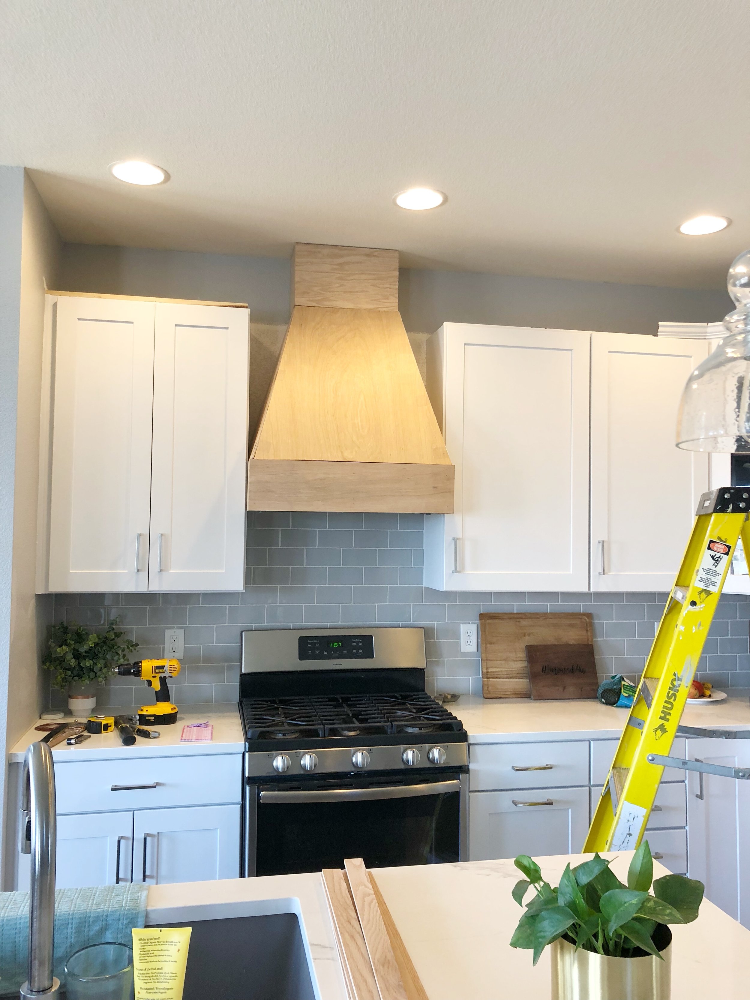
October 8, 2018: Building a Custom Wooden Range Hood

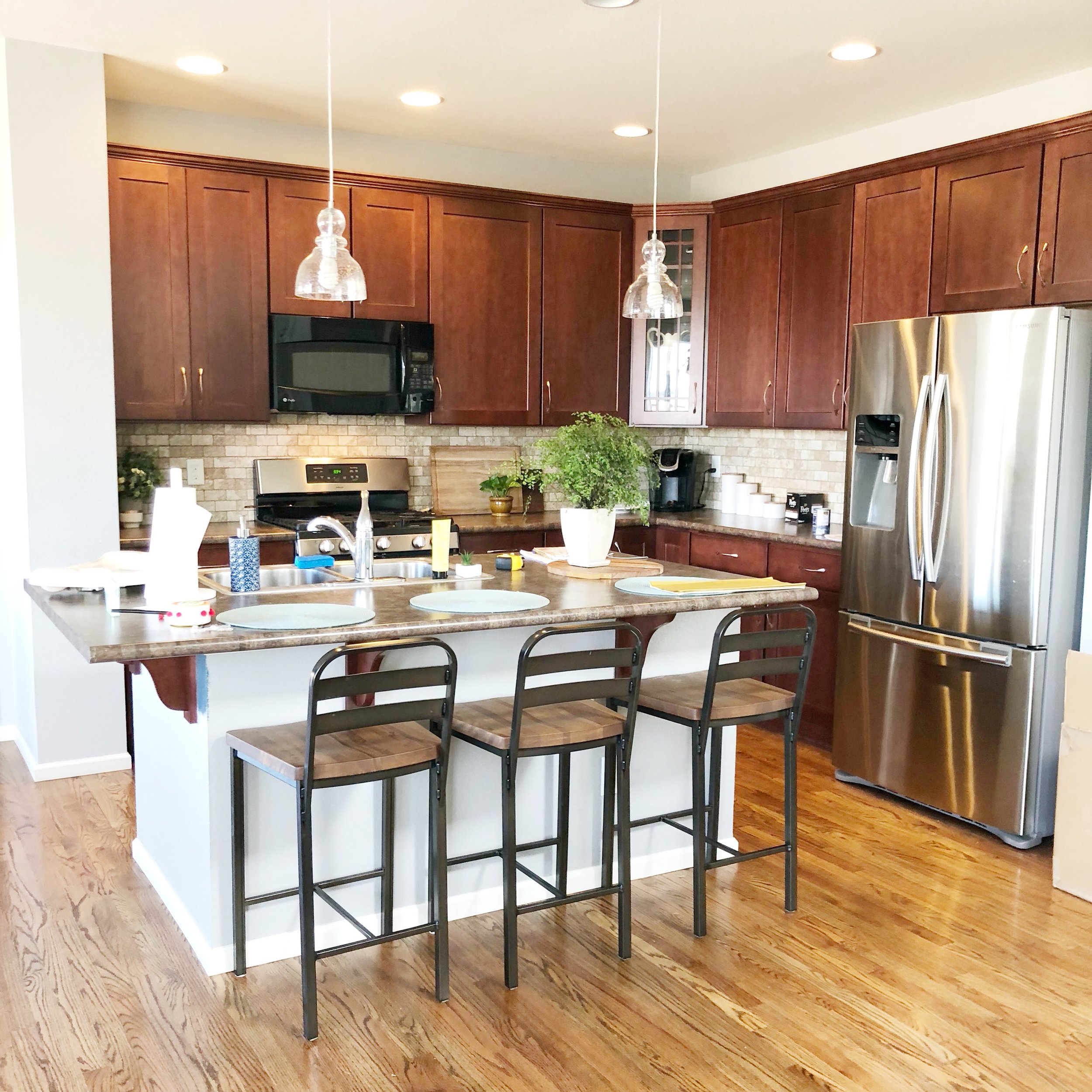
When we walked through our house for the first time, I had an immediate vision: Paint the cabinets white, install a beautiful wooden range hood over my range, and paint the island a dark color. At the time, there were cabinets and a microwave over the stove. I donno how you feel, but I hate seeing a microwave in a kitchen. In our last house, we took it down and put it in a cabinet. In this house, we put the microwave in the pantry because our pantry is huge and I don’t mind walking around the corner to use the microwave.
We decided to tackle the hood install along with our new back splash, counter top and under cabinet lighting install. If you want to do a new hood, I highly recommend installing under cabinet lighting at the same time so you can wire everything behind the hood and it not be seen. I will cover under cabinet lighting soon!
We started by removing the existing cabinets and microwave and taping off the vent opening in the wall. Then we measured how big the opening for the actual vent hood insert would be so we could order that. My husband was in charge of the frame and chose to use 2 x 4’s to build it. We calculated that we had 30” of opening between cabinets, and 3 1/2” of that was going to be the frame, so I found a vent hood insert that would fit a 26” opening. That allowed for room on the outside of the frame to add the veneer wood covering. I chose a vent hood insert from build.com that had good reviews and wasn’t super expensive. We spent about $250 on a vent hood insert that had medium power and good reviews - and most importantly fit our opening. If you have 30” common range, and build your frame the same way, then you will also need a 26” insert.
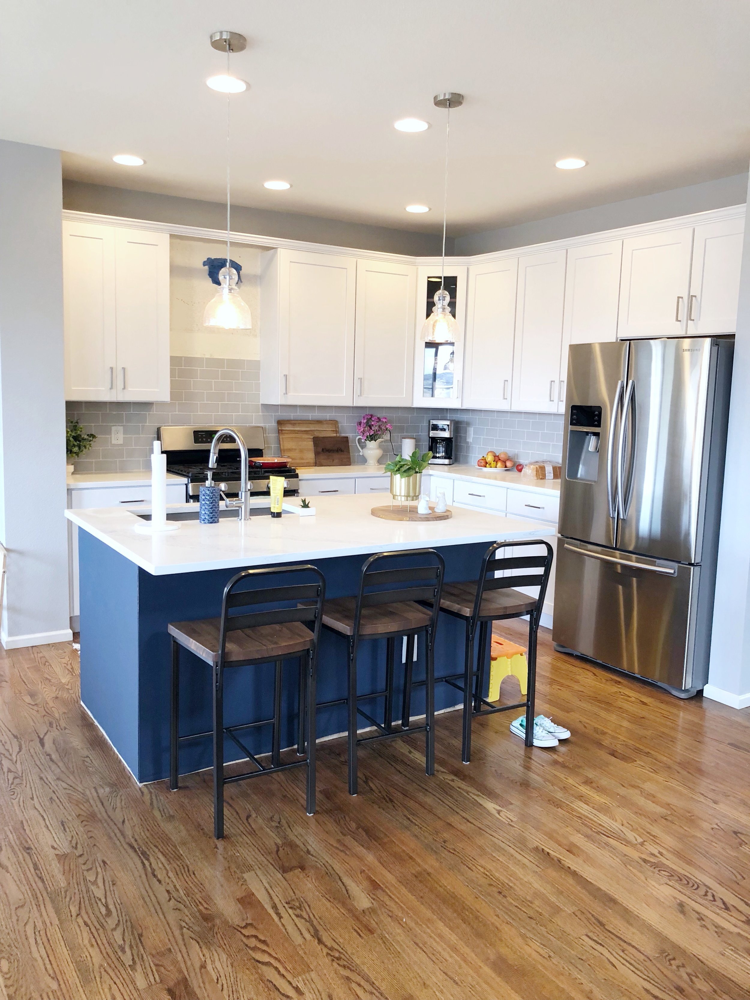
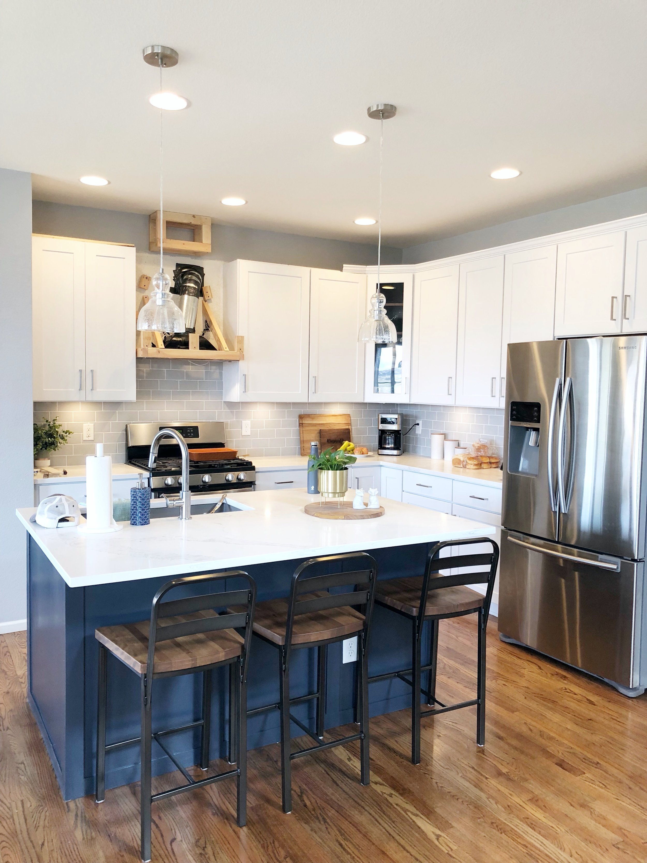
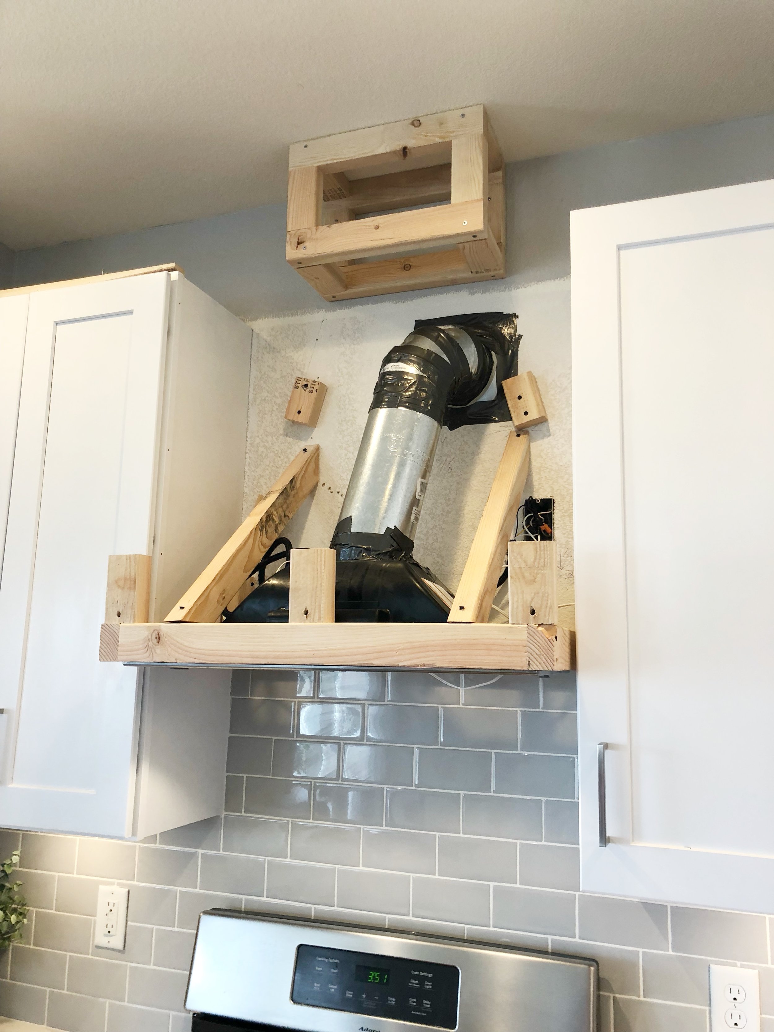
As you can see in the pictures above, after getting the insert in, and dry fitting it with the frame plan my husband created, we framed the hood by creating a box of 2 x 4’s around it, attaching that to the studs in the wall, and then attaching that with angled braces to the wall into the studs. He added pieces to the front, and some braces on the wall for the front of the hood to attach. Then he built a box at the top to connect the front to the ceiling.
The next part was venting the hood. He had to buy pieces of 6” duct and used duct tape to vent the hood to the current venting to the outside. This took some manhandling on his part, but he got it done. The last thing he had to do was hard wire the hood to the outlet behind where the old cabinet was. This is also a good place to install your under cabinet lighting into this same outlet. The last picture above is to this point.
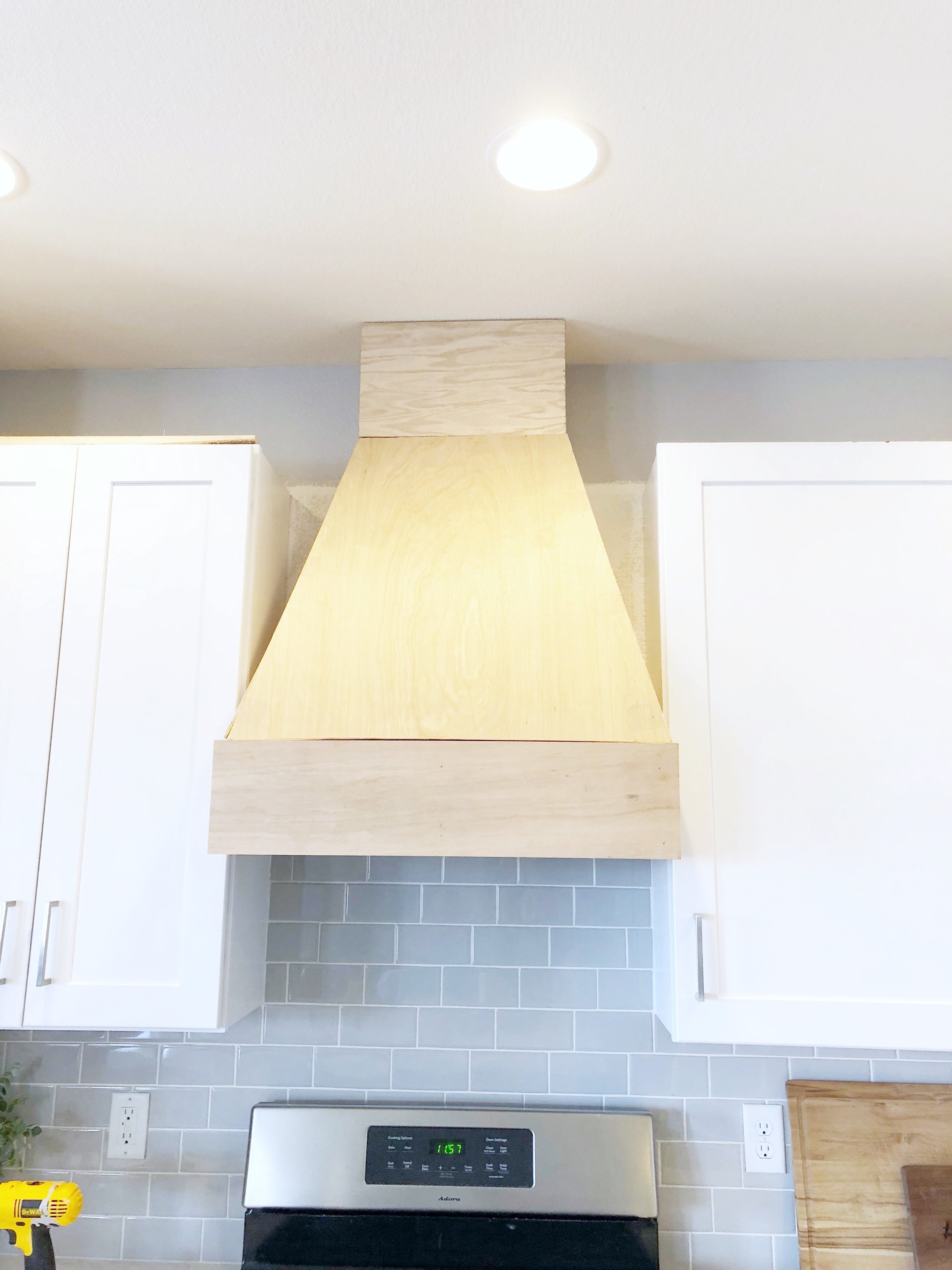
The rest was my job. I had in my head what I wanted the hood to look from the beginning so that wasn’t a problem. I bought oak veneer sheets that had good quality wood veneer but that were thin enough for me to cut with a box cutter. If you don’t use a box cutter, the veneer will split. You basically are covering a box on 3 sides, bottom and top, and then creating 3 pieces that will connect those at an angle.
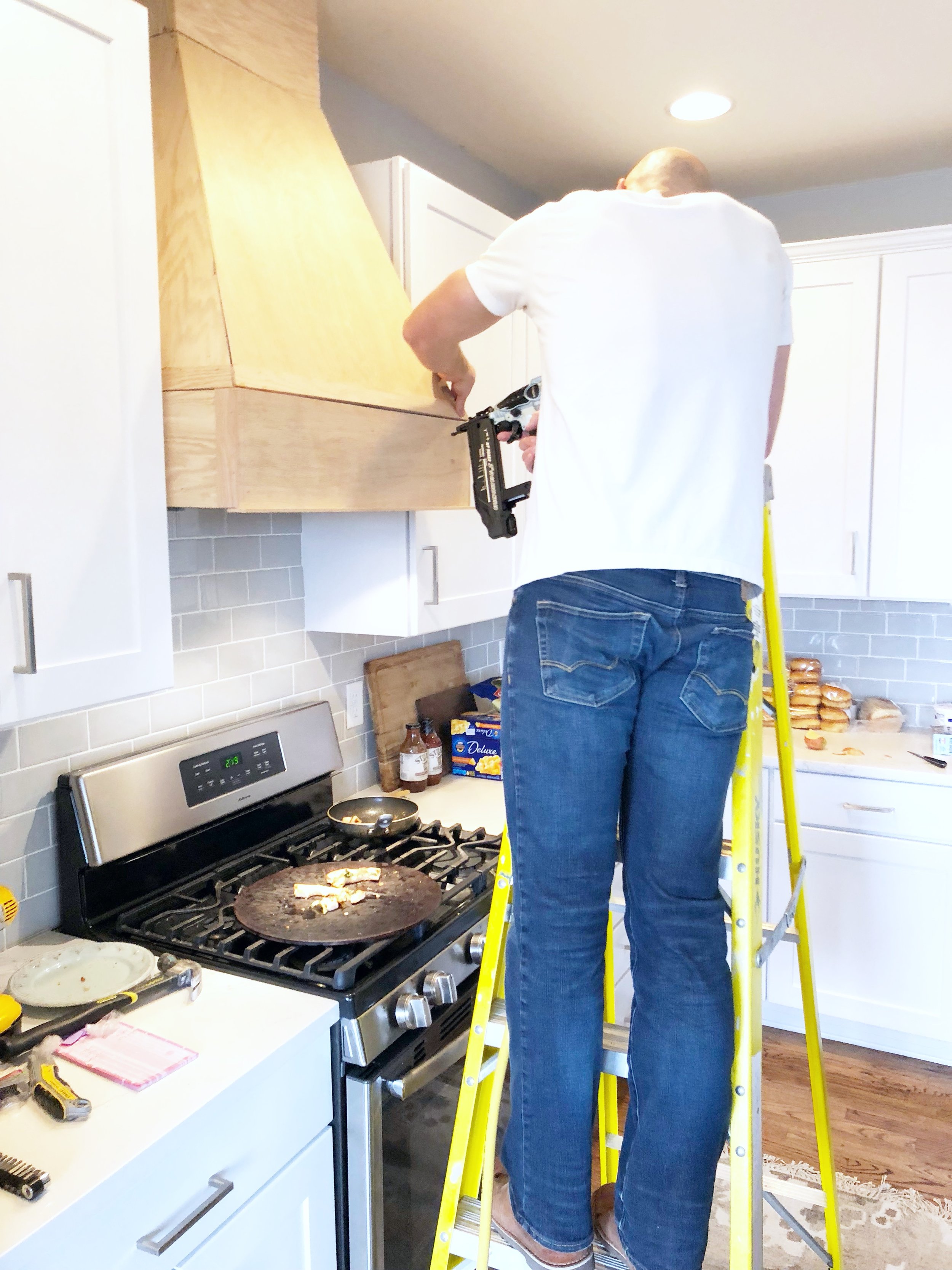
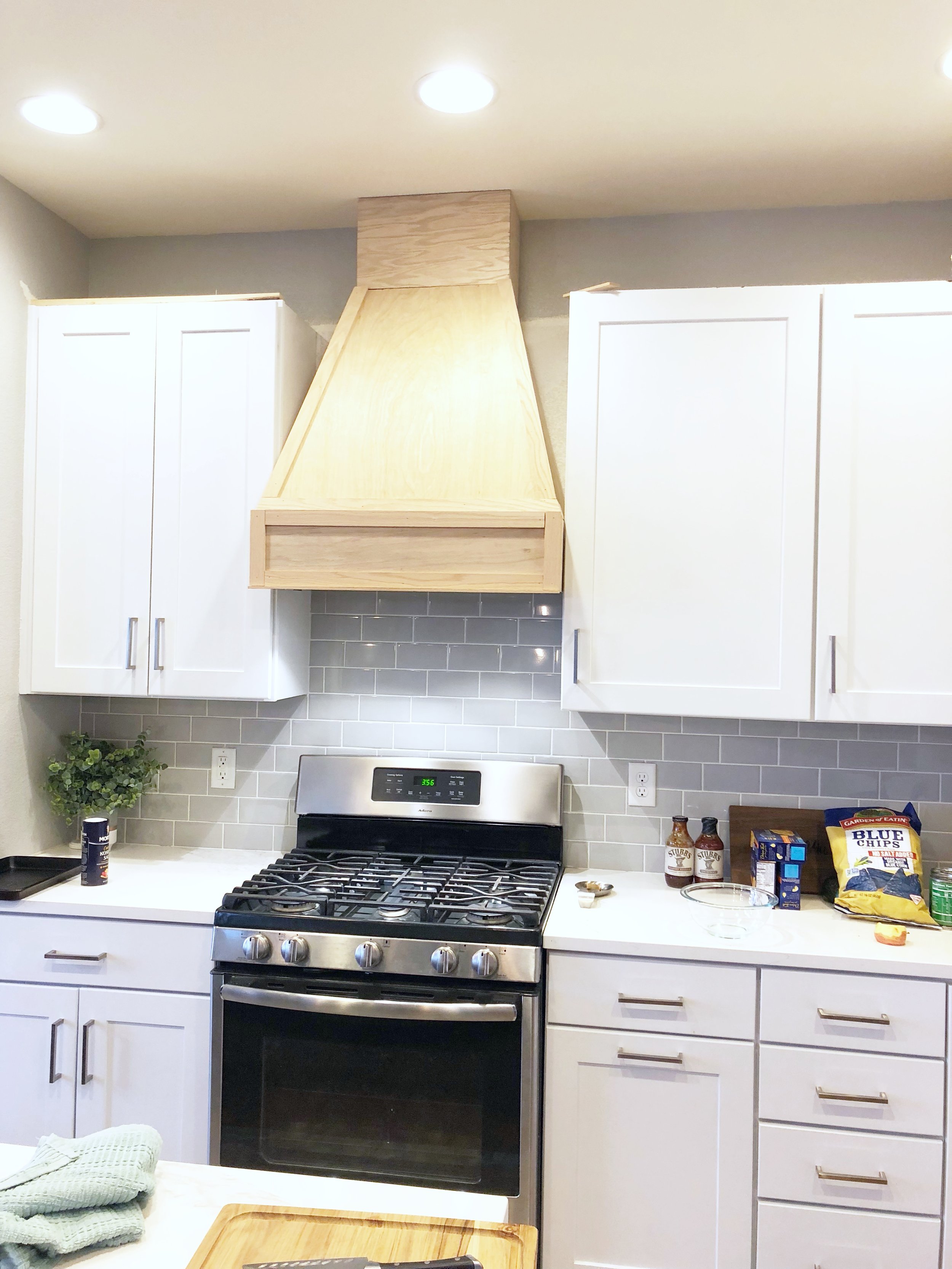
Covering the bottom and top boxes where easy, you just measure and cut, but the 3 large angled pieces were much harder. I bought extra pieces of veneer (about $8 a piece so no big deal) in case of mistakes, but I also recommend cutting card board pieces to create a template. Once you have 3 pieces of card board that fit together well, then use those to trace onto the wood and then cut. I knew that the 2 side pieces would essentially be right triangles so it was just figuring out that one angled front side that would be hard. I figured out the lengths of both bottom and back sides and then used some geometry to figure out the front angles knowing the lengths I needed. I had to make one piece twice and trim the other 2 times, but I dry fit all three pieces and adjusted until they were all pretty flush. They don’t have to be perfect, because the trim will cover these. We used a brad gun to nail all the pieces to the frame and to each other. The final result is the first picture above.
The second to last step was trimming it out. Trimming it out is important because it allows the large veneer pieces to be imperfectly cut. If you look closely in the first 3 pictures above, you can see the flat pieces that cover the hood aren’t exactly flush or may not be touching on all sides. The trim pieces cover these imperfections. Trim also gives the hood it’s style. I wanted a craftsman style hood so I chose square, simple 1 x 1/4” trim pieces. I used oak again just so all of the grain would be the same if I chose to stain it instead of paint it. (At this point I hadn’t decided yet). I used a hand saw to cut the angles on the end and I tied my very best for all of these angles to match up perfectly because they were the top and final layer. Some times they didn’t so I used wood putty to help fill in.
After trimming, it looked like the last picture in the gallery above. I then puttied all the brad holes and spaces where the trim met up. I sanded everything down and then had to decide what color it would be. I wanted to stain it, but I also wanted to do something different and many people had stained hoods, so I decided to paint it navy to match my island. This worked out because as clean as I wanted it to look (not distressed or barn wood looking) the paint covered all of the spots I puttied. Staining putty is hard to match to the un-puttied wood.
The end result is pretty much exactly what I had pictured when I first saw that kitchen in person. I love how it sends your eye up to reveal the high ceilings in the some what small space. My favorite part is the color. There is nothing better than a moody piece in a light and bright space. This was an in depth process and kinda scary - but having done it once, I could easily do it again. If you want to build you own hood, go for it! I know it looks hard but, I promise, you can do it! As always send me any question you have on the process and I’ll be glad to help!
October 1, 2018: Creating and hanging a gallery wall


First of all, let me say how impressed I am with Courtney Taylor Photography and how beautiful our family pictures turned out. I had been spoiled by Sweet Roots Photography the last 5 years and I was so sad to not have them anymore. Courtney was just what I needed. She created the most gorgeous pictures of my sweet family - so I knew I had to do something special with them.
How many of you get wonderful pictures taken but then never get them printed or displayed? So often we are ok with posting them on Facebook and then never knowing what to do to go any further. Well that’s a shame because you pay good money for those pictures and they should do more then stay on a computer screen. Creating a gallery wall is easier than you think and I hope that this morning I can help you feel confident enough to get those pictures printed and hung. Beside an entry way, great places for family galleries are over a couch, around a TV, or in a Master bedroom where you can see your beautiful family at the very beginning and ending of the day.
To begin, you need to know how many pictures you are going to hang. That means going through your pictures and picking out the ones you love. A great number for a clean looking gallery wall like mine is 8-10 but it could be more or less for sure. I love printing pictures at Walgreens. They always print clear (I’ve printed up to 11x14 with them), you can do it all online, and pick up same day. Also they ALWAYS have a discount code for %20-%40 off. I printed these and lots more for family and such for $70. If you count just the ones I used in the gallery, I paid $36 for 9 8x10’s - so wonderful.
Next decide on frames. I feel like this is the first place people get hung up. If you want something easy and clean and simple looking, go with very thin simple frames and thick white mattes. I chose these white frames from Hobby Lobby. They were in the pre-made frame section where none of the frames have backs. They were 11x14’s and were $7 each after the %50 off. They only had 3 white and then 3 in each of several other colors. I picked 3 cream and 3 light gray and spray painted them all to match the white. I also picked up 9 11x14 thick white mattes to fit 8x10 pictures. They had plenty of those. All total, the frames were about $65 and the mattes like $1.50 ea. I spent right over $100 on this entire project.
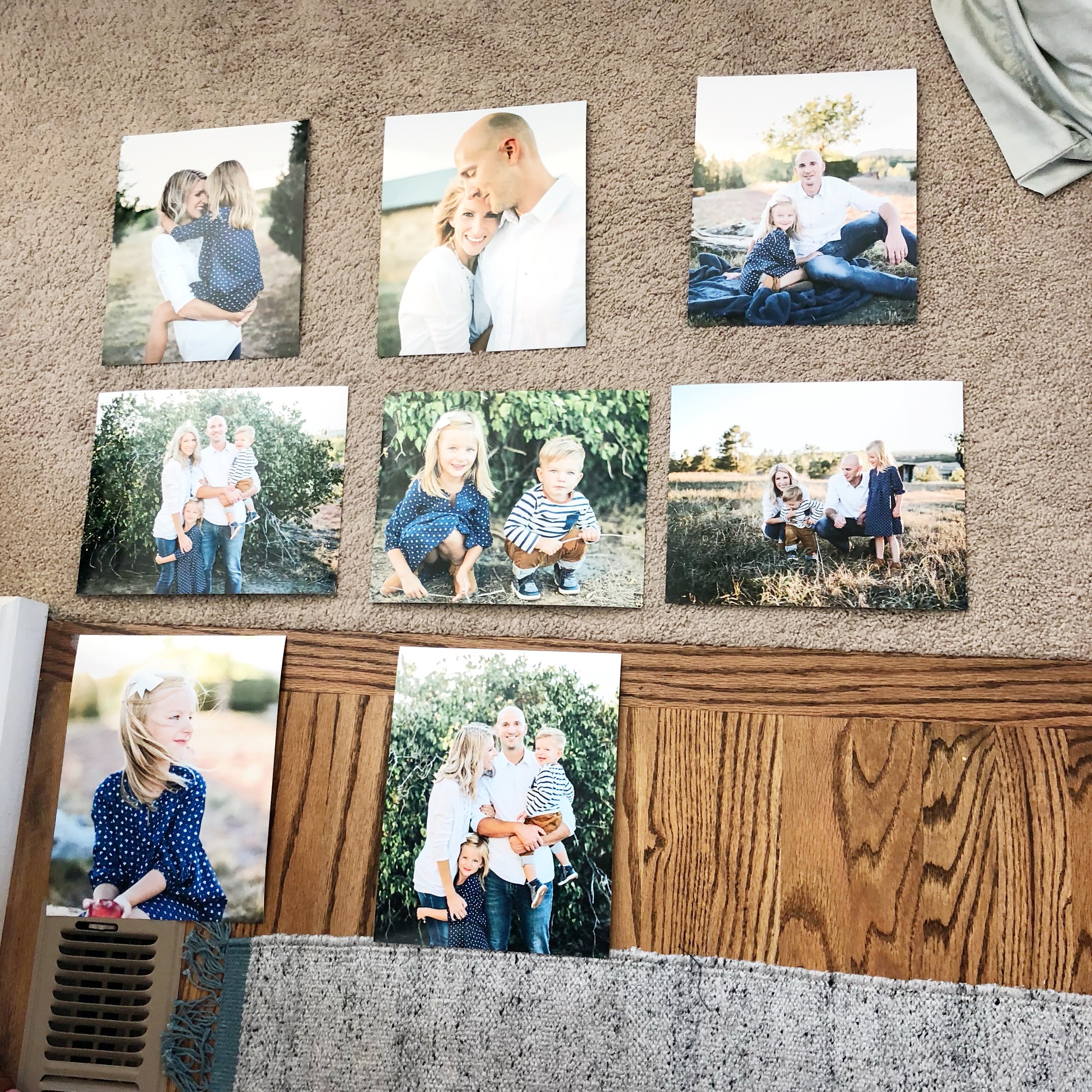
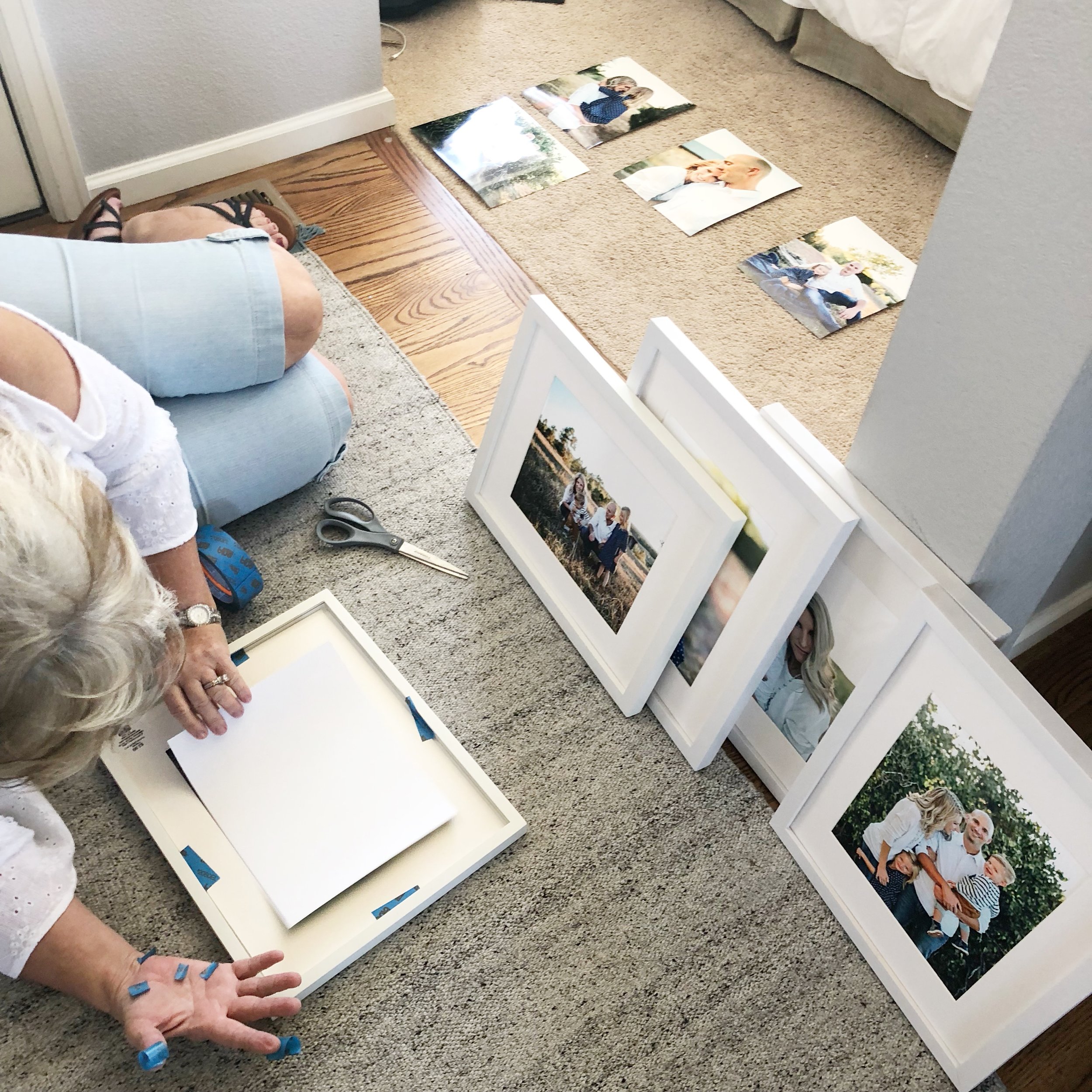
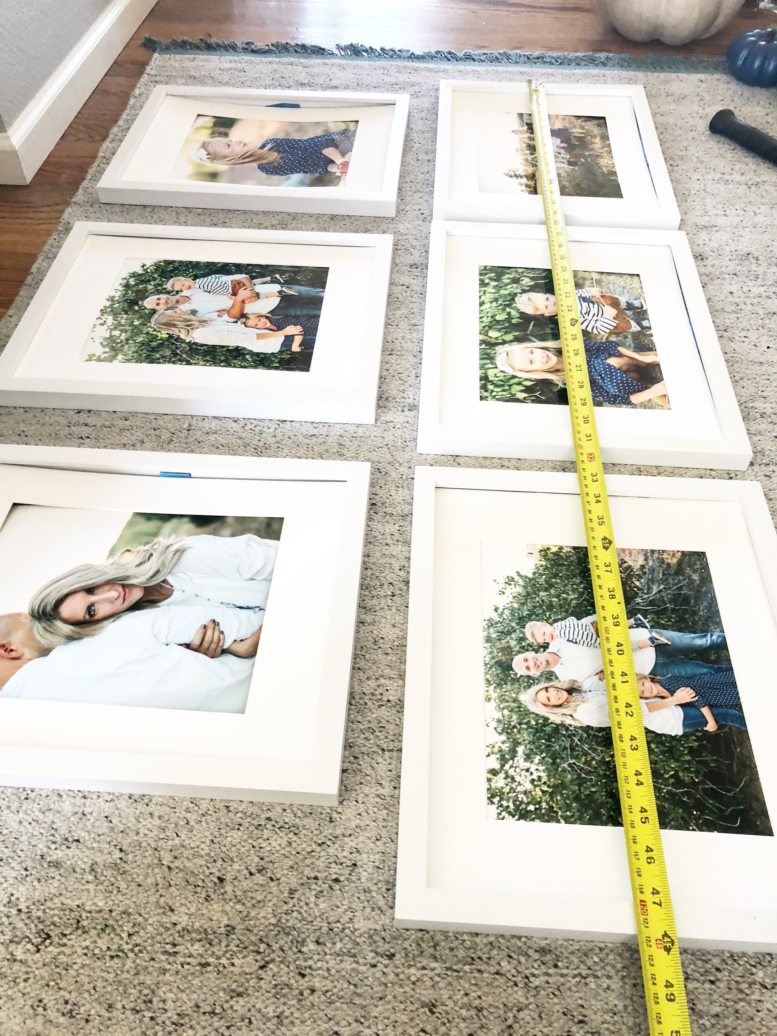
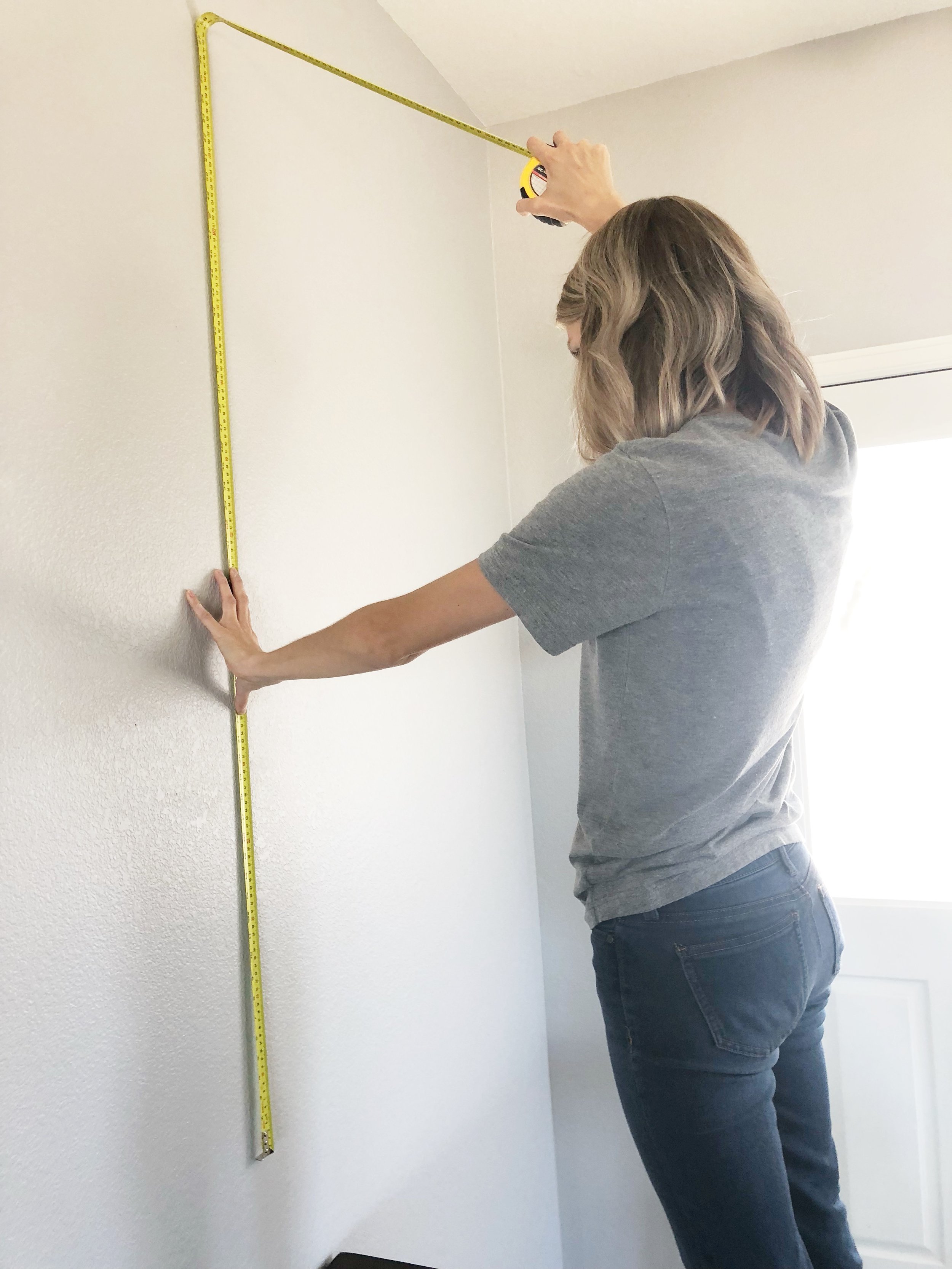
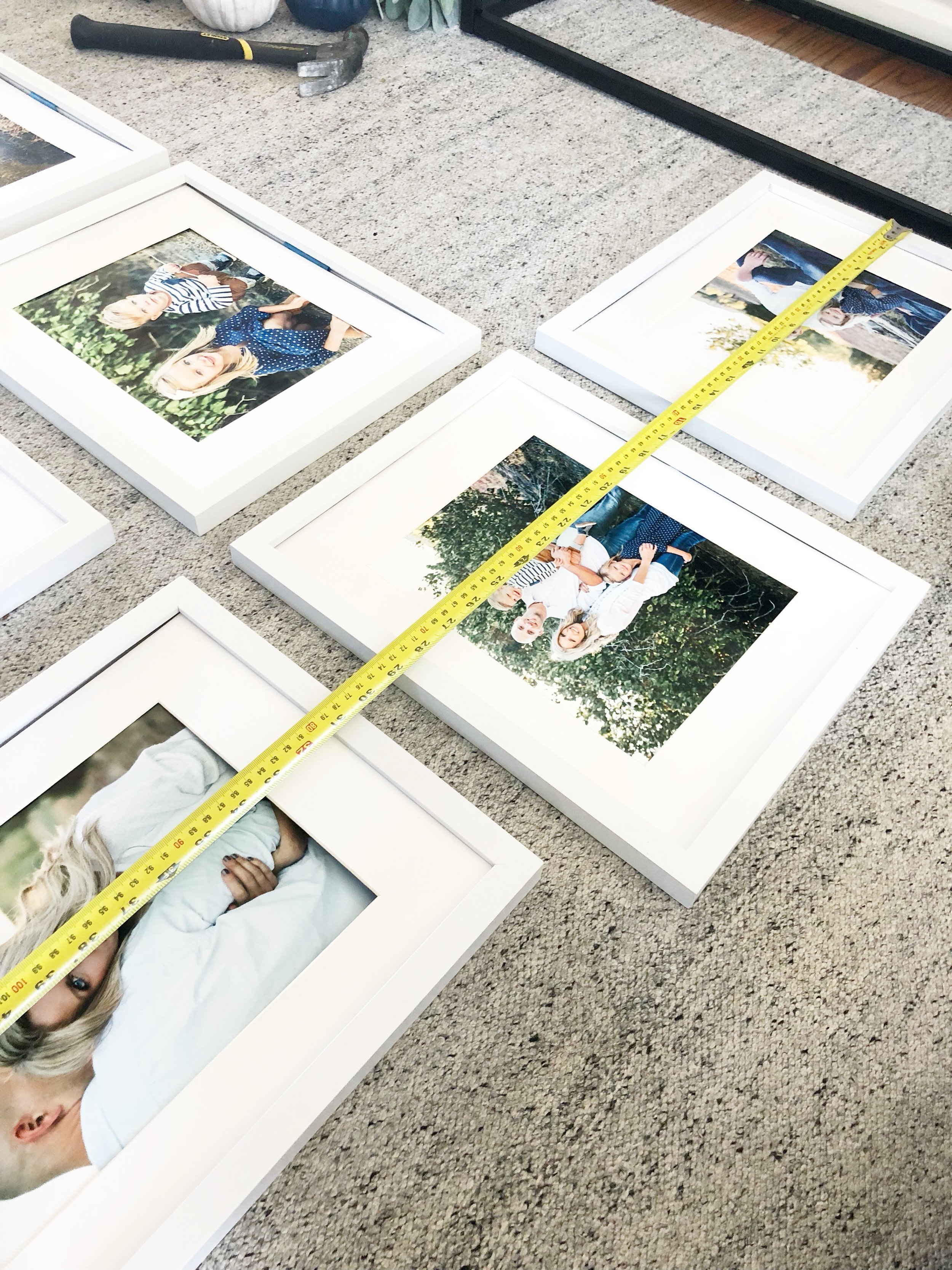
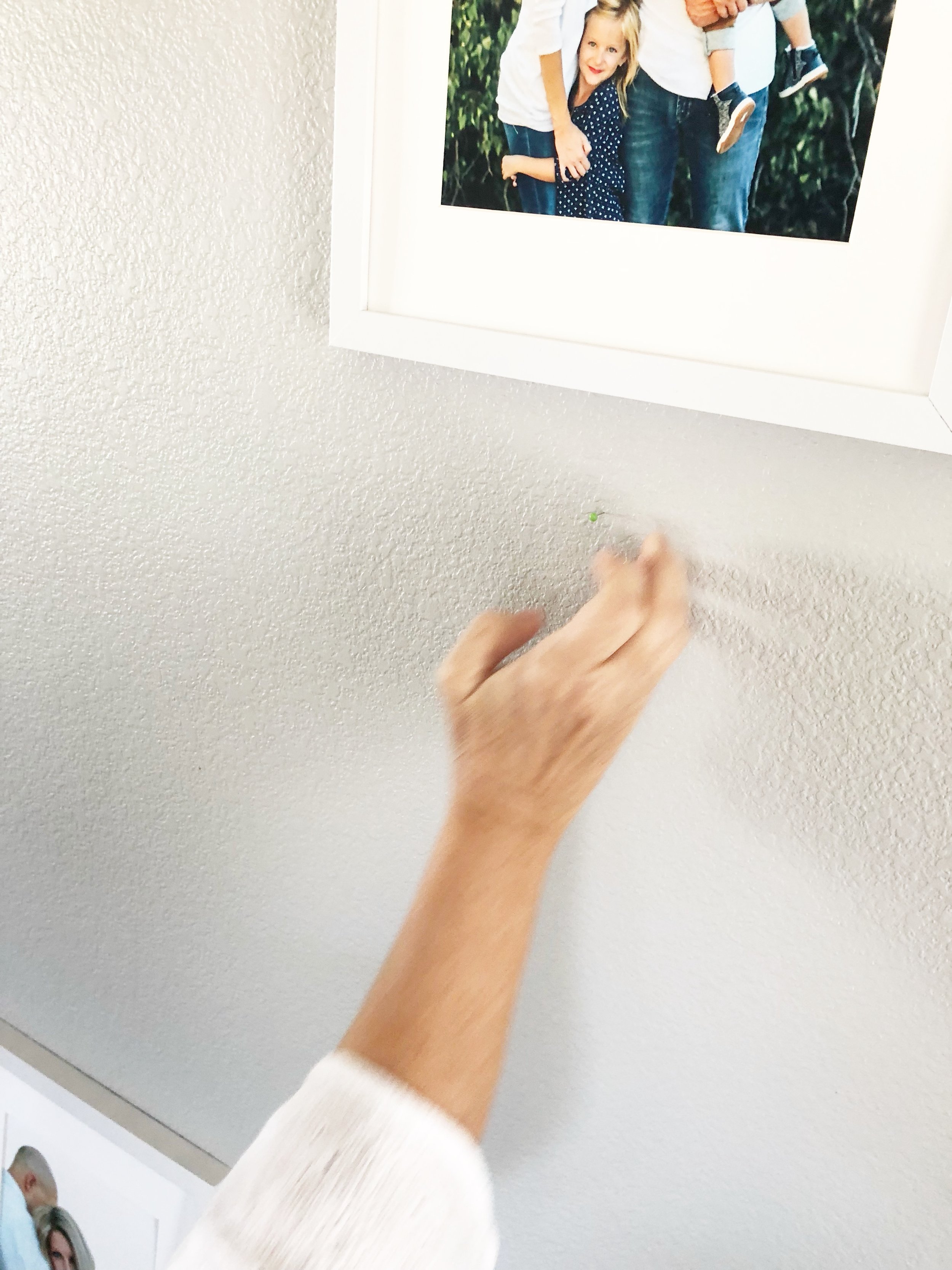
To keep this a cheap project I used painters tape to tape the pictures to the mattes and the mattes to the frames. This kept my pictures light weight which is going to help us later on. My mother in law was here visiting so she helped me put everything together :)
So lets talk about the process of hanging - for anything not just this project. Lay everything out on the floor how you want it. This is where you play and decide what looks the best and most balanced. I decided to do 3 rows of pictures, 2 portrait rows and 1 landscape. Measure the TOTAL height and width of all of the things you are hanging together. This includes the spaces between. Take a picture of the layout on the floor to look back at and measure the distance in between your pictures as well. I made mine an even 3” apart for the top and bottom rows to make it easy. Then I measured the entire height. I took that height (46”) and decided where I wanted that to lay on the wall. I decided I wanted them to start about 8” above the table. Then I marked where the top of the pictures would be on the wall with a pencil.
Next I measured the total width of all my pictures (48” for the middle row) which my table was 50” so that was perfect. I measured 1'“ in on each side. Then I marked the middle. This gave me a height to start my top row and a middle to hang my top middle picture. Here’s a little trick for ya: If your pictures are light weight- hang them with straight pins! Make sure they have a little head you can hammer them in, but they make a hole so small you don’t feel nearly as bad moving it if you need to. Also hammer the pin in at a 45 degree angle so the head sticks upwards some. This allows you to pull the pin down a little if you need to without redoing the hole. I do the same thing with nails. And the pins bend so if you put the pin in the wall and then decide it needs to go up or down just bend it. This allows you to have some correction room if your pictures aren’t lined up just perfectly. If you are staggering pictures on the wall none of this is nearly as important. Just eye ball your design onto the wall from the floor.
I hung the first top middle picture and then measured 3” out left and right, and hung the rest of the top row. I went down 2” plus the 1/2” of the frame width and hammered in my pin. I hung my second row middle picture centered under the top middle picture. I went down 2 1/2 more inches and hung my bottom row. Because my pictures were so light weight, they didn’t want to stay level, so I took small pieces of painters tape and rolled it to create stickiness on both side and stuck it under the bottom middle of each frame. This holds them in place. They make little felt pieces that help with this too but I’m cheap.
So then I styled the table with colors that played off the pictures and kept it simple to go along with the simple frames. I love how it turned out and it took about an hour and $100!
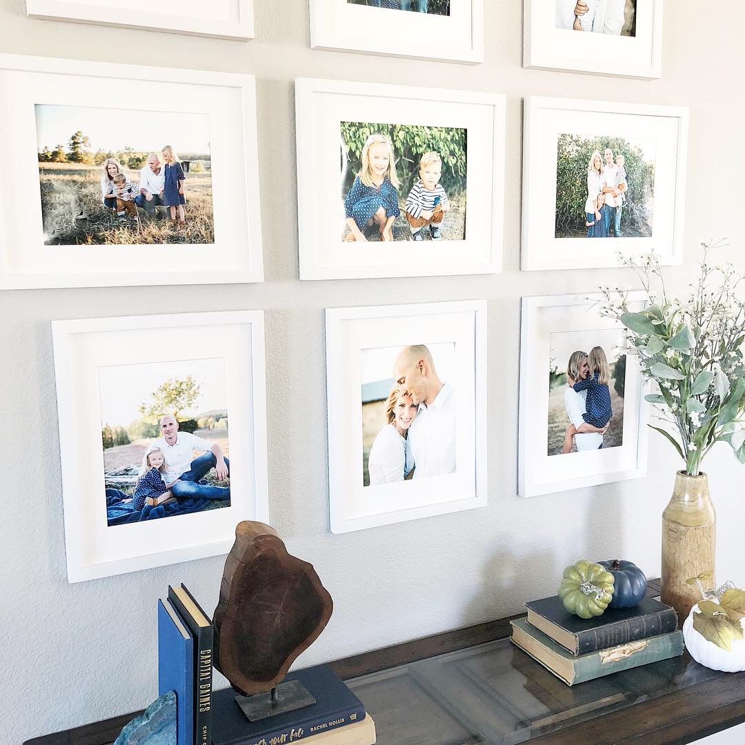
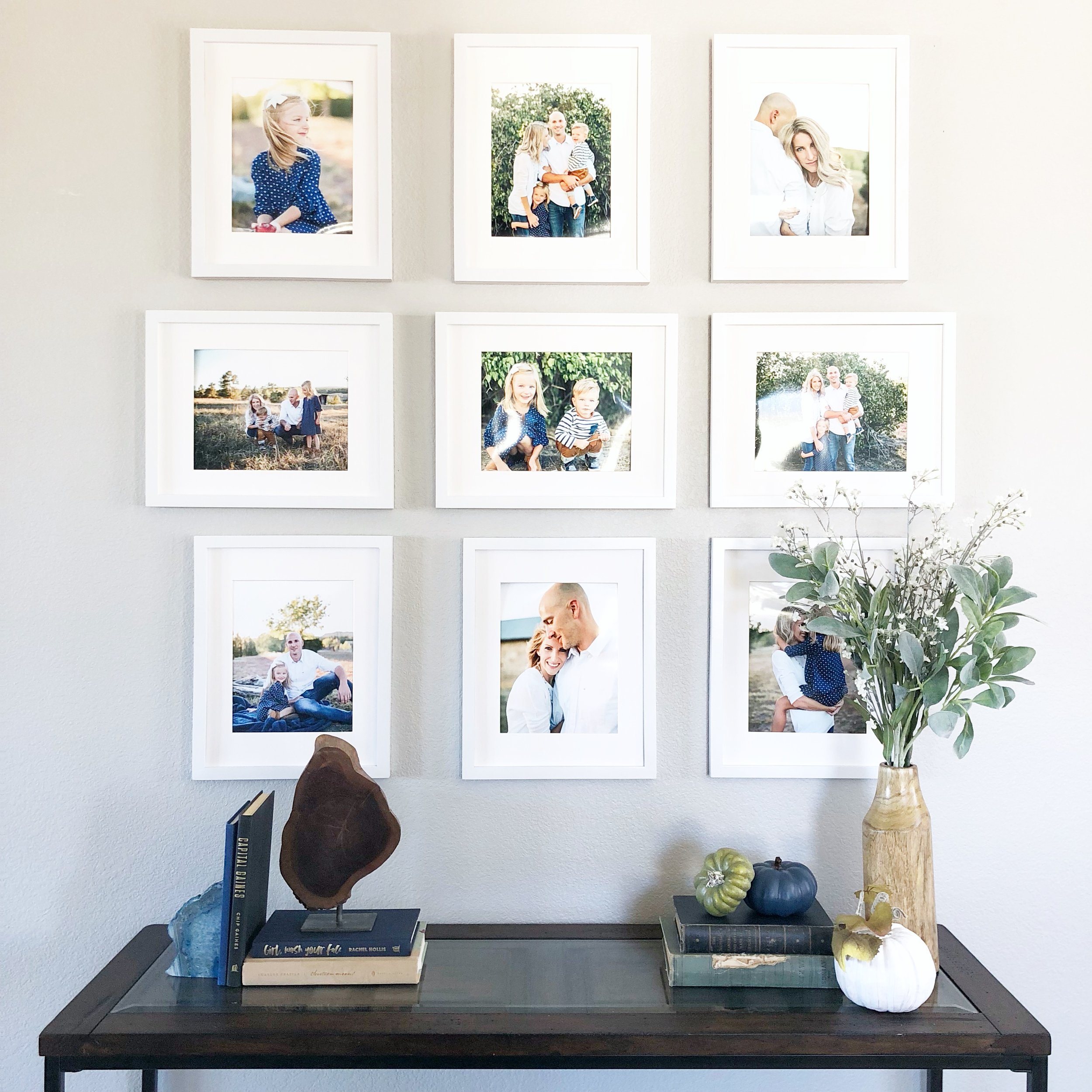
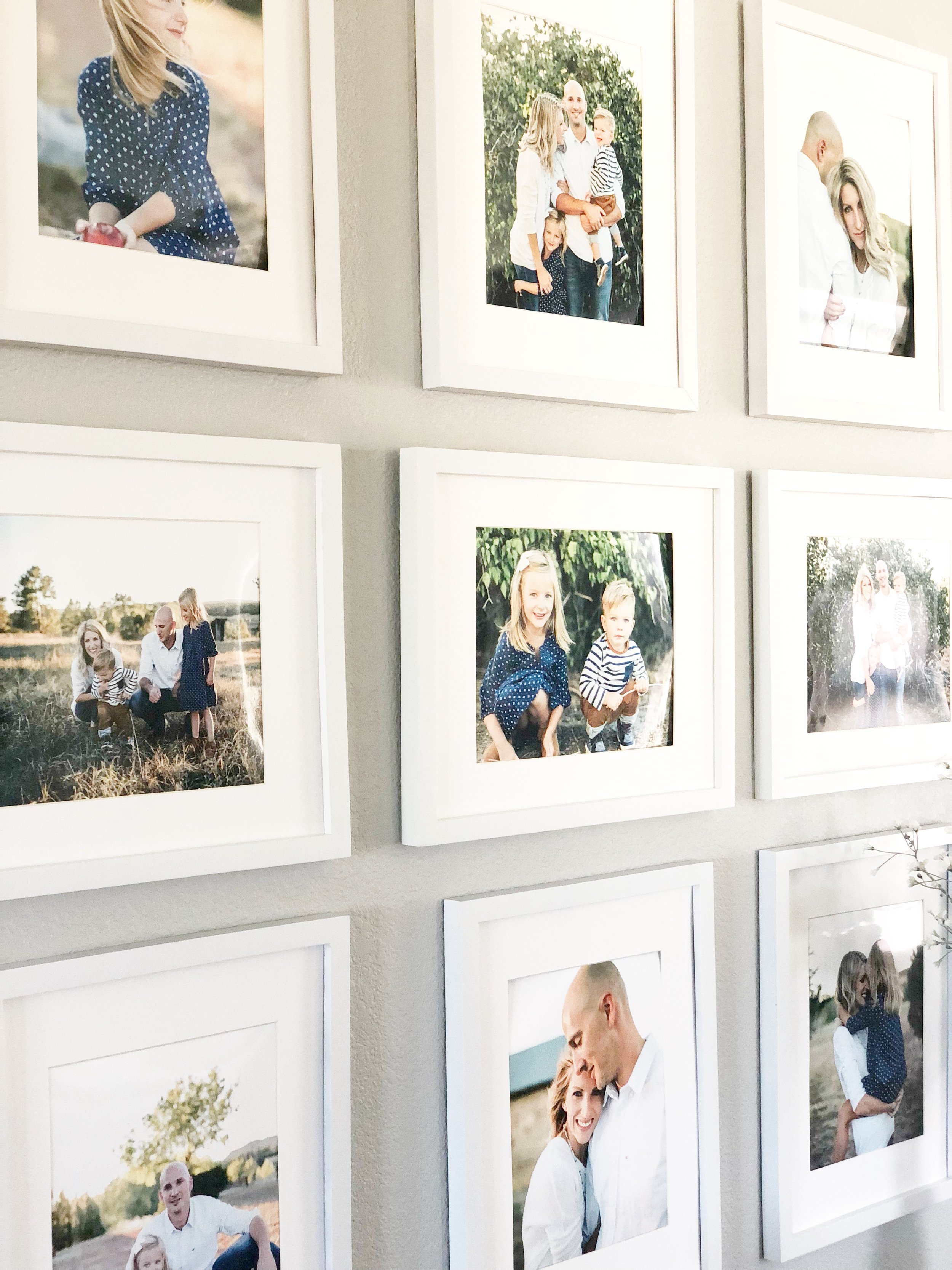
As always thanks for following along here and on IG @kindandabell - Next week is DIY vent hood!
September 17, 2018: Using Plants to Decorate

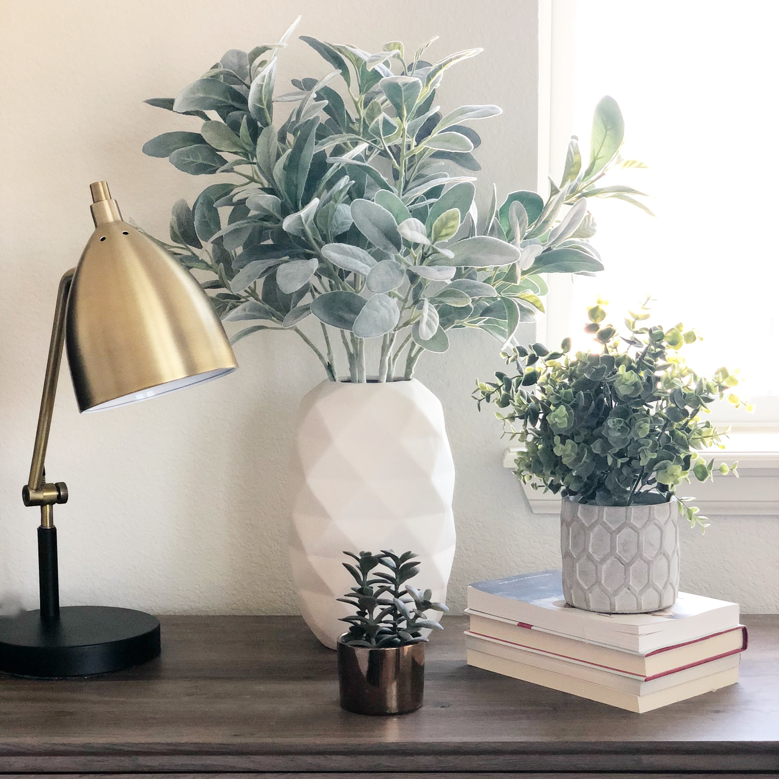
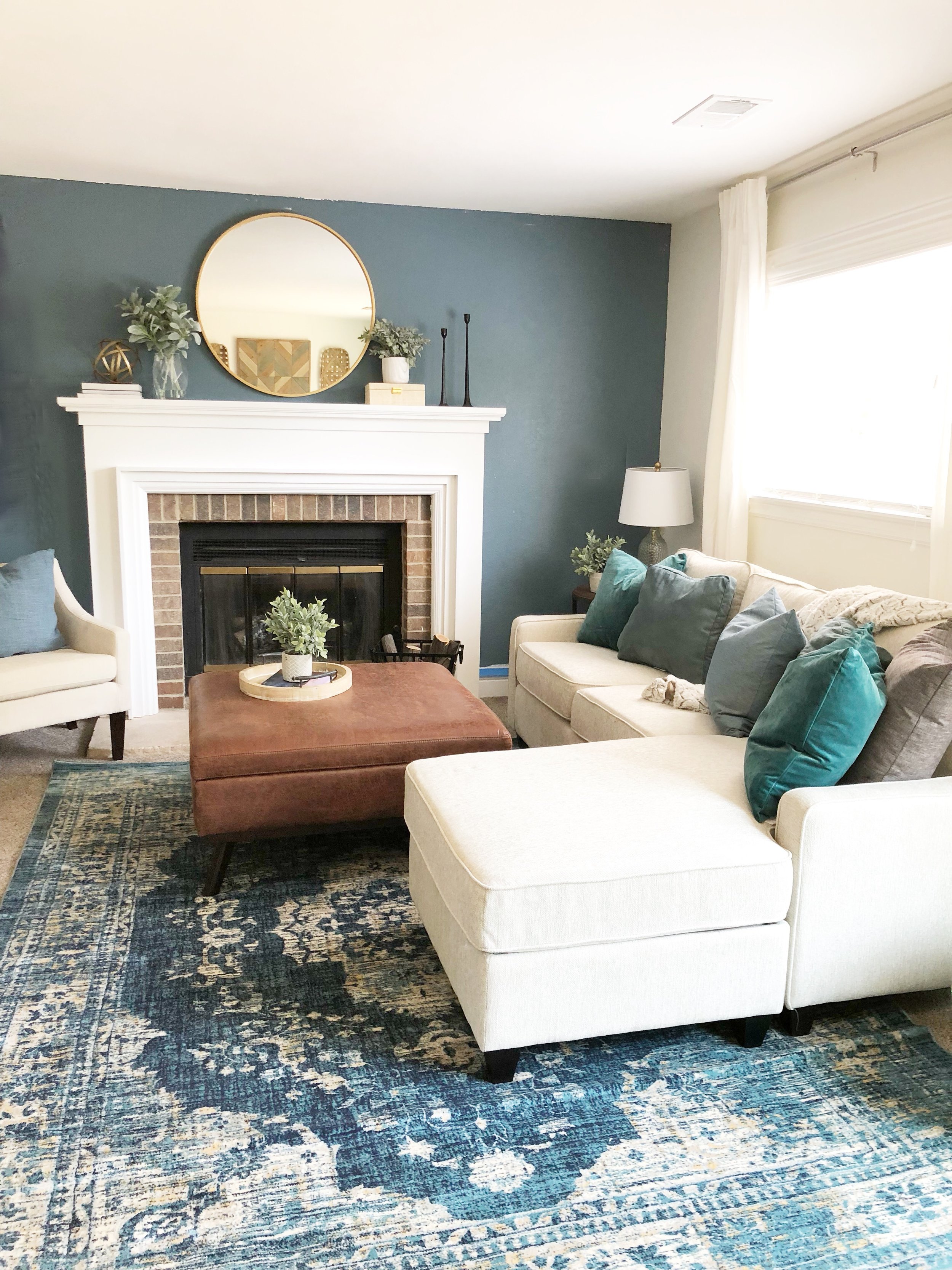
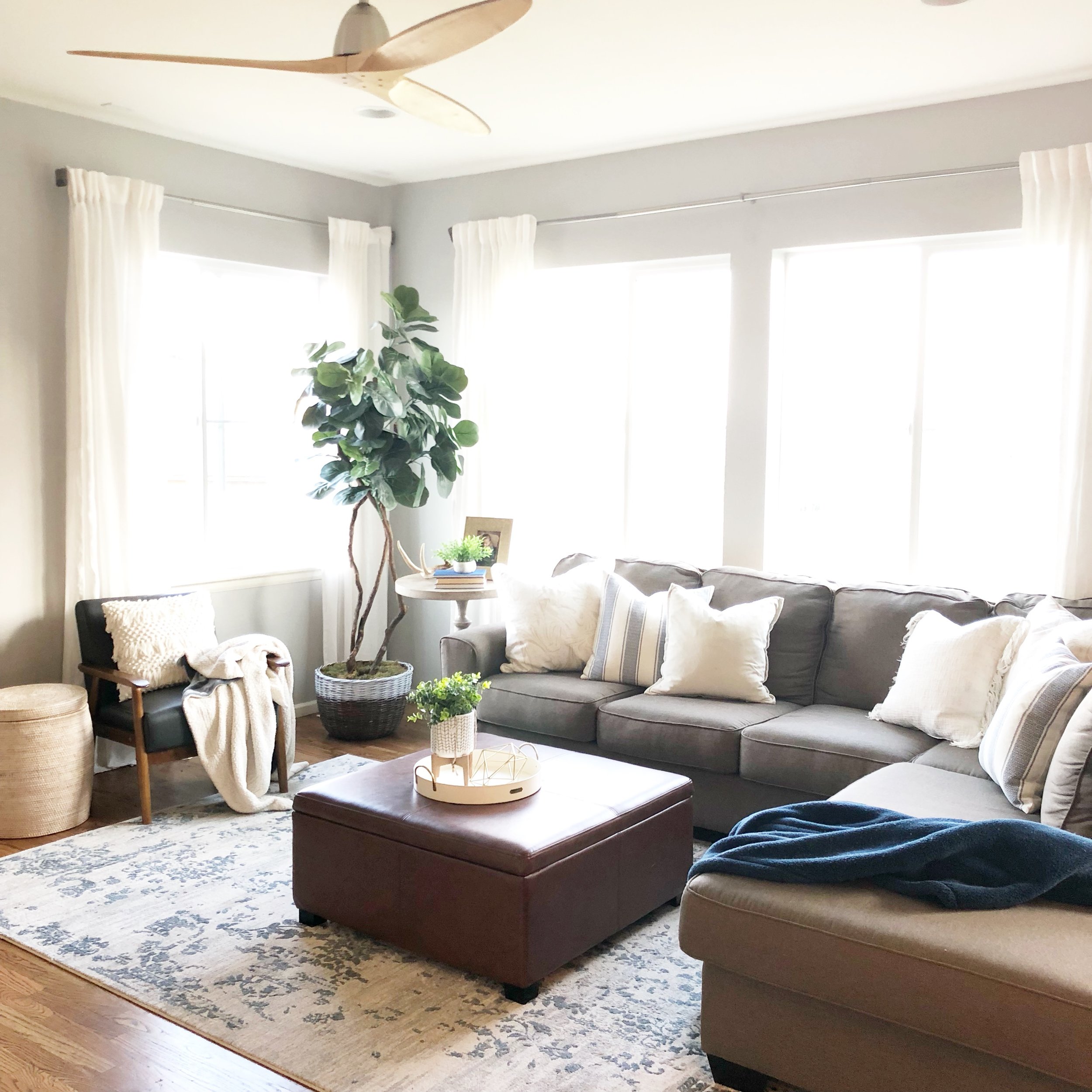
Happy Monday Y'all! Today is a simple but important blog post about using plants to decorate. I feel like plants are the easiest go-to when it comes to sprucing up a room. They make a room feel fresh and modern- and let me be clear, these are not your grand mama's plants (well the fake ones anyways). So today I'm going to go over how to style with plants, what types of fake and real plants to get and where to get them.
I have rarely seen a picture of a house with too many plants. I do believe its my personal bohoish style but I can't get enough plants in my house. Plants are perfect for decorating side tables, coffee tables, mantles, empty corners, bathrooms, and kitchen counters. You can look throughout my blog and see plants in every room of my house. Without them, my decor feels unfinished to me.
How to use plants: Height is important. The best way to make plants look great in your house is making sure they are the right height. Using boxes and books is the best way to create the height you want with plants you buy. For a coffee table I usually want a shorter plant and I place it in a try on top of a few books or find one with a little stand and pair it with a shorter object. On side tables like night stands, end tables, or dressers, I usually want more height. If I'm using a few plants together, I find 2-3 different heights to place them. Unless they are already very different heights, this may mean adding books or a wooden box under them.
Fake plants: OK honestly I kill plants....really bad. Tye makes so much fun of me "How can you take care of all these animals and kids, but not a plant?" Because, Tye, animals and kids whine and complain all the time to remind me to feed them, plants don't complain! I know some of you are with me. SOOO, most of the plants in my house are fake. In the four pictures above, there is not one real plant. When buying fake plants, its important to get ones that aren't too bright green. I know this sounds crazy but, the bright grass green ones will age your decor and not give you the look you want. My fav places to get fake plants are Homegoods/TJ Maxx, Athome, and sometimes Hobby Lobby. 90% of my fake plants come from Homegoods. Go for ones that look like eucalyptus, succulents, or lambs ear (as in the second picture from the left above). All of these will give you a fresh modern look. As for trees, fiddle leaf figs, lemon trees, or olive trees are a good way to go. I have a fiddle leaf fig from Homegoods, that I love. I will be buying more in the near future. I see them in all sizes at Homegoods all the time. Mine is about 7 ft tall but 5-7 ft will be good for most spaces. What I want ASAP is a huge (8 ft) olive tree for our master. They are so pretty. If you have really tall ceilings, go for a tall tree that is 1-3 feet from your ceiling.
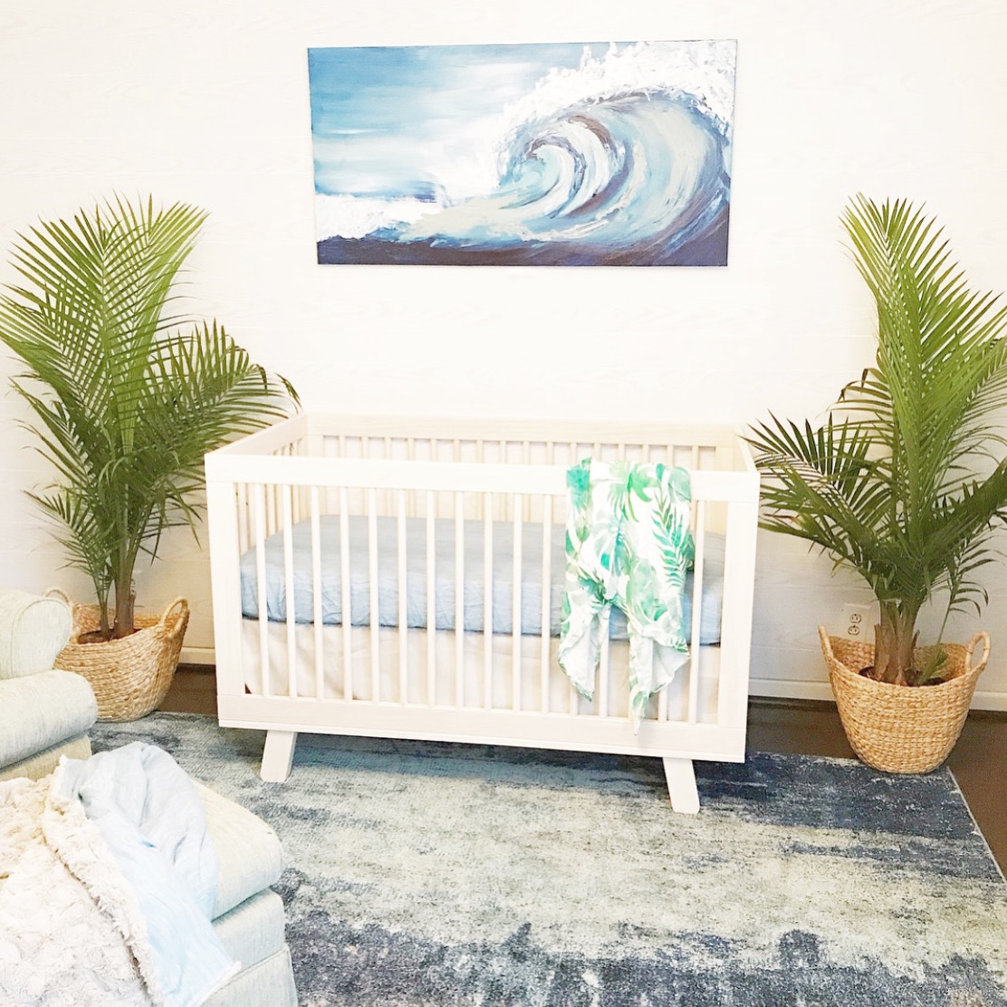
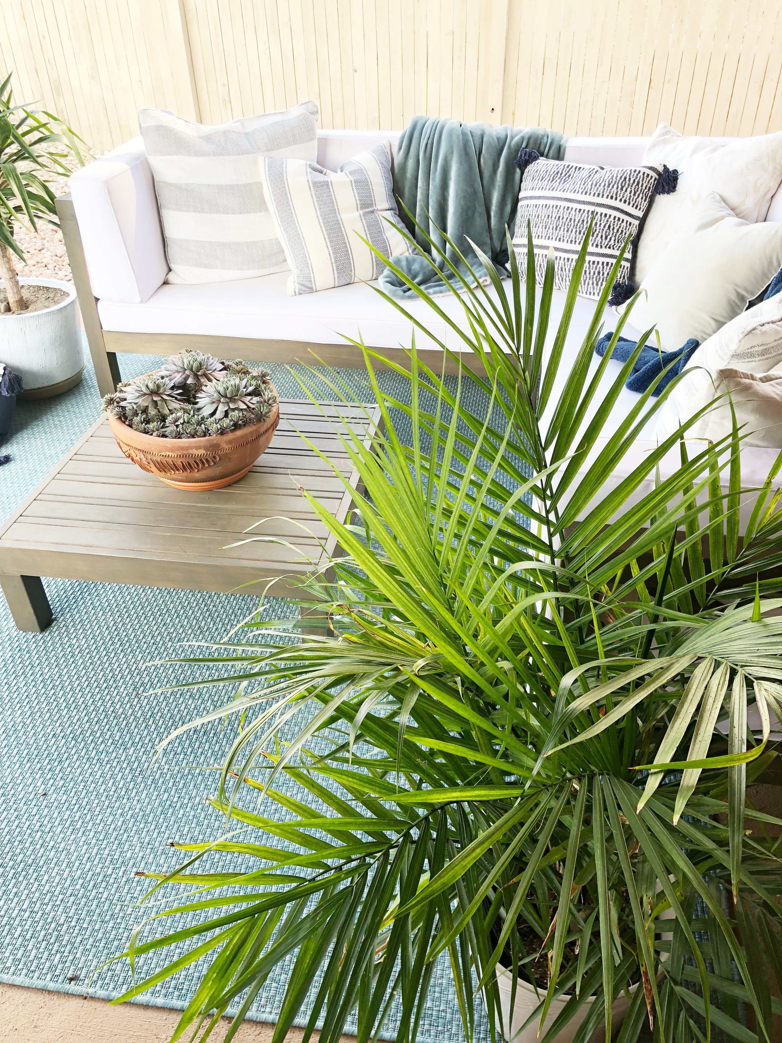
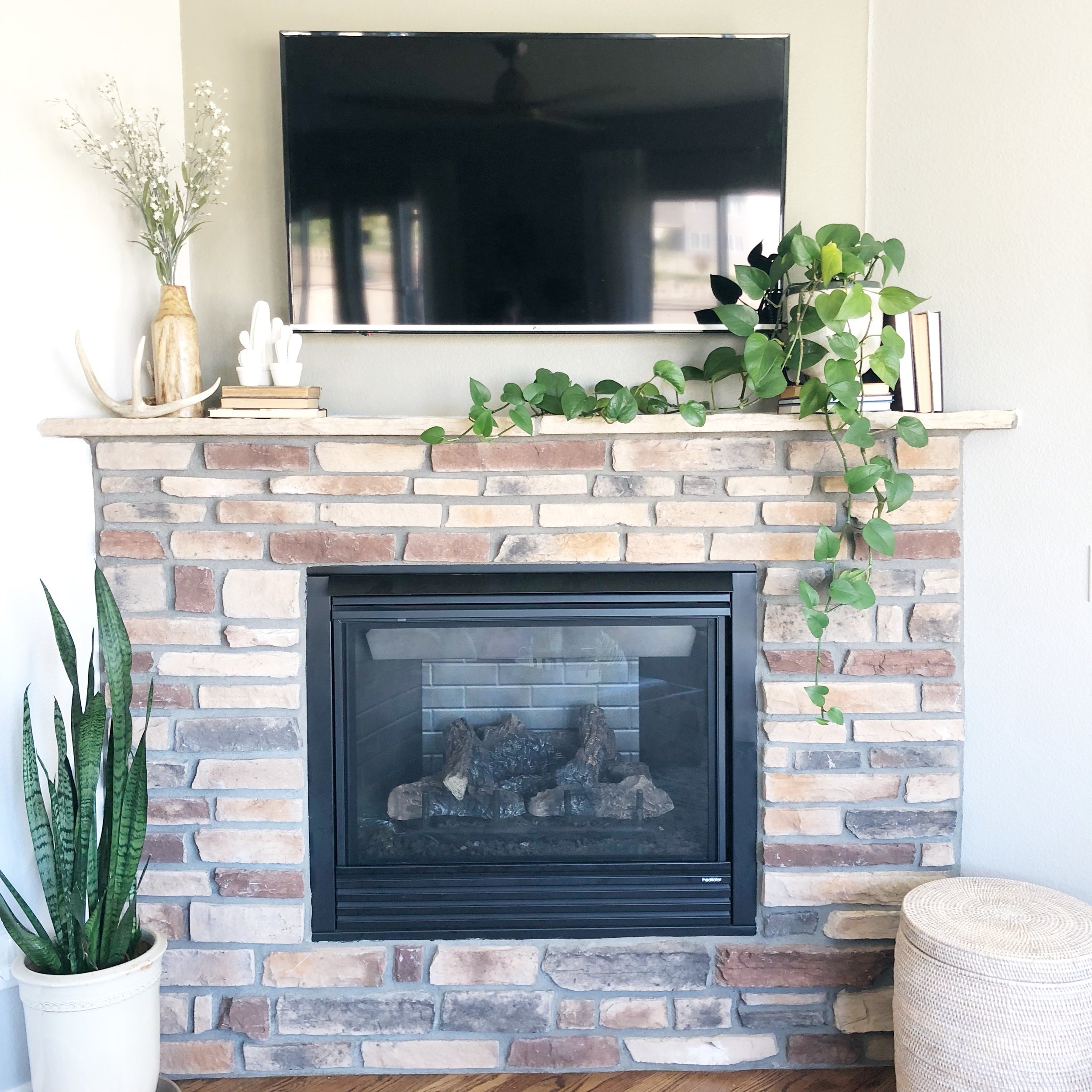
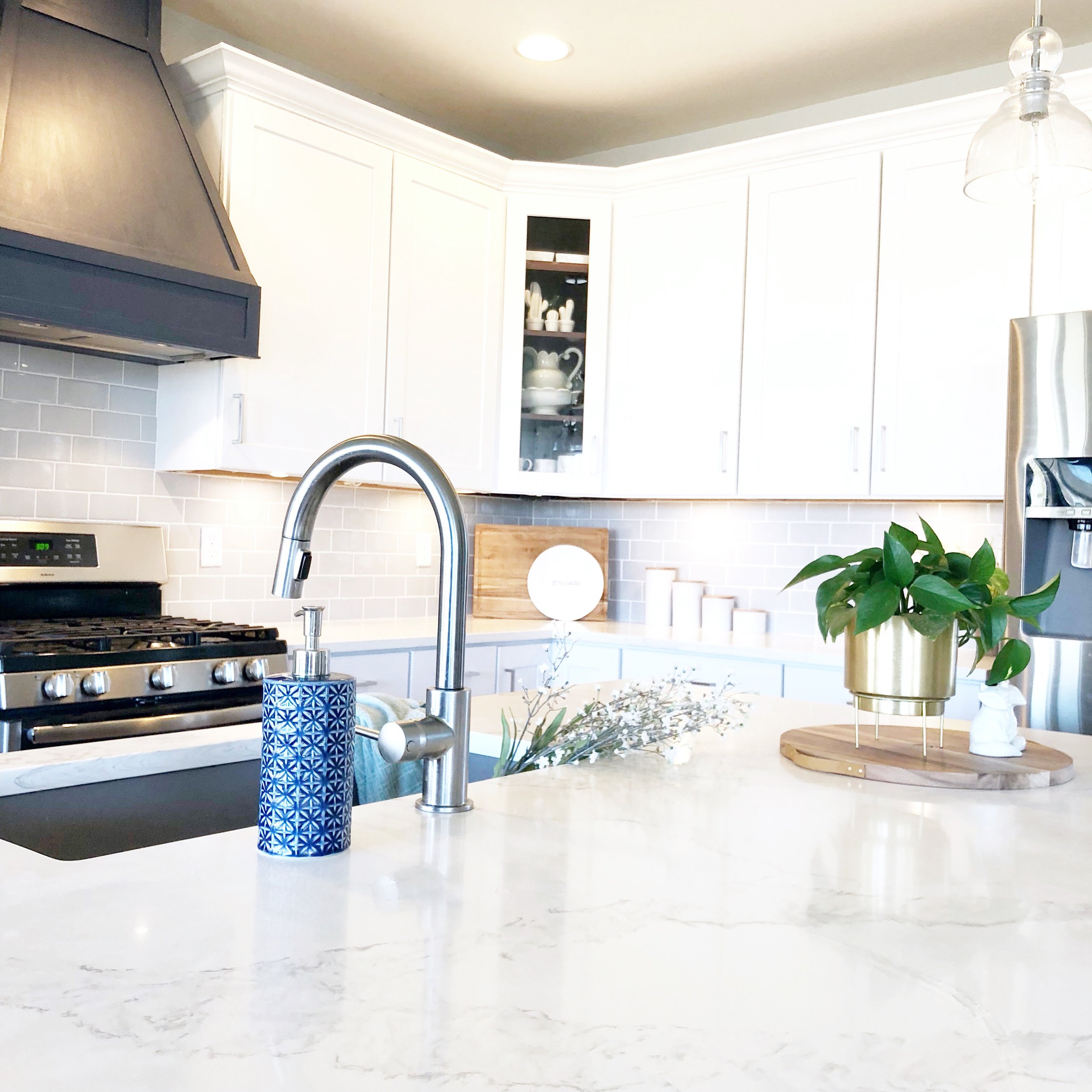
Real Plants: Besides the little white flowers, all of the plants in the six pictures above are real. These plants hardly cost a thing ($10-15) and they make a huge impact. There are two types of indoor plants I adore because they are so easy to care for.
1. Sansevieria aka Snake plant/mother in law tongue: This comes in a variegated or solid color and are tall and thin. I have a few small ones and a big one. These are in the middle top and bottom left picture on the floor. Theya re soooo easy. I water them in well drained soil (meaning a hole in the bottom of the pot) about once every 7-10 days, maybe more sometimes. I never see any stress from them as long as they see some indirect light part of the day. They are great for bathrooms because the steam from the shower is enough to water them and they don't mind small amounts of light. The do grow, but very slowly. Don't let them get too cold or hot if they are close to a window. Pets: they are considered mildly toxic to cats and dogs, but it is so low in toxins that pets that ingest a moderate- large amount are usually limited to stomach upset only.
2. Philodendron aka Pothos: These guys are short and viney and are gorgeous on a shelf or mantle. They do need more watering than the snake plant (about once a weak min), however they will remind you to water them by a leaf or two starting top turn yellow. If you catch it quickly,it will turn back. If not, you will loose that leaf, but at least you wont loose the plant! They also need well drained soil and filtered (indirect) light. These guys are what is on my mantle and on my island. If their stems get too long for you, you can cut them off a couple inches above a leaf and put it in some clean water and it will grow new roots and start a new plant! Same as the snake plant: they are considered mildly toxic to cats and dogs.
3. Areca Palm: These guys I use for the patio and bring them indoors during the winter. They are cheap ($10 from Lowes) and are so pretty, fresh and tropical. They love partial sun and moist air. Here, where the air is super dry, I have to water them every other day. But in the southeast, 2-3 times a week would be good. If the leaf ends start to get brown, water more often. Also make sure soil is well drained. These guys don't like the cold at all so bring them in once it starts to get close to freezing at night. They are great for bare corners in your house and you can set them on a plant stand to lift them up if you need more height.
Next week NO BLOG because it is Mrs. Ryann's birthday!
September 10, 2018: DIY - Tile Back splash
This is a story of a girl who wanted a new back splash but had little money so she figured out how to do it herself. (This is why I figured how to do most everything I do to houses my self.) I want you to get a new back splash too if you want one, so I'm going to help you with that. I'll talk about how to pick out a back splash, how to rip out an existing one, and install a new one. Tiling back splashes really is one of my favorite things to do. It's not hard if you have the right tools, it can be pretty cheap if you get the right tile and it has such a big pay off at the end.
My first tiling experience was in my last house in Huntsville, AL. We had navy blue counter tops and a khaki back splash with a pink tint to it. It was horrible but I had a limited budget. My next door neighbor had a tile saw and told me he would show me how to cut tile if I wanted help so I though "if all those people on TV can do it, so can I" - so, I did. Since then I have tiled a shower, 4? kitchen back splashes, and a few bathroom back splashes. I have yet to do a floor, but that's coming real soon and I'm not scared haha.
My latest large tile project was our kitchen remodel here in Denver, so that's the pictures I'm gonna use to explain everything. This tile project cost me $50 worth of tile and about $30-40 worth of tiling supplies. Tye, my husband, bought me my own tile saw for this project because renting one for 3 days would cost the same. I knew I would be tiling lots more so we just bought one ($150). But you can rent one from home dept for $50 for 24 hours. I can tile a kitchen in one day if its a simple one but I recommend putting away a weekend.
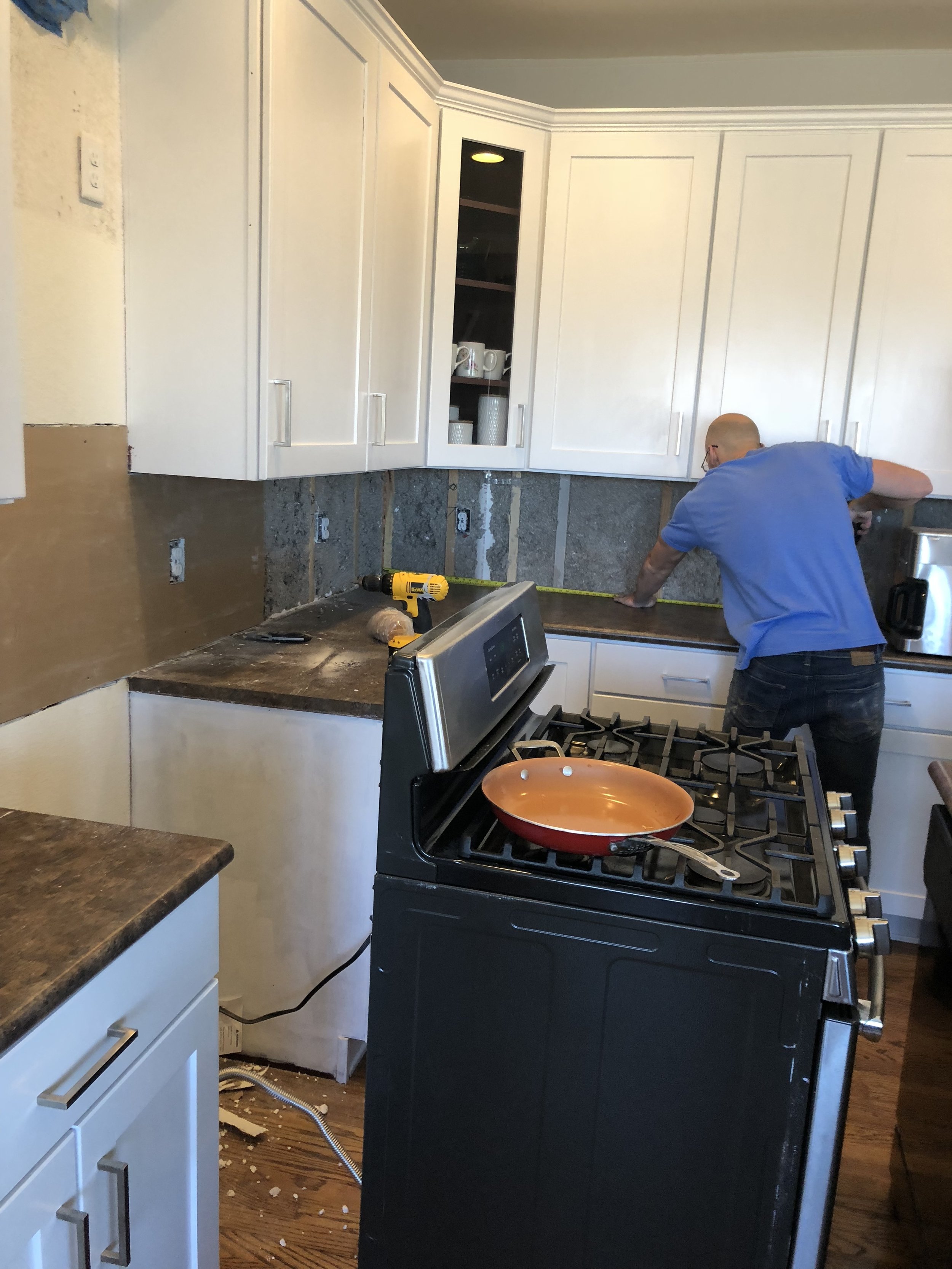
So... this is what my kitchen used to look like. It was so much brown. I knew though, that since I loved the lay out, the island, and the cabinet style, I could make it what I wanted with a little resurfacing. I know this post isn't about painting cabinets or building vent hoods, but your gonna see some of that too. (Blogs coming soon on those :) I painted the cabinets and then it was time to move onto the back splash. I wanted gray and white quartz counter tops and decided to do a contrasting light gray porcelain subway tile. I really wanted the longer more modern subway tiles that are about 3 x 9" but I couldn't find them for very cheap so I settled for classic 3 x 6. (not our forever home so whatev). I found these at Lowes for $.99 a sq ft.
{When you buy tile you need to be able to calculate square footage. To do this, multiple the height from the counter top to the cabinet bottom (usually 17") by the width of the run. You usually have to do this in sections so just add all the sections up. I had about 40 sq ft. Add %10 for waste and mistakes.}
It's best to have the old back splash taken out and new board put back up before your counter tops are put in if you are replacing those. If not then you can do it all at once. After the counter tops are installed, then back splash. The hardest part of back splashing is ripping out the old tile. I have Tye do this because, although I think it might be possible for a girl to do, it would be VERY HARD. You really have to have some strength to do it. Don't try to pry the old tiles off the wall, take a box cutter and cut the dry wall out around the tile and take every thing out. This is not as scary as it sounds.
1. Cut with the box cutter around the bottom of the cabinets and across the top of the counter top, then on the ends. 2. Rip that stuff out! If you have an interior wall you are working with, it is easier because you have more space behind the wall without insulation and more piping to get your hands back there to pull on the dry wall. It is hardest to get the dry wall off where it is screwed to the studs. The less screws, the easier it is to rip out. The dry wall will most likely pull off in big chunks and you just rip all that crap out. 3. Clean up - it is dusty.
Then you will be left with the studs. Go to the store and get dry wall or backer/cement board and dry wall screws. The difference between backer and dry wall is that backer board is stronger. Its better for holding lots of weight like a floor to ceiling tile job or tiling in showers. For a normal back splash, dry wall is just fine. Its cheap and you cut it with a hand saw or box cutter. The hardest part is measuring to cut out for outlets and such. Just take you time and do several pieces if you need. Make sure that you end on a stud so that you can screw it in and it wont bow out> you want where two pieces meet to be flush. It doesn't have to meet up perfectly as far as no cracks or small gaps (you will cover those), you just don't want to have anything sticking out.
After the new wall is up, the easier part begins. Make sure you have a tile saw as close to the job as you can, but outside. A tile saw spits water out on top of the saw blade as it cuts so water gets everywhere. I also recommend a bunch of towels at the door way to wipe your feet on. You will take several trips in and out and it will get wet if you don't. Make sure your saw blade is the right kind for your tile type. You need a heavier duty blade for more dense, natural stone. For porcelain, the normal blade is fine.
You need mastic (tile adhesive) made for your tile type. It comes in a bucket and looks like toothpaste. Also a trowel to put the mastic on the wall, spacers to hold the tiles apart, and a couple tile sponges (the big yellow ones). Lastly, the grout in whatever color you want. Get unsanded grout for small joints like in back splashes. You can grout with out worrying about clogging up your sink if you use unsanded grout.
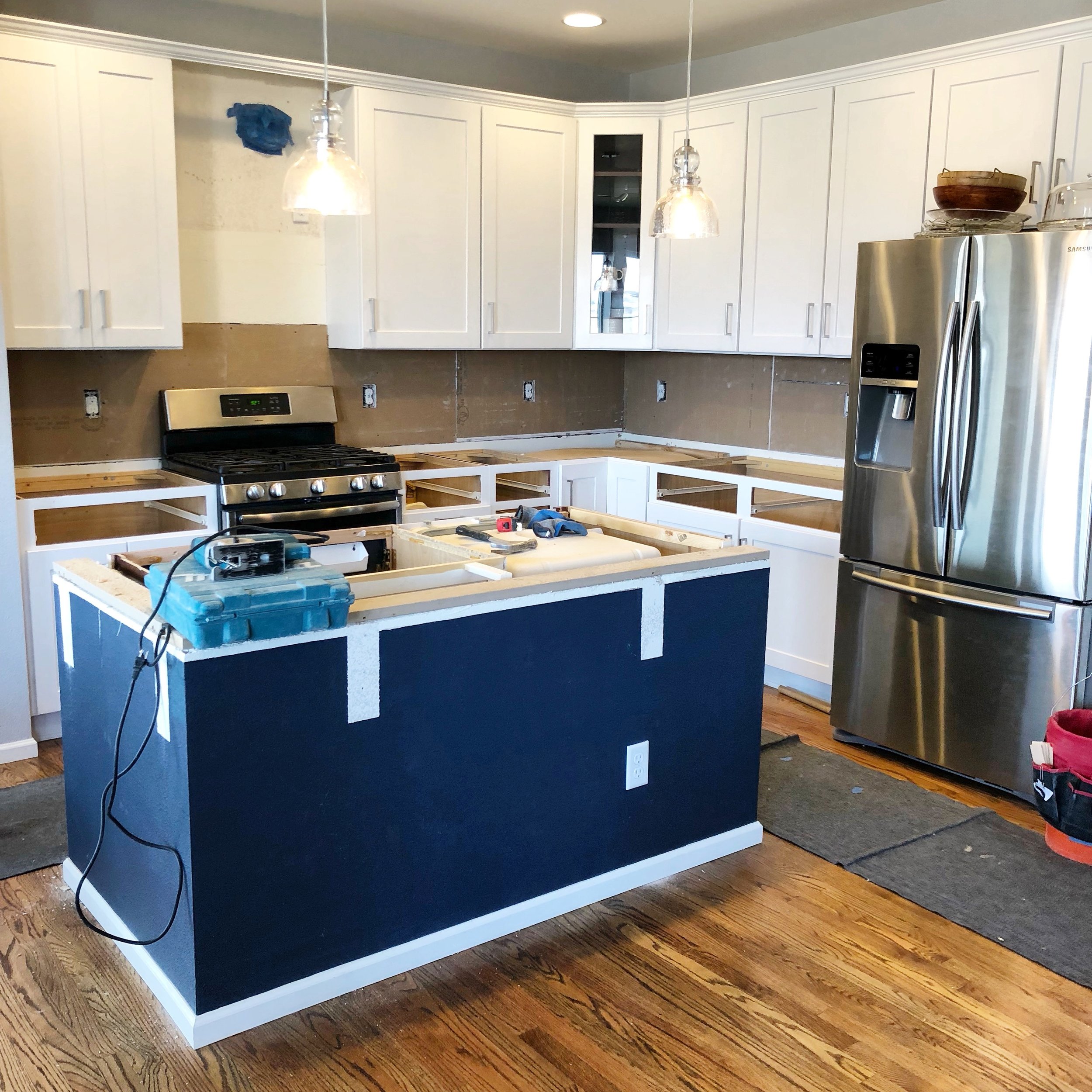
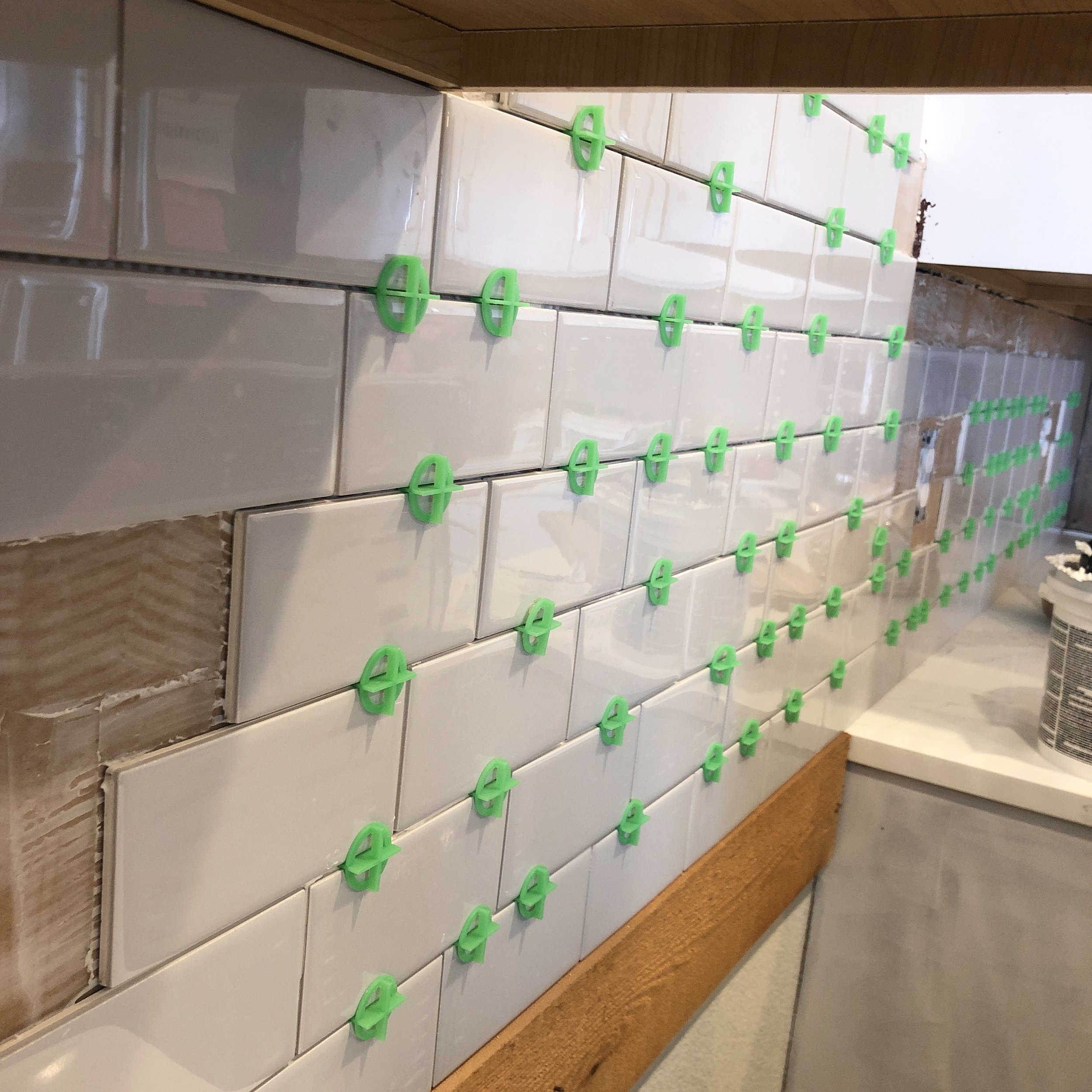
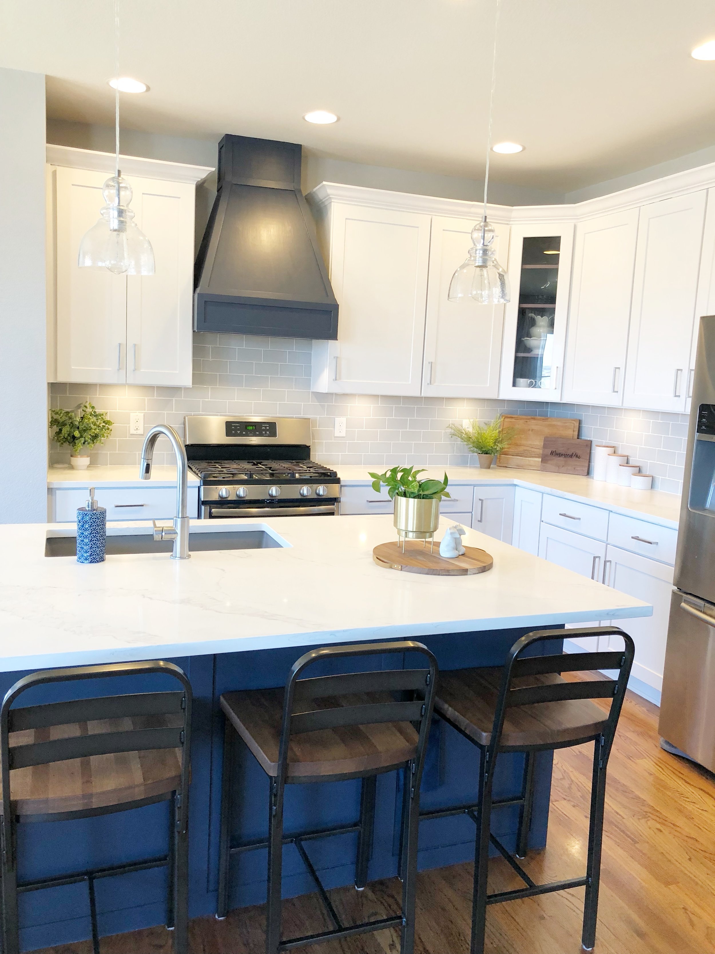
Start by lining up your pattern on the counter top in front of you to make sure you know what's ahead. I was just doing a simple subway pattern but the space in between my cabinets and counter tops allowed for a whole 6 rows and in others a whole tile couldn't fit on the top row, so I had to cut a sliver off the top of the whole top row of tiles. If you are doing another pattern, laying them out to start with helps you see if you will end with tiny pieces or larger ones that are easier to work with. Some times you need to adjust to make it easier on yourself creating less cuts. My first tile job I did a herringbone. It was fun and not much harder so don't feel like your stuck with a boring pattern.
I usually start right out from the end/wall and all you do is slather the mastic on the wall in a medium thick layer and then wipe it off with the trowel at an angle so that the teeth on the edge leave lines of mastic on the wall. As you go you will get better at it. Don't leave clumps on the wall, but use it generously. Its kinds hard to mess this up. If you put too much on, it will squish out the sides of the tile. Take the tile off, take some mastic off and put the tile back on - no biggy. I put the mastic on in large areas if I can put the tile up quickly, like in an area I don't have any cuts. Do small areas if you will be going slowly, like where you need to do lots of cuts, as the mastic will start to dry. You can also "back butter" tiles, meaning you can individually put mastic straight on the back of each tile after you cut it. This is useful for small tiles or cut tiles that are being put in hard to trowel places.
After you have done a bunch of full tiles, start cutting tiles. If you mess up you have extra don't worry. Also if you need to back up, pull your tiles off and redo. Unless the mastic is really dry, its not a big deal. Use a pencil or sharpie to mark on the tiles inside where they need cut and then follow that line outside on the saw. This will take some practice, but it doesn't have to be perfect. Grouting will fill in gaps you created from not cutting enough or cutting too much off. Unless your tile and grout are very different colors, the grout will hide your gaps. Sometimes I have to cut and re-cut several times to get a tricky shape I need. That's ok. You will get better and faster as you go. Once you have finished all your tiles, let them sit overnight to dry before grouting.
Grouting is really annoying to me. Is basically slathering grout all over your tiles then wiping it off over and over until the tiles are clean. Grout comes in a powder that you mix with water until it becomes a paste. There is no real amount of water you have to use. I just add water until it is a consistency that I like. The less water the more crumbly and the less time you have to get it up before it starts to dry. The more water, the looser the mixture and the more time you have to wait for it to dry some before you can wipe it off. You can adjust this as you get started to suite your personal needs while your grouting. Once again, this is hard to mess up, just learn as you go. You can change things up as you want. Just start with a mixture that is similar to toothpaste and adjust from there. If you used a porous natural stone, seal it before grouting to make removing the grout from the tile easier.
To start, take your sponge or a flat grouting trowel to spread the wet grout all over the tile pushing it several directions to get into all the joints. Move onto another spot and let that spot start to dry. You want it to dry enough that when you go back to wash it off with the sponge, it doesn't come back out of the joints. You don't want it to dry so much that you have to scrub the tile to get it off. There is a happy easy medium that you will find as you go. Its not going to mess anything up to go too much one way or the other, it will just be the easiest, quickest to find that middle ground. Use your finger to get the grout into hard places and work it into all of the gaps. I just run my sink on warm and wipe it over and over until it looks clean. Once again, if you don't let it dry enough before wiping, it will keep pulling out of the joints and spreading out over the tile and it will seem that the tiles are just not coming clean. Let it set 10-15 more minutes and start up again. Grouting to me is the part you have to finess at the end to get everything perfect. You can work and pick at it forever, so at some point I just usually have to walk away haha. As long as the grout is still wet from you wiping everything, you can work at it as long as you want to get all the grout joints perfect and straight.
Ok I know that was a lot, but I wanted to explain everything well. This last section is a brief explanation of how to pick your tile and some of my fav styles that will go with most everything.
Picking a color: If you are trying to back splash to help update your kitchen with out changing out your counter tops, choose a tile that will brighten. Take the lightest color from your counter tops and find a solid colored tile in that color. For example, if you have dark, or beige granite, pull a light khaki color from it and find a solid marble or porcelain tile and use that. Try not to use mosaic tiles. Those will age your kitchen and it will be too busy against a speckled granite. If you are changing your counter tops or already have a lighter or white/gray counter top whether it is granite, or quartz, find something that contrasts. You want a distinct difference in your two surfaces. If your counter top has a ton of movement and variation, try to use a back splash that doesn't have a ton of variation or it will be too busy, like a solid gray or white of some kind. If your counter top is more solid and has little variation, you can do a gray and white marble that has a lot of variation. Find a grout color that blends the best with your tile to keep busy-ness down. If you want the individual tiles to stand out, go slightly darker or lighter with your grout. Just know that if your grout is not a similar color to your tile, the grout joints will stand out and your cuts will have to be more exact because the grout won't hide imperfections.
Picking a shape: a 3 x 6 subway tile is the more common shape. A more modern twist on that is the longer subway tiles, about 3 x 9. You can do tons of different patterns with either of these. I love herringbone in a solid color porcelain tile. There is also heavy textured stacked/split face stone. This is harder to cut and clean but it is very pretty. Tumbled marble subway tiles are also pretty and great for a natural stone look. If its tumbled (rounded edges) you don't have to use spacers. Just put the tiles right up next to each other. When your grout the rounded sides will create joints. This makes tiling easier if its your first time.
Below are a handful of my fav tiles to use and the bottom row can be used for several styles of counter tops. Most of these are from Lowe's just because most people have a Lowe's close but you may can find these same tiles cheaper elsewhere.

Using a Geometric shape in plain white is a great way to do something different without being too bold.

Patterned cement tiles are amazing- but very bold. If you are scared they will be too much, use them above a stove top

Patterned cement tiles are also great for laundry room back splashes

This light gray subway is the same color as my kitchen back splash, just longer and more modern

This cream tile is perfect for back splashing with an existing brown/gold granite counter top

Marble subway tiles are really pretty and have lots of variation. Great for solid gray or mostly white counter tops.
September 3, 2018: Interior Paint
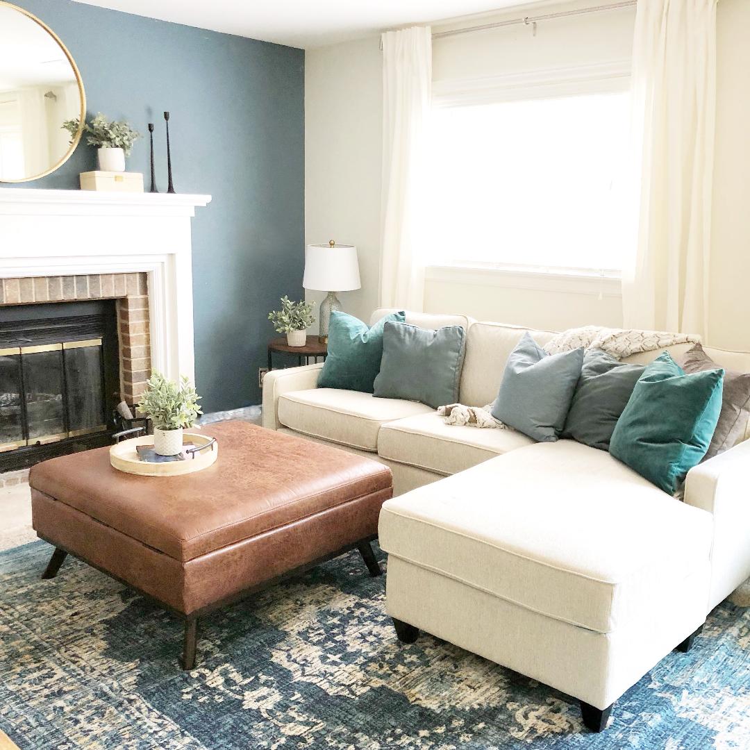
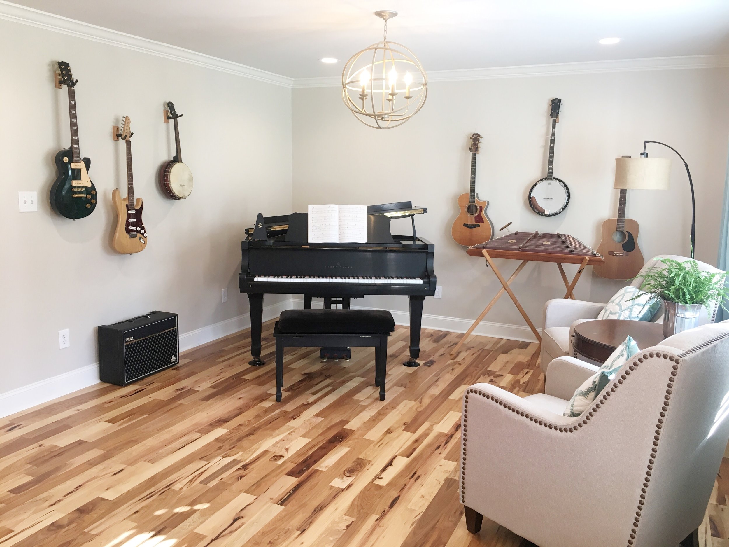
I find that paint colors for interior walls are what trip my clients up more than anything. I guess because its the largest surface area change in the house, and it's a lot of time (and sometimes money) to change. For me I love painting, so personally I don't put a ton of thought into my houses' paint colors because I can paint a room in a couple of hours and it costs me $20. I know especially for common areas though, a paint color is a huge deal and I totally agree it should be one thing you spend time on deciding.
There are two things I want you to walk away with today :
1.Remember that a paint color can be changed. Its not the end of the world if you start painting and don't love it. And don't get stressed because "I have to pick the perfect color because I don't ever want to paint this house again". Within 10 years your going to want to update your paint color anyways.
2. There is not any "perfect color that works for everyone". People are all over Pinterest looking for that "full proof gray" that will be perfect for their house. ALL COLORS ONLY LOOK A CERTAIN WAY BECAUSE OF WHAT YOUR EYE IS COMPARING THEM TOO. Let me explain. Whatever the color will be placed next to (a couch, floor, trim) is going to change what that color looks like to those in that room. So you may think a gray color looks so pretty in someone else's house, but in your house, your furniture, floor, or fireplace color will probably make that color look completely different.
Moral of the story, you have to bring that color into your home and put it in that space to be certain it will be what you expect. My advice is to take some colors that I recommend today, get samples, and paint them in different places against your trim, cabinets, floor, fireplace... anything that may change the way the color looks and go from there. Be careful not to compare the current color since it's about to be gone.
It works like this: a warm gray works well with other wood tones because they are also warm. Any warm tone like wood: yellow, orange, red, brown, will all cool the colors around them. This means they will make them look more blue or purple or green. This is why people often pick a gray that may look "true gray" in the store but then when they start painting, it looks blue or purple to them. You have to be conscientious of things like a warm beige couch or wood cabinets in the vicinity. This is why warm gray will in turn look "true gray" in most peoples homes because they almost always have beige carpet or wood floors that will cool the gray. Here is a handful of warm grays "greiges" that have worked for a lot of spaces I have designed/redecorated: Revere Pewter MB, Edgecomb Gray BM, Baloa Mist - BM, Mindful Gray -SW, Agreeable Gray -SW, Repose Gray- SW.
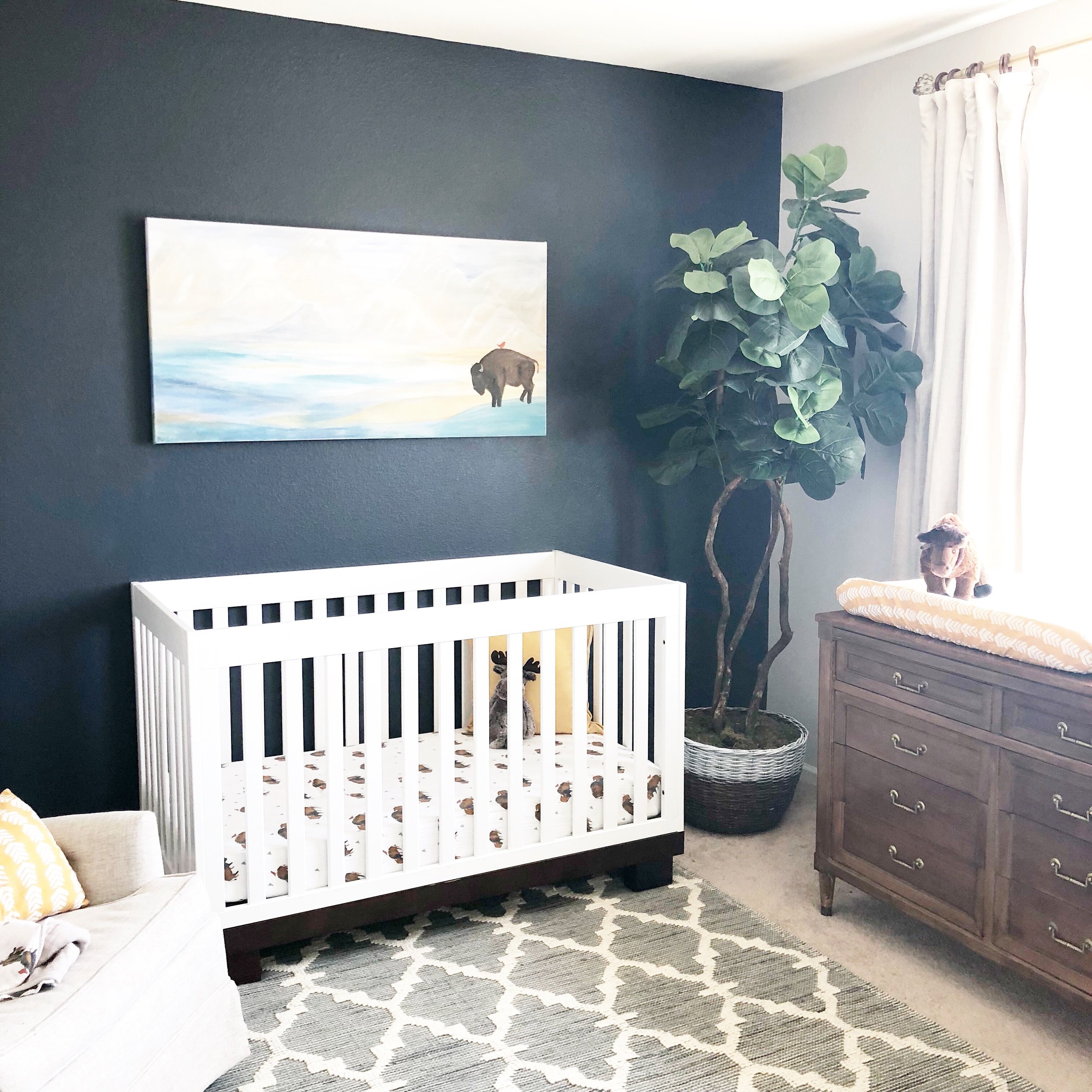
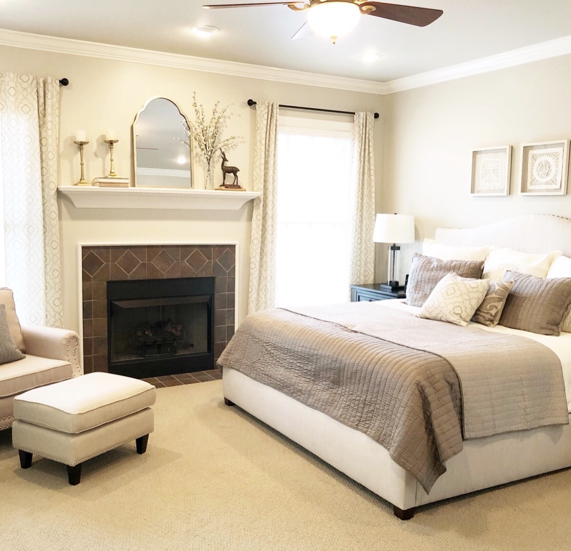
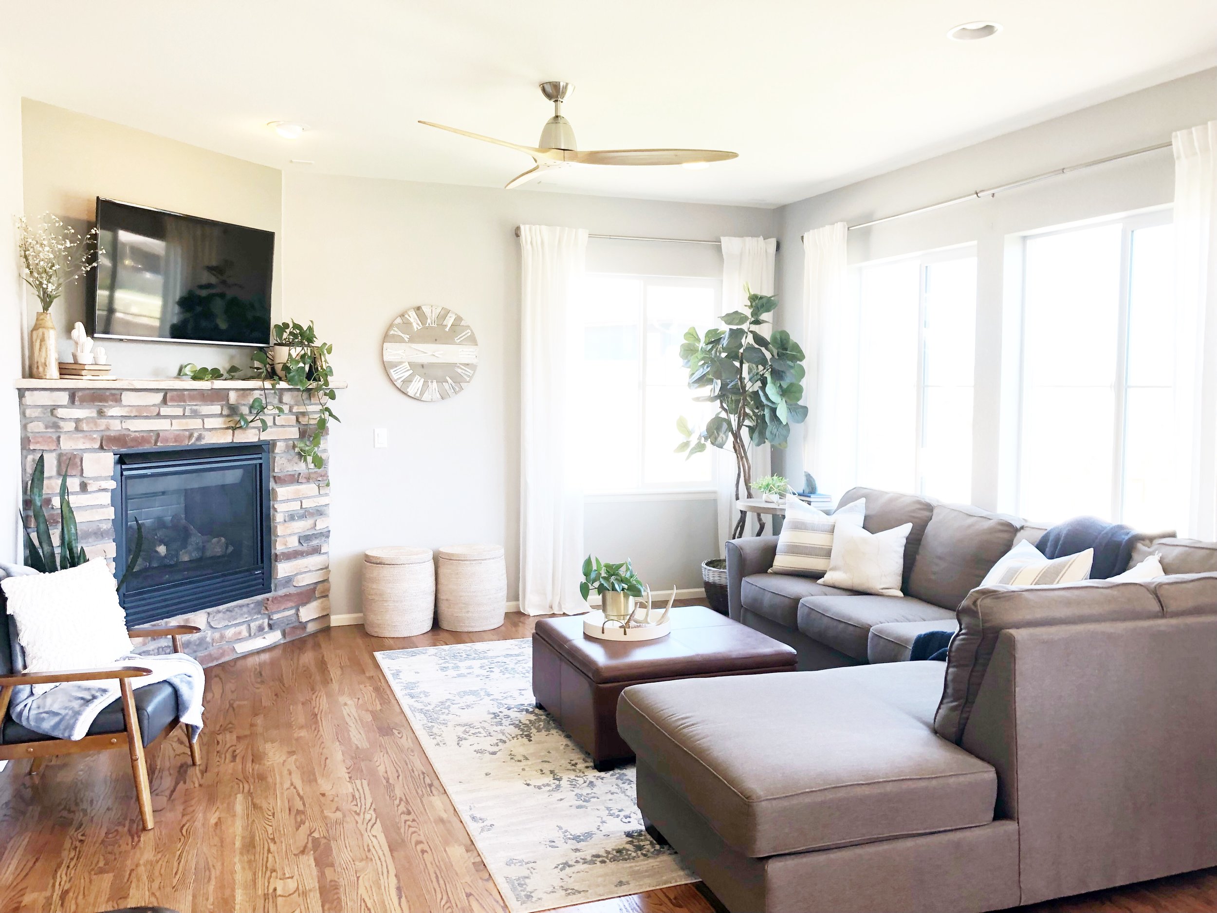
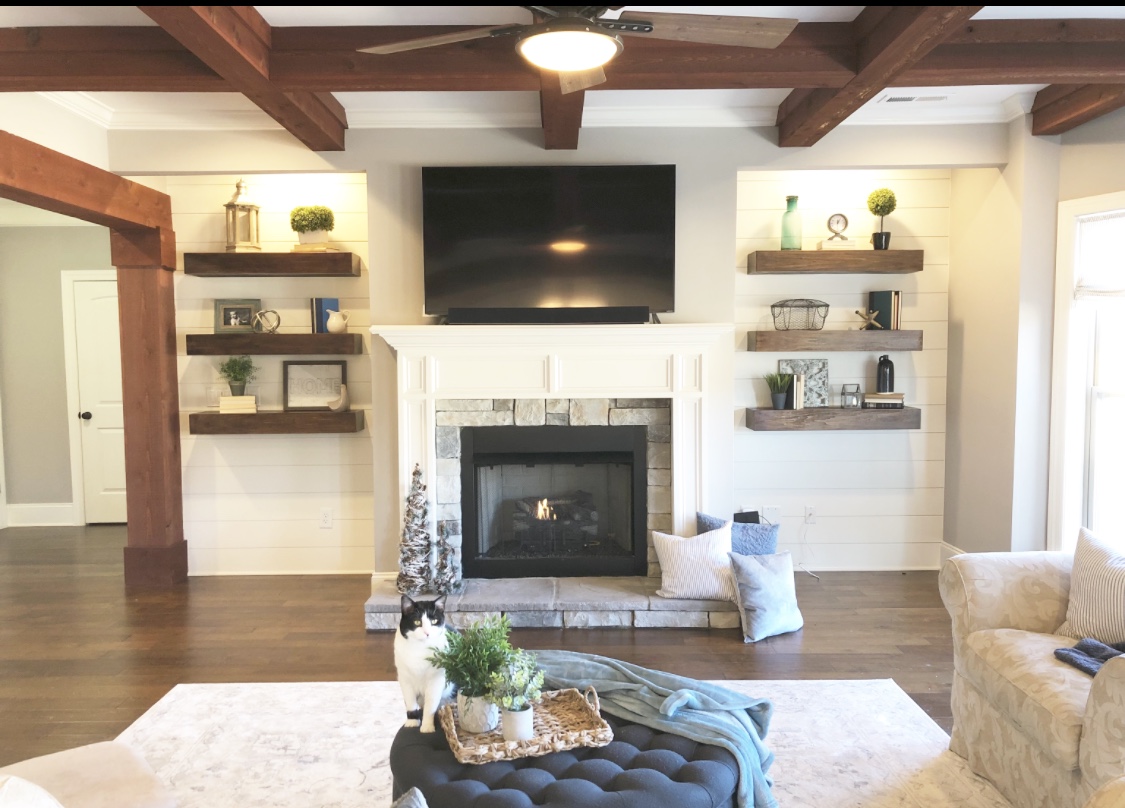
In the pictures above in order: Hale Navy -BM and Balboa Mist- BM, Agreeable Gray -SW, Cumulus Cloud -BM, Repose Gray -SW
Another alternative to gray walls are white walls. So many people are scared to paint their walls white, but don't be. All walls need touching up. White walls are not going to show scuffs any more than light gray ones. White walls, like white sheets, are clean, crisp, and give a nice contrasting back drop to your decor. And white walls are not nearly the hassle of gray or beige walls when it comes to picking out the right color. You basically just match your trim and be done. Some great whites I use are Decorator's White- BM, and White Dove -BM, Elder White -SW (actually super light gray if your still scared). Same thing as other colors, there are warm whites (slightly off white) and stark whites. If you have stark white trim, you need a stark white for your walls or the walls will look yellow. If you have warm trim, you need a warm white or your trim will look yellow.

Pictured above in order: Dove White trim and Edgecomb Gray walls - BM, Olympic Mountains (very light beige) - BM, White Dove- BM
Picking a trim color: Stark white trim gives you a very clean, modern feel. It will feel brighter. If you want a warmer, cozier, more classic feel, a warmer white is better for you. Also consider an trim color other than white, like light gray. This is definitely different but it looks gorgeous. Trim also needs to have some sheen like semi gloss or gloss. PS nothing makes a house feel cleaner and fresher than newly cleaned touched up trim.
Sheen: Sheen is the amount of shine in the paint. They also give the paint different properties besides the color.
1. Flat has no shine and can be almost chalky. This is a good choice if you have textured walls or imperfections you want to hide. Any sheen will reflect light off the surface of the wall showing you any rise or fall in the dry wall. I have textured walls in CO (thumbs down) that I don't want to notice so all of my walls are flat. This hides the texture. The downside to flat is that it can show water from condensation and smudges don't come off as easily. One trick to getting anything off walls is a magic eraser. Most people are scared to paint walls flat because they don't come as clean, however in my experience, if it doesn't come off with a magic eraser, it wasn't going to come off a wall with more sheen either. Secondly, its called touch up paint.
2. Egg shell has a slight sheen. Many people like this because it is kinda in between. Its great for bathrooms because it helps hide condensation drips yet it doesn't appear very shiny. Many people also feel they like how smudges wipe off of eggshell.
3. Semi -gloss has quite a bit of sheen to it. It is best for things like trim and cabinets because things do wipe off fairly easily and it differentiates the woodwork from the drywall. Just remember that it shows imperfects more so things like cabinets have to be painted with care to avoid seeing every rise and fall of the wood.
4. Gloss/high gloss has a ton of sheen. It is great for specialty projects and some people love it for trim and cabinets. It does give your woodwork a higher end feel, but once again it will magnify imperfections. Its great for high traffic doorway trim and base boards that will need lots of wiping.
Design Tricks with paint: Because paint is cheap, it is a great way to add fun and interest to your decor. I love a good accent wall. As you can see from my pictures, an accent wall with some good contrast to your furniture and adjacent walls can create an extra wow factor to your room fairly easily.
Stenciling is also a low commitment wow factor you can easily add with paint. I always recommend stenciling to clients that are scared to wall paper but want something bold. If/when you get tired of it, just quickly paint over it. Good quality stencils cost about $50, so for $75-$100 you can stencil a wall that easily upgrades your decor.
The Westminster Project:

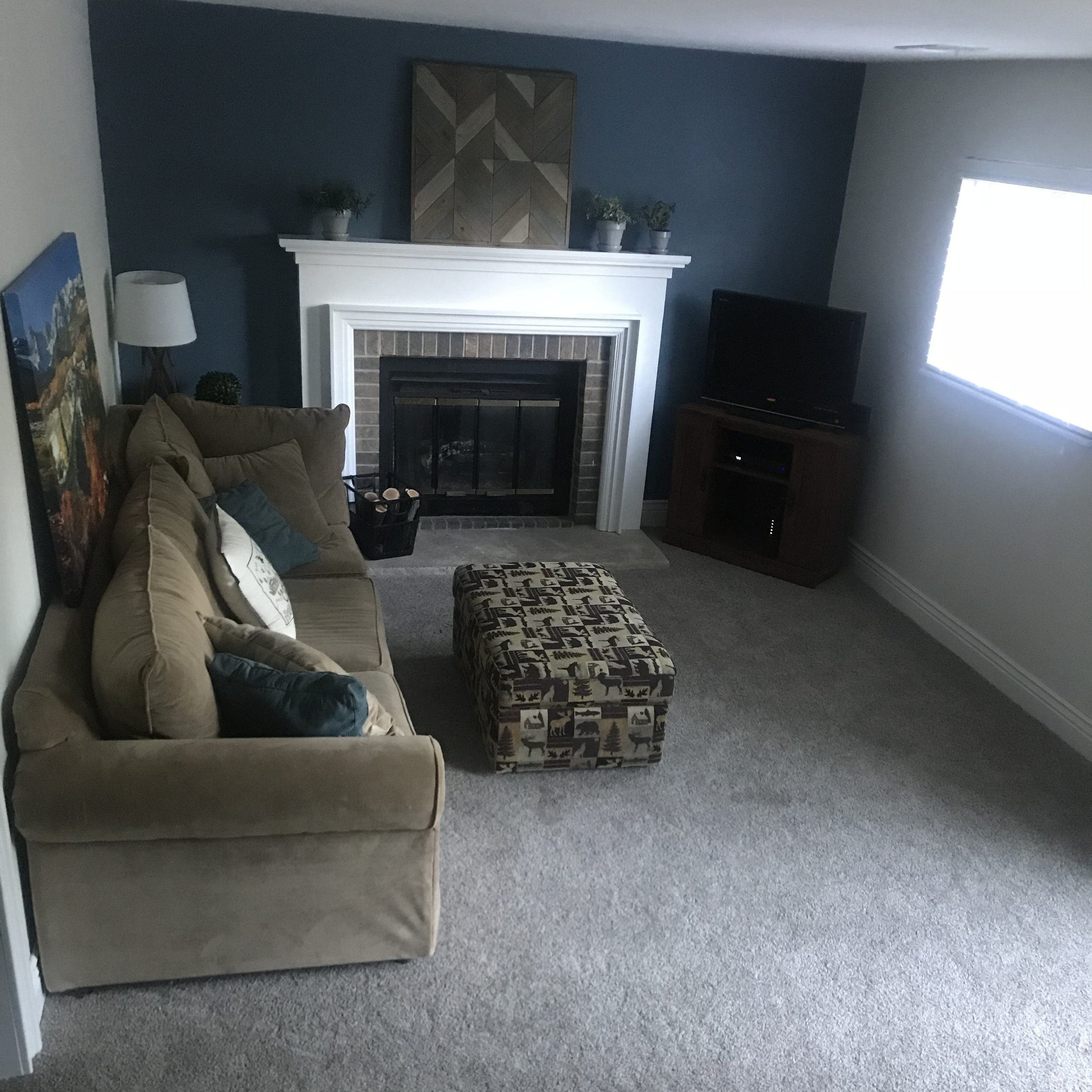
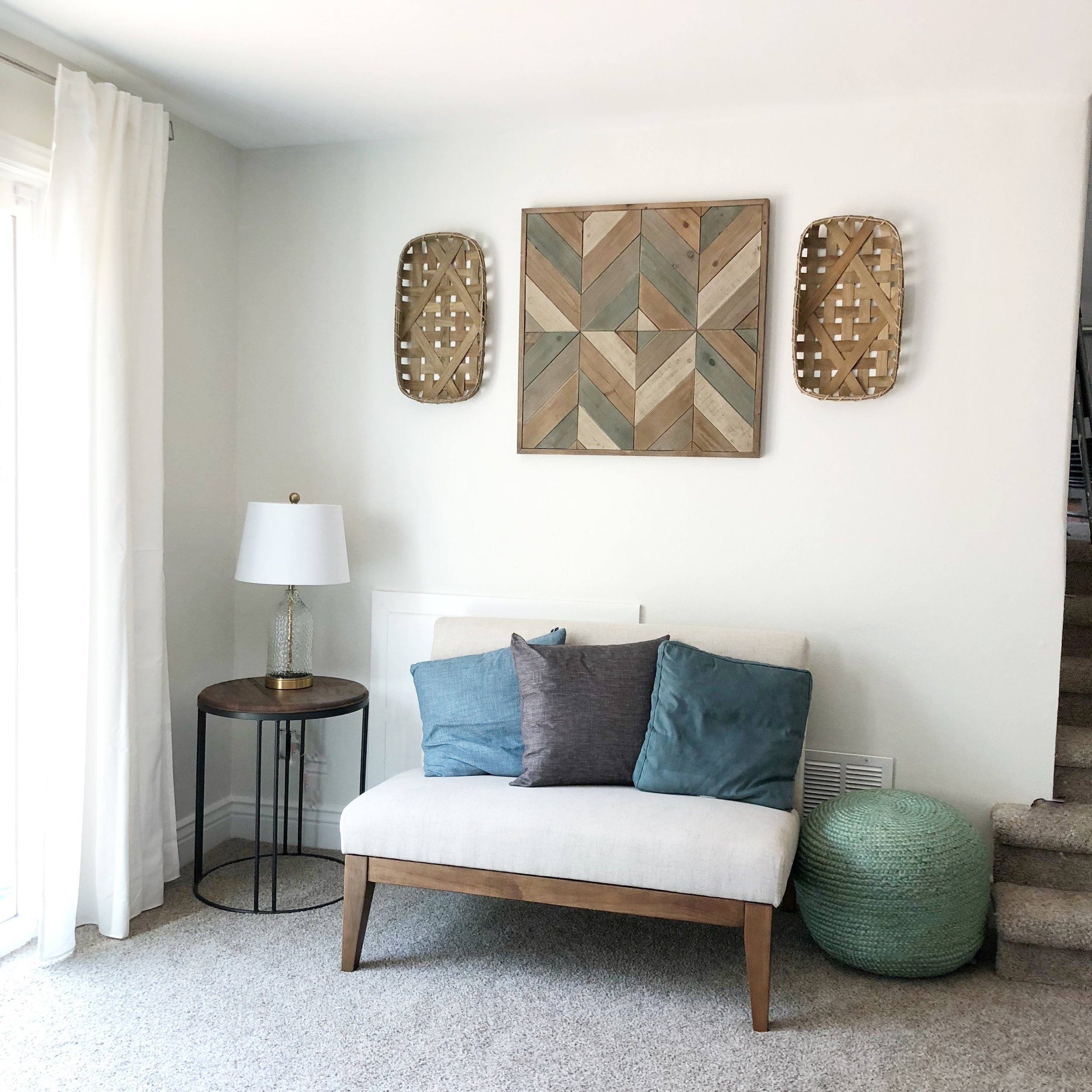
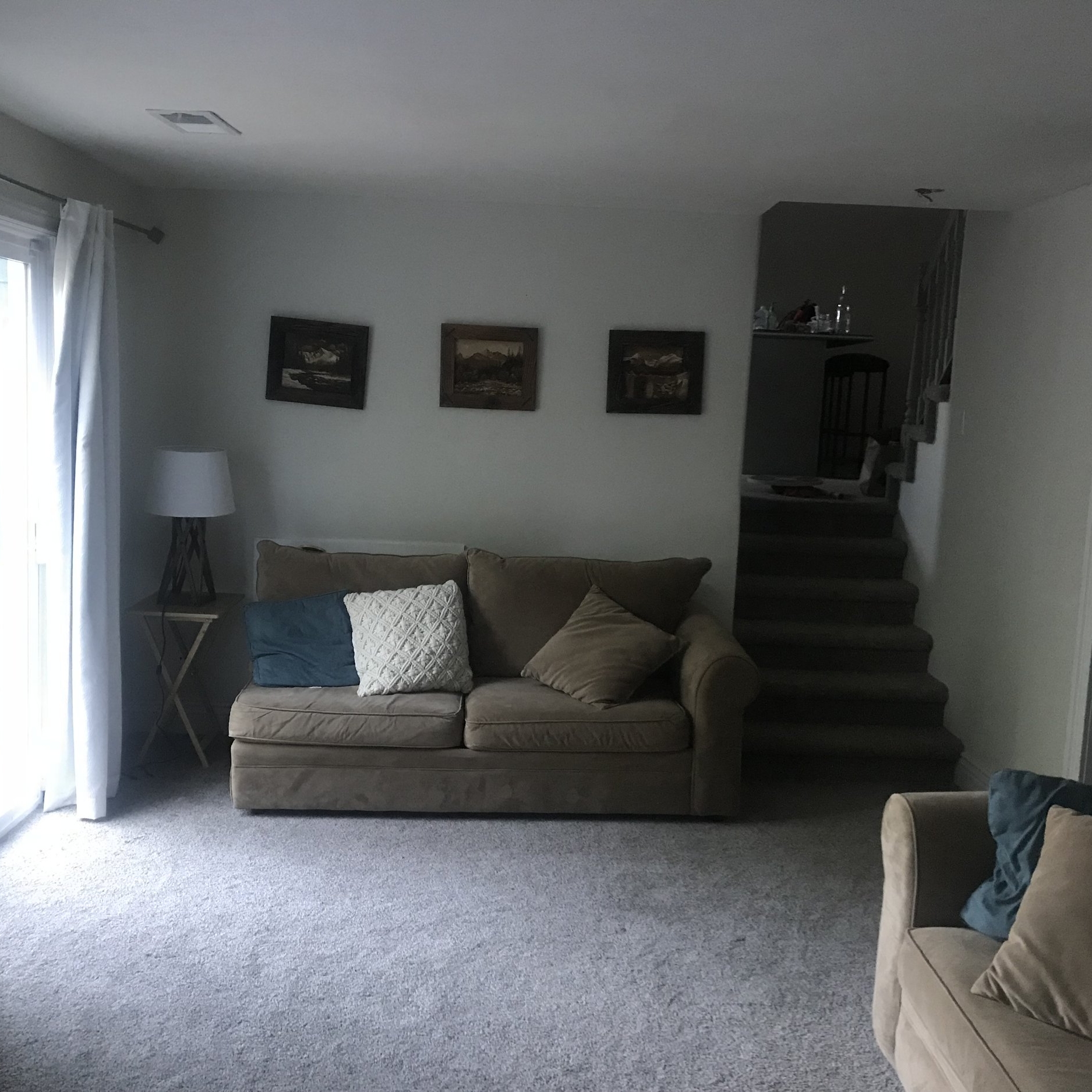
This project was a ton of fun, mainly because this couple was so sweet and fun, but also because I got to do my favorite things which is to swoop in, and in a few hours, transform a room. Because they were about an hour away, we did all the planning and ordering of everything but the wall decor and accessories remotely. Then once everything was delivered, I came to their house, along with all the decor (curtains, wall decor, accessories) and put the room together in just 2 hours.
It is a small space that the owners, Jake and Erika, wanted to maximize for friends to come over and socialize. She also, of course, wanted to update the room into something "modern farmhouse and cozy". Their current furniture, from college, was too big for the space forcing them to separate their sectional into two different places in the room. She was also concerned about making the room feel split from the left side of the sliding door the right.

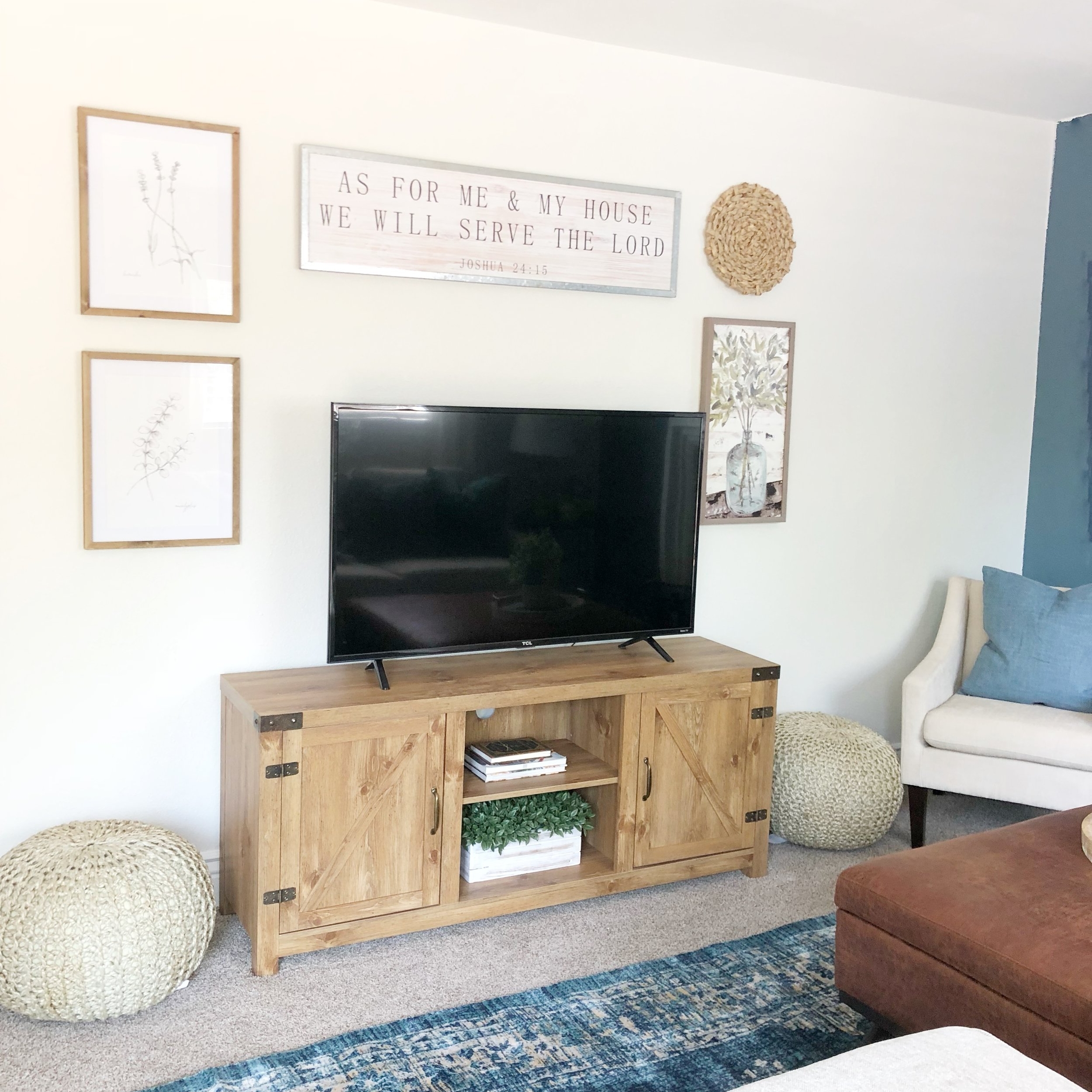
We solved all of their problems by ordering a chaise sofa that fit the room and allowed for a good bit of seating. We created seating for up to 13 people with 4 different pouf ottomans and an extra seating section next to the door with a bench. Without a main light source in the room, I balanced the lighting with a pair of lamps on opposite ends of the room on two side tables perfect for setting drinks.
We also created a cozy feeling by adding curtains, an area fug, and lots of pillows. Erika wanted to decorate with teal, but Jake was afraid of how bright and overwhelming the color would be so I chose furnishings that had a toned down teal and paired them with a grayish medium blue to help tame the color. I also added the saddle ottoman and warm which adds a masculine feel to the sometimes feminine feeling teal can give a room. These warm tones also balance out all of the cool blues in the room.
The accent wall had already been painted and Erika loved the color. I was also excited about leaving it and playing the rest of the room off of the soft yet contrasting dark aqua. I loved how it made the fireplace pop against the white wood work.
We chose furniture that guests could enjoy and that could grow with Erika and Jake. The ottoman, couch, and rug are all spill friendly. I didn't want them to feel like guests couldn't come in a prop their feet up with a drink. Thanks to Erika and Jake, I designed a room I am super proud of.
Source list:
Couch: Scott Living, Montgomery Sofa - Amazon
Rug: Jay Navy Blue Tibetan Area Rug 8x10 - Wayfair
Ottoman: Owen storage ottoman in saddle - Wayfair
TV Console: Adalberto TV stand - Wayfair
Chair:Aileen Mid Century Tailored chair -Wayfair
Loma end tables - Wayfair
Emanual Settee - Wayfair
Odin and Koby Sphere Poufs - Wayfair
White walls: Cascade Mountains - MB
Accent wall: Phillipsburg Blue - BM
Candlesticks, Round mirror, lamps, wall decor: Hobby Lobby
All plants, ottoman tray, pillows: Homegoods
August 26, 2018: Curtains
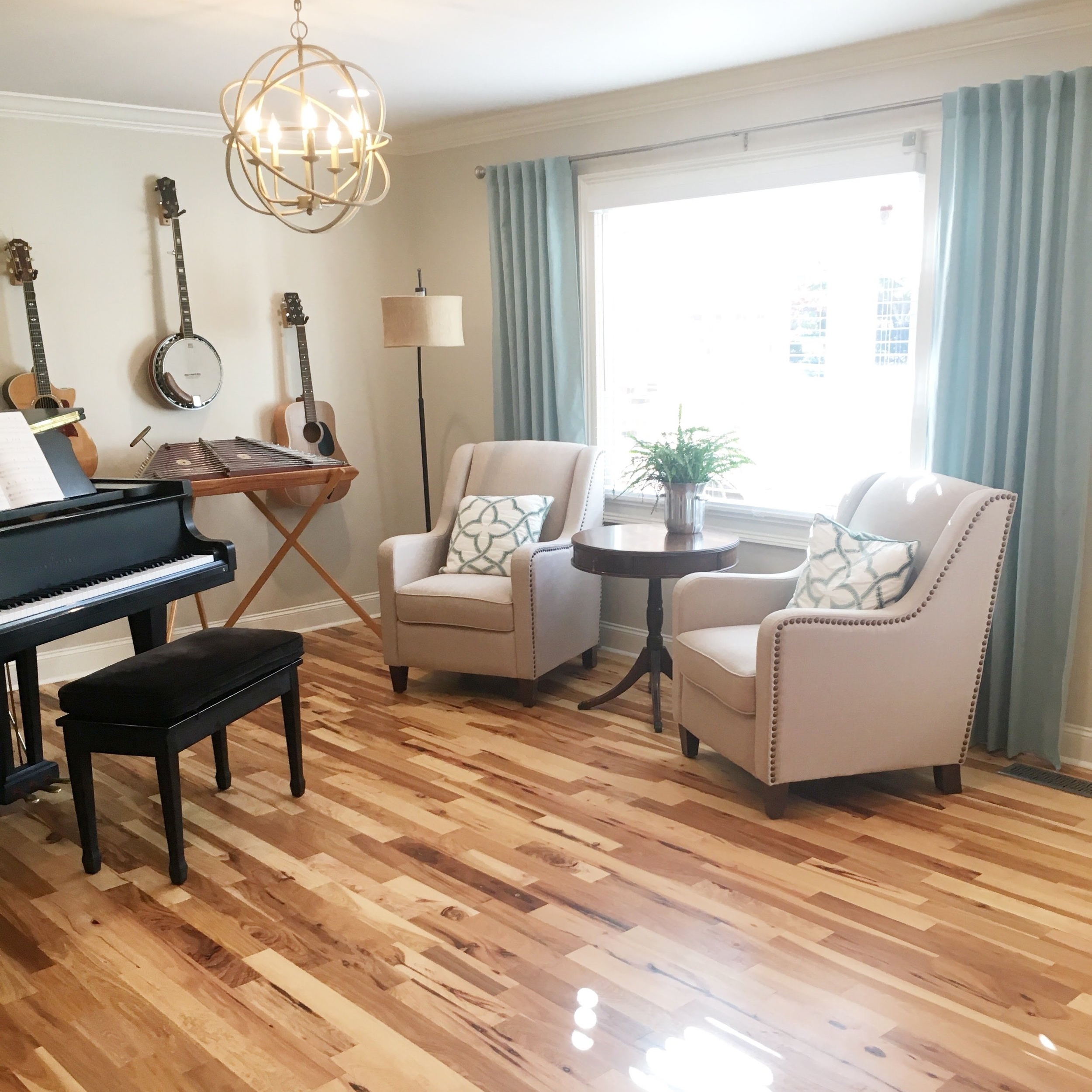
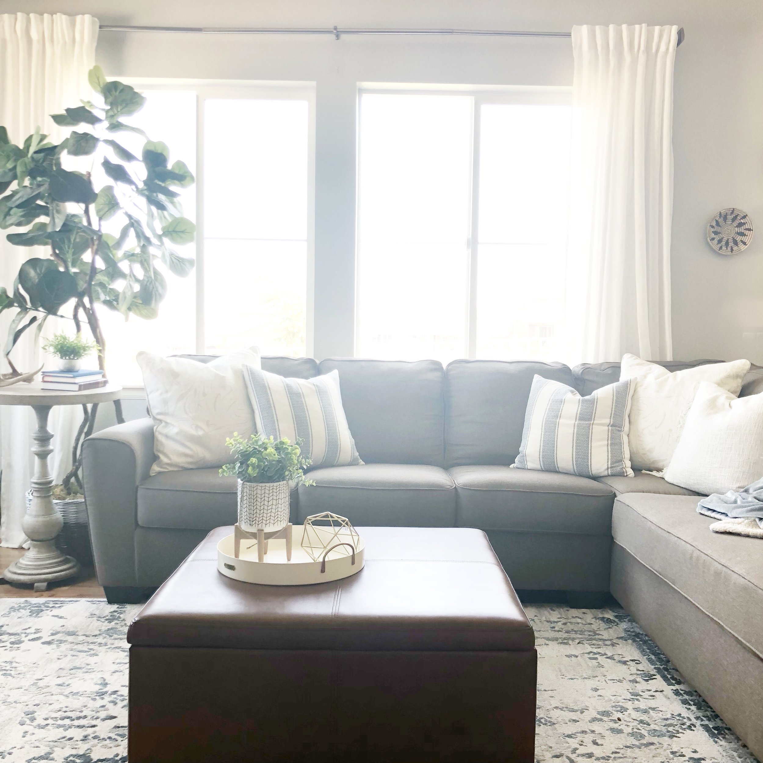
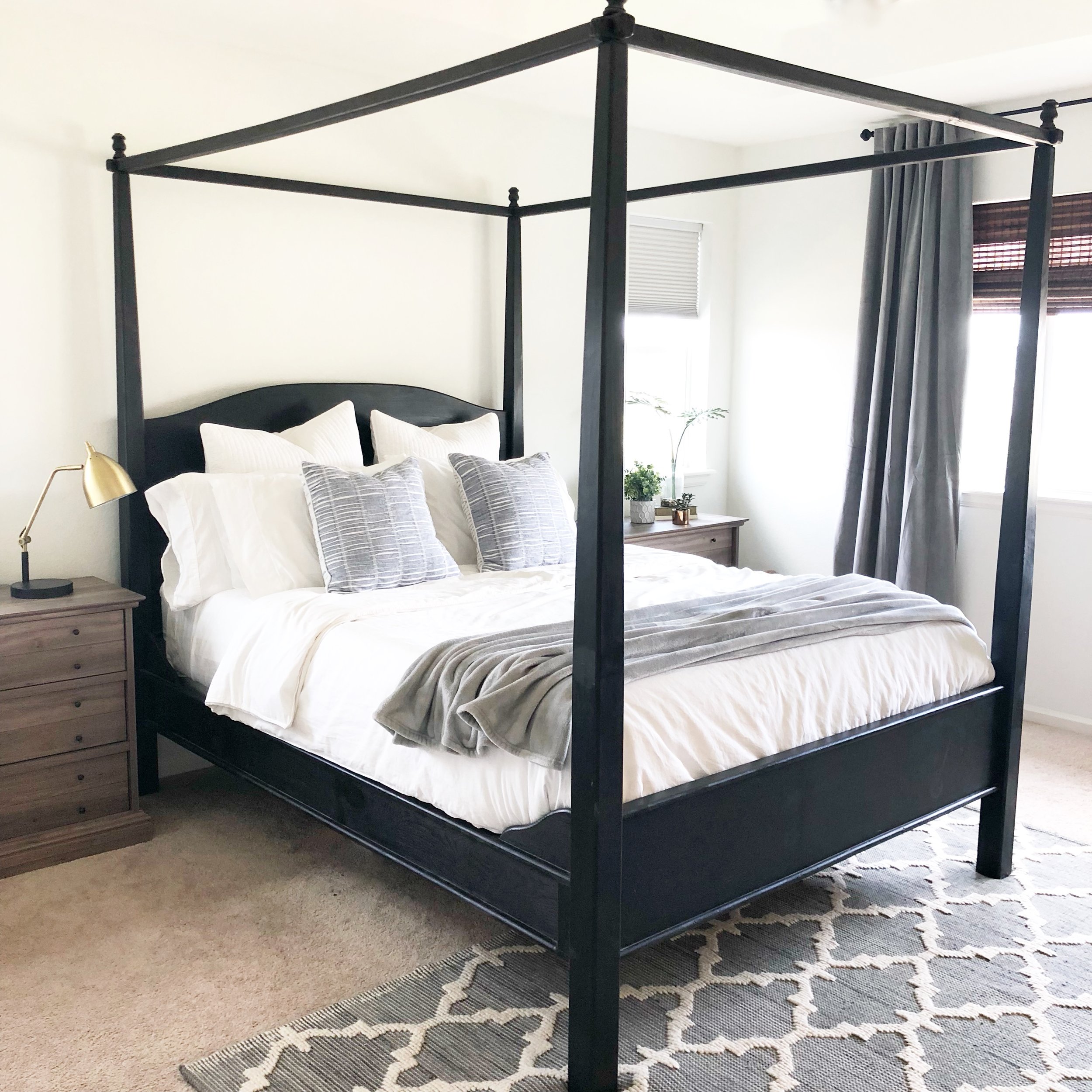
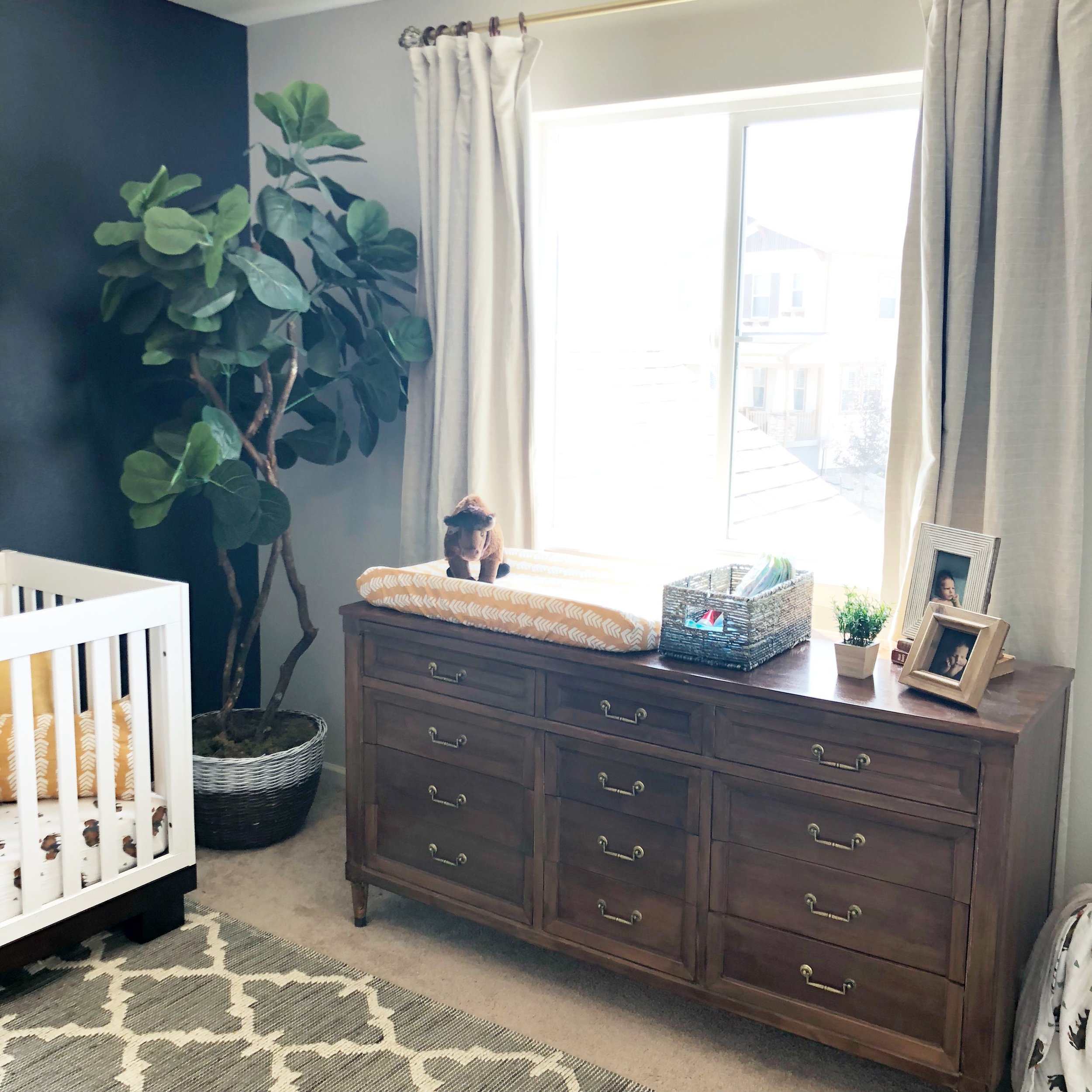
Curtains are a super important aspect of a room. When people start decorating from scratch, it's the first thing I have them do after getting the main furniture pieces. Curtains and throw pillows are what makes the space feel comfortable and "lived in". Several people I have helped complain that their house doesn't feel "homey" and the lack of curtains are the main reason for that.
Curtains DO NOT have to be expensive. A solid curtain panel if sized and hung correctly can look grand and upscale. You don't need custom curtains to get a custom look. I'm going to show you all the tricks to making this happen. In all the pictures you see today, not one of these sets of panels cost me more than $80 for the pair.
Length: I'm telling you now - your curtains are probably too short. Curtains come in several common lengths: 84", 96", 108", 120". Let me be honest- you really should never buy 84" curtains, unless you have an unusual set up. This is because you should be hanging your curtains about halfway between the top of the window and the ceiling AT LEAST - you can go higher. So, even if you have 8 ft ceilings, you should get 96" curtains and hem them to be 90". This because half way between your window and your ceiling is about 90". If you have higher ceilings, like 9 ft or more, you for sure need 96" or maybe even 104".
If you are saying "but Emily I can't hem them because I can't sew" - its called fabric glue. Cut them and then just turn them under and glue them. No one will ever notice. If you find some curtains that you just love and they are 84ish", you can also take out the 4" hem at the bottom and re-hem them with the glue to gain some more length. Most of the time though, they really need to be a few inches longer.
Notice that in the pictures above, I hang them almost to the ceiling. This is for a couple of reasons. First of all, hanging curtains high, like we discussed last week, brings your eye up thus making the space seem bigger. It also makes your window look bigger thus making the room look grander and more upscale.
How they hit the ground: Some people do not like curtains that touch the ground or "puddle" (which means to pile on the floor a little). That's fine, but they at least need to come to (or "dust") the floor. If they stop above the floor they look unfinished or like you bought them too short. I always advise, especially in rooms where you want your curtains to close to block out light, have them dust the floor about a 1/2". This keeps them in place once you close them. In all my rooms I make sure they dust the floor so that they also stay open all the way. You want them not to cover the glass of the window when they are open, and having them dust the floor keeps them from doing this. That brings me to the next thing.
Width of rod: People often get a rod that is too narrow. You should make sure your rod comes out from the side of the window about 8-12". This is because you need room for the curtains to have a resting place NOT IN FRONT OF THE WINDOW when they are open. And you don't want them all scrunched up on the sides when they are open either. You want them to look full and luxurious when they are hanging there in front of the dry wall. For example: if you have a standard 36" window, you should get a 36-66' inch rod. You need at least 52" inches of rod. See my pictures above for reference. All of those curtains are open and you are looking at the whole window, ideally. (Except MAYBE 1-3" in that one picture because I didn't realize until now its not open all the way.)
Rod Style: Keep it simple. Don't get a fancy finial (thing on the end) unless you are going for fancy dining room or something. What is in style for rods now is a very minimalist finial. I listed one from Bed Bath and Beyond below that I love for all kinds of spaces. Don't be scared to order it in gold either. Also, don't spend a ton on a rod. $20-40 should do it. I get mine at Home goods, BBB, or target most the time.
Width of curtain panel: The wider the better in most cases. Most panels come in a 40-45" width. This is fine if you are trying to save money or you have very small spaces for the curtains to hang (for instance in between bay windows). But if you can, try to spend a little extra and get 50-54" wide curtains. They look fuller and more expensive this way. You especially need this if your window is a double window. Remember how we are hanging our curtain rods extra wide? Well that means our brackets we install in the wall are also out about 5" or more from the window (depending on your stud). The best thing to do is to put the first 1 to 3 rings or tabs (that the panel is hanging from) outside of the bracket so when you close them they stay put on the outside. This means the 50" panels will compensate for the this extra width needed if your window is more than 45" wide.
One more example:A double window is usually about 77" wide with trim so you need an 80-120" rod and at least set a 50" panels.


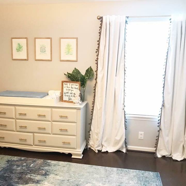
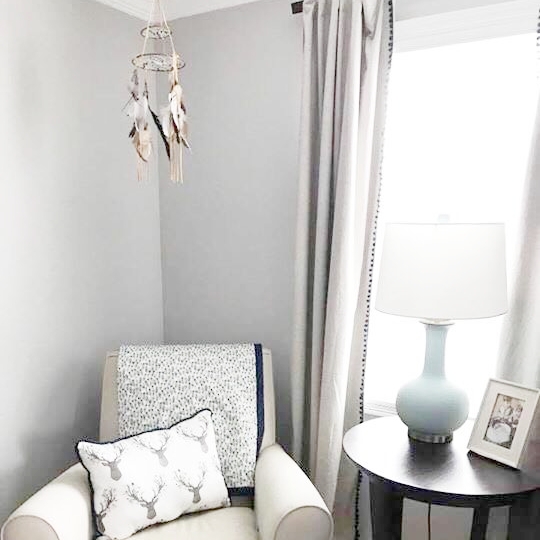
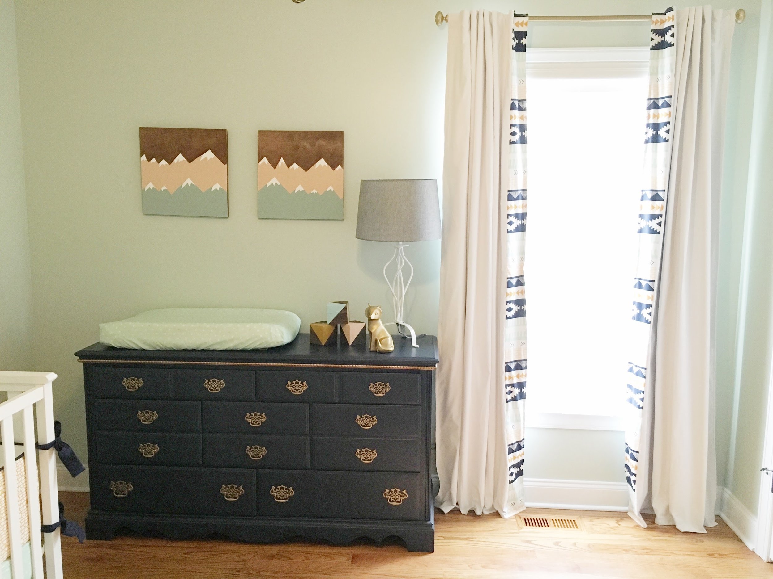
Additional Tricks:
1. Adding trim - I do this ALL THE TIME. See pictures above. I buy cheap solid curtains and then I add trim to the inside of both panels. This can be a ribbon, pom pom trim, tassel trim, or a patterned fabric. I go to Etsy and search "____ (color) trim". It costs me usually about $12 for trim for 2 panels. Once again, no sewing needed. Just glue on.
2. Adding or buying curtains with lining - some curtains look cheap because they are thin or even see through. In my living room I don't care because they are just there to soften my room. But in bedrooms and places like dining rooms, I make sure they are lined. This makes them look thicker and more custom.
3. Buying them a little longer than needed: If you don't mind them puddling a little, do it. Letting them rest on the floor about 1/2- 2" gives them a higher end look - and like I said before, it keeps them in place well.
Kids' rooms and nurseries - Get black out curtains or add black out lining. Its called "roc-lon blackout lining" and its about $40 to add it to a pair of curtains. They look so much better and they block out the light in bedrooms allowing kids and babies to sleep longer (yyyyaaaassss). They also help block out heat and cold to keep the room's temperature more stable. I'll say it one more time for the people in the back: Glue it on the back of the curtain around the perimeter if you can't sew. You can also use iron on bonding tape.
Style of curtains: Just to make it simple if you are over whelmed by decorating, buy solid curtains that have a texture, like linen or velvet. There is a place for patterned curtains but sometimes that's hard and over whelming, and to be honest, I've only liked pattered curtains if they are a patterned fabric that I have picked out to match a nursery and then I made them. I have rarely seen patterned curtains I liked in common areas. So moral of the story is, keep it simple - solid curtains are beautiful if you follow the advice above. No need to get complicated.
Curtain Header Options: There are grommets (metal rings in the fabric), tabbed back (top of curtains are in front of the rod), pinched pleats (fancy and requires rings and hooks at the top- sooo pretty), rod pocket (the original style that is scrunched at the top). Out of all of these, my fav for everyday is tabbed back. That's what you see in most of my pictures. I also love pinched pleats and rings. Hanging your curtains from rings is super helpful if you will be opening and shutting them everyday, so I usually mix by buying tabbed top and adding rings. They move smoothly across the rod with out any tugging which I love for nurseries and kids rooms. I posted a pic below of the rings in the shopping section for you. Target also has them in metal super cheap ($6 a set).
I will go ahead and say it - I don't like the look of grommets even though they are good for opening and closing too. They usually just look out of date to me.

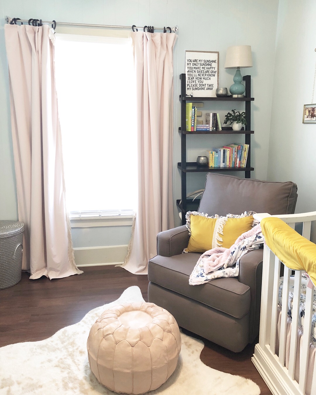
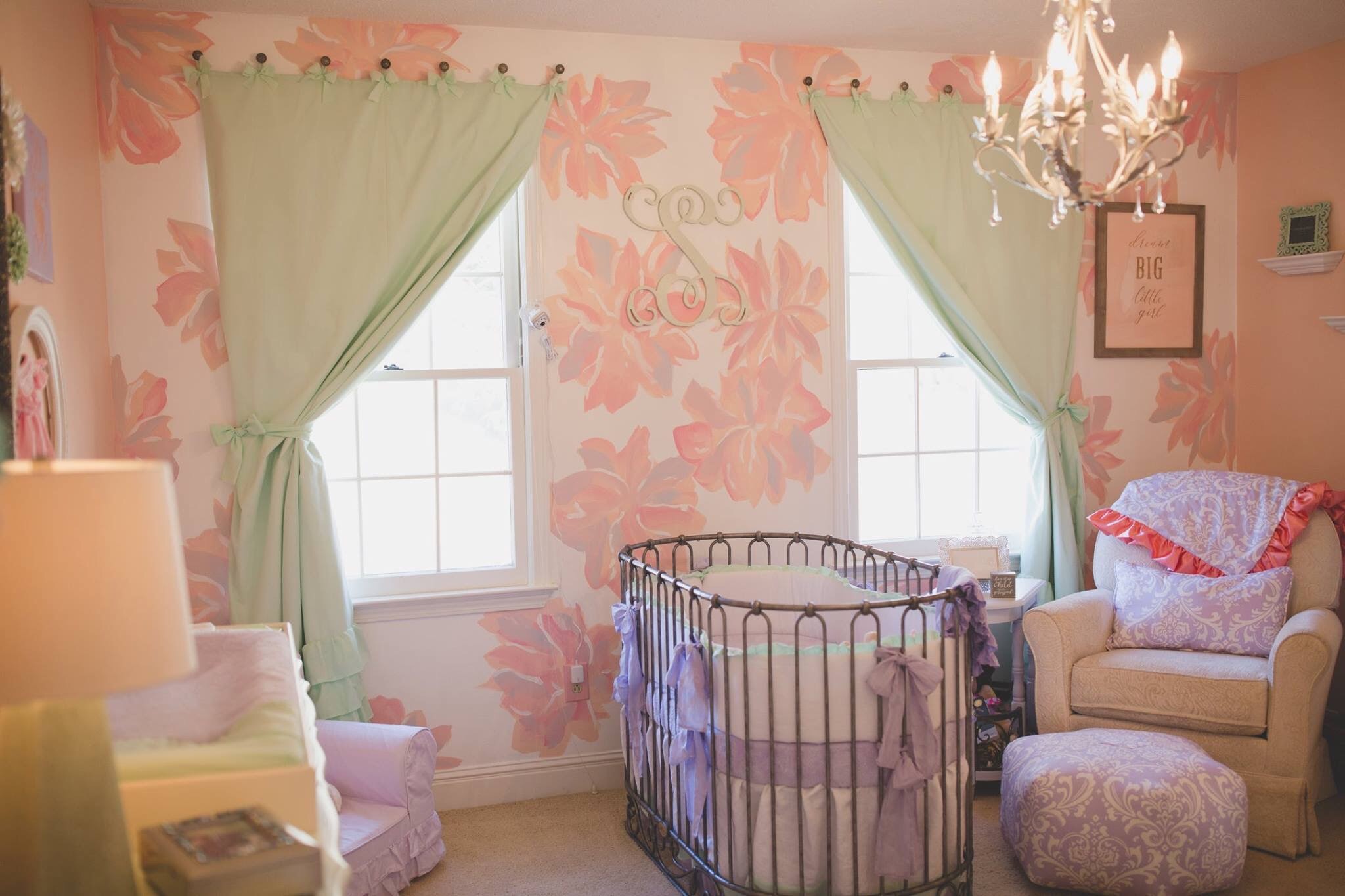

Where to get curtains: Below are some of my favorite curtains to use and an example of curtain rings. The first two are nicer full, blackout curtains. They are my favs to use in bedrooms and dining rooms and come in all kinds of colors and lengths. They both also help with draftiness. The first set has a linen look, and the second are velvet which is also a great texture to use. The third and fourth sets of curtains are cheaper, from IKEA.com and not lined but are great to use if you are saving money and don't care about some light coming through ( these are what I have in my living room). They come in 98" which can be cut to fit most spaces. These all also have several options for hanging including my favorite: tabbed back.
Note: The first set of curtains seem to be a favorite for most people because they go out of stock quickly. However if you want them, set up a restock alert and Wayfair will get more in soon.
Freemansburg Room Darkening Thermal Curtains: Wayfair $40.00

Umbra Cappa Window Hardware: Bed Bath and Beyond

Albert Solid Blackout Thermal Curtains: Wayfair $52.00

Allen +Roth Tobacco Wood Curtain Rings - $10: Lowe's

Vivian Panels: IKEA.com $12.99

Majgull Panels: IKEA.com 34.99
Ok there it is! Hopefully that was super helpful and of course if you have any other questions don't hesitate to contact me on Facebook or Instagram! Next week: PAINT COLORS!!!
August 20, 2018: Decorating Small Spaces...


For those of you with small spaces: I hear you. My house here outside of Denver is about 2,000 sq ft which includes a kitchen, eat- in area, and living room all in one room, a master bedroom and bath, 2 kids rooms and a guest bath, a laundry room, mudroom, guest room/office, and half bath. I love our house, and although it is efficient, every room is SMALL. I want to talk about making the most of your space, whether common area, or a kid's room so here goes.

No matter where, listen to me: LESS IS BETTER. Do not try to fill every wall with a piece of furniture or every corner with a chair. It is OK and really, a good thing if you will let walls stay empty, especially if it is a hall way, or a wall that people walk by often.
Have less small pieces, and a few big pieces. I understand a plant in the corner, or a basket for storage, but don't buy 3 small tables, 5 small chairs, and 2 love seats. I see people do this all the time. They feel that a bunch of smaller pieces make the room look bigger because they are too small, leaving the room looking cluttered and therefor smaller. If all you have room for is a couch and a coffee table that's OK.
Of course you don't want the furniture to be too large either. If you want a larger couch but want to make the room feel bigger, get one that has a lower profile back or a chaise (my couch is both). This allows for people to see over the couch better, which doesn't break the visual field as much making the room look bigger. This is even more important if you float your furniture.
Paint the walls light. It's OK to paint a dark accent wall, but you want to make sure there is plenty of natural light in the room and you have light furniture to contrast. And white walls are AMAZING...just sayin - white goes with everything, don't be scuurrddd.
Hang light curtains from as high up as you can. Even if you have a small space, taking the eye up still increases the field of view therefor making the space feel bigger.
For bedrooms: The bed should always be on the wall furthest from the door if possible. This way the bed is facing people that walk into the room. No foot board helps. Utilize closets very efficiently. Make sure you have a good closet organizer that has cubbies and uses all the wall space in the closet so less has to set out in the room. In a small bedroom, especially if you need a full size bed, get two bed side tables with drawers and put clothes in them instead of a full size dresser or chest of drawers that may not give space to walk around the foot of the bed. This is way better than having to turn sideways to get between the end of the bed and a dresser. I have to do this in both of my kids' rooms (see the blush bedroom below). Once again, curtains up high to make the room look taller.


For kitchens: Drawing the eye up is important in making a kitchen look more open also. I have a small kitchen. It looks and feels bigger for a few reasons: 1 It has light cabinets and counter tops, 2 its open to the rest of the common area, and 3 I added larger trim to the top of the cabinets to get them as close to the ceiling as I could easily and I made sure my range hood went all the way to the ceiling when I built it. This draws your eye up increasing the visual field of the room even though the foot print is small.
I have so much more I could add to this but I'll split it up some.. next week I will talk CURTAINS! I tell you how to hang them, what size to get, what types are good for each room, and of course my fav curtains to order for myself and clients. I'll have a few tricks to save money and make your curtains look custom- even if you can't sew! See you next week - have a great one!
August 13, 2018: Rugs...

Gosh rugs... there is so much to say and I only want to write so much today...
Rugs are almost always the show stopper of the room. They really do make a difference. They define a space, add texture, and most of all they are gorgeous (when you get the right one). They also have the very important job of giving kids a soft place to play, or the dog a warm spot to nap.
I really feel every space looks better with a rug whether you have carpet or not. That's always my opinion, so lets get to it.
Once upon a time, purchasing rugs online for clients stressed me out: What if its not thick enough? What if its not soft? What if it doesn't clean well? What if those colors aren't accurate? Now I feel like its one of my strengths, and hopefully I can make you feel as confident today after this post.
There are a lot of great places to buy rugs online, but my fav is Wayfair. Remember the company also include Birch Lane, All Modern, etc. The reasons I prefer Wayfair are: the stock pictures, the reviews, and most importantly- the pictures people post in their reviews. They are worth everything. Also, if you get a rug and don't like it, Wayfair will return it on them as long as you accept a Wayfair credit (which you can go buy another rug with).


Material:
Natural fibers like wool, cotton, and jute are soooo beautifully textured, as pictured above. However, wool and cotton blends do not clean well. They will also bleach if not cleaned properly and are more expensive than synthetics in general. I advise those with pets and/or kids to stay away from most natural fiber rugs in main living spaces. You may want to spring for one in an main entry provided the kids and dog mainly come in through a different entrance.
Jute and grass type rugs can be a different story. The one I have under my kitchen table is jute and it cleans really well - however its a loose weave so most crumbs make their way through the rug onto the floor requiring us to take it out and vacuum underneath occasionally. But, the beauty is so worth it to me, haha!
Synthetic rugs are the way to go if you want to keep cost down, desire easy cleaning, and want to be able to get ANYTHING out of your rug. All of the rugs I'm going to post below are synthetic and under $350 (except 1) for an 8x10. I can attest that synthetic rugs will clean like magic too. You can clean them with dish detergent powder and warm water! You don't have to worry about getting that really light rug for fear of wine, kool-aid, or mud that will (you know) get all over it no matter how hard you try. GO FOR IT! My rug is mostly cream and gray and it has had cat vomit, coffee, red snow cone, and baby poop all over it; all of which came out no problem.


Determining Size:
Living room/Den- if there is no carpet, make sure the rug is big enough to go under the front of the main furniture in the room by at least 6 inches. This includes the couch(es) and chair(s). This not only looks great, but also keeps the furniture from sliding away from where you want it. Most living rooms need a 9 x 12 or 11 x 14ish, unless its a small living room like mine, which can handle an 8 x 10 but I could have could gone larger and been ok.
Nurseries - especially when carpeted, I recommend a rug that fills up that empty space in the middle of the room since you're lacking a full size bed. It needs to come up at least 12-18 inches from the furniture around the outside of the room or go up under the furniture slightly. If you don't have carpet, try to size the rug to go under the front of the furniture, but it's not necessary for the room to look right. Most nurseries are good with a 5x7-8x10. You don't want to go too big since they will have a bed soon and it may fill the room; that said, if they have a big room, go for it!
Bedrooms - the Rug needs to go under the bed a fair bit, (about half way) and usually needs to be centered horizontally under the bed. If its a kids room, these guidelines may be too big, but for master bedrooms, a queen needs an 8x10 and a king needs a 9x12. These are especially good sizes if your bed is close to the center of the room. If you have a longer room where there is a separate sitting area then you may need to go larger and center the rug towards the sitting area. Even carpeted master bedrooms will look more complete and styled with a rug.
Other Spaces - Runners are great for in the kitchen, bathroom, or a narrow entry way/hallway.
Now to the fun part: shopping!
Below are a handful of rugs I love. They are all from Wayfair, however other places like target have great ones too - these are just ones I have personally ordered for myself or clients and they are soft, durable, and beautiful. I know they are all kinda the same colors but this is because I wanted to give you all options that go with a lot. You can always contact me for other color options.

Eva Antiquities Rug (more expensive than the others but worth it)

Bryant Gray Rug (also comes in Aqua that's really pretty)

Ismay Ivory/Gray Rug (also comes in light blue)

Twila Gray Rug (has some very light blue)

Youati Ivory/Gray Rug ( this rug is in the picture of the bedroom above)

Olga Gray Rug (more modern)

Abbeville Gray Rug (Has light gray blue and navy) I have this runner in my kitchen. This rug is not as thick as others.

Jake Steele Blue Rug (Cream, light and medium gray, and navy) This rug is in my living room.
How to pick a rug that matches your decor:
Again contrast is important. You want a lighter rug if you have dark floors or a dark couch. If you have a light gray couch for example, don't get a light gray rug. Choose one that has some other color like a mostly white or light blue rug. Sometimes finding a rug you love first, then using those colors to pull from in throw pillows and accessories is the easiest, but if your going backwards, go neutral and don't worry about being matchy matchy. What you are trying to achieve is to break up the furniture from the floor.
Happy rug shopping! As always question are welcome > on the blog next week: DECORTAING SMALL SPACES!
August 6, 2018: Toy Storage...

You know there are toys there somewhere......
It is really important to me that IF I want to have a toy free first floor I can. Sometimes this is when I have a bunch of girlfriends over for book club, and sometimes this is just after I have had a bad week and I want my house to look good after a therapy session (which for me is cleaning my house). If this isn't important to you- that is OK. I don't want any mom to read this and think "oh should I be making sure I have a toy free living room?" No you don't need to necessarily, but I just need a space that can be a complete "adult zone" if I so wish.
My kids toys are 75% "binable" yes thats a made up word for "can be stored in a storage container of some kind". The other 25% are not (cars they ride on, a basketball goal..) for those "nonbinable" toys I have a hall closet that they can go in. They can also go outside if need be. For the binable toys, my go to is a storage ottoman. Not only can they store almost all of my kids small toys, they are also soft and keep my children from killing themselves as they jump around the living room on a daily basis. On top of that, they serve as a perfect place to prop your feet up and relax. I love a good faux leather square storage ottoman. Storage ottoman + round tray + plant = magic.
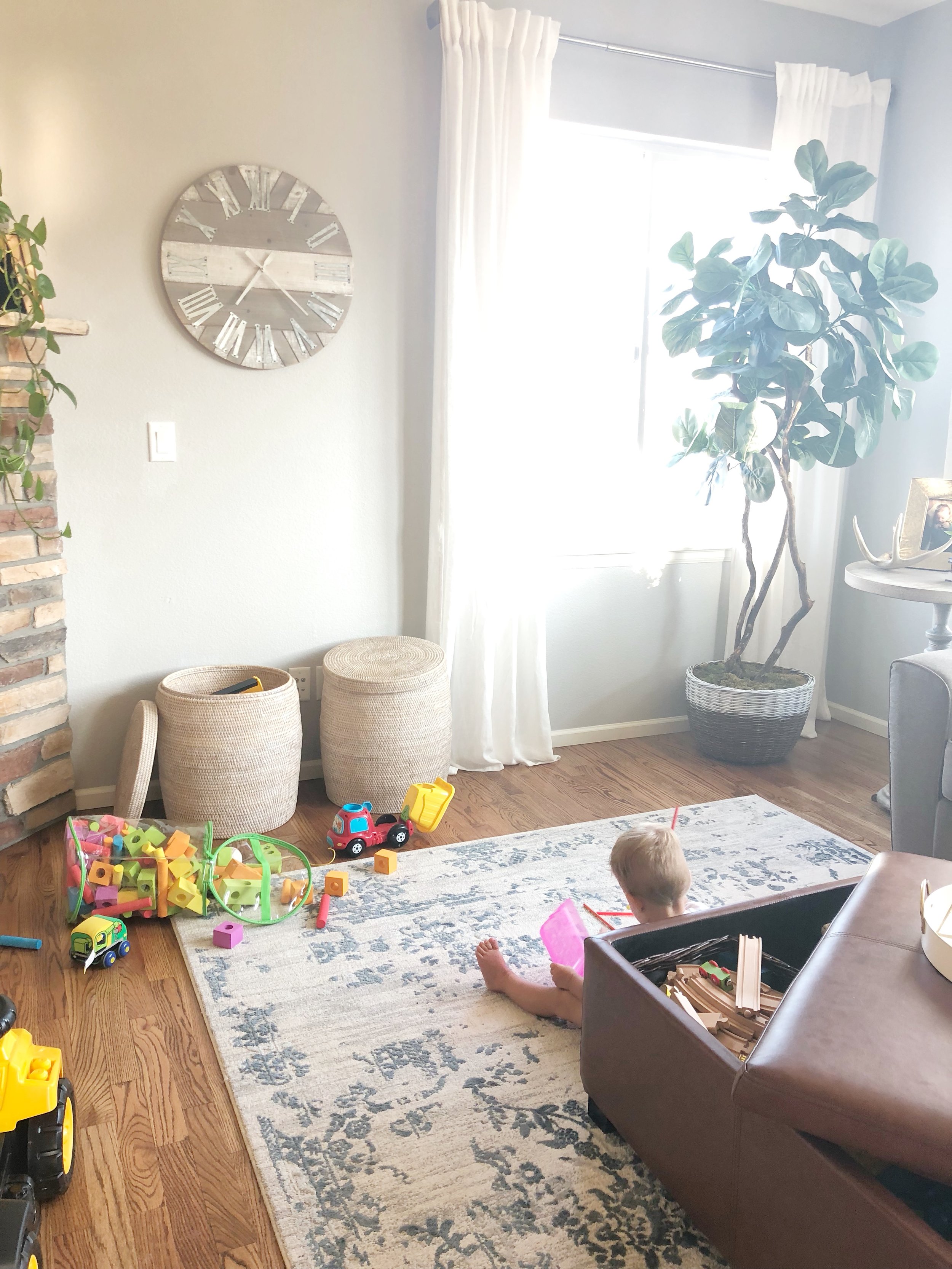
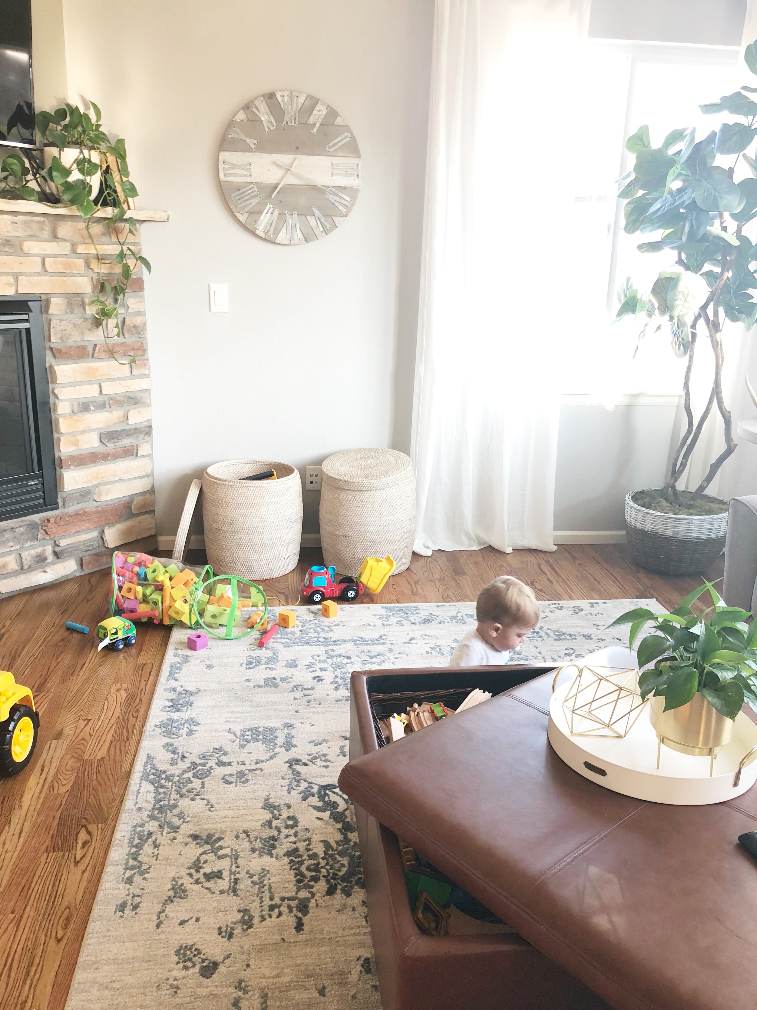
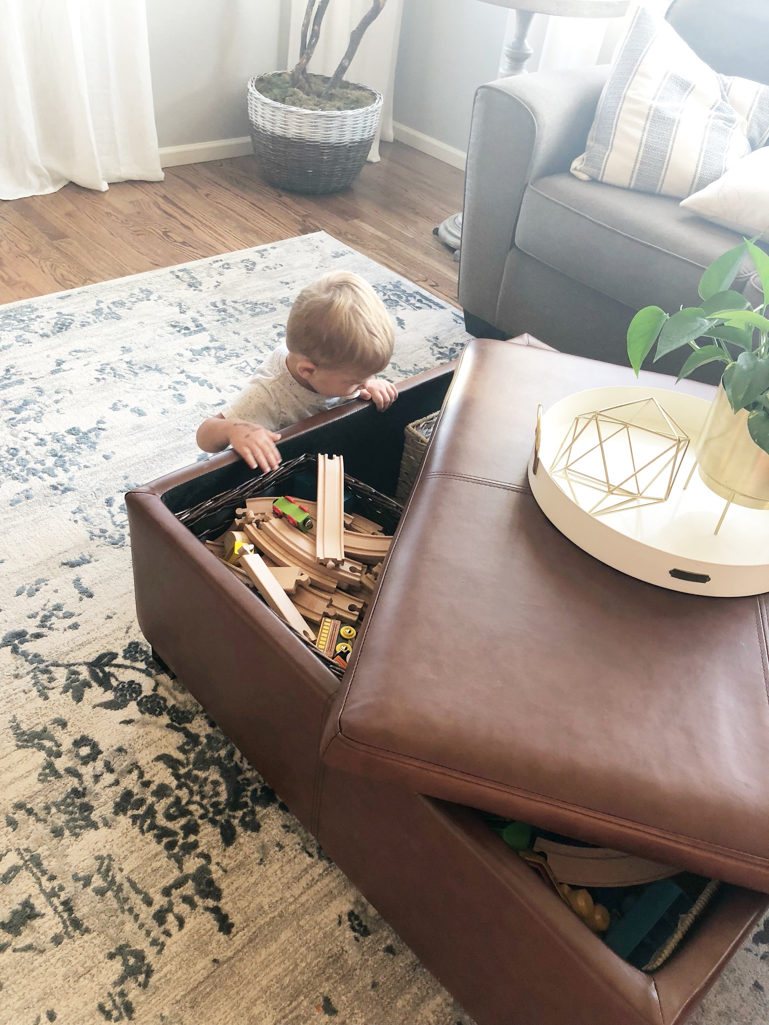
The only downside about these guys is they are sometimes hard for kids to get into. You have to remove the whole top to get to the toys inside. Sometimes this is nice for a momma, sometimes not. That's why in my situation I have these two storage baskets (see pic above) that double as stools for extra guests. The tops can hold lots of weight and they kinda snap off and on- I love them. What I do is store the majority of their toys in the ottoman in organized (loose term) smaller baskets inside. I take some of those toys out, maybe the kids' favs at the time, and put them in the storage stools. Every few months I rotate them and to Beau at least, he has all new toys!
Now let me say that I probably have a much smaller amount of toys than most. I am the opposite of a keeper, but if your goal is to get some control of the "toy ridden" situation you have going on, this is a great way to start reigning that in. Of course there may be a play kitchen in someones room, or you may have a play room (we do not and I miss it). If that's the case, I will also have a couple of playroom suggestions below, but the main goal of this post is help in the living room.

The Owen Storage Ottoman from Wayfair or Target is a great example of a super stylish storage ottoman that will be easy to keep clean. I love this guy. He comes in 4 colors too. I have 2 friends that have bought it because of my recommendation and love it. The best part is the top lifts up easily and has a mechanical arm that safely holds the top open so kids can reach in and get what they need.

Another option is storage baskets. Mine have tops to double as stools but they don't sell them anymore (as of right now). There are plenty out there though. Stick them in a corner or if they don't have tops and you want to hide whats inside, you can tuck them under an open bottomed coffee table like this. It tucks them away nicely but allows the kids to get out the toys and (with any luck) put them back up on their own as well.

For kids' rooms and playrooms I love some good cube storage. This one my handy husband, Tye, made, but I will post a few good ones in my "shop my insta" section. If you can guess this pic was taken before we had a ton of toys. Now, each cubby has a bin. Another great idea to help kids learn to put away their own toys with the cubbies is to get the bins with a card on the front. Draw a picture of the type of toys that go in that bin (legos, trains, etc) and that way kids that cant read will know what goes in that bin.
Hopefully that was super helpful! If you have any questions or want more help, you can always message me. Every Sunday night- God willing, I will write a blog topic for you to read Monday morning! Something to look forward too!! Next week I will write about area rugs: how to pick the right size, how to find one that feels good but also cleans well, and of course some great examples that fit a tight budget that will go with a ton of decor styles! Happy Monday!!!
Em